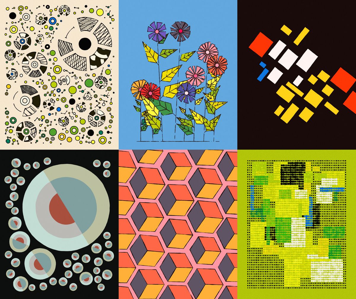
Genuary has been an absolute whirlwind tour-de-force of a month! You might've already seen some posts on social media with the #genuary hashtags, have had a crack at some of the prompts or even made it through all of the daily prompts (in that case I salute you!). Genuary is a month long event where creative coders come together, roll up their sleeves and code up sketches in response to a daily prompt. In a sense, Genuary is the generative art world's answer to inktober. It's only been the 3rd Genuary so far, and overall my second time participating, but it already felt much bigger than it did last year, just from the amount of people that participated this time around!
We also saw two attempts at speedrunning all Genuary prompts in one sitting, first by Raph and later also by Daniel Schiffman from the coding train. The current record stands at roughly 3 hours and 45 minutes, but that might change soon!
Another big thing this Genuary was #GenuaryTogether, an initiative by Raph where prompts become a group effort and can be approached as collaborative pieces. Here's the first sketch in that regard by Raph and Lionel Raddison:
Happy new year everyone and thank you again for 2022! 🖤
— Lionel Radisson (@MAKIO135) January 1, 2023
I'm super happy to start 2023 with the first collab of #genuaryTogether with @sableRaph on the perfect loop theme 🙌#genuary #genuary2023 pic.twitter.com/2FYMo4MmR9
I tried my best to get a sketch in for the daily Genuary prompts, but the daily-ness of this sketching routine quickly fell apart at some point as there were some other things that I had to take care of. But that’s just life! Not gonna beat myself up about it, I ultimately managed to catch up, and overall I’m really happy with all of the sketches that I came up with, some of which I think I'll dig into more throughout the coming weeks. Sometimes the best way to go about creative coding is while being on a time crunch, that’s when the best ideas happen and you really tap into that hidden creativity compartment at the back of your head!
Here’s a rundown of my Genuary sketches alongside some commentary about the idea and inspiration for each one of them as well as some thoughts on the code that went into their making! I'll also round up my favorite sketches, at least the ones that I've seen in my feed, there have been some absolute bangers!
This article contains a lot of media and links, hence it might take a couple of seconds to load! Here's a messy quick index to the different sections if you're interested in a specific prompt in partiular.
#01 - #10
#01 Infinite Loop
For the very first prompt I wanted to make an animation I had already been thinking about for weeks at that point. It was a bit of an exploration until I figured out how to put it together. The initial inspiration was this infinite Mondrian loop by Feliks Tomasz that I found on giphy:
I believe it was even minted as a token in the early HEN days! However, after some initial attempts, I couldn’t really figure out how to recreate this infinitely looping spiral. After searching a little more I came across another animation that I thought to be a bit more approachable:
You might already have a hunch on what's going on here! Essentially, the ratio at which the squares are expanding here is better known as the ‘golden ratio’ (a very popular ratio in creative coding as well). This ratio also describes the Fibonacci sequence, where each element in the sequence is the sum of the two previous elements. Dividing an arbitrary element in this sequence by its immediate predecessor yields this golden ratio. Now, when visualising this with squares you might say that the third square is clearly larger than the sum of the two previous squares! And visually that is true, but you have to keep in mind that we’re not representing the area, but rather the length of the sides.
In my first attempt I focused on recreating only one of the four quadrants of the animation, since the other 3 are just rotated mirror images. I quickly realised though that it wasn’t as straightforward as I had initially thought, I did get something going that looked pretty close, but it wasn’t really a Fibonacci sequence, just some expanding lines:
I returned to a sketch that I had done just a couple of days prior to that, that actually made use of the Fibonacci formula to obtain the size of the squares. Positioning the squares in that distinct manner can be done with two parameters and a couple of if conditions that keep track of things. Now to the hard part: animating this thing somehow.
The majority of examples for the Fibonacci sequence start with the two initial values 0 and 1, but it isn’t necessary to start with these two numbers, in fact you can start with any two arbitrary numbers. For example, 0 and a very small number like 1e-4, and we’d still end up with a valid Fibonacci sequence if we keep adding them up. Using the same code to draw out these fibonacci tiles, we initially get many small rectangles, so small in fact that they’re practically invisible on the canvas.
To animate this, we can now simply increment the starting values of the sequence, redraw the squares and export the frame to later compile into a GIF. But there are two problems here: firstly, at which rate do these starting numbers need to be incremented for a visually constant and smooth expansion of the Fibonacci tiles? And secondly at what point do the squares line up again? The second part is important for resetting the animation and making it seamlessly loop.
And I still haven’t found the answer to either one of these questions… I ended up cheating a little bit, trying out different numbers and manually checking where the animation lines up again. When the rate of expansion is slow enough it is virtually smooth. That’s also why the animation speeds up a little bit towards the end and then slows down again, I didn't actually mind it too much, thought it kinda looked like an easing function.
If you have some thoughts on this please let me know! Would love to get this right!
Piter Pasma, who's also the mastermind behind Genuary and the one who put together the Genuary website that lets you keep track of all the daily prompts. He kicks off with a sketch that is just absolutely bonkers:
#GENUARY 2023 Day 1:
— piterpasma (@piterpasma) January 1, 2023
Perfect loop / Infinite loop / endless GIFs#genuary1 #genuary #genartclub #generative pic.twitter.com/tzCJBJ3aaa
A second stunning loop is by Yann Le Gall, where we can also already see a little sneak peek of day 12:
#genuary day 1 and 12: looping dynamic tessellation#genuary1 #genuary12 #art #generativeart #loop pic.twitter.com/pnBYN6X7A2
— Yann Le Gall (@Yann_LeGall) January 17, 2023
#02 Made in 10 Minutes
Numerically this was my most successful genuary tweet! I just felt really good that day, and I already had a vague idea of what I wanted to make, basically a remix of these grid SDFs that I had already done countless times before and thought that it could be fun to make a timelapse of me coding it up. I guess, in a way, it is fascinating to see the code come together while observing how many times I scratch my chin during the process.
Made in 10 minutes! ⌛️
— Ahmad Moussa || Gorilla Sun (@gorillasu) January 2, 2023
Thought it would be fun to make a little time-lapse of me coding up today's #genuary sketch. Also made a little track for your listening enjoyment 🎵 Never mind all the clutter in the background lmao.
GIF of final animation in replies 👇 #p5js #genuary2 pic.twitter.com/8YRn8KNFgl
As for the code, I'll talk a bit more about that in <>#8 SDF since it's pretty much the same concept. Definitely planning on doing more like this in the future!
Samir felt inspired by my tweet and also did a timelapse, where we can see that holding your chin is a viable strat for algorithmic problem solving:
Made in 10 minutes! Inspired by @gorillasu here’s a timelapse of me making it, final output in reply 👇 #genuary #genuary2 #genuary2023 pic.twitter.com/Ua4s7eJ280
— samir 🧙♀️ (@smrghsh) January 3, 2023
#03 Glitch Art
Never tried to make glitch art before, initially I wanted to have a stab at a pixel sorting Algorithm but didn’t end up having enough time. In this sketch I’m reusing my irregular grid algo from a couple of months back, with the additional twist that it’s animated and not just a static piece. Looking at the formal definition for what a glitch is, I tried to approach the prompt from a little bit of a different angle:
Glitch: a sudden, usually temporary malfunction or fault of equipment.
The idea was to create some sort of machine, whose components are slowly breaking apart until complete failure is reached. Each cell in the grid holds it’s own counter that has a random chance of being incremented every frame, which is represented by a blinking 404 Error message. Once this counter reaches a specific threshold the cell turns red and can be considered defect. The overall counter (the red bar at the bottom) is made up out of the sum of all of those individual counters.
Glitch Art ⁉️
— Ahmad Moussa || Gorilla Sun (@gorillasu) January 3, 2023
glitch: a sudden, usually temporary malfunction or fault of equipment #genuary #genuary3 pic.twitter.com/qgi7XKOZ4B
Here I really liked elsif's sketch! Pixel sorting with a beautiful motif to boot (I love generative flowers and plants):
#genuary3 glitch art
— elsif (@ElsifThen) January 3, 2023
I made some flowers with math and then partially sorted the pixels. Pixel sorting is my favorite kind of glitch art. #genartclub #p5js #genuary2023 #genuary pic.twitter.com/qsqrQM2Mlw
#04 Intersections
My initial idea for this were just some intersection lines that are looping between two coordinates on the canvas, coloring the lines whenever they intersect each other:
This didn't look like much hence I decided to go a different route with something more geometric. I ended up with something that looked more like futuristic bookshelves.
There were so many stunning sketches for this prompt, ultimately making my ideas feel a little uninspired in comparison. Two favourites here were by Elliot Schultz:
Day 04 – Intersections.#genuary #genuary2023 #genuary4 #blender #b3d #geometrynodes #generativeart #phenakistiscope #zoetrope #stroboscope #animation pic.twitter.com/teCyDOTpfZ
— Elliot Schultz (@elliotschultz) January 4, 2023
And Seohyo:
Genuary Day 4: Intersection
— seohyo (@seohyowork) January 5, 2023
Inspired by Sato Masahiko #genuary #genuary2023 #genuary4 #seohyowork #creativecoding #dailycoding pic.twitter.com/0oE8rsVVsW
Another contender here is Daniel Lever. If you have a closer look at his Twitter timeline, once a year Daniel he awakens from a long slumber to unleash a generative box of Pandora full of stunning sketches. I highly recommend checking out all of his creation this Genuary. For this prompt he recreated Jared Tarbell's iconic substrate algorithm, which I thought was also super on point:
Day 4 — Intersections#genuary4 #genuary #creativecoding #generativeart #javascript pic.twitter.com/SIdqyLmQTP
— Daniel Lever (@_danlever) January 3, 2023
And another three who took the prompt very literally were Loackme, Christophe Choffel and Nicolas Barradeau:
#genuary Day 4: Intersections
— loackme (@loackme_) January 4, 2023
Took that prompt quite literally.#genuary4 #genuary2023 #generativeart pic.twitter.com/PReeNiVNxo
#genuary4 Intersections
— Christophe Choffel (@ULuIQ12) January 4, 2023
Well, just one, but a busy one!#genuary2023 #generativeart #creativecodgin #genart pic.twitter.com/g7Mi3o1BL6
"intersections" uses a thing I did a while back (finding cycles in an undirected graph) to create intersections. https://t.co/2lalSMH3P9
— Nicolas Barradeau (@nicoptere) January 4, 2023
it's absolutely unstable but it's somewhat fun to play with. #genuary2023 #genuary4 #genartclub pic.twitter.com/8rk7CMwdjw
#05 Debug View
I tried being creative with this one, where I attempted to visualize the sketch as well as what's happening behind the scenes at the same time:
The prompts that take the cake here would be Dave Pagurek's and meezwhite's de-bug sketches:
#genuary5: "debug view." Maybe not the original intention of the prompt, but hey... https://t.co/sc1yKfZIkc #genuary pic.twitter.com/lClP2ic0Es
— Dave Pagurek (@davepvm) January 5, 2023
de-bug view#genuary #genuary2023 #genuary5 #creativecoding pic.twitter.com/oX6dqtwQC3
— 𝔪𝔢𝔢𝔷 🌴 (@meezwhite) January 5, 2023
Another two that really stood out to me where by Alexis André:
#genuary5 debug view
— Alexis André (@MacTuitui) January 5, 2023
Original was like 80MB for 10s so here is the lame version#generative #dailycoding #genuary pic.twitter.com/6Id29D9vXx
And yet again by Elliot Schultz:
Day 05 – Debug view.
— Elliot Schultz (@elliotschultz) January 4, 2023
This was a fun one. I've never really tried to visualise any designs this way before.#genuary #genuary2023 #genuary5 #blender #b3d #geometrynodes #generativeart #phenakistiscope #zoetrope #stroboscope #animation pic.twitter.com/Gfy4JBsOKc
#06 Steal like an artist
I'm a huge fan of Dave Pagurek’s interpolated hand-drawn SVG sketches, where one drawing morphs into another one. Have a look at this goose morphing into an angry goose!
Happy #genuary 1! Going to be doing all of mine in @p5xjs on @openprocessing. honk! https://t.co/to9eKv0Hyu pic.twitter.com/2C0jwA5QKY
— Dave Pagurek (@davepvm) January 1, 2023
I think it's just a really smart and relatively straight-forward way to animate things, without actually having to go through the process of animating. Adding a slight sinusoidal wobble to the strokes gives it an even more cartoony character:
There's a few steps involved with this one, but it involves: (1) importing drawings as SVGs, (2) drawing the SVGs with offsets to make it wiggle, (3) interpolating between paths in different drawings
— Dave Pagurek (@davepvm) January 2, 2023
Technically, any path can morph into another given that they have the same number of vertices, which was the idea behind my sketch. I generated a couple of numbers based on coordinates in a grid, which I manually typed out in an array and then interpolated between, creating this generative counter:
Steal like an Artist #genuary #genuary6
— Ahmad Moussa || Gorilla Sun (@gorillasu) January 6, 2023
To me this means taking inspiration and remixing ideas from others. Here's something inspired by @davepvm's lovely interpolated animations! #p5js #creativecoding https://t.co/6wkXumHY7M pic.twitter.com/xr0Ac1aqJI
Here I also want to mention Neel Shivadasani's kinetogram sketch, where he takes down 6 prompts in one:
I'm late to #genuary, but here's #genuary1, #genuary3, #genuary4, and #genuary6
— Neel Shivdasani (@DataNeel) January 6, 2023
A kinegram: the intersection of different slices of time of a perfect loop, resulting in a glitchy texture
Made in glsl
An ode to the Poemotion series by @thinking_forms: https://t.co/gxKGehOoZ9 pic.twitter.com/UHSm0VXxSI
#07 Sample a cooler palette from your favourite movie/album cover
I was excited for this prompt at first but then felt really uninspired when it actually came to making something for it. Ideally I would have coded up some sort of color sampling algo, like k-means clustering, but decided that that was too much work and wouldn't really net me a graphic that I could later share. I decided to go back and reuse some code inspired by Roni Kaufman's poetical computer vision project:
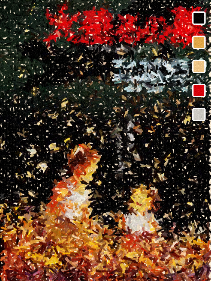
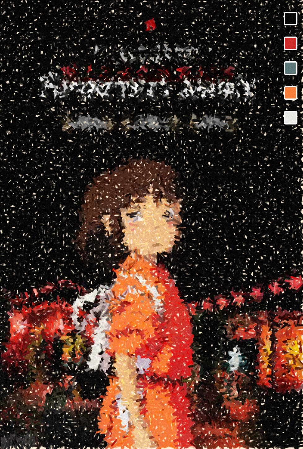
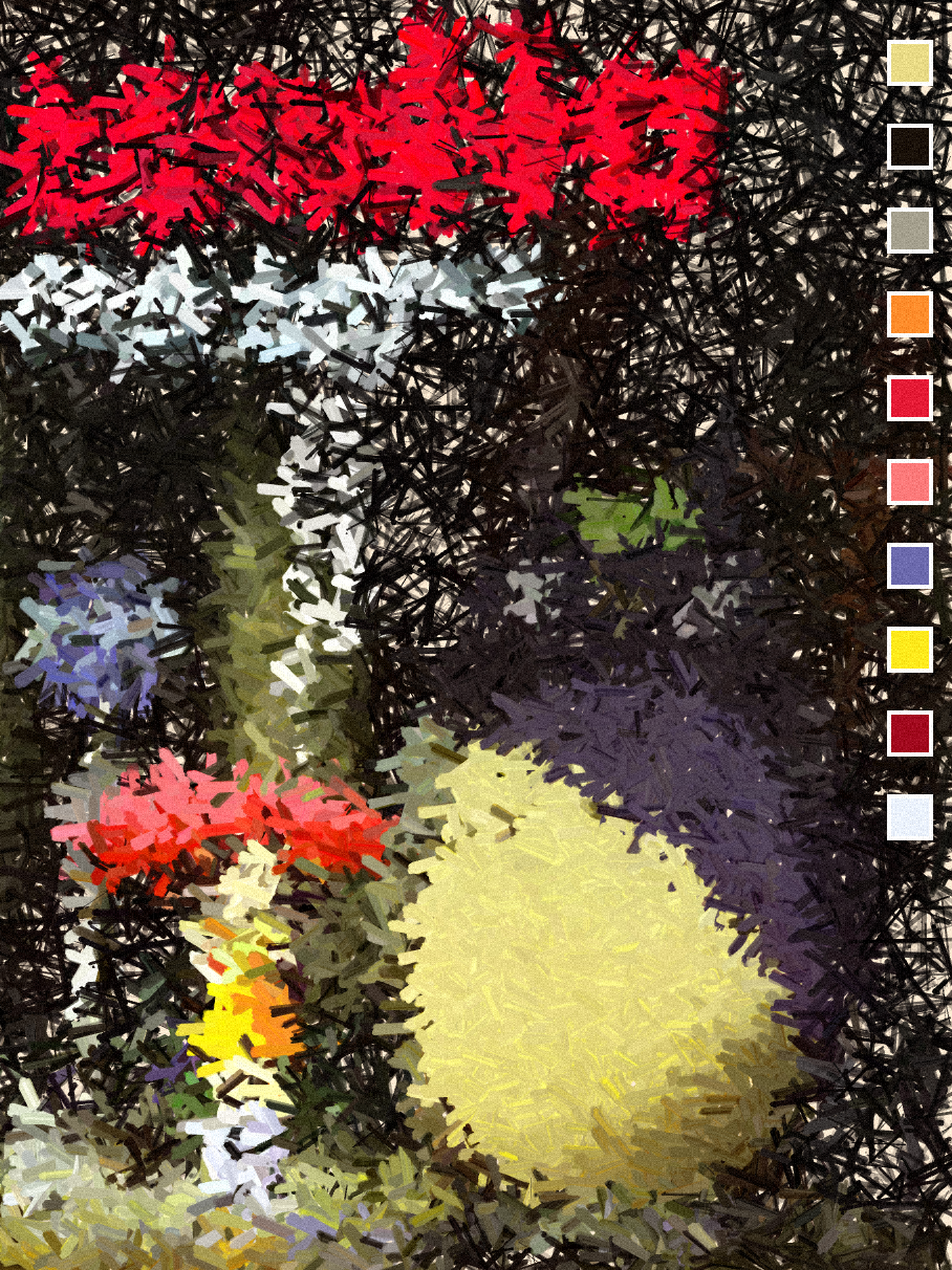
Grave of the Fireflies | Spirited Away | My Neighbour Totoro
In that manner the algo samples colors from the underlying image to alter it's style and make it appear as if it were drawn by many brush strokes. The brush strokes themself are composited from many short lines of varying thickness.
#08 Signed Distance Functions
For this one I already knew what I wanted to do, playing more with grids and sinusoidal movement similarly to what I did on the second genuary prompt, as well as many previous sketches. A little tutorial on this can be found here.
Mid-November of the past year I was playing again with these SDFs, and had a little bit of a lightbulb moment when I made the realisation that the distance of the points in the grid don’t necessarily only need to be measured with respect to another single point, but can also be measured with respect to an entire polygon positioned somewhere on the canvas. You still have find a formula for measuring this distance correctly but in that manner very interesting patterns can emerge. For example, here is an SDF where the size and colour of the points in the grid is modulated with respect to their distance to a rotating line positioned at the centre (for clarity's sake the line is drawn out here in red):
Additionally, you can also combine different distance functions, or place multiple items in the scene and see which one is closest! In my genuary sketch I am drawing three lines going outwards from the center and measuring the minimum distance towrads them, obtaining a sort of rotating peace sign:
Signed Distance Function #genuary #genuary8 pic.twitter.com/ywdzmG495M
— Ahmad Moussa || Gorilla Sun (@gorillasu) January 9, 2023
I think that this one was the prompt that people were afraid of the most, since SDFs are usually associated with shaders. But Piter Pasma to the rescue, he put together a super informative tutorial about the topic on the tubes!
And another super cool one is by Matthew Hughes, where I have absolutely no idea how it was made:
Genuary Day 8: Signed Distance Functions
— Matthew Hughes (@tasty_plots) January 8, 2023
Thanks to Zorro Weaver for his sdf geometry nodes#genuary #genuary8 #b3d #generative pic.twitter.com/gOEB8yiFPH
#09 Plants
A redo of a flower sketch I was working on during the beginning of December, and I think I almost like it more than the initial version:
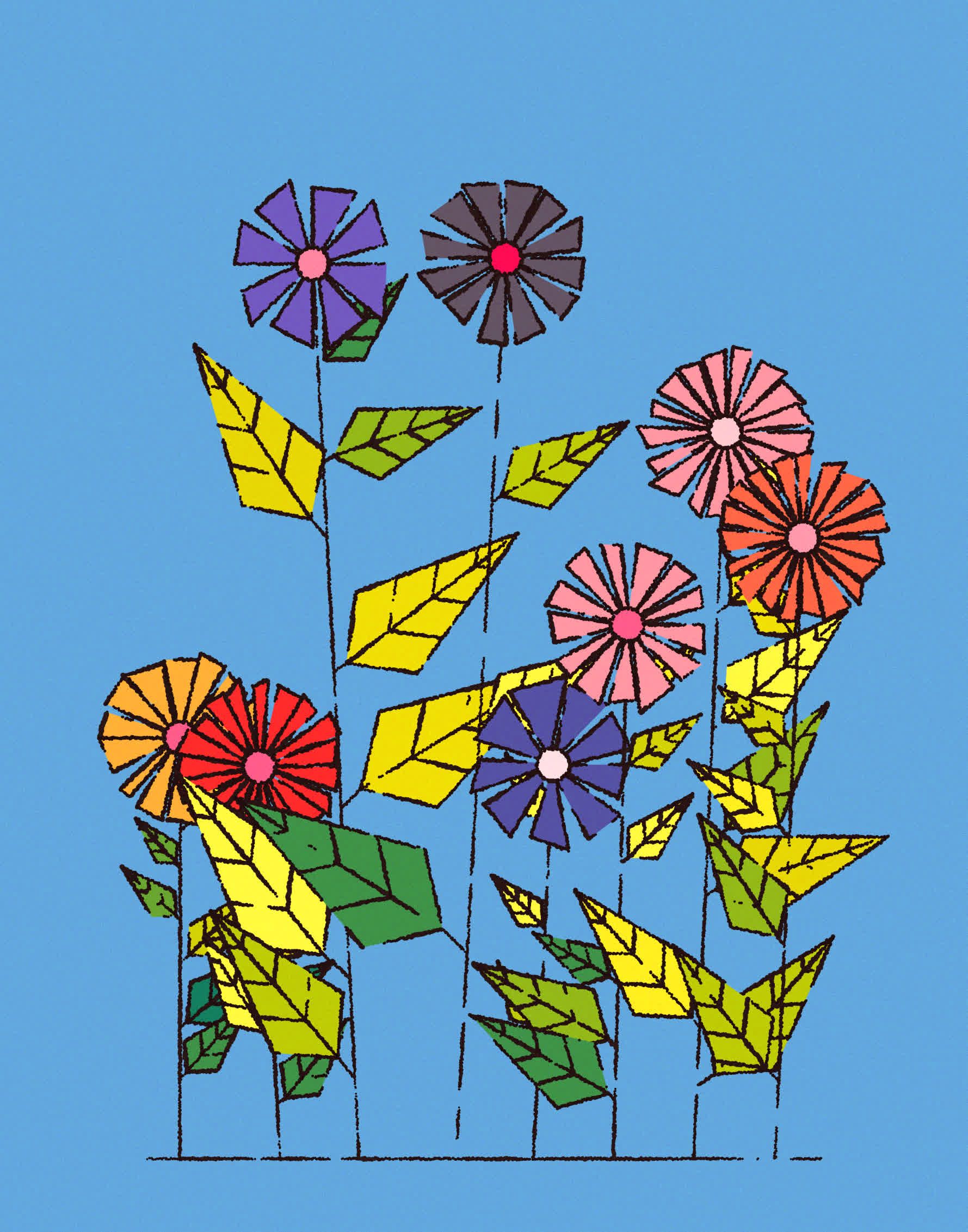
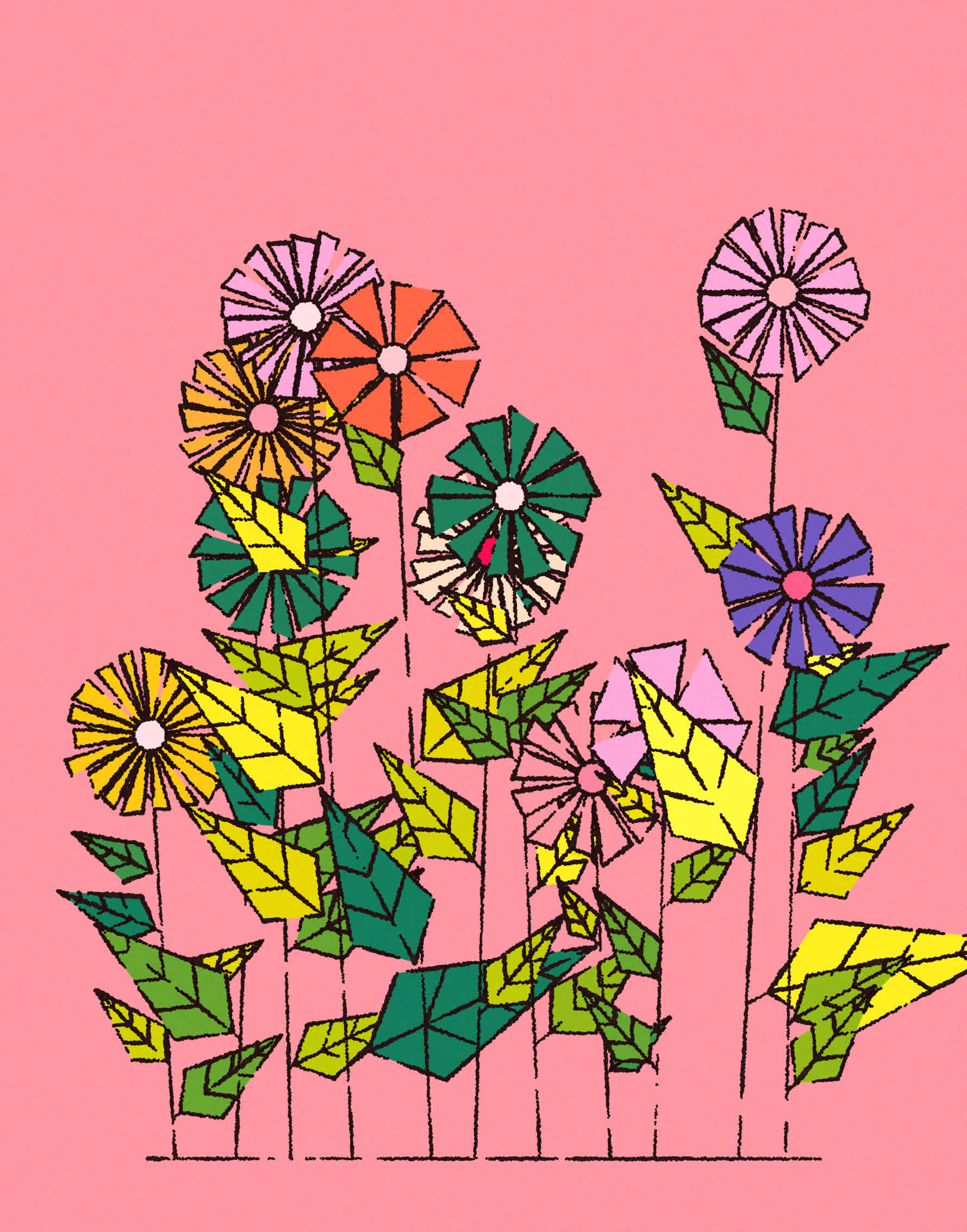


An absolutely stunning piece here is again by elsif:
#genuary9 Plants
— elsif (@ElsifThen) January 9, 2023
🌸🌻💐#genartclub #p5js #genuary2023 #genuary pic.twitter.com/HCkDEmyx2D
I liked this one so much I had to ask how it was made, assuming that it might use an underlying picture for flowers, similarly to what I did for genuary #7, and I believe that the ultimate texture is achieved in this manner. Elsif reveals though that is completely generative by first generating a field of geometric flowers, the same motif that they used for genuary #3:
hi, thank you! it's fully generative pic.twitter.com/sp3QQ4NT75
— elsif (@ElsifThen) February 3, 2023
I believe that the resulting texture is still achieved by applying an intermediary pixel sort as well as orienting the direction of the lines with a Perlin noise flow.
Another cheeky sketch was by ippsketch:
Plants#genuary9 #genuary2023 pic.twitter.com/ap6p1B7OK7
— Jeff · ippsketch (@ippsketch) January 9, 2023
#10 Generative Music
I generally feel like more sketches should have sound accompanying them, especially animations. This one I've also thought about before, wondering what it would sound like if the collisions between rectangles produced a sound. There's a lot of playroom here, choice of musical scale, what rectangles produce what sound, tying velocity of the note to the force of impact, etc... I just did a simple thing however, adding a little bit of reverb and delay in ableton live makes it sound quite ephemeral:
Generative Music #genuary #genuary10
— Ahmad Moussa || Gorilla Sun (@gorillasu) January 10, 2023
Sound On 🔊
Notes are triggered when the rectangles collide with each other or the borders. Notes are selected from a minor seventh chord + major 6th step (no idea what that's called). Added some reverb and delay in post!
Beep, Boop 🤖 pic.twitter.com/NegQwJe4rb
The most impressive entry for this prompt was Chris Barber's gesture controlled music sketch:
I feel like I have the force
— Chris Barber (@code_rgb) January 11, 2023
genuary day 10: generative music#genuary10 #genuary2023 pic.twitter.com/mgy8xqlT7B
The device is a Leap Motion controller by ultraleap if you want to look it up or get one for yourself! (Not sponsored, sponsorships are welcome however 🤔)
#11 - #20
#11 Suprematism
Positioning plays an incredibly important role in Suprematist compositions; to me these compositions often evoke a sentiment of fleetingness and ephemerality, as if we were only gazing upon a brief slice of a larger geometric movement.
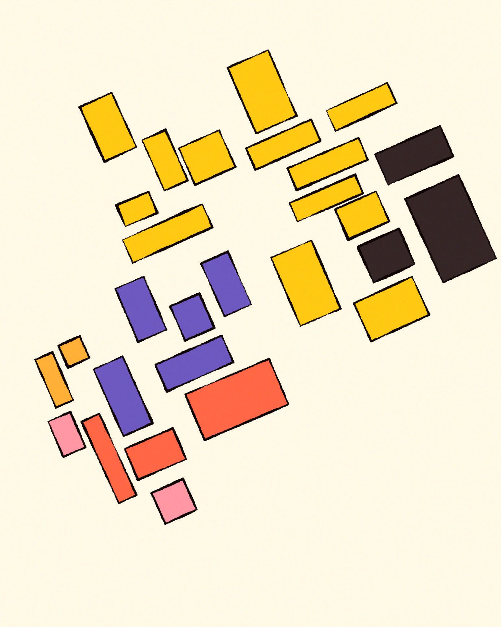
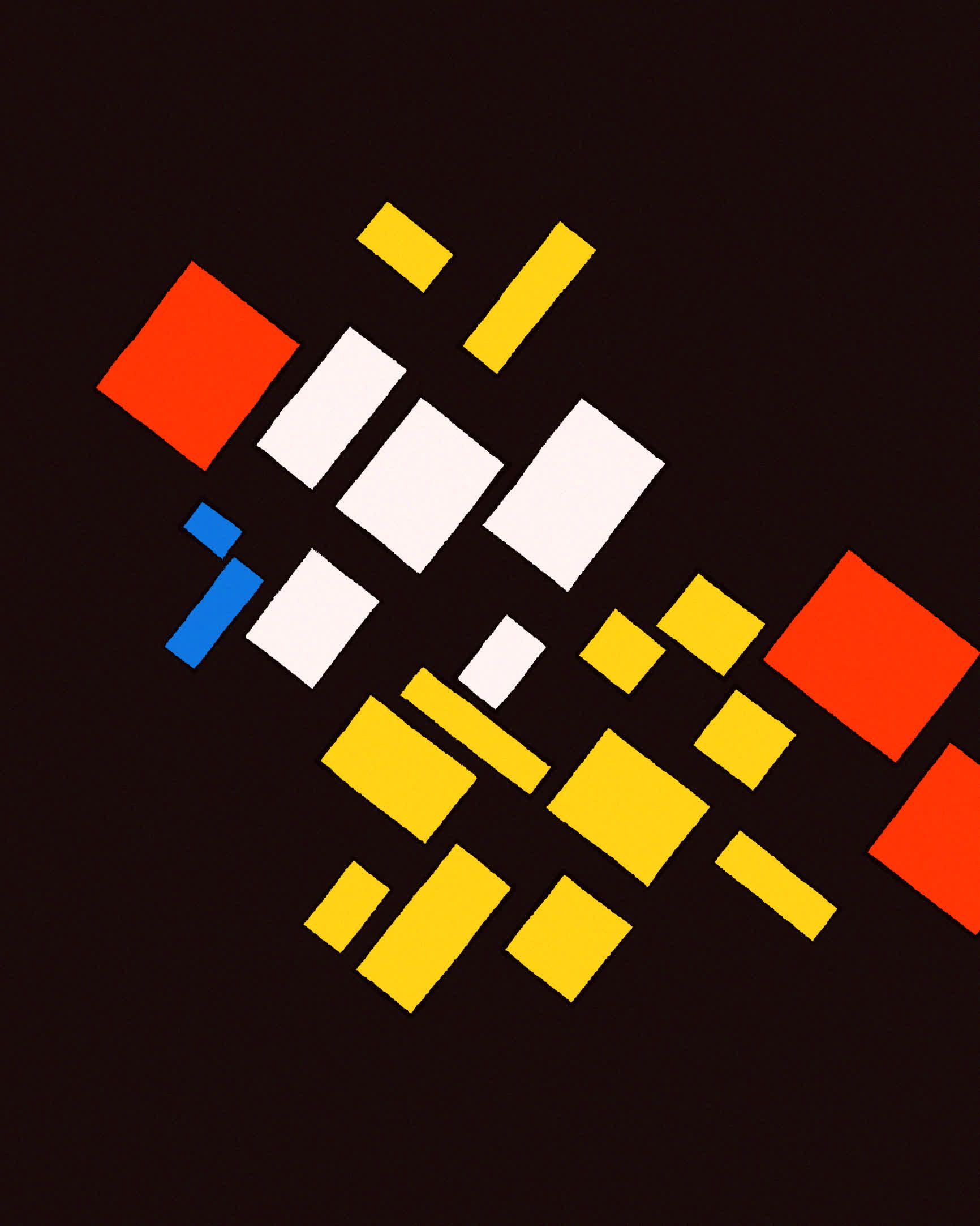
During the making-of my fxhash token Neo-Supremus I learned a lot about trying to imitate a natural positioning of these kinds of geometric elements, and I was surprised how quickly the code came together for the gentry sketch. It’s been a minute since I looked at the code for Neo-supremus but I guess all the agonising over positioning strategies did have a lasting effect. You can read more about how the token was made here.
Anapet's sketch really stood out to me here:
#genuary day 8 and 11.
— AnaPet (@AnaPetArt) January 12, 2023
Signed distance functions + Suprematism.#genuary2023 #genuary8 #genuary11 #generativeart #genart #creativecoding pic.twitter.com/UMZ8OnYDlC
#12 Tesselation
Generally, a tessellation is the subdivision of a 2 dimensional space with geometric shapes and forms (in that context better referred to as tiles) such that there are no gaps or overlaps between these tiles. I've done a lot of sketches that are based on this, and decided to return to one of my favourite geometric shapes, the hexagon:
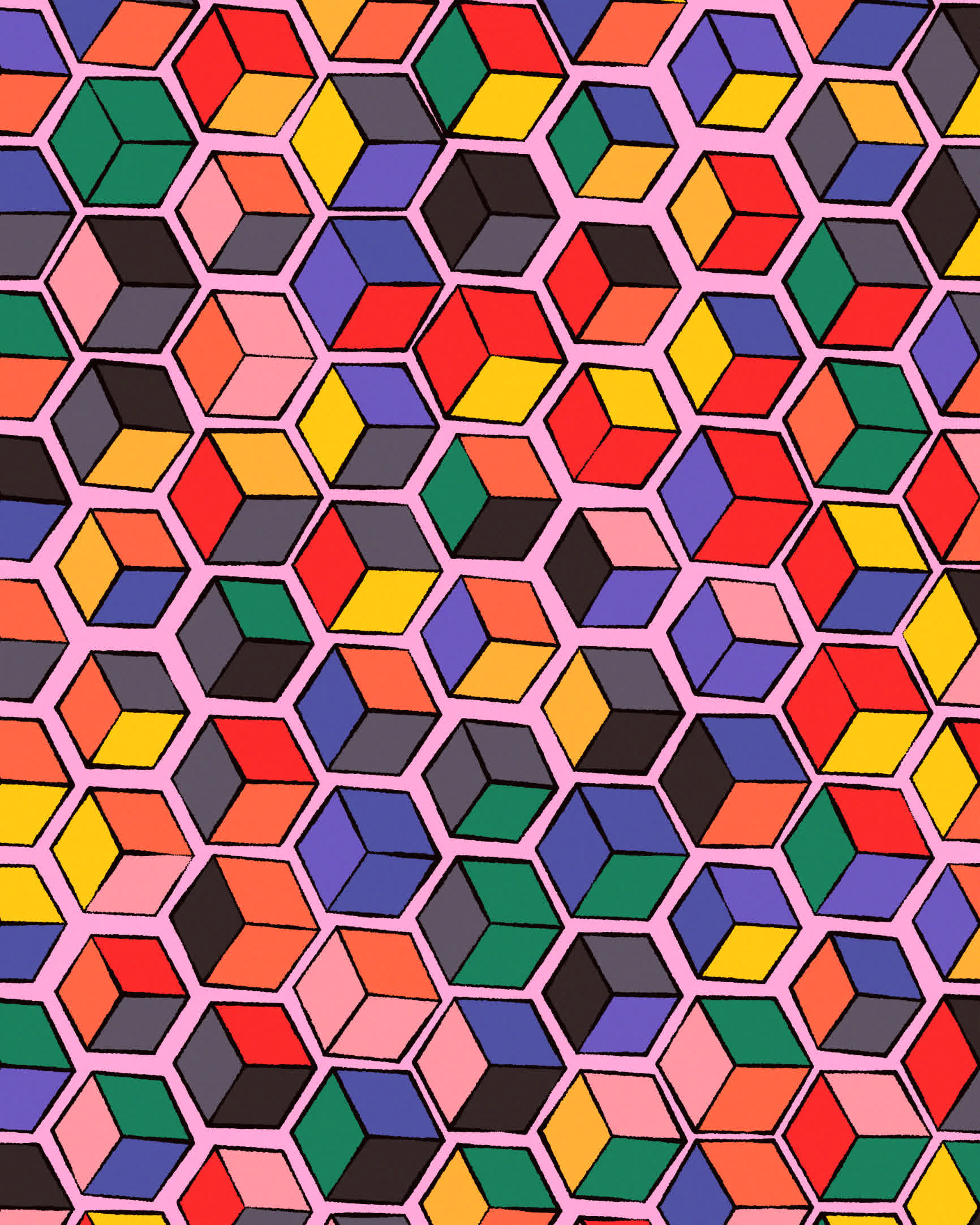
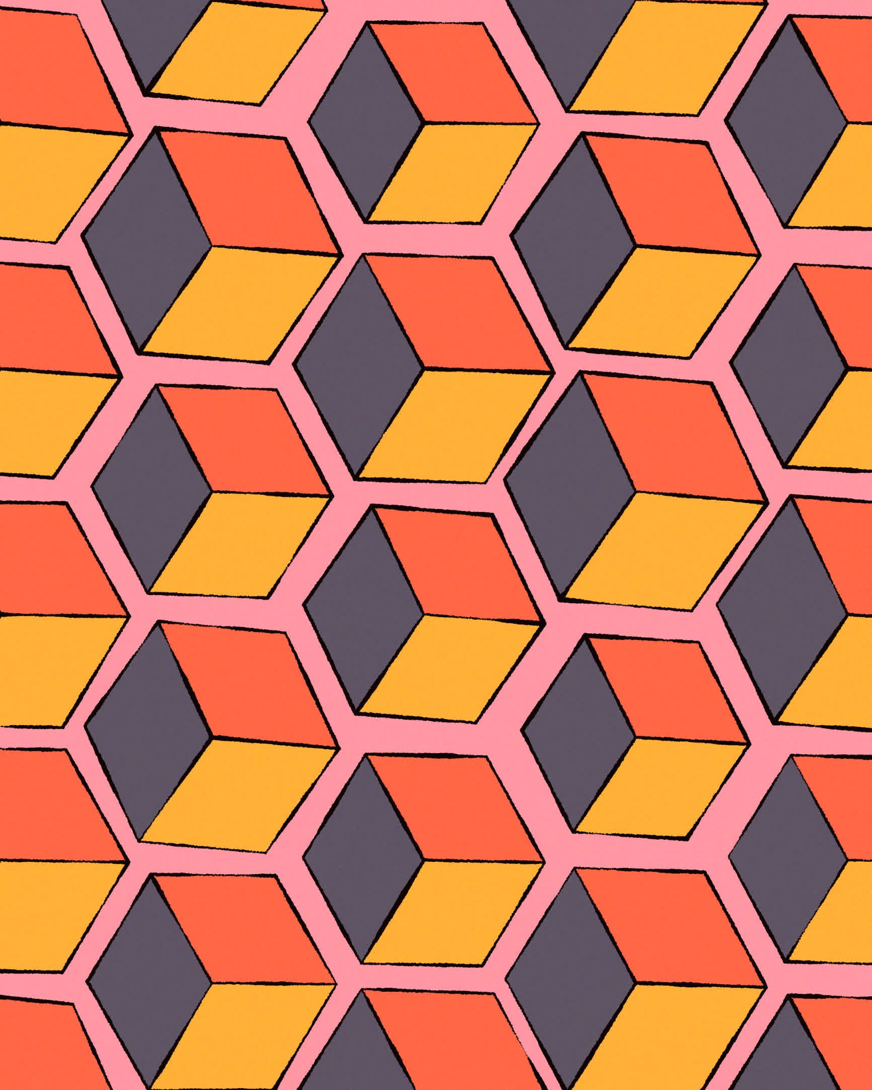
And the patterns that can emerge in this manner are truly endless. A sketch that I really enjoyed here was by Julien Labat, which is also based on a hexagonal tiling, with the additional twist that they're Truchet tiles, generating a infinitely interlacing connectedness:
#genuary12 - tessellation
— Julien Labat (@JulienLabat) January 12, 2023
Hexagonal grid caused some headaches here…#genuarry #genartclub pic.twitter.com/sZ1eJ0eZFp
#13 Something you’ve always wanted to learn
Always wanted to do more with text, especially after seeing Roni Kaufman’s overarching Genuary theme. One thing I’ve always found annoying working with text in p5 is how hard it is to precisely position it. For this reason I took a little dip into opentype.js that makes this much easier by giving you access to the bounding box of the text, and hence making positioning much easier. Additional it gives you access to the vertices of the strokes that make up the letters, at various granularities, which is what I used to make the letters wiggle erratically back and forth:
My favourites that day by far were from MV, and yet again Daniel Lever (this is slowly turning into a Daniel Lever appreciation post):
Finally got my #genuary13 ‘Something you’ve always wanted to learn’ to work 🎉
— MV (@mountvitruvius) January 18, 2023
A soft-body solver in about 1.5kb 🍦#genuary pic.twitter.com/k9LPI9Yzz8
Day 13 — Something you’ve always wanted to learn
— Daniel Lever (@_danlever) January 14, 2023
I'd never played with differential growth before, so here's my first crack.#genuary13 #genuary #generativeart #creativecoding #javascript pic.twitter.com/exbBhZnSWW
Also really loved Jeff's sketch that made use of the polygon corner rounding code that I wrote about during Genuary 2022:
Something I've wanted to learn: rounded polygons#genuary13 #genuary2023 pic.twitter.com/K8Z01IVq4P
— Jeff · ippsketch (@ippsketch) January 13, 2023
You can learn more about the polygon rounding code here.
#14 Aesemic
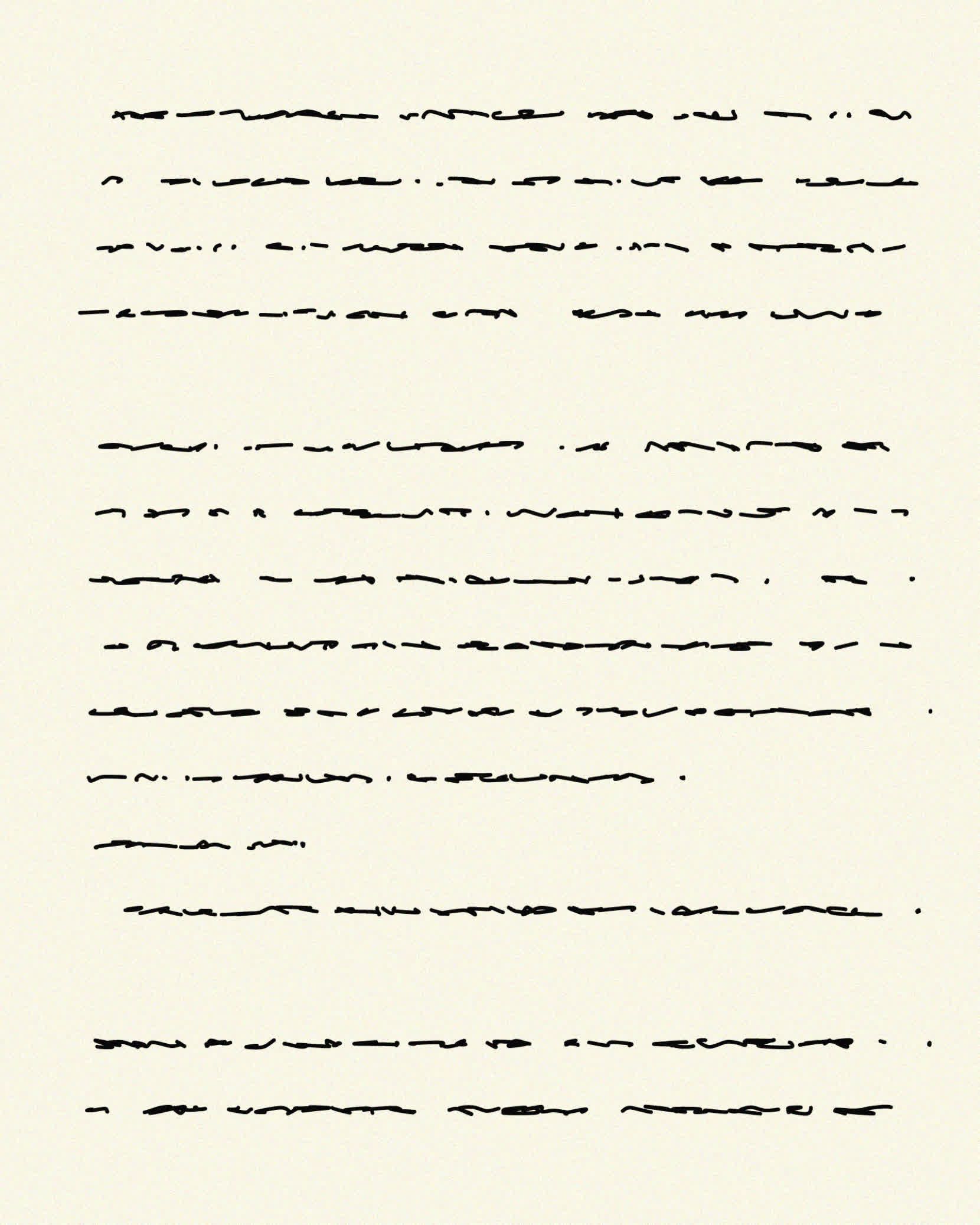
The term Asemic is used to describe characters, lines and symbols that deceive the eye by having semblance to human writing but are ultimately devoid of any semantic meaning. I discovered that this actually is a very popular art direction and a lot of works have been made in that regard.
My sketch for this prompt made use of a grid where the coordinates are slightly displaced and then connected with Bezier curves. There's also a random chance to end the current row as well as skip a line:
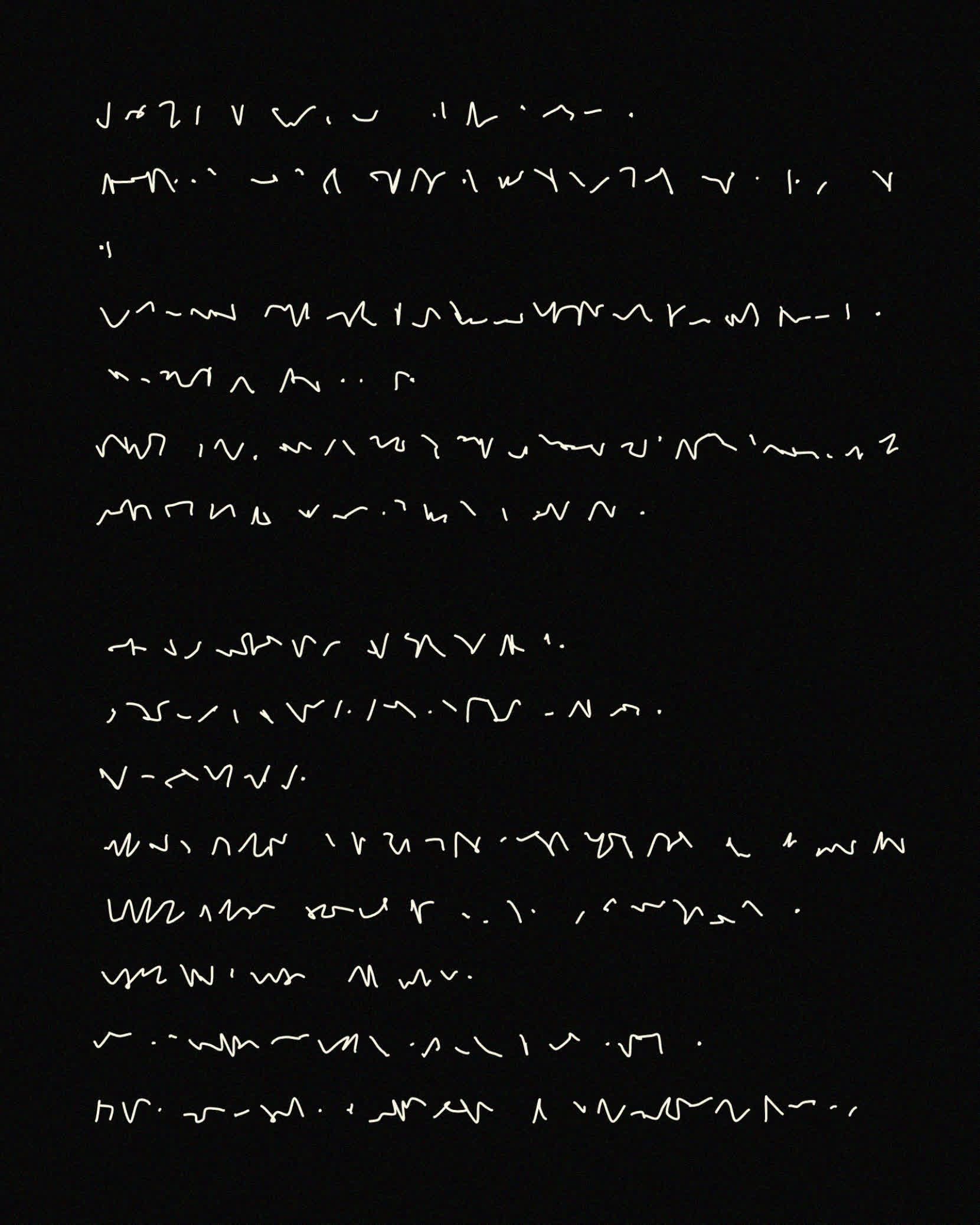
I really loved Piter's sketch here, instead of faking it the way I did, he attempts at simulating the actual wrist movements that go into human hand-writing. This is actually non-trivial, and he elaborates a little in a thread underneath his artwork:
#genuary14 Aesemic
— piterpasma (@piterpasma) January 14, 2023
I wrote this algorithm a couple of months ago in the p5 web editor (I like it for quickly prototyping ideas), I'm using today to rewrite it so it's plain JS and outputs SVG.#genuary #generative #genartclub pic.twitter.com/MFCe36HN7i
I also learned that there has been research in this regard, trying to find sinusoidal formulas for approximating these hand movements and coincidentally this somehow comes very close to what Piter does in his sketch.
Huh, wow! No I hadn't seen that before, but it does look kind of similar! It was based on my own observations of handwriting and hand/wrist motion. I'll check out the paper, thanks!
— piterpasma (@piterpasma) January 18, 2023
Need to investigate this more in the future!
#15 Sine Waves
This one came together pretty quickly, I've had a lot of practice with sine waves and it's really easy to make cool animations with them at this point:
Sine Waves #genuary #genuary15 pic.twitter.com/P4C22yOucd
— Ahmad Moussa || Gorilla Sun (@gorillasu) January 19, 2023
Sine waves are an incredibly integral part of creative coding, and I think folks had lots of fun with this prompt since it's not very difficult to obtain interesting patterns by throwing together a bunch of trigonometric functions! Some that I liked here were again by Seohyo:
Genuary Day 15: Sine waves
— seohyo (@seohyowork) January 16, 2023
#genuary #genuary2023 #genuary15 #seohyowork #creativecoding #dailycoding pic.twitter.com/jmFvNYb3Cq
By Mr. Tasty Plots:
Genuary Day 15: Sine Waves#genuary #genuary15 #b3d #generative pic.twitter.com/sI43ZiozCJ
— Matthew Hughes (@tasty_plots) January 15, 2023
And Matt Perkins:
A little rain drop sketch for #genuary15, sine waves #genuary #generativeart pic.twitter.com/FnKYsxxCAr
— Matt Perkins (@nudoru) January 16, 2023
#16 Reflection of a Reflection
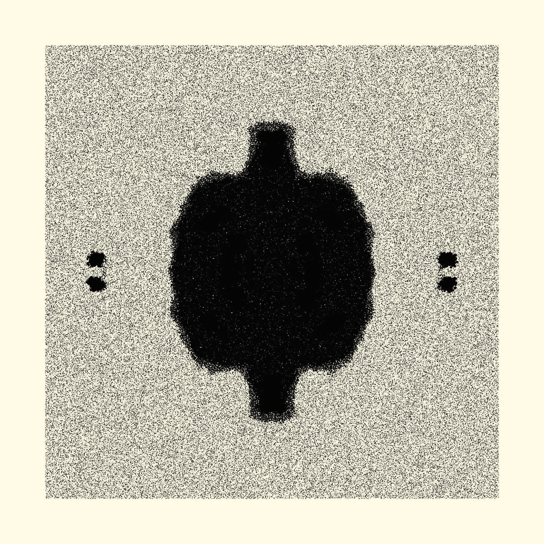
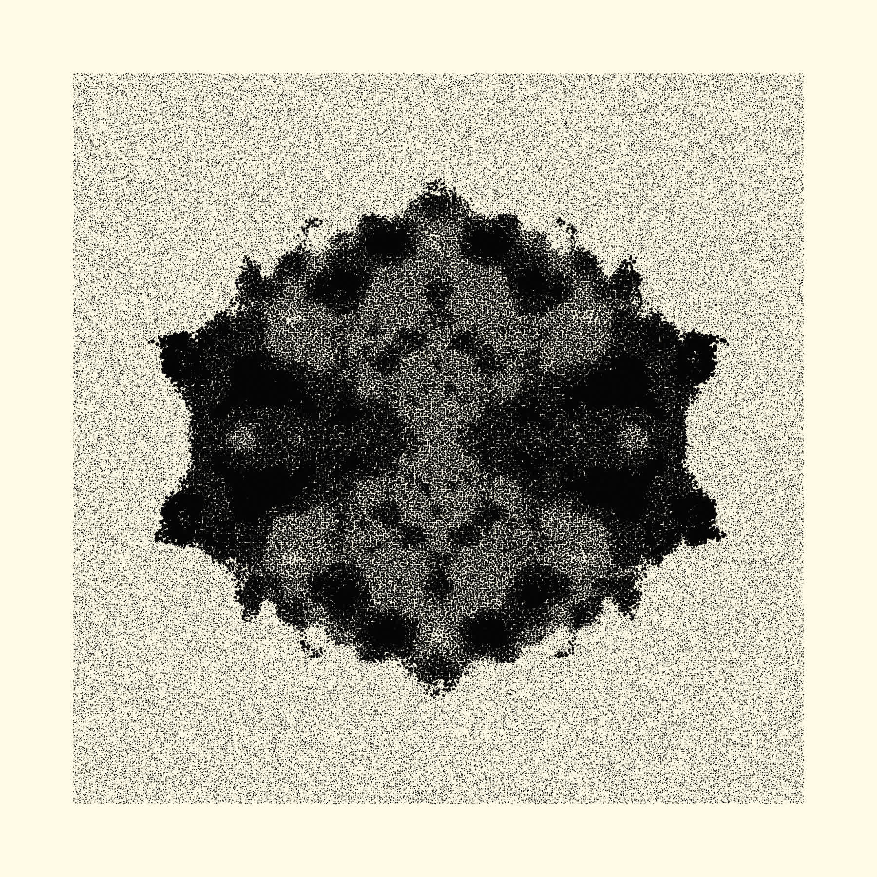
Reiterating on an idea from the previous year, by exploiting the property Perlin noise's mirrored-ness around the origin, one can obtain interesting Rohrschach-esque graphics by assigning the same stroke-width to the points that fall at the same spot in the four quadrants. Slightly displacing these points yields a faintly fuzzy texture:
Aleksandra Jovanic and Roni did their own take on twofold symmetry:
I've seen things you people wouldn't believe in Reflection of a reflection - #genuary day 16 #genuary16 #genuary2023 pic.twitter.com/Ych6WgwQwj
— Alexis ||| Aleksandra Jovanić (@alexis_o_O) January 16, 2023
#Genuary day 16 🪞
— Roni Kaufman (@KaufmanRoni) January 16, 2023
"Reflection of a reflection"
What do you see? pic.twitter.com/fKd8PXXdWg
And another Banger by Dave was this mind bending slap-stick sketch:
#genuary16: reflection of a reflection. Here's a silly joke animated with some shaders. #genuary https://t.co/aTO1GsnD62 pic.twitter.com/XAQEVsm2fh
— Dave Pagurek (@davepvm) January 16, 2023
#17 A Grid inside a Grid inside a Grid
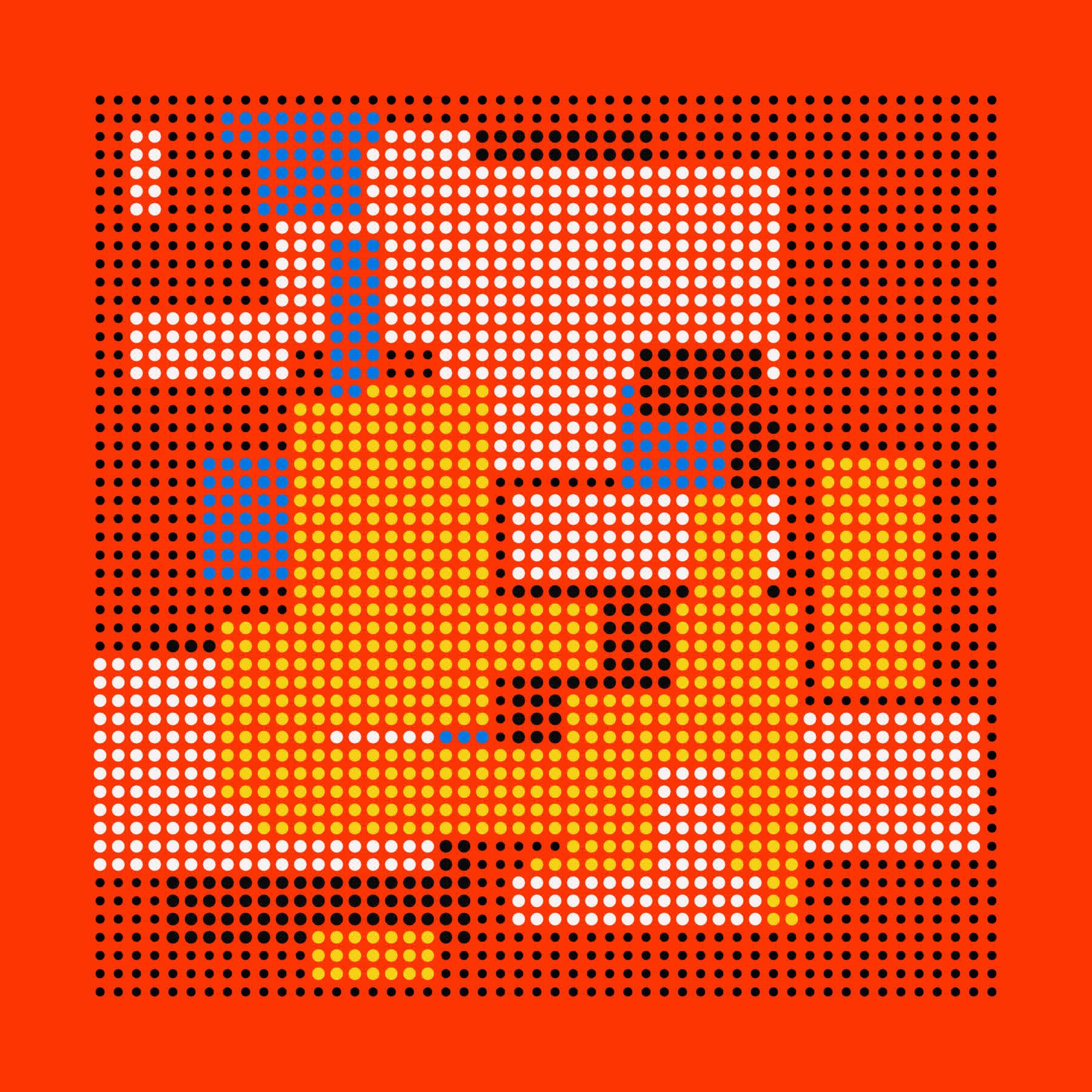
Saskia Freeke’s patterns were a big inspiration for this one, finding a couple of her sketches on pinterest, that had several dot patterns arranged on a grid, overlapping each other.


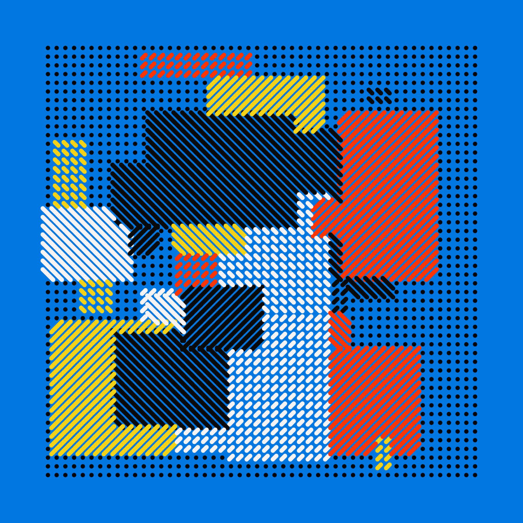
Similarly the irregular grid sketch for Genuary 3rd, the idea starts with a 2D array of boolean values that are initially all set to false. Then in a loop, we choose a rectangular patch of array entries with specific height and width, assign a colour to them and mark them as true. Here a truthy value signifies that these spots are occupied. Now, a cool thing happens when we try to mark a new patch, and it collides with an already existing patch of occupied entries. In this case we obtain a patch that is either missing a chunk or can not be assigned in its entirety.
In this manner we get a grid, with smaller grids inside of it that are intersecting and inside of each other. Drawing diagonal lines instead of dots on the array entries we can get some more interesting patterns as well.
The two that I liked most that day were by two animated ones by Laurent Malys:
#genuary 17 - A grid inside a grid inside a grid
— Laurent Malys 🇺🇦 (@losylam) January 17, 2023
made with #p5js #genuary17 #creativecoding #art #generativeart pic.twitter.com/I6ZxtvvSgW
And this one by Dave for obvious reasons:
#genuary17: grid within a grid within a grid. hey who does that remind you of? time for Mondrian!! #genuary https://t.co/UvwlQJC7mJ pic.twitter.com/QcrOzBtwEO
— Dave Pagurek (@davepvm) January 17, 2023
And this collab by Greweb and Agrimony:
Had the chance to collaborate with #plotter master @greweb on #genuary17 "grid in a grid in a grid". I wanted to try out rotating and warping each recursive grid. I think the end product came out amazing!
— agrimony.eth/.tez 🦇🔊 (@agriimony) January 17, 2023
Thanks to @sableRaph for putting the event together#genuarytogether pic.twitter.com/ARuJ2hkR5Z
#18 Definitely not a Grid
Cheating a little bit now and then is also a big part of Genuary: to me this prompt had a bit of a sarcastic undertone, in as “Well, this definitely isn’t a grid? But maybe it is!”
I was a bit behind with the prompts at this point and went on Twitter to look for inspiration, and especially loved Greweb’s sketch that I think really fits the prompt. Using a different grid-like positioning strategy that is known as Quinconce positioning
Quinconce. Definitely not a grid 😁 #genuary #Genuary18 pic.twitter.com/Weah9PoaZg
— @greweb (@greweb) January 18, 2023
This site gives a good definition of Quinconce patterns, translated from French:
In art and decoration, Quinconce is given to arrangements that resemble a checkerboard pattern. These kinds of ornaments are placed in the four corners of a square and add a fifth additional element in the center. This repeated pattern has the advantage of producing a symmetrical and infinitely repeating motif
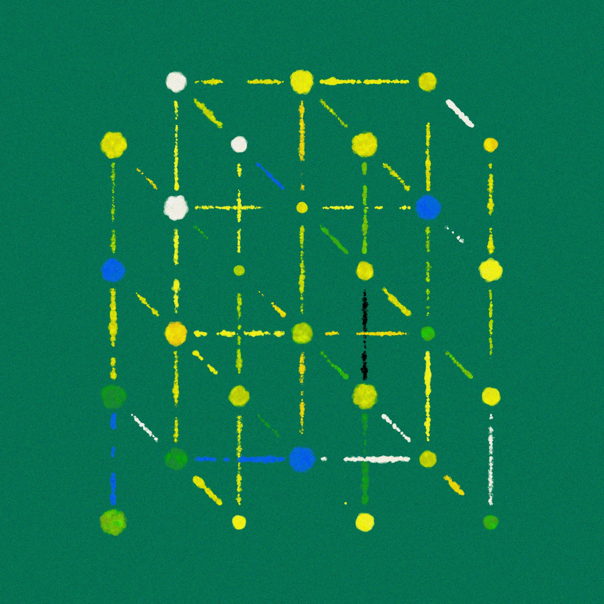
Essentially it is still a grid, but with every other row displaced by half of the width of the grid elements. I found a sort of hand drawn graphic that day, and wanted to recreate it by doing a little texture study. It became more of a pattern generator later on, drawing connections between the elements at random.
Definitely not a grid! #genuary #genuary18
— Ahmad Moussa || Gorilla Sun (@gorillasu) January 24, 2023
Loved @greweb's take on this prompt and google a bit what Quinconce is, then came across this graphic on the net (img #1) which I thought would look cool as a generative thingy. Generative thingies ensued 🤖 #p5js #creativecoding https://t.co/JtPDCtQY8c pic.twitter.com/qK53eHyXry
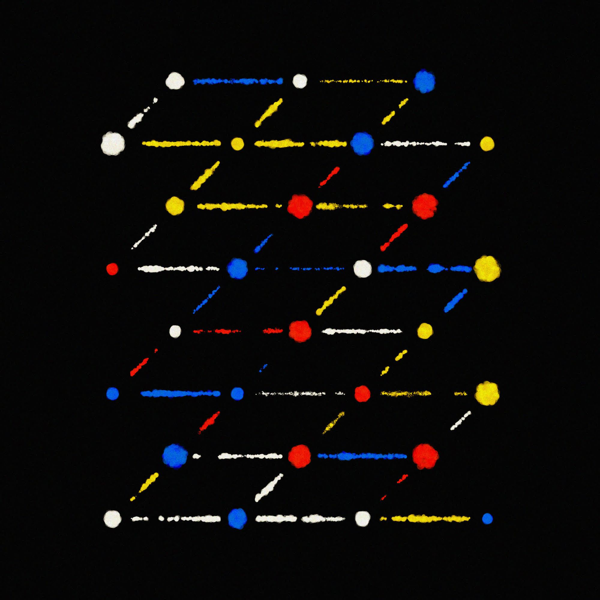
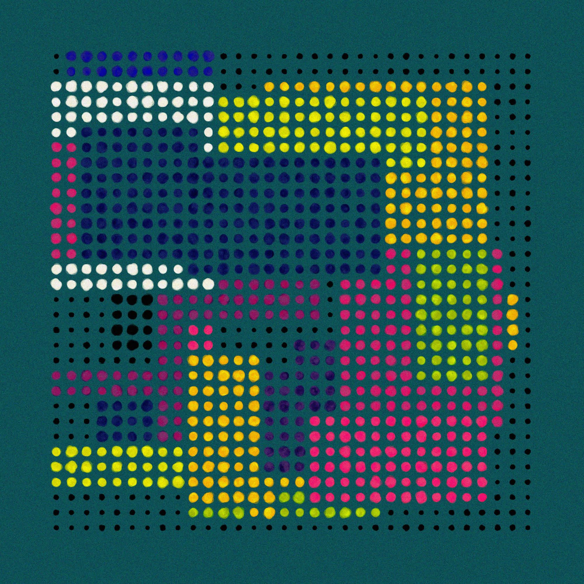
Later I combined the code from #17 and #18 because I wanted to see what it would look like, and it actually turned into something interesting:
Combined code from #genuary17 and #genuary18! Think I'm onto something #p5js #creativecoding pic.twitter.com/p1OvvPy1SU
— Ahmad Moussa || Gorilla Sun (@gorillasu) January 24, 2023
#19 Black and White
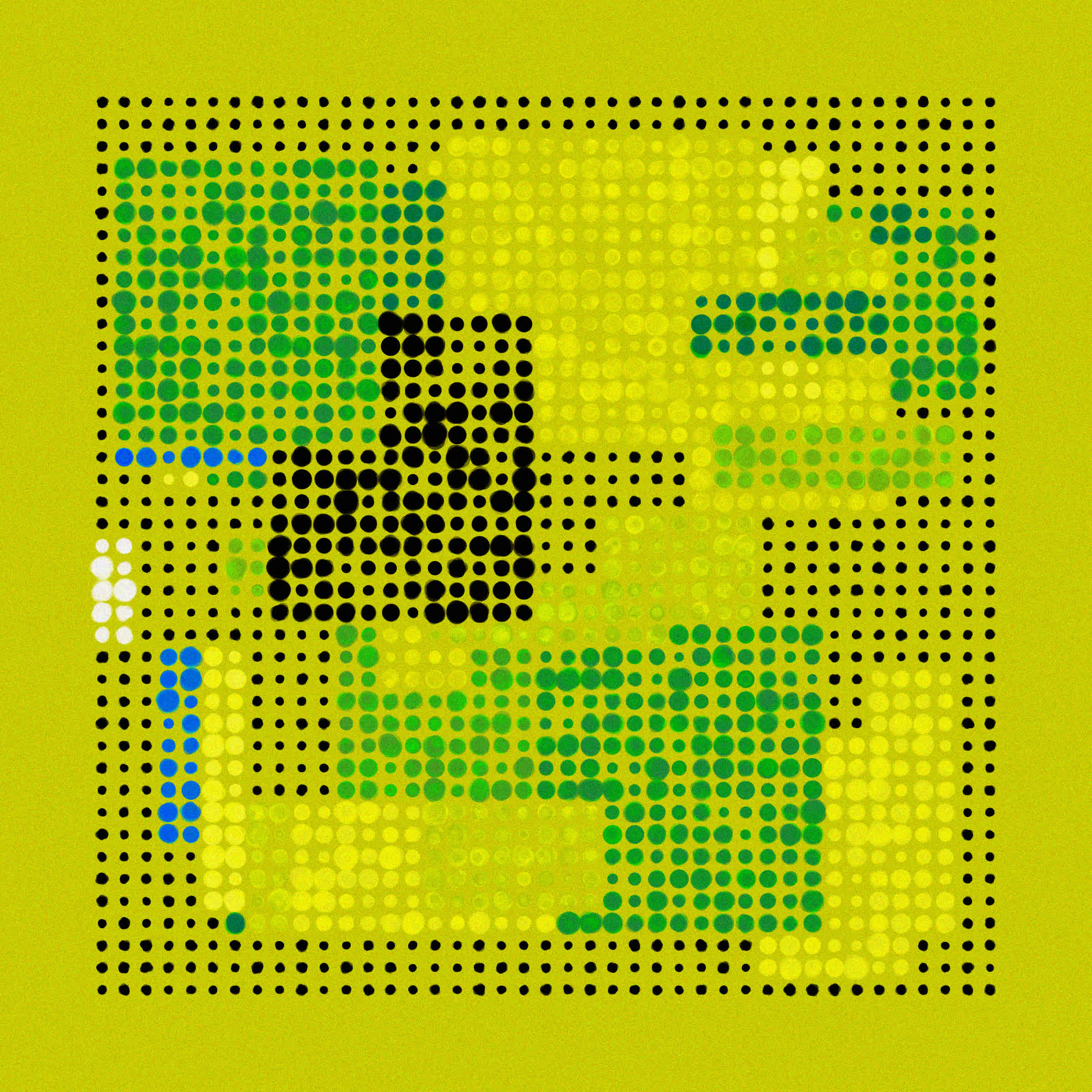
And again we’re cheating a little bit, technically any sketch can be disguised with black and white colors, but I wanted to sprinkle just a little bit of colour on top. Still messing around with the texture from before I combined it with the code from #16. Instead of drawing regular p5 points using the textured circular patches from before, with the occasionally coloured circles:
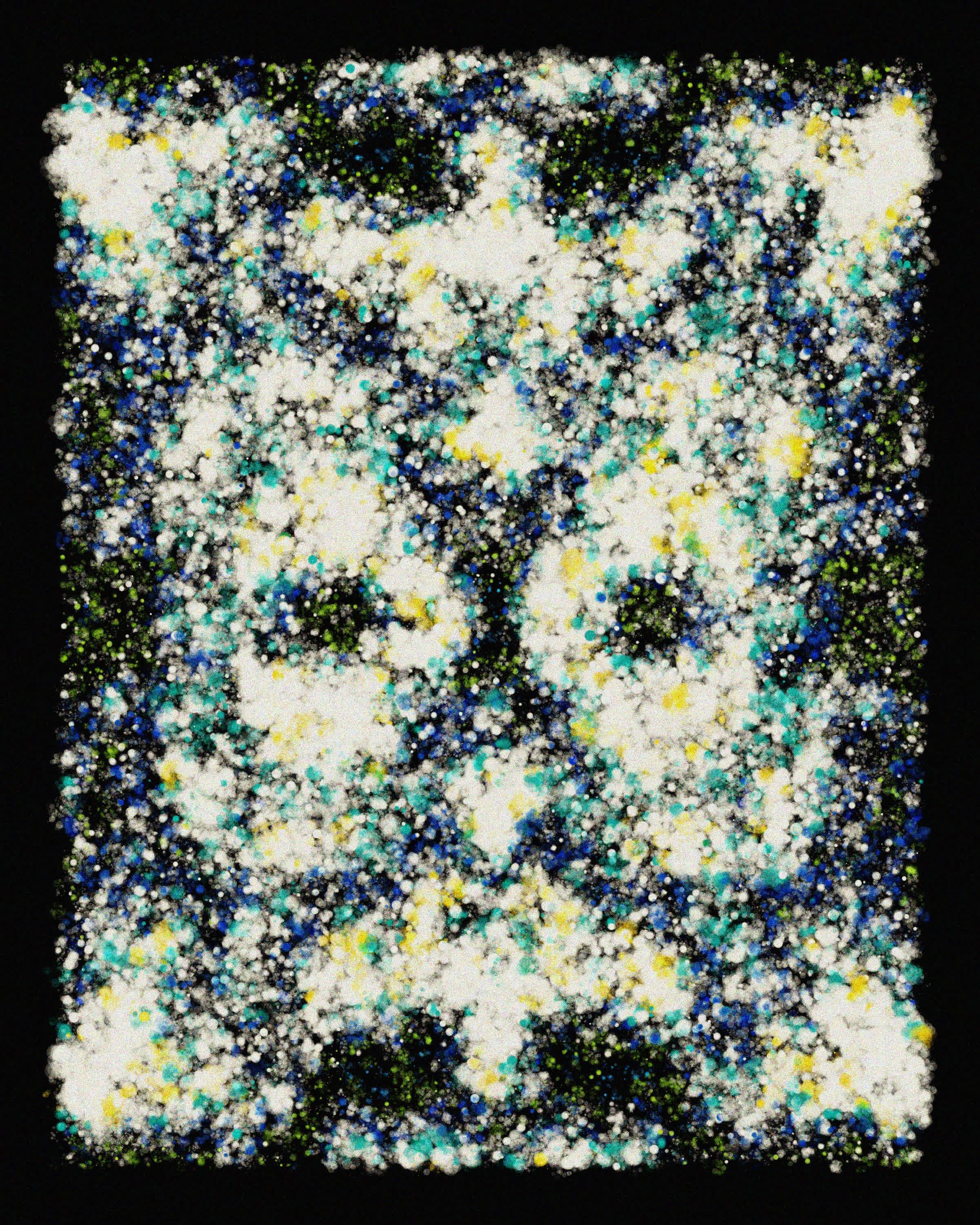
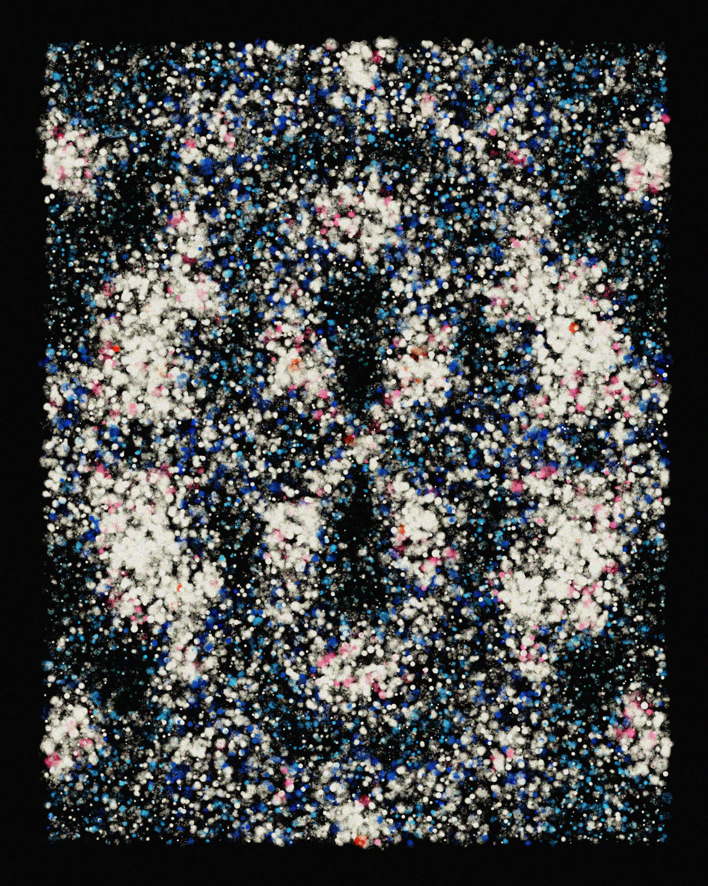
After playing a bit more with the code I ended up with a sketch that I’m probably the most proud of this month:
A Dream of Spring 🌻 #generative #creativecoding pic.twitter.com/eo8PIiVO3X
— Ahmad Moussa || Gorilla Sun (@gorillasu) January 28, 2023
A super aesthetic sketch was by Jos Vromans:
#Genuary Day 19: Black and white.
— Jos Vromans (@JosVromans) January 19, 2023
Waves#genuary19 pic.twitter.com/Rk04HMeLxm
And a cool animated black and white recreation of space invaders by Computer Museum NAMIP:
#genuary19 Black and White in #RETROGAMING
— ComputerMuseum NAMIP (@ComputerMuseumB) January 19, 2023
👾Space Invaders👾(partial) tribute in #p5js (original game was B&W with color overlay at the bottom)
Credit to @ferjerez3d for his random alien generator of #genuary2022 day3 !#genuary2023 #genuary #retrocomputing #creativecoding pic.twitter.com/wviYQumRs4
And another stunning creation here was a collab between Julian Hespenheide and pifragile for #GenuaryTogether:
Day 19 of #GENUARY2023
— Julian Hespenheide (@julihespenheide) January 19, 2023
Black and white
Collab with @pifragile#genuary19 · #genuary · #genuaryTogether pic.twitter.com/GW4ecf7EL1
#20 Art Deco
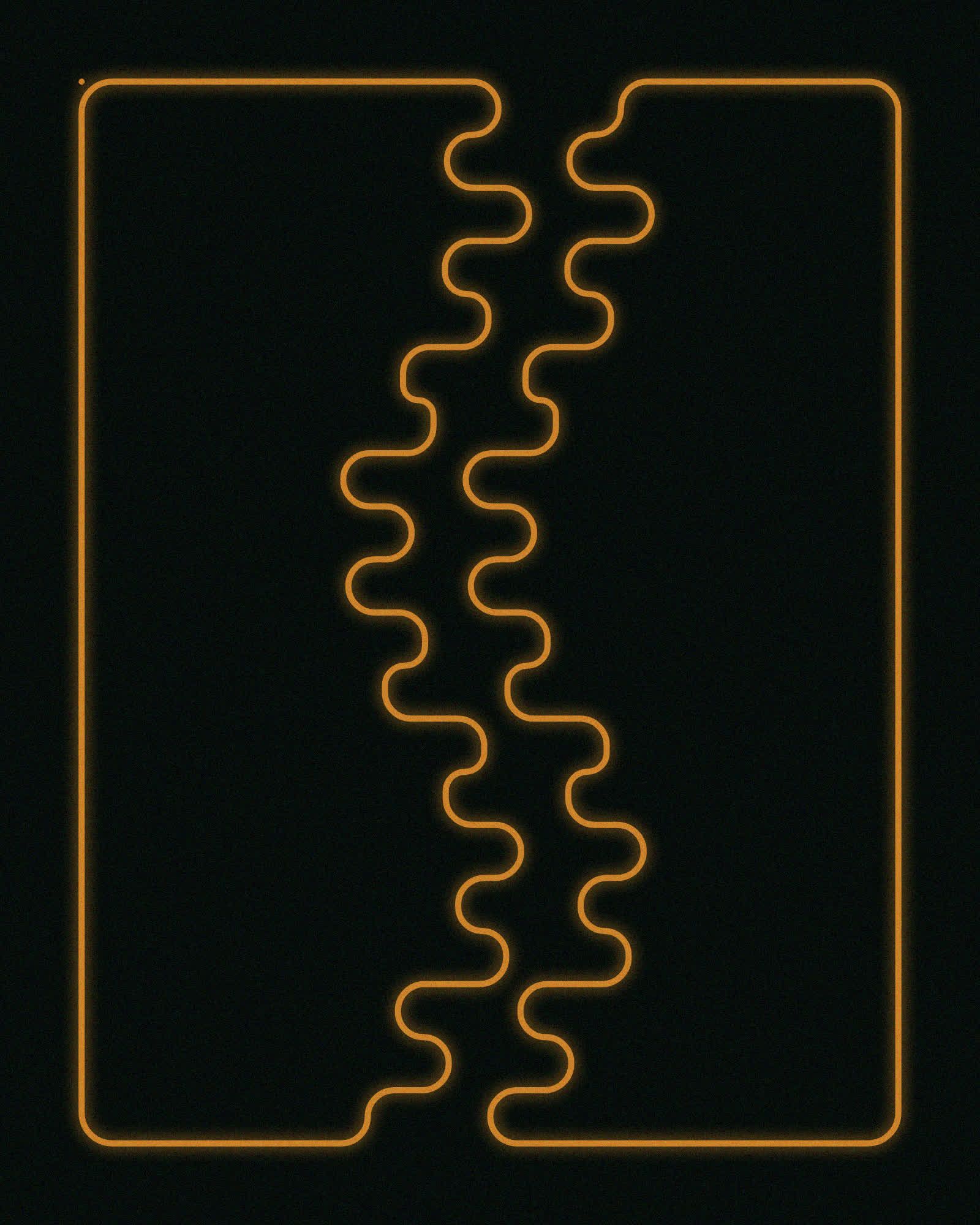
This one was a bit unimaginative to be fair, it’s a grid of some art-deco-esque patterns, adding a shadow with the rendering context and using transparent fills for a little bit of a glow effect. Personally I just don’t find the art-deco stuff very inspiring, maybe because it feels a bit lifeless to me.
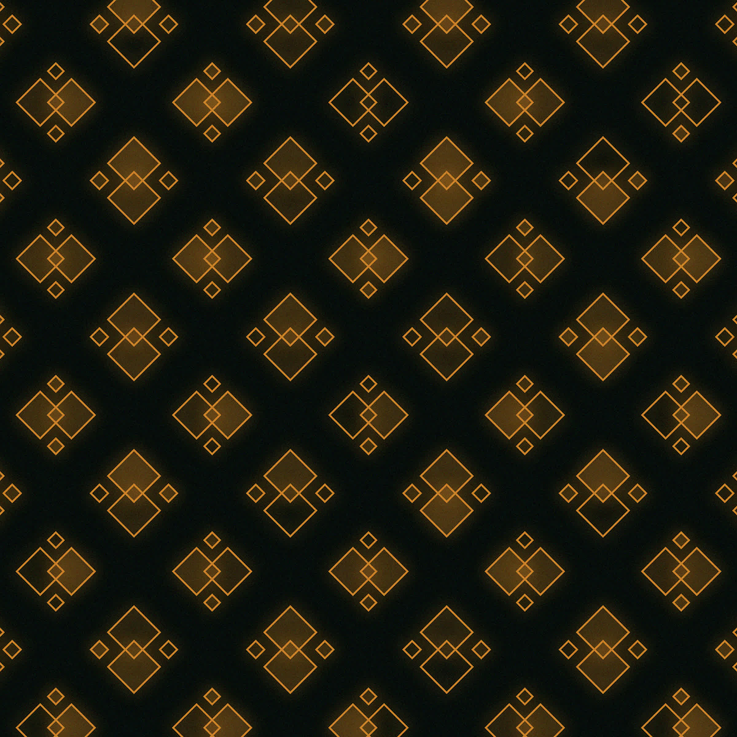
Art Deco Sketches
It did lead to an interesting animation though, after my initial sketch I wasn’t satisfied and browsed Pinterest a bit more and wanted to make something a little less angular, ending up with the patterns you can see above on the right. The animated version of this sketch looked cool, and could have equally been a submission for the black and white prompt:
Motus Art and the serial collaborator Julian Hespenheide created a super cool animated art deco pattern generator as a collaboration for #genuaryTogether:
Genuary 20th "Art Deco"
— Motus Art (@motus_art) January 20, 2023
Collab with @nodashNET as part of #genuaryTogether#genuary #genuary20 pic.twitter.com/RRkUlK2b32
#21 - #31
#21 Persian Rug
One of my biggest projects from last year was Exotic Quarpets, an sketch revolving around generative rugs:
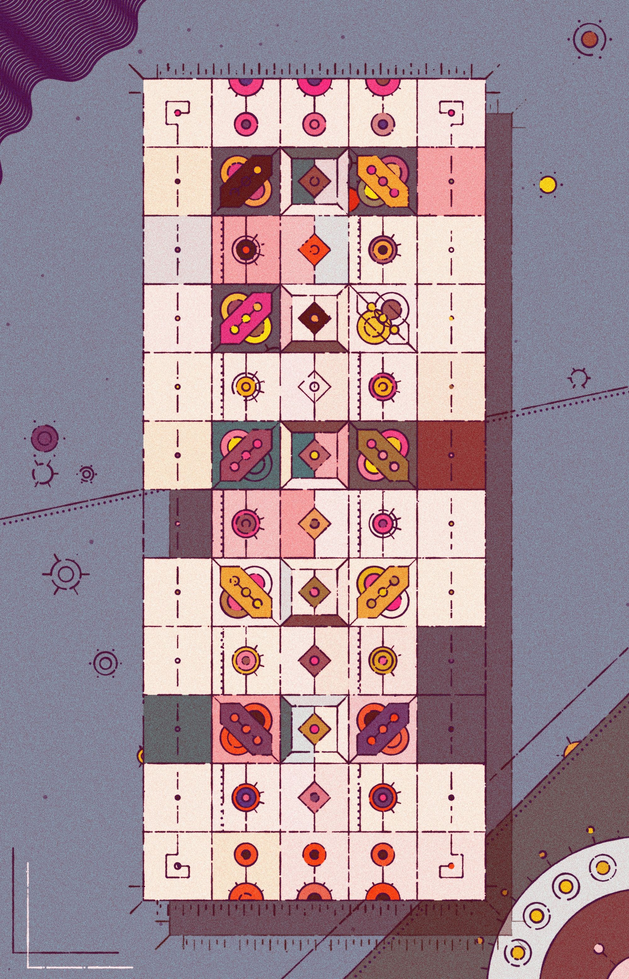
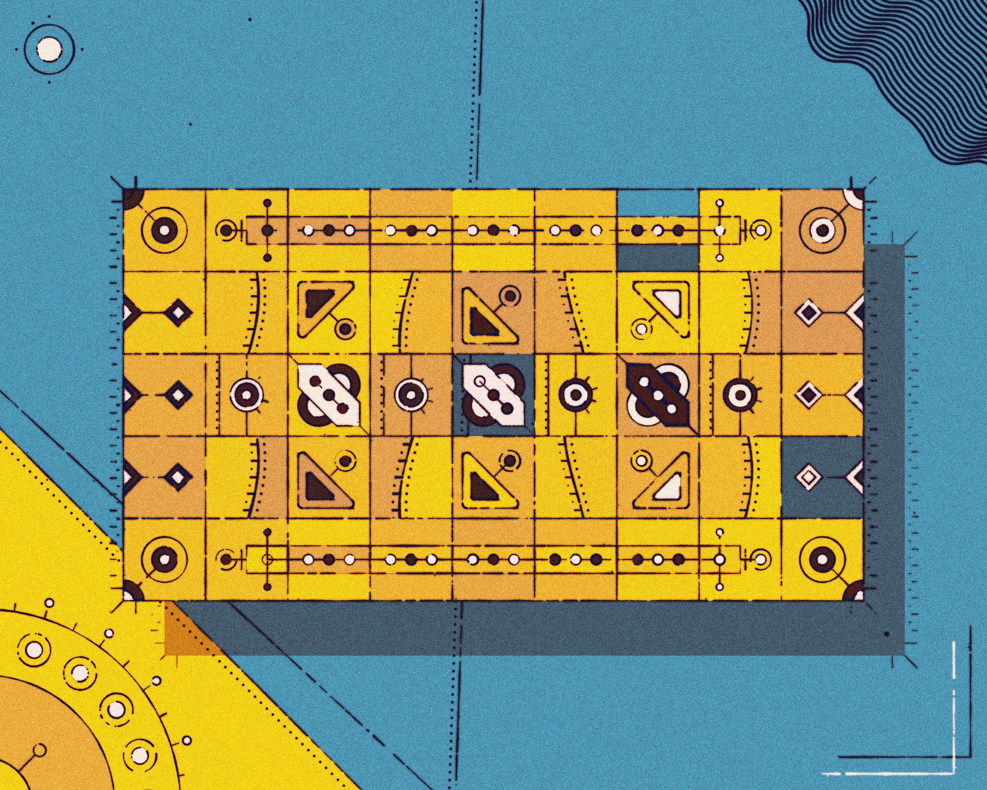
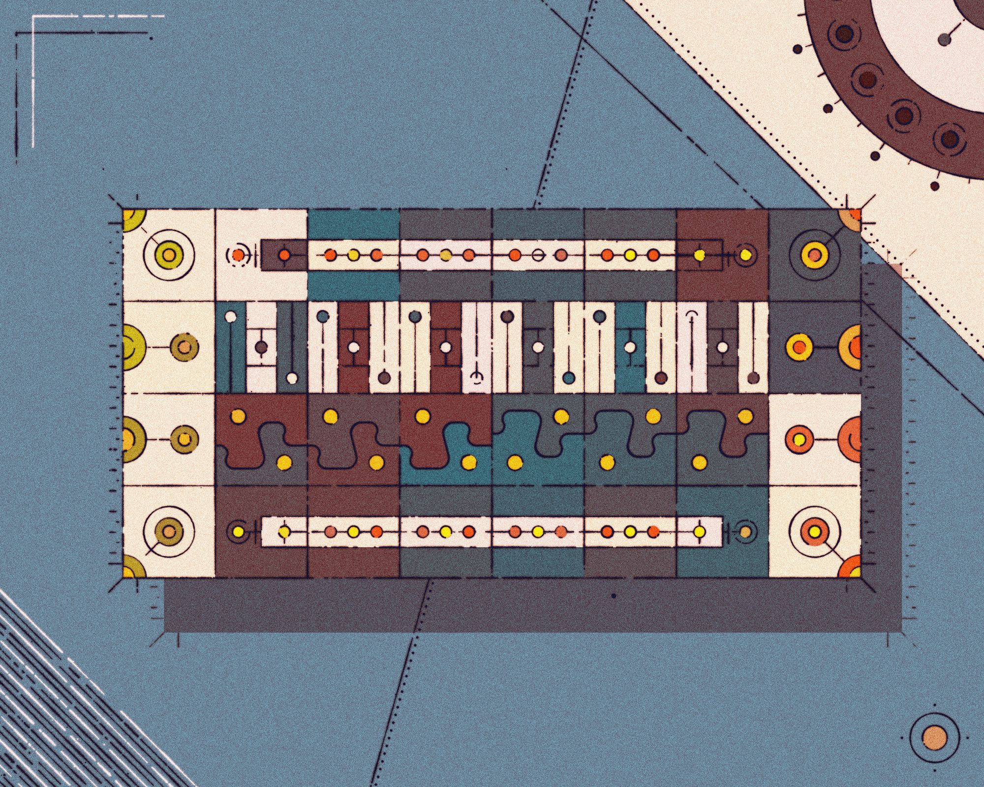
Ideally, I would have reiterated on the project, but I remember it being a big and convoluted project. I dont't think that I could have elevated it or made any meaningful addition in one days time. I did however tackle the prompt in combination with #30 minimalism.
Persian rugs have really intricate patterns, and here I really liked Foldster's very technical approach to generating these kinds of patterns:
#Genuary21: Persian Rug
— Foldster (@theFoldster) January 21, 2023
Good thing I already made a Persian Rug generator last year using Parametric Newton fractals over Chandni figures! pic.twitter.com/Lmt2jTamTI
#22 Shadows
I’ve been ogling Amit Patel's, aka redblobgames, article on 2d visibility and ray casting for a while now, and used the prompt as an excuse to code up the described ray casting algo. It was fairly easy, I was in the right headspace that day and already had already explored some line intersection code that I could reuse (thanks Paul Bourke).
Approaching it in an object oriented manner, it simply boiled down to creating a bunch of obstacles (polygons made out of lines) and then checking if the obstacles intersect with the rays of the caster (light source?):
I wanted to see what it would look like with multiple light sources, which actually gave me a headache after a while. I had created a visual migraine. Coincidentally I came across Alexis Andre's Yayoi Kusama submission and sort of had a lightbulb moment:
#genuary25 Yayoi Kusama#generative #dailycoding #genuary pic.twitter.com/rJp6u9IZPO
— Alexis André (@MacTuitui) January 25, 2023
My ray casting code could easily be transformed into an animated Voronoi diagram with a simple modification. First, instead of drawing the rays as lines, we draw these lines as little dots, however still creating an illusion of a line. Then, for each one of these dots, we check its distance to all of the light sources, if the distance of a dot with respect to a light source that it doesn’t belong to is less than its distance towards its own light source, we simply don’t draw that dot. This is essentially just the basic definition of a Voronoi diagram, achieved in a backhanded manner, and we end up with something that looks as follows:
The sketch I loved the most that day was by Roni:
#Genuary day 22 🔦
— Roni Kaufman (@KaufmanRoni) January 22, 2023
"Shadows" pic.twitter.com/uiVExCI3lW
#23 More Moiré
What’s better than one Moiré pattern? More than one Moiré pattern, duh!
A fairly simple sketch, a simple circle packing procedure that is run twice, filling two independent arrays with the positional information of the circles. These circles are then drawn to the canvas on top of each other and filled at random with two types of patterns: parallel lines or concentric circles. Making the circles sway back and forth slightly in a sinusoidal manner, accentuating the moiré effect, but also causing it to be butchered by compression on social media. I found that making the strokes a little thicker helped with that just a tiny bit.
I think this sketch would look really cool on a huge screen, or projected onto the walls of a dark room for example. Could work well for an installation, with some atmospheric music playing in the background.
Darien Brito wins the aesthetics prize for this prompt:
#genuary Day 23: More More Moiré.
— Darien Brito (@DarienBrito) January 23, 2023
Inspired by the interference patterns in graphene sheets. Interesting article where I got the idea from below.#genuary2023 #genuary23 #creativecoding pic.twitter.com/RgNNQXSM7e
#24 Textile
Again I scoured Pinterest for inspiration because I had no idea what to make for this one, but came across some cool images searching for ‘abstract textile’, here’s two that I particularly enjoyed:


Pinterest Textile Inspiration
What I ended up making looked a bit different but still had a cool effect:
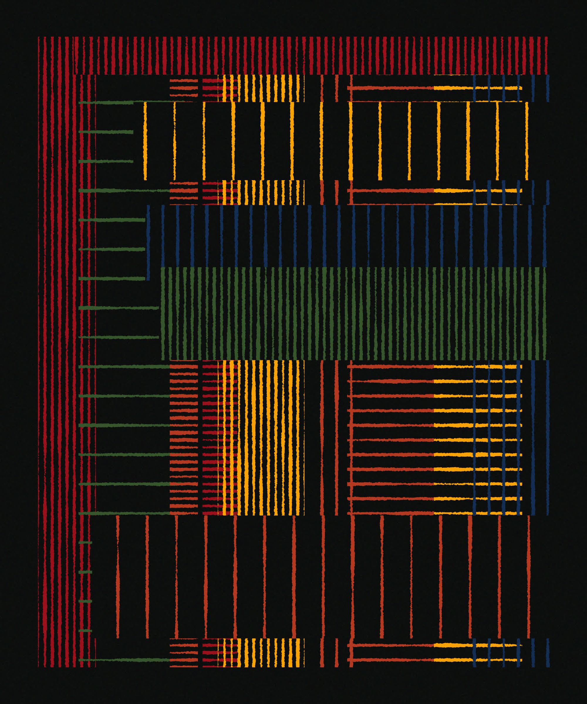
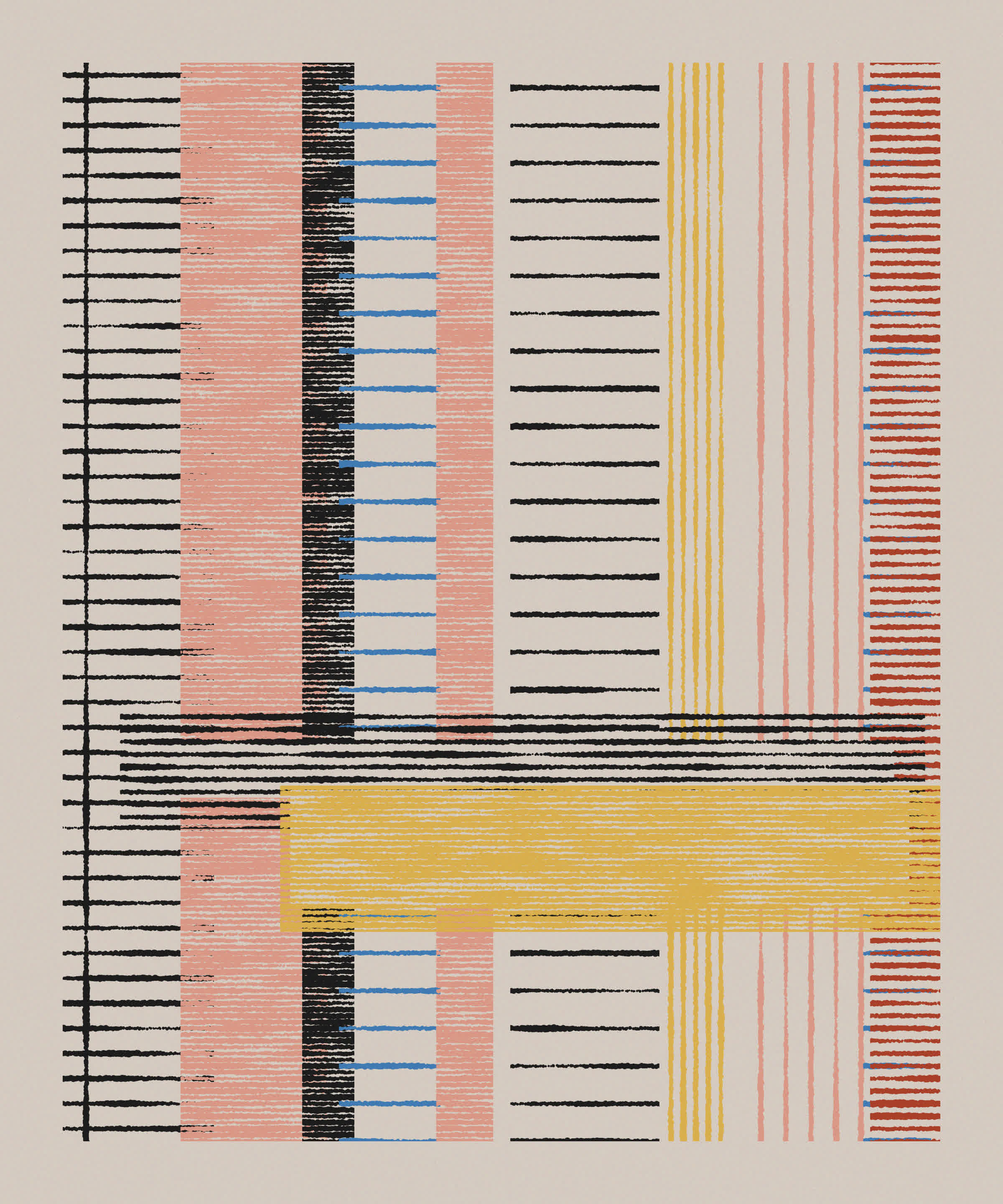
Michal Rostocki's two tweet long pico8 infinite stack of persian rugs is an absolute masterpiece here:
"Textile"
— Michał Rostocki (@von_rostock) January 24, 2023
You take a little sip of tea. The smiling merchant starts showing the rugs, and you immediately feel tired. Strange, he hasn't even started haggling.
2 tweets long source code below #genuary24 #genuary #pico8 #tweettweetcart #codeart #generative #sizecoding #pixelart pic.twitter.com/8syI2BCP9V
I could make an entire list where all sketches are just by Daniel Lever, his genius strikes again with this animated carpet:
Day 24 — Textile#genuary24 #genuary #creativecoding #generativeart #javascript pic.twitter.com/2CDsA8Dtx3
— Daniel Lever (@_danlever) January 24, 2023
Lunarean also had a couple of bangers, really liked their textile sketch that day:
Textile #genuary #genuary24 #genuary2023 pic.twitter.com/EAnTNo3kqw
— lunarean (@lunarean) January 24, 2023
And a stunning piece by the generative textile master Anna Lucia:
#genuary day 24: textile pic.twitter.com/4D7Qd7ABJB
— Anna Lucia (@annaluciacodes) January 24, 2023
#25 Yayoi Kusama
Generative art has also been a gateway for me to explore art history for myself. I especially love learning about specific artists' process, understanding where their art comes from and how they initially found their inspiration. Yayoi Kusama has a fascinating story:
One day I was looking at the red flower patterns of the tablecloth on a table, and when I looked up I saw the same pattern covering the ceiling, the windows, and the walls, and finally all over the room, my body and the universe. I felt as if I had begun to self-obliterate, to revolve in the infinity of endless time and the absoluteness of space, and be reduced to nothingness. As I realised it was actually happening and not just in my imagination, I was frightened. I knew I had to run away lest I should be deprived of my life by the spell of the red flowers. I ran desperately up the stairs. The steps below me began to fall apart and I fell down the stairs spraining my ankle.
Yayoi Kusama draws her very distinct style from this experience, trying to emulate the feeling of these feverish visions through her artworks. At first I wanted to create something in the style of her mushroom artworks:

However it wouldn’t have been possible to do in one sitting, especially the quadilation (is that a word) pattern in the background. What kind of algorithm can emulate such a natural seeming pattern? A Delaunay triangulation where a common edge is removed from adjacent triangles? It definitely is something that I want to tackle at some point.
I ended up settling for the simpler dot pattern that occurs in most of her artworks:
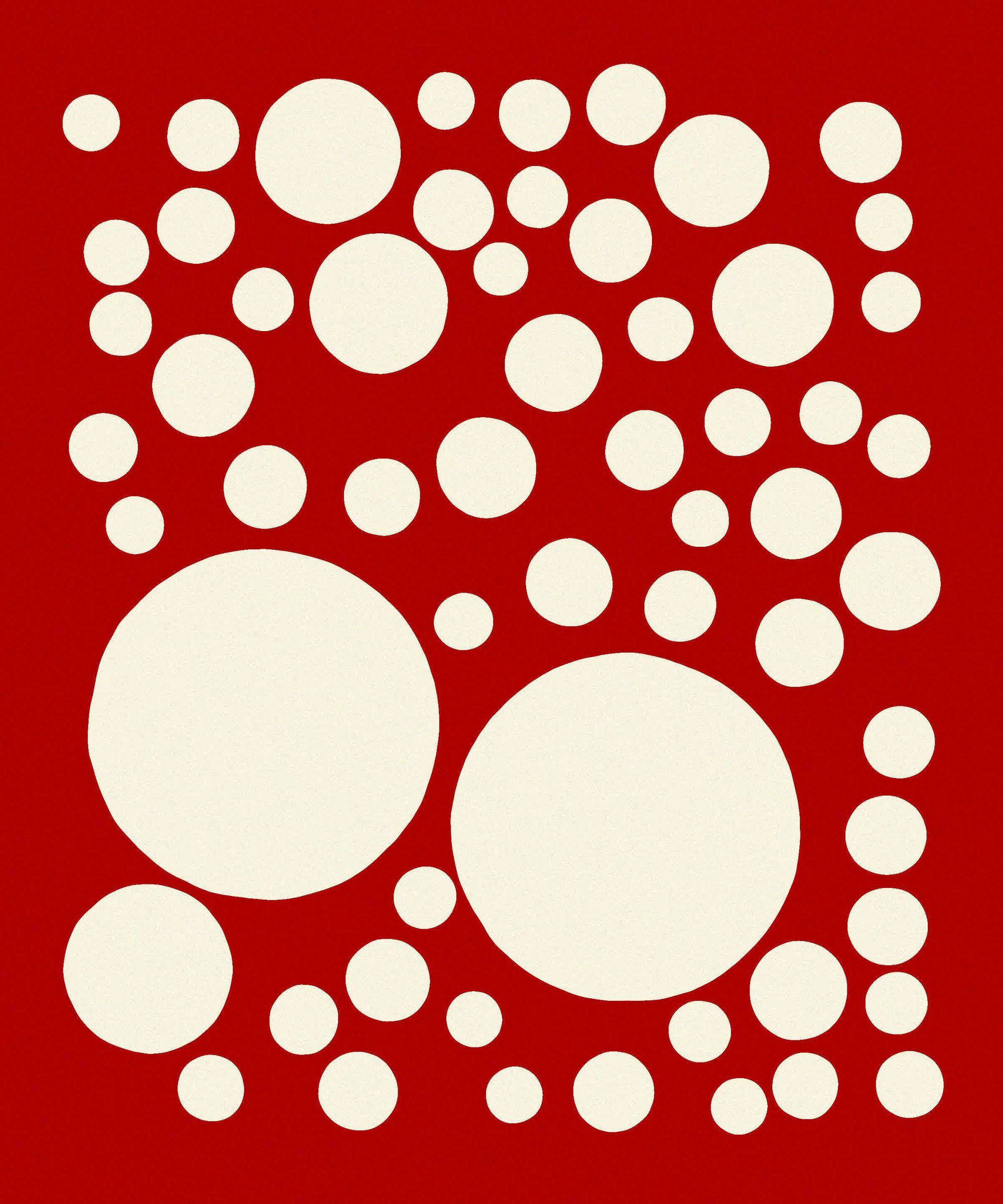
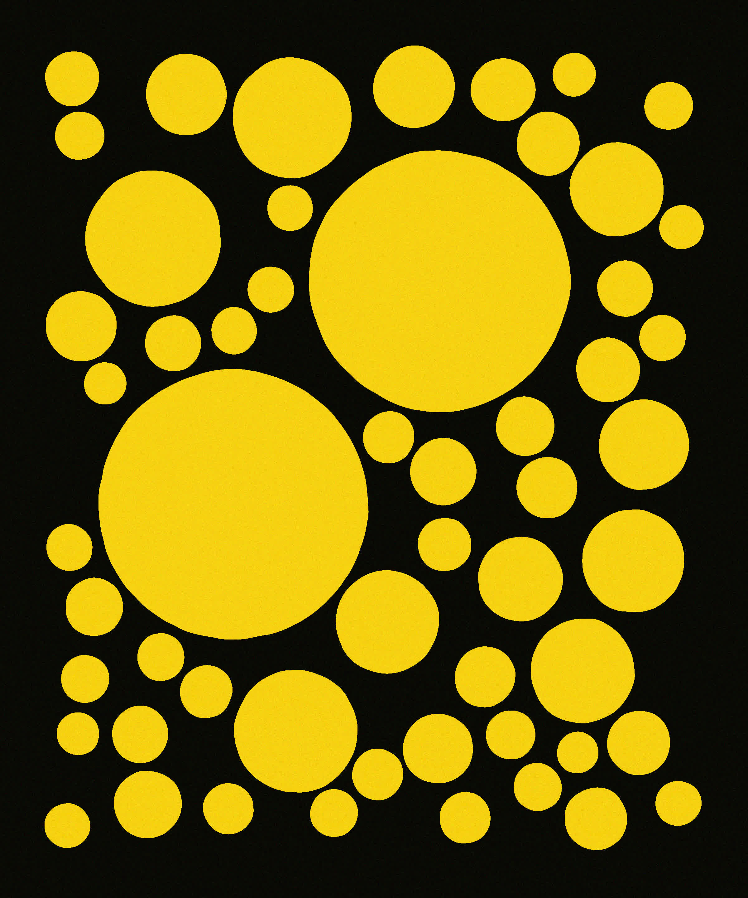
The special thing here is the slightly wobbly deformed circles, giving it a more hand drawn vibe. Tracing the circumference of the circles with many dots, and modulating their size with circular Perlin noise allows for a smooth and continuous deformation.
We already saw Alexis Andre's sketch, another cool one that day was by Yazid who put his own spin on it with his recognizable style:
If you haven’t seen it, there’s this interesting video that goes into explaining the reason as to why dots have appeared so prominently in her work https://t.co/WfNQBv7iSI
— Yazid (@Yazid) January 26, 2023
#26 My kid could have made that
What screams “this was made by a kid” more than something that is made with crayons? I leaned into that and redid a sketch back from early 2022 when I was sick and down with covid. It’s essentially also based on an irregular grid, where each rectangle is filled with scribbly hachure strokes giving it a little bit of a chaotic vibe:
The innovative thing here is that I didn’t use the rendering context’s clip method, but rather, for each one of the dots that make up the scribbly strokes I checked if they fill within the area of the rectangle. I fit falls outside, it is not drawn. That way the lines have smooth circular endpoints instead of being cutoff by the clip function.
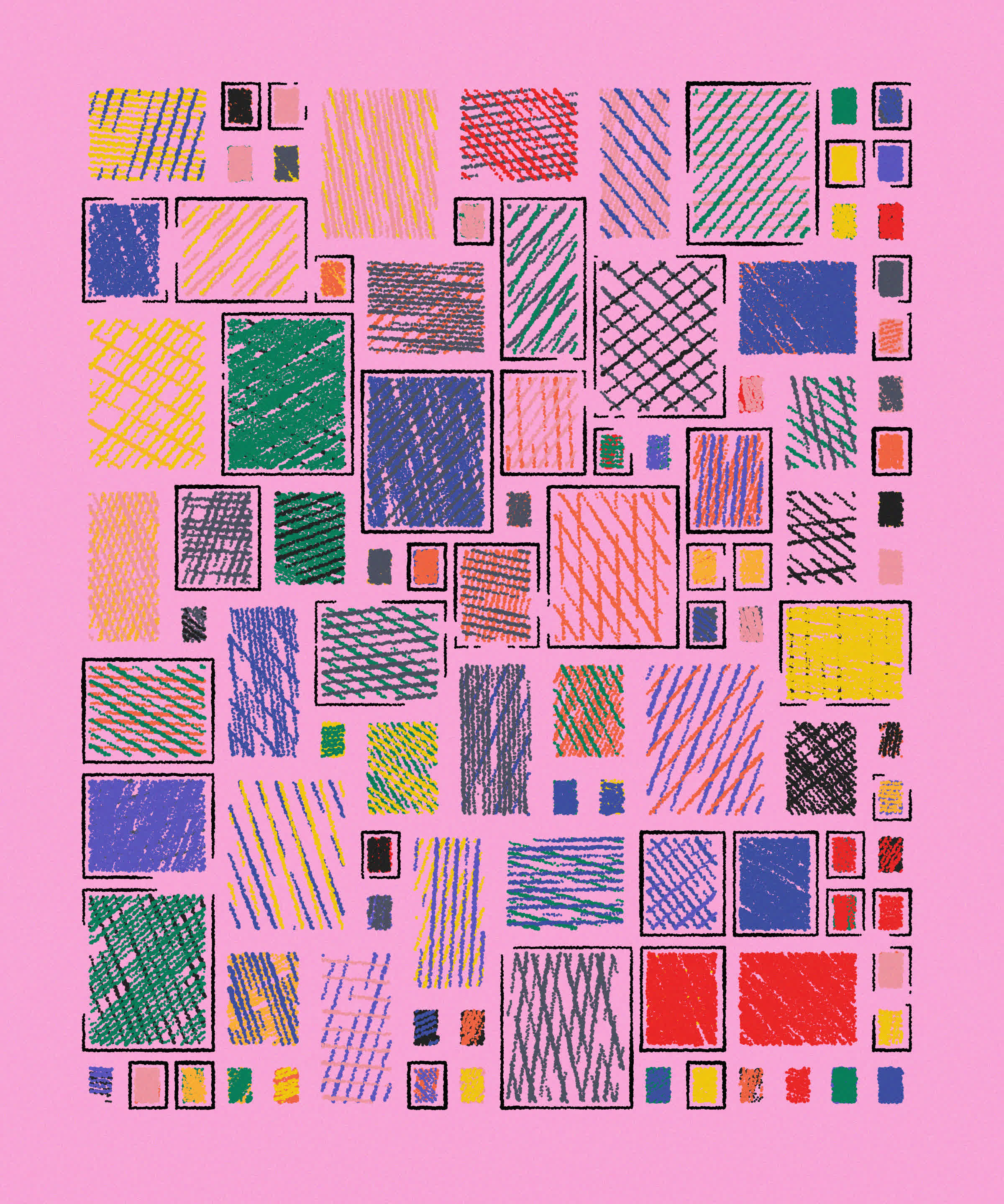
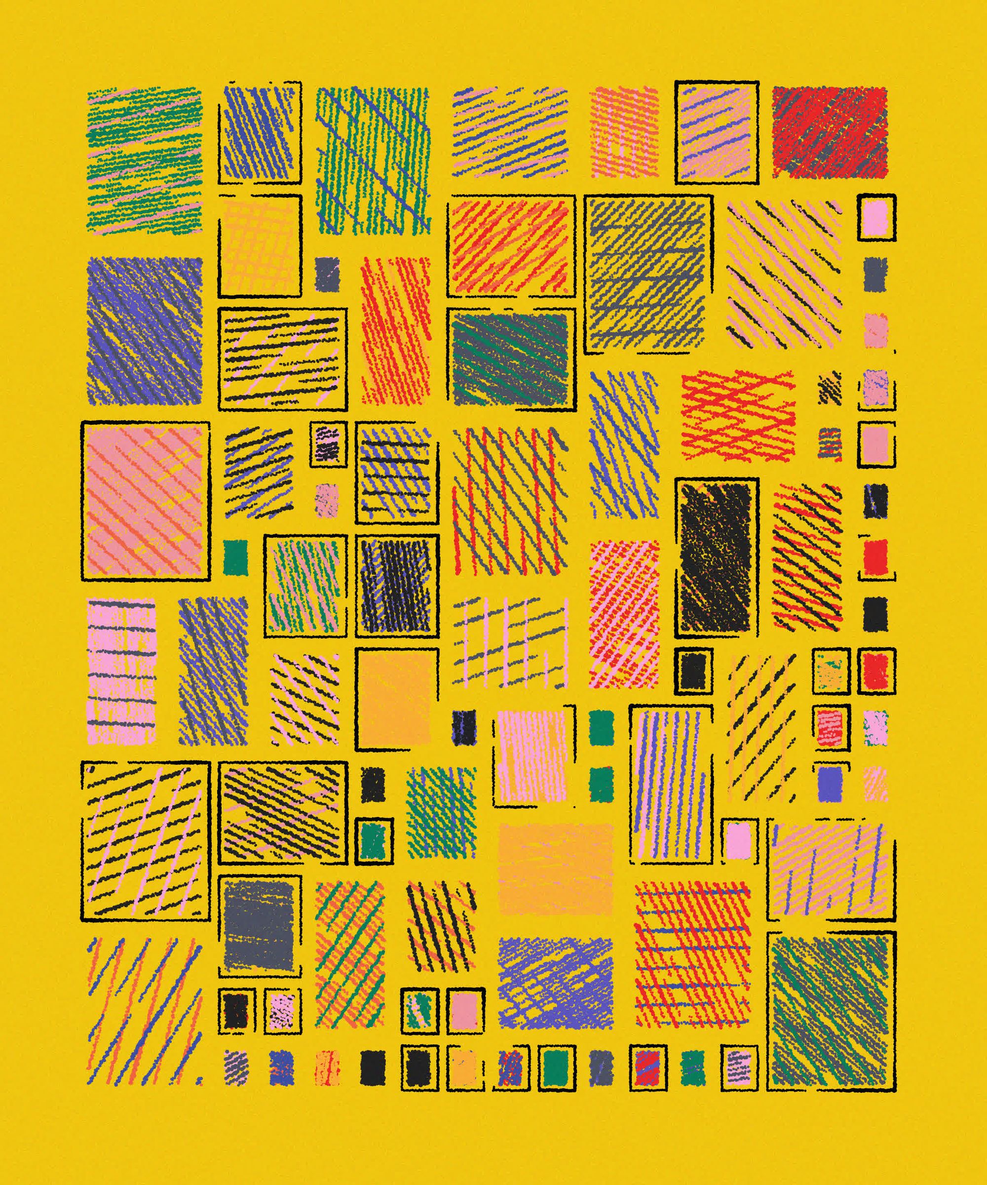
Juhani Halkomaki and Fran Piaggio collabed on this one sketch that uses ml5.js behind the scenes to generate scribbly and childlike drawings of cats:
#genuary #genuary26
— Juhani Halkomäki (@JuhaniHalkomaki) January 26, 2023
Prompt: "My kid could have made that"
A collab with @fipiaggio using @ml5js
We made a crayon-like brush and let @ml5js AI draw sketches of cats. pic.twitter.com/UTYY5eTgcj
I believe that the model was originally trained on the quick draw dataset, and is called doodlenet. And again we've got Lunarean with a very painterly sketch of randomly colored ribbon-like scribbles:
Day 26: My kid could have made that #genuary #genuary26 #genuary2023 pic.twitter.com/LRBt56vra0
— lunarean (@lunarean) January 26, 2023
#27 In the Style of Hilma af Klint
I did this sketch immediately after the Yayoi Kusama sketch, reusing the circle packing code with a slightly different aesthetic:
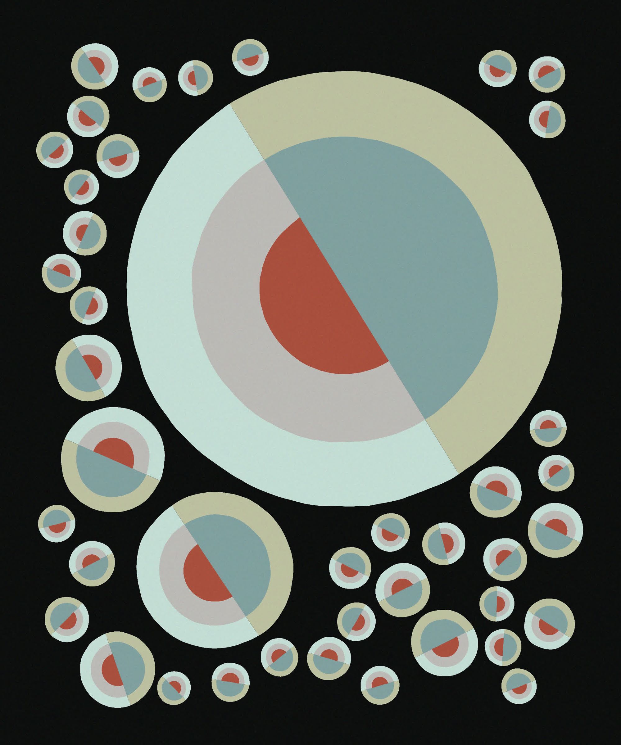
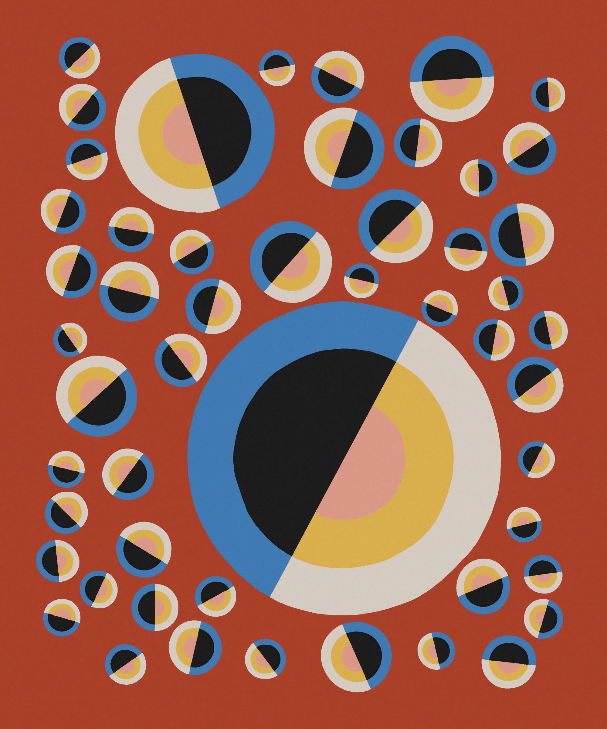
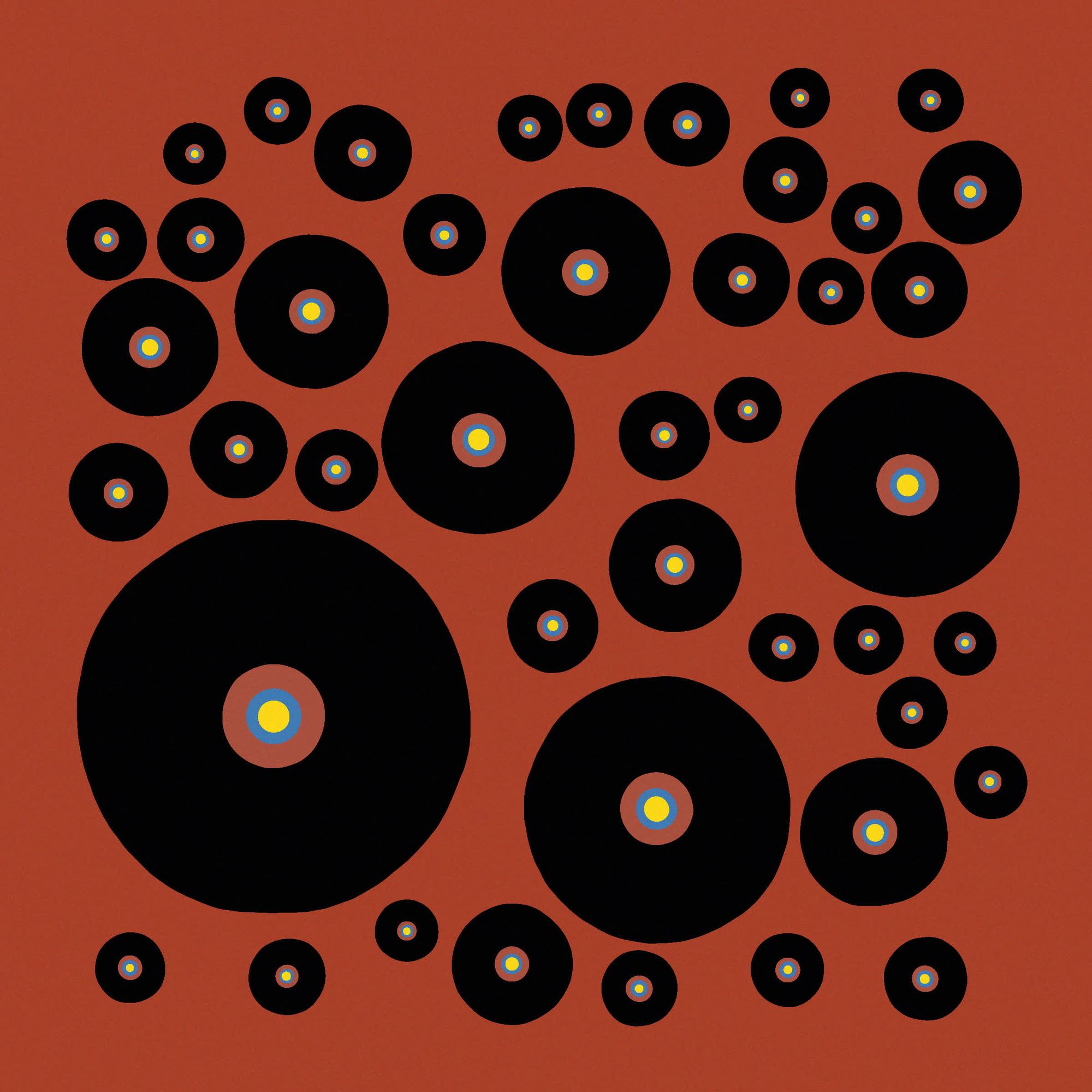
And here we have another collab with Juhani and Hetvi:
#genuary #genuary27
— Juhani Halkomäki (@JuhaniHalkomaki) January 27, 2023
Prompt: "In the style of Hilma Af Klint"
Collaboration with @vuisnotabot pic.twitter.com/mqX42viUDx
#28 Generative Poetry
Generating meaningful sentences is a difficult task, and extensive research has already gone into this topic. At first I just printed random letters to the canvas to see if anything meaningful would come from it, but I just ended up with something that looked like a crossword puzzle. My second idea was forming random sentences from chaining random words, I found these two GitHub repos that had arrays of many adjectives and adverbs, and I was surprised to see that it kind of worked:
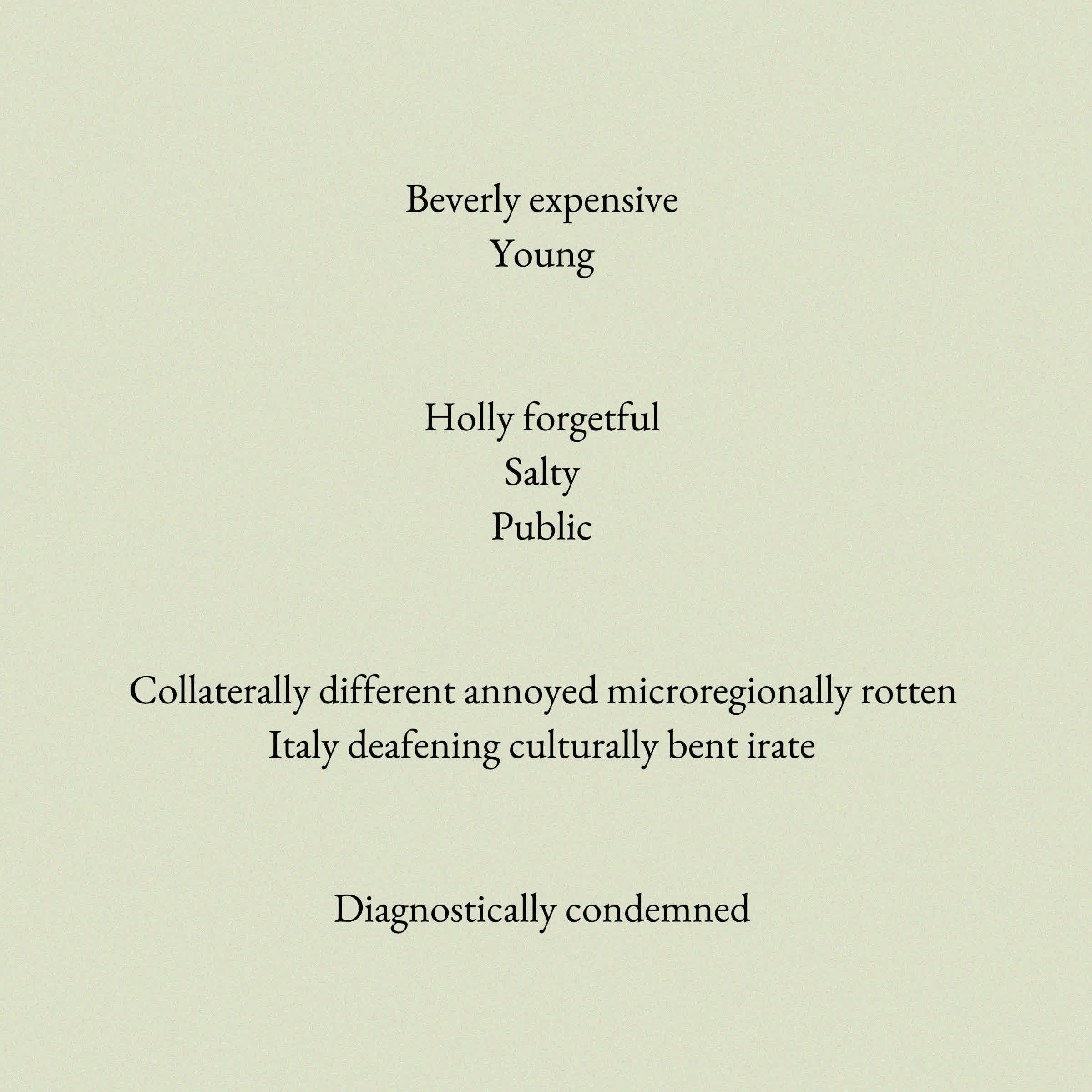
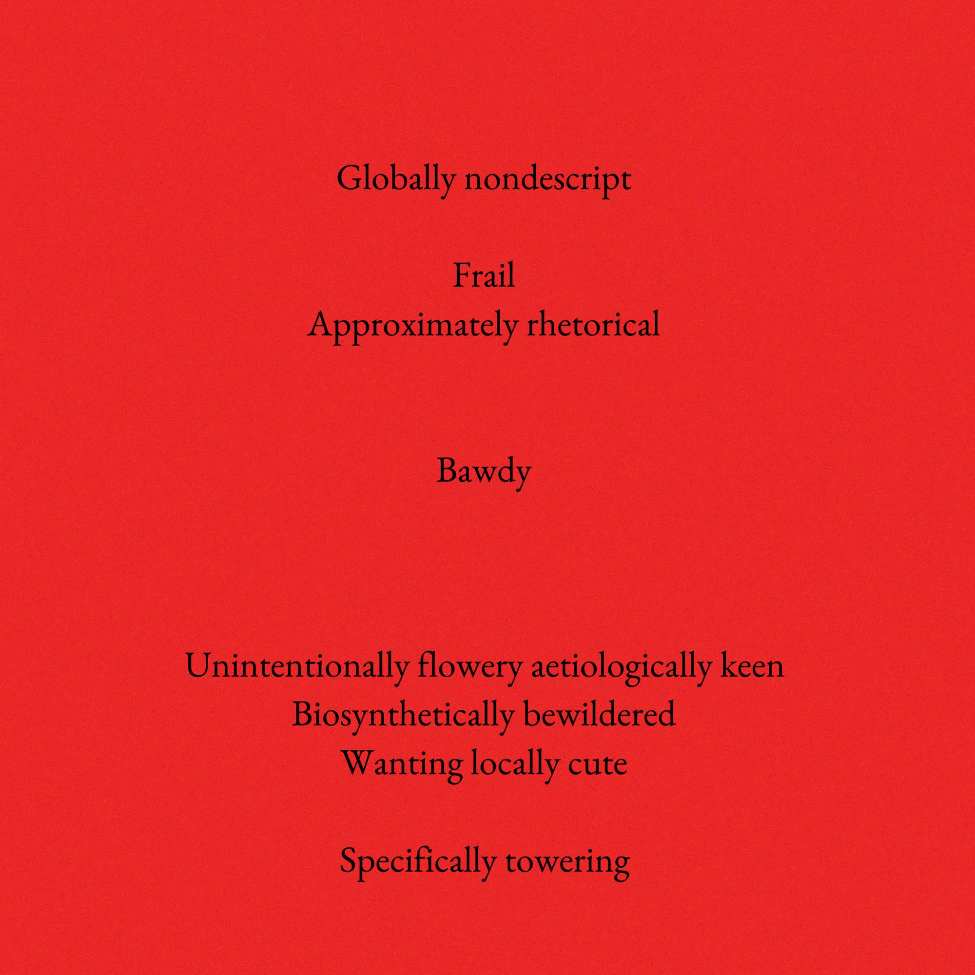
Poems put together by randomly chaining together adverbs and adjectives
I know that it’s just random combinations of words, but a lot of meaning can actually be read into the generated poems. Even though the sentences only consist of random adverbs and adjectives they end up being very expressive, and really emphasise certain moods. There is also something very rhythmic about this type of sentence.
That was the final form of the sketch, but I wonder what more can be done to control the generation process. One idea would be to somehow track the mood of the poem depending on the initially chosen words, somehow measure how positive or negative they are and then base subsequently chosen words on that, in an attempt to make the message of the generated poem a little bit more coherent. Another idea would be to generate sentences, not completely at random but with the help of a lexical tree (not exactly sure if that is what it’s called), basically choosing words based on previous words. At some point I also want to have a crack at making a context free grammar.
A favourite here was Dominikus' attempt at finding hidden messages in a jumble of ad slogans:
#genuary28 'Customize The Feeling!' - finding hidden meaning in 1200 ad slogans - the most ubiquitous poetry of our age.#genuary #genuary2023 pic.twitter.com/cTaNTQLRh8
— dominikus (@dominikus) January 28, 2023
And this super fun one by sleeping that brought me right back to 2016 when I first heard the pen pineapple appple pen song:
generative poetry #genuary28 #genuary #genuary2023
— sleeping (@speginel) January 28, 2023
merge the words with the same suffix and prefix in style of pen-pineapple-apple-pen meme! pic.twitter.com/wX0mjwpQyd
#29 Maximalism
I browsed Pinterest for inspiration and found a lot of things related to interior design. One picture stood out to me, that had a cool checkerboard patterned floor and a sexy orange couch:

I wanted to somehow channel that aesthetic in form of a sketch, which turned out as a combination of outwardly expanding arcs and lots of alternating black and white textures:
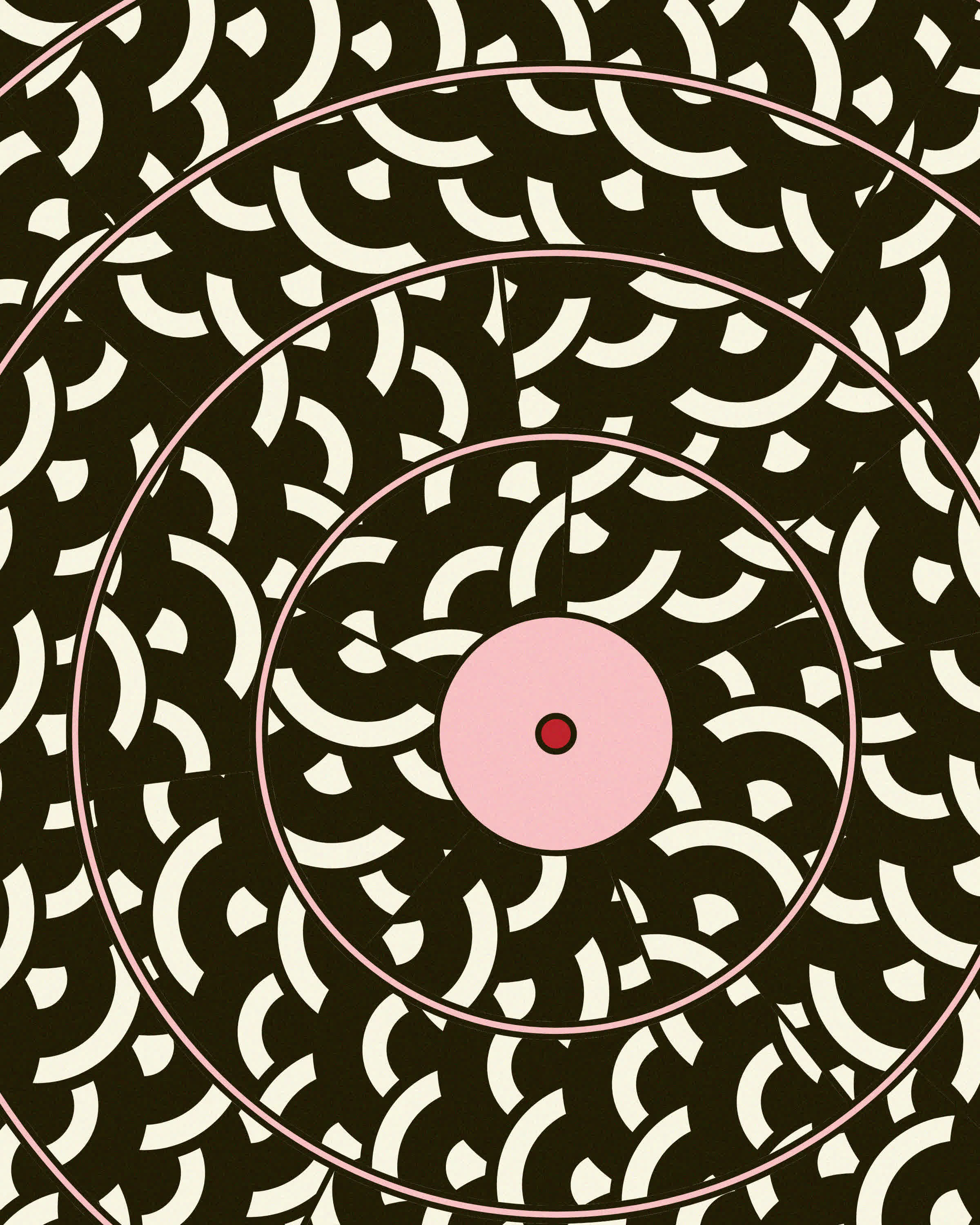
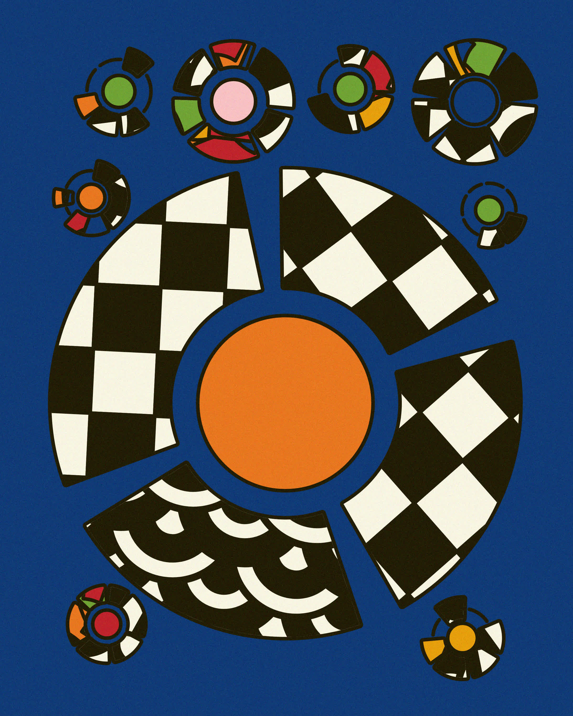
Initial Idea for the Maximalism Prompt
These forms did feel a bit uninspired in the end and I reverted back to the circle packing code that I had already used for #25 and #27 but wanted to make it over the top and add as many patterns as I could fit.
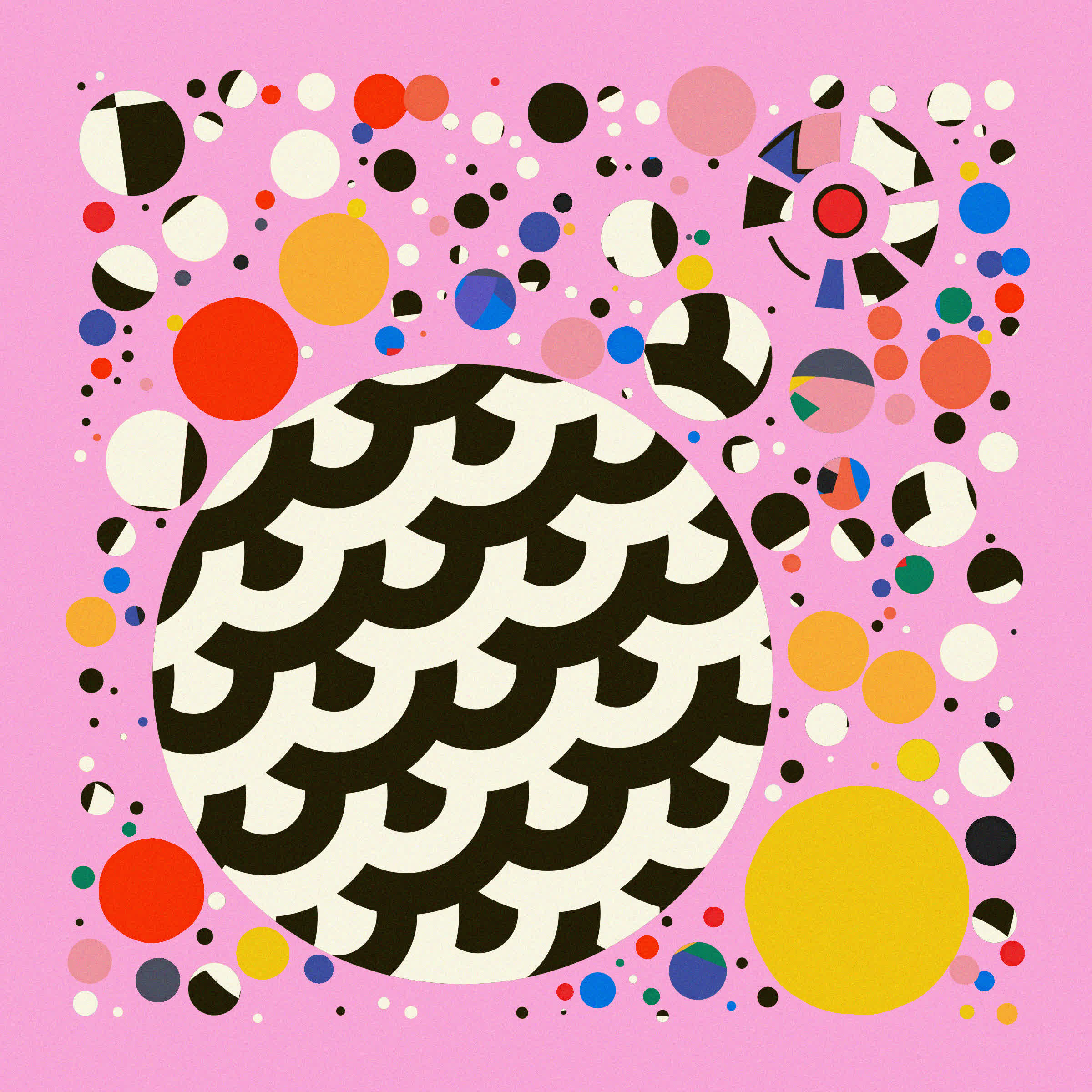
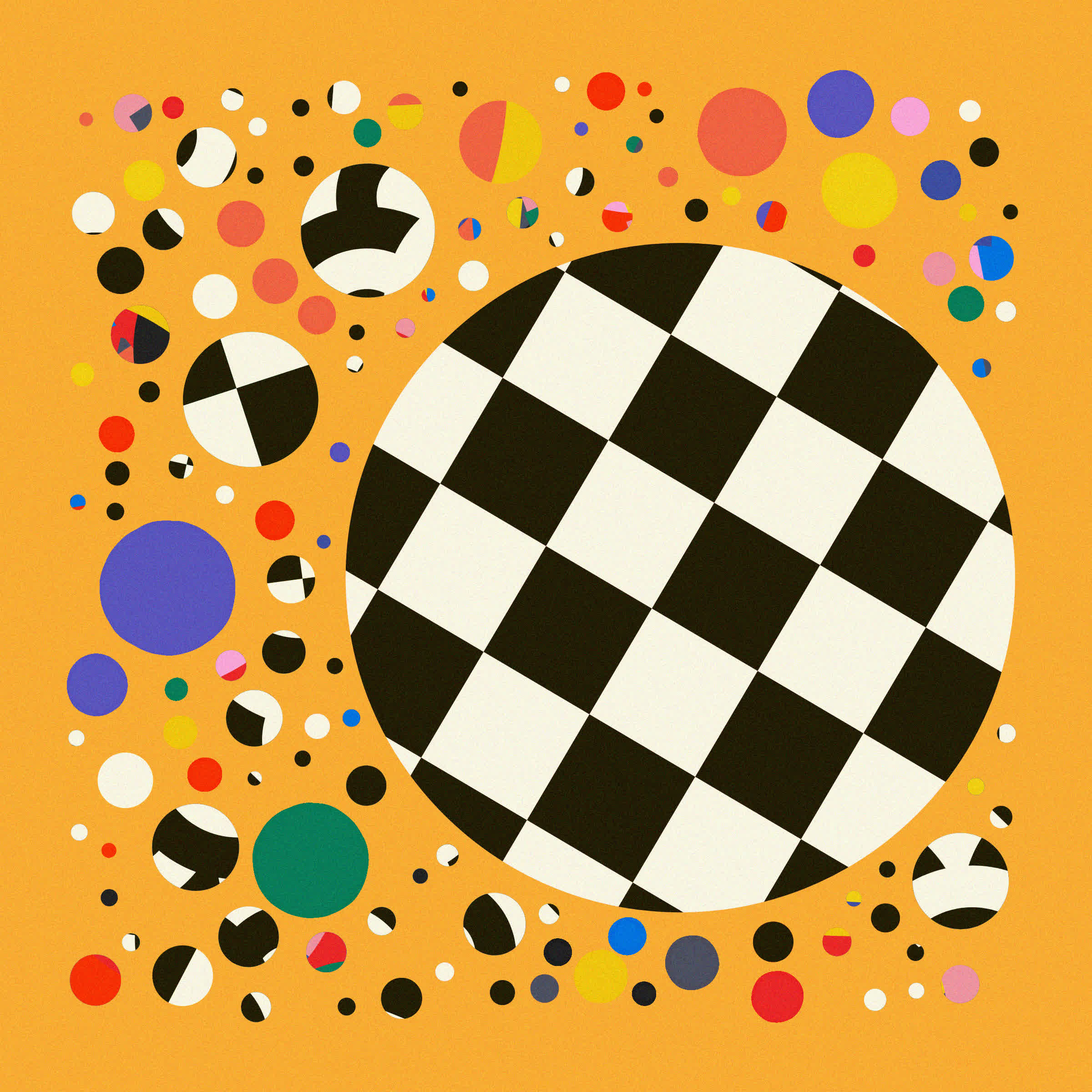
Reusing the Circle Packing Code
The final state of the sketch then looked like this:
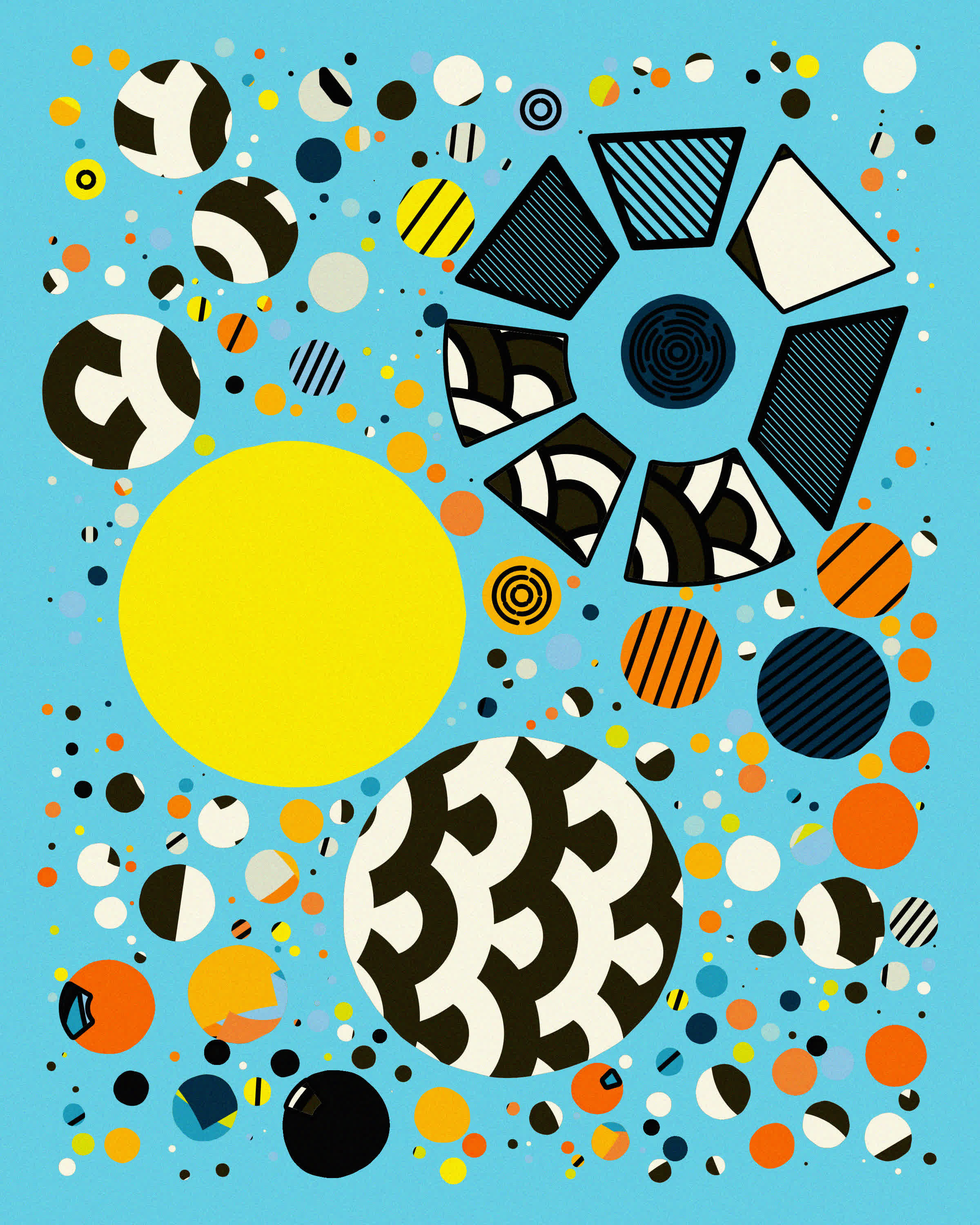
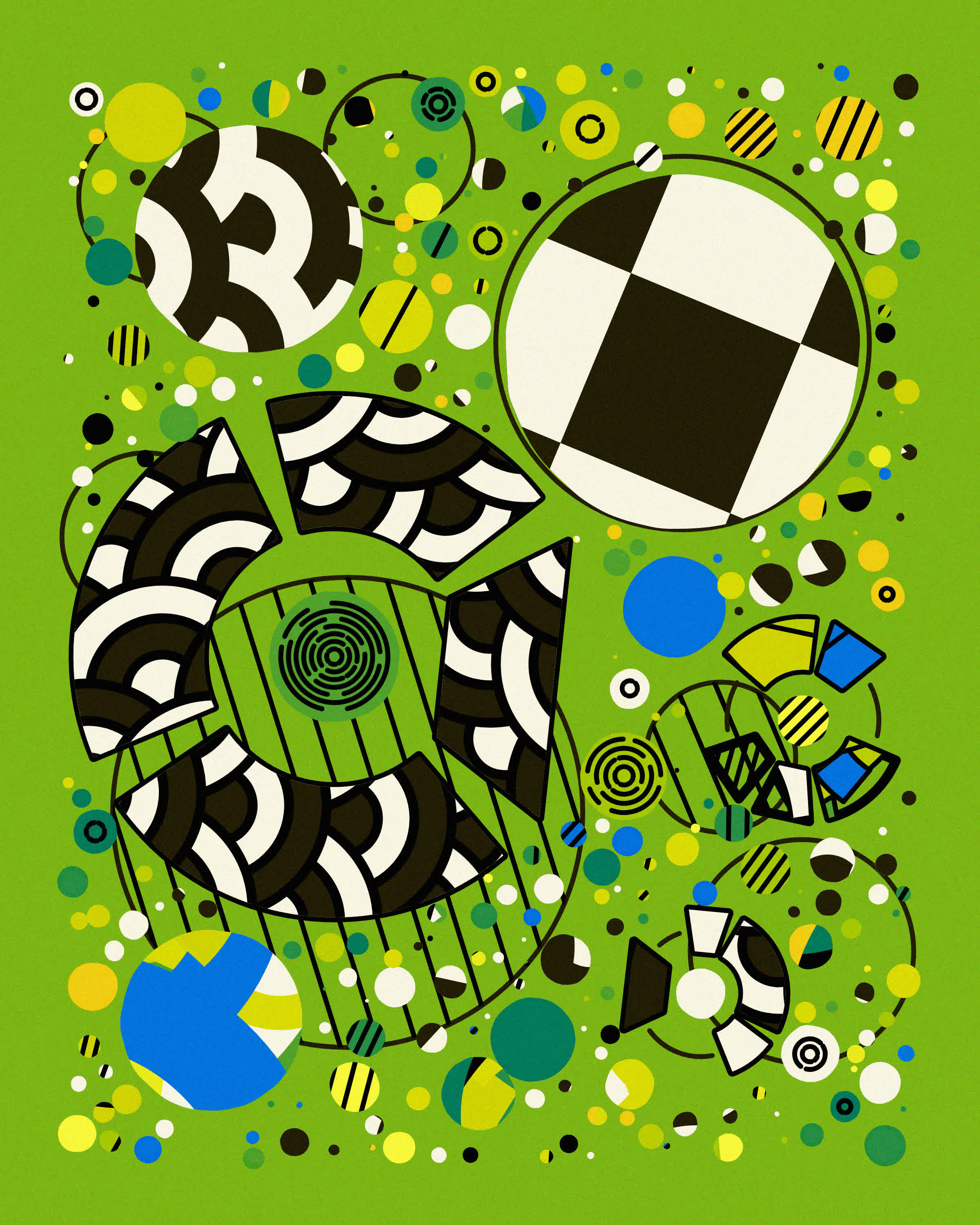
Adding Details and Randomness
I enjoyed the interplay between slightly wobbly and strokless circles and the cleaner looker cartoony ones that had thick strokes, gives it a nice contrast. I also did some variations where there's two layers of circles, borrowing that idea from #23.
Reaching the final stretch we're still going strong, some cool ones for maximalism: spirograph flowers from Emily Weil, a big mashup from Yazid and a cool video based one from Dave:
#genuary29: " Maximalism." Start with circle packing, a maximalist layout in #generativeart, apply it to the most minimalist of elements – a line – and what do you get? A field of spirograph-ical blossoms. #genuary pic.twitter.com/R1zz77CVxU
— Emily Weil (@emilyaweil) January 29, 2023
#genuary29 Maximalism
— Yazid (@Yazid) January 30, 2023
GENERATE ALL THE THINGS#genuary2023 pic.twitter.com/CCYz3EmKDb
#genuary29: Maximalism. I wanted something really busy and dense, so I started with a CC0 video of Yonge/Dundas, one of the busiest pedestrian spots in Toronto, and kept layering the moving parts of the video on top of itself again and again. #genuary https://t.co/11DpfBtwnn pic.twitter.com/yocCESNjrT
— Dave Pagurek (@davepvm) January 29, 2023
And lastly an older piece by Loackme:
I don't have much time to work on #genuary today, but here's an output of 'a multitude' with an overload of shapes and gradients for 'Maximalism'. #genuary29 pic.twitter.com/Gyb9QF9gs3
— loackme (@loackme_) January 29, 2023
#30 Minimalism
I almost reused the code from #26 again as I was completely out of ideas, and even though there is some slight Perlin Noise being applied to the points that make up the central grid, it's quite subtle. Ultimately I ended up liking the minimal and playful aesthetic of these carpets, as if they were straight out of a children's book:
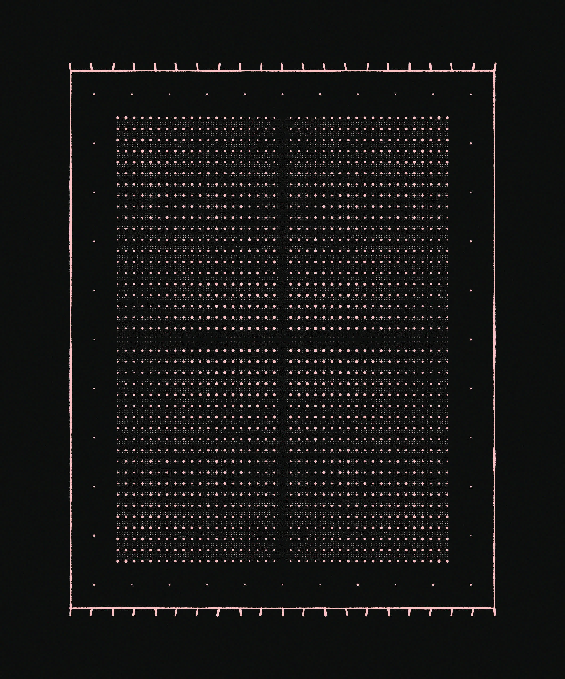
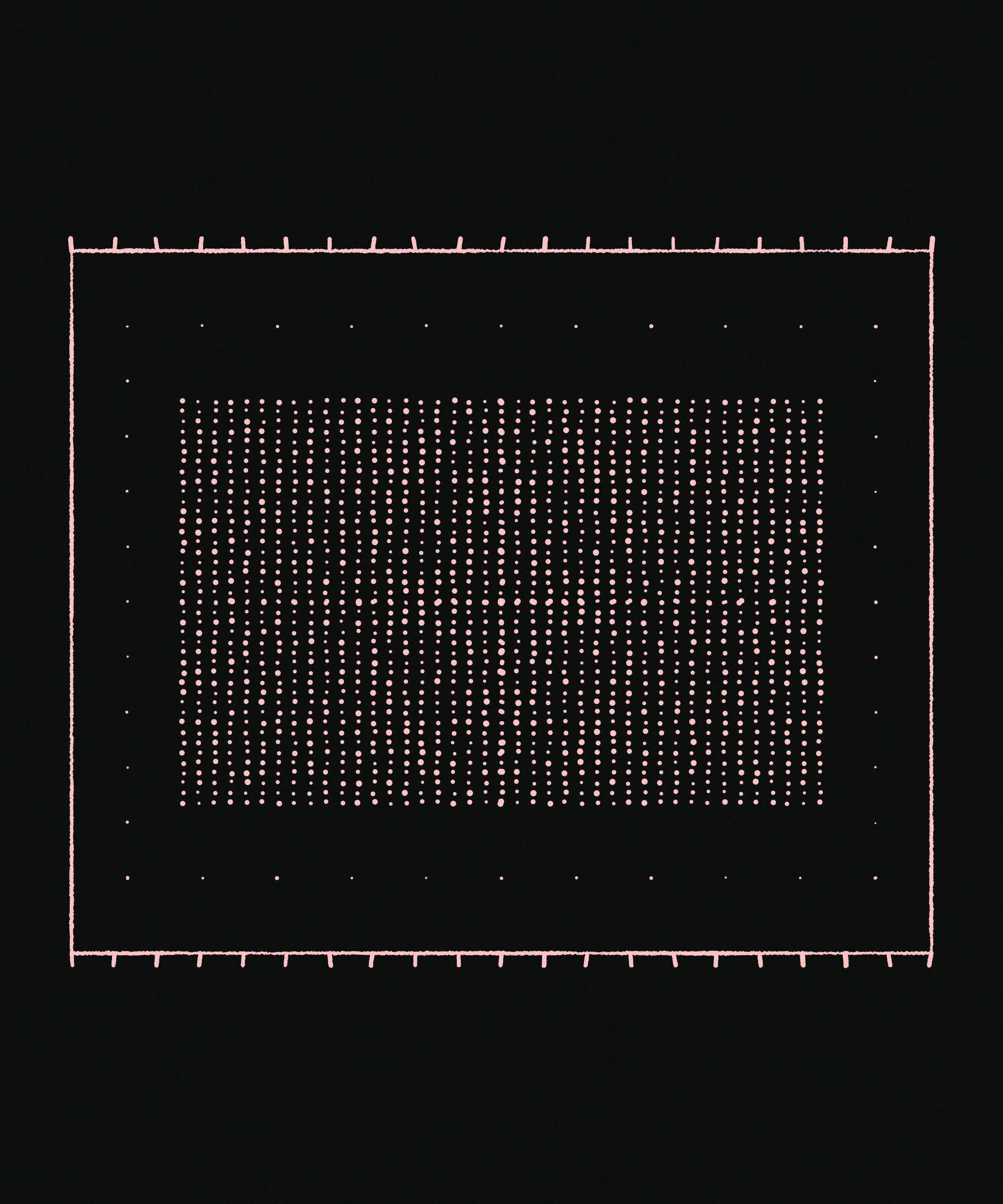
Minimalist Generative Carpets
A #TsubuyakiProcessing sketch is super on point for the minimalsim prompt, and Koma Tebe nails it with his sketch. I believe that it's the formula for a squircle where the curvature parameter is being interpolated:
f=0,draw=c=>{f||createCanvas(W=400,W,F=filter,C=circle),background(0),fill(W),noStroke(rectMode(CENTER)),C(w=200,w,Z=80*(sin(f)+PI/16)+160),rect(w,w,Q=60*cos(f+PI/2)+170),f+=PI/128,F(BLUR,50*cos(2*f-PI/16)),F(THRESHOLD,.4),fill(0),C(w,w,80)};//#つぶやきProcessing #genuary30 minim pic.twitter.com/Oev1icJrnJ
— Koma Tebe (@KomaTebe) January 31, 2023
And another super cute pixelated and imaginative one by Michael Rostocki, that shows a scene of flowers bending with the wind:
"Seer"
— Michał Rostocki (@von_rostock) January 30, 2023
You hunch your shoulders from the chilling wind, humiliated by the Old Gods once again. This damn seer better has some meal ready. If she doesn't, she's not a seer. Or you won't make it.#genuary30 #genuary for "minimalism"#pico8 #tweetcart #codeart #generative #pixelart pic.twitter.com/ZzBnNTh74n
#31 Remix one of your previous Works
I also felt like I could skip this one as I had already remixed quite a few of the previous sketches, in addition to my brain being devoid of any new ideas as I had been catching up with 3 prompts a day at that point:
Some final favourites here were by Alexis Andre and Matteo Mauro:
#genuary31 remix of #genuary14#generative #dailycoding #genuary pic.twitter.com/buRQJalHkx
— Alexis André (@MacTuitui) January 31, 2023
Today is my father's 72 birthday and also the last day of #genuary. To both, my father and generative art, depends the birth of my artistic journey. To celebrate this #genuary31 / #january31 , here we post one of our last artwork produced this month which is a fragment of joy. 🤍 pic.twitter.com/pnfwysxhgT
— Matteo Mauro (@mattmaurostudio) January 31, 2023
Final Thoughts
And that's a wrap! So. Much. Generative. Art.
This took a while to put together, but is in no way an exhaustive list of sketches, just a round up of my personal favorites throughout the month. I probably missed quite a bunch of cool ones. If you want to explore more you can do so via the respective hashtags on Twitter, IG and Mastodon.
If you enjoyed going reading this, consider sharing it with on social media, with friends or family, dropping me a like and/or a follow on social media, or alternatively checking out some of my other posts form the past! Happy creative coding, sketching or time off from creative coding (I think we need a rest after Genuary)! Cheers!
