Welcome back everyone 👋 and a heartfelt thank you to all new subscribers that joined in the past week!
This is the 45th issue of the Gorilla Newsletter - a weekly online publication that sums up everything noteworthy from the past week in generative art, creative coding, tech and AI - as well as a sprinkle of my own endeavors.
That said, hope you're all having a great start into the week! Let's get straight into it! 👇
Weighted Voronoi Stippling
When I read the title of the newest coding challenge I immediately dropped everything and had to watch it start to finish. This time around Mr. Shiffman breaks down quite a tricky one for us — Weighted Voronoi Stippling!
I'm super excited about this topic because it's something that I've looked into myself about 2 years ago, at a time when I was exploring Voronoi diagrams and Delaunay triangulations. Back then however I gave up on pursuing a stippling effect, because I ultimately couldn't figure out how to implement the algorithm.
If you look into it yourself, you'll come across the very same paper that Shiffman implements in the challenge - which makes up the very first result that comes up for the search query Weighted Voronoi Stippling:
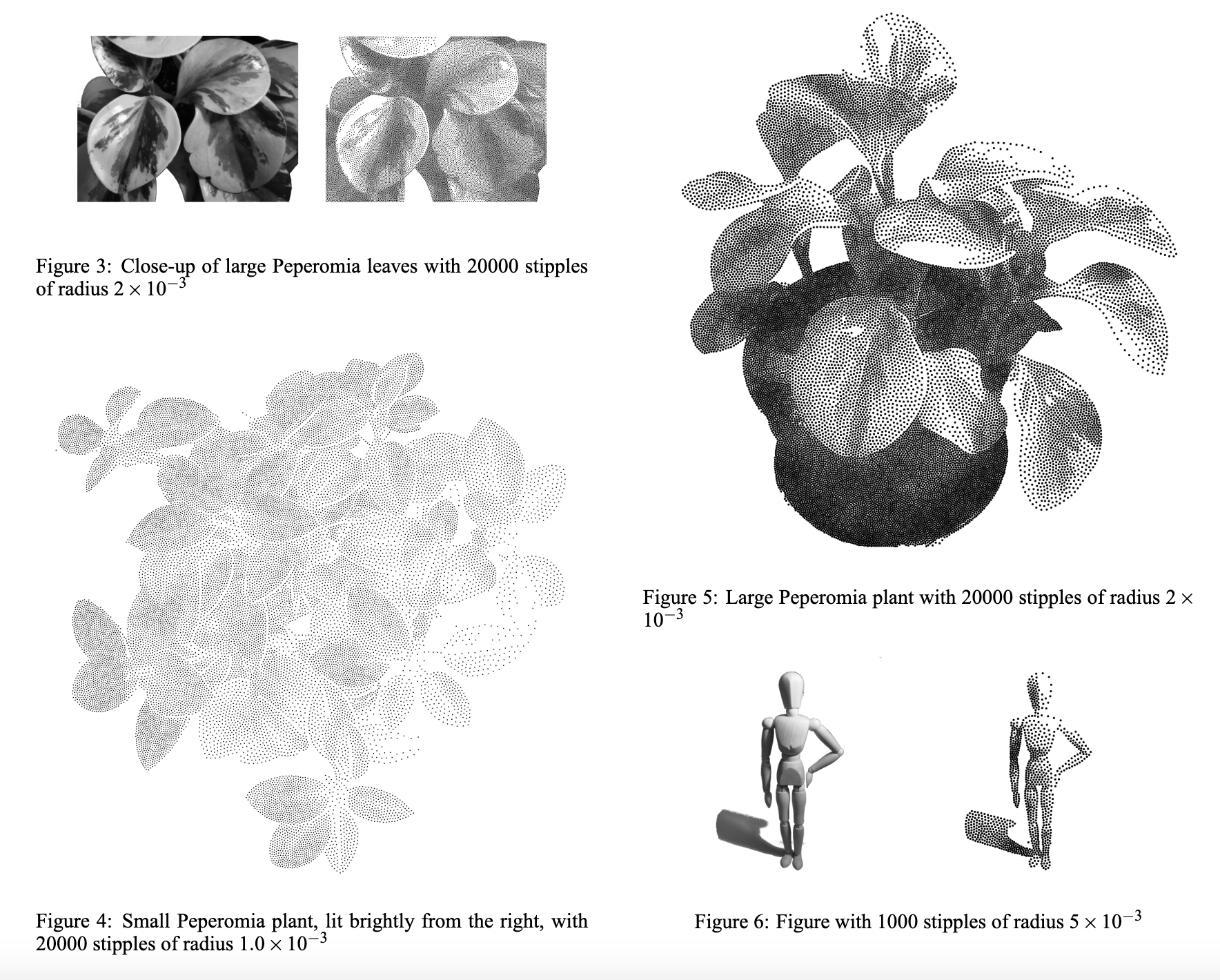
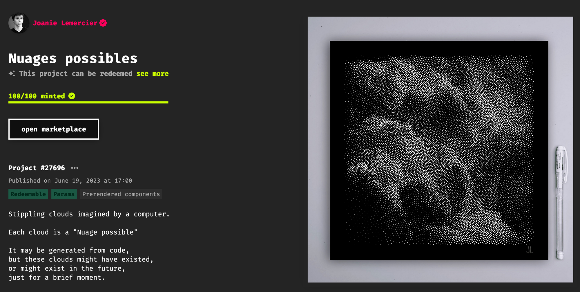
The effect really comes to life when it's used to represent 3D scenes, such as the little mannequin/figurine that's shown in one of the paper's figures (see above) - it's fascinating how the human eye can make out shadows/illumination simply through the density of the individual points. That makes me think of a recent collaboration between Joannie Lemercier and Quentin Hocde that's also powered by a stippling algorithm, titled Nuages Possibles, in which beautiful cloudscapes are brought to life through many thousands of individual dots:
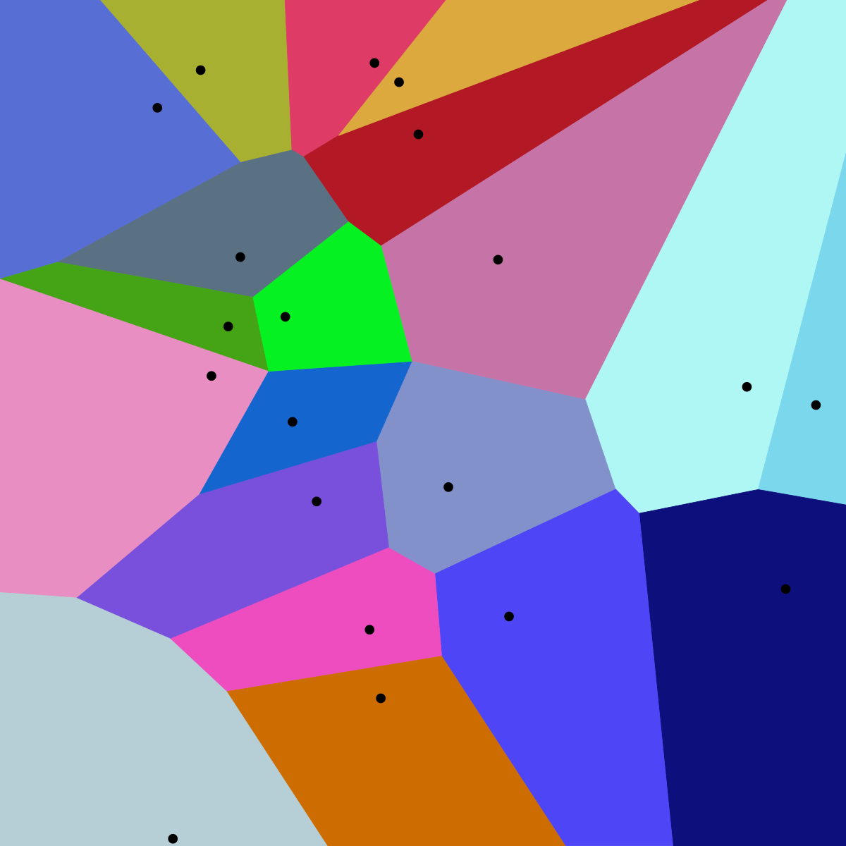
But what actually are Voronoi Diagrams? A Voronoi diagram is essentially a type of space partitioning, in which a 2 dimensional surface is split into individual polygons based on the distance to a set of points that's scattered across this surface - we basically need to distribute some points on a plane as a starting condition to construct a Voronoi diagram. The defining characteristic of each polygon is that it corresponds to the region that is closer to a specific point than to any other point in the set.
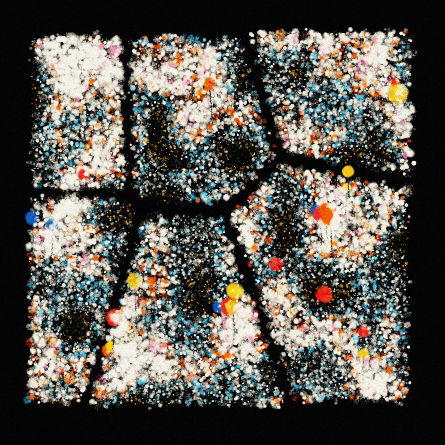
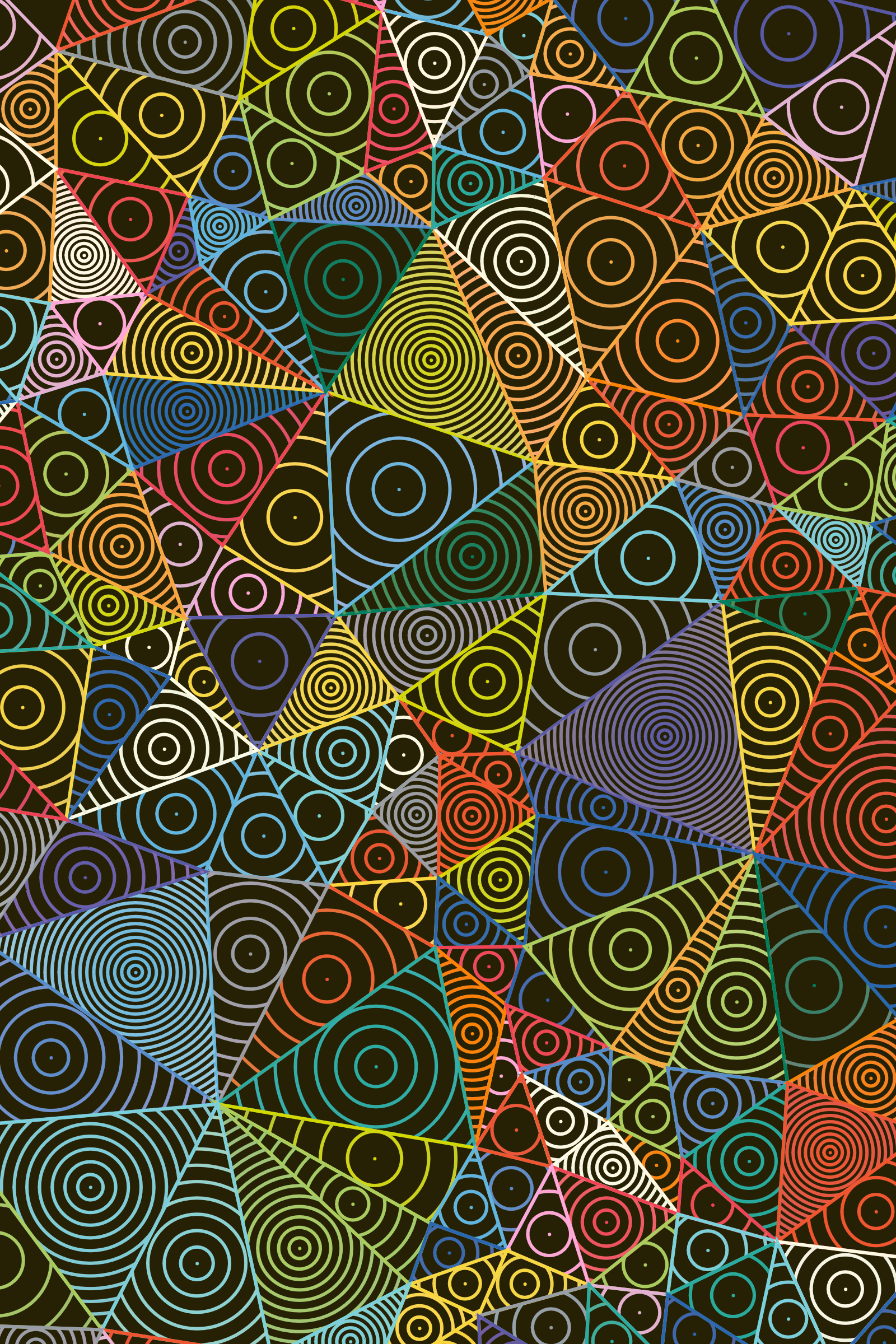
Here's what this looks like, next to some art I made with the concept back from Genuary 2023:
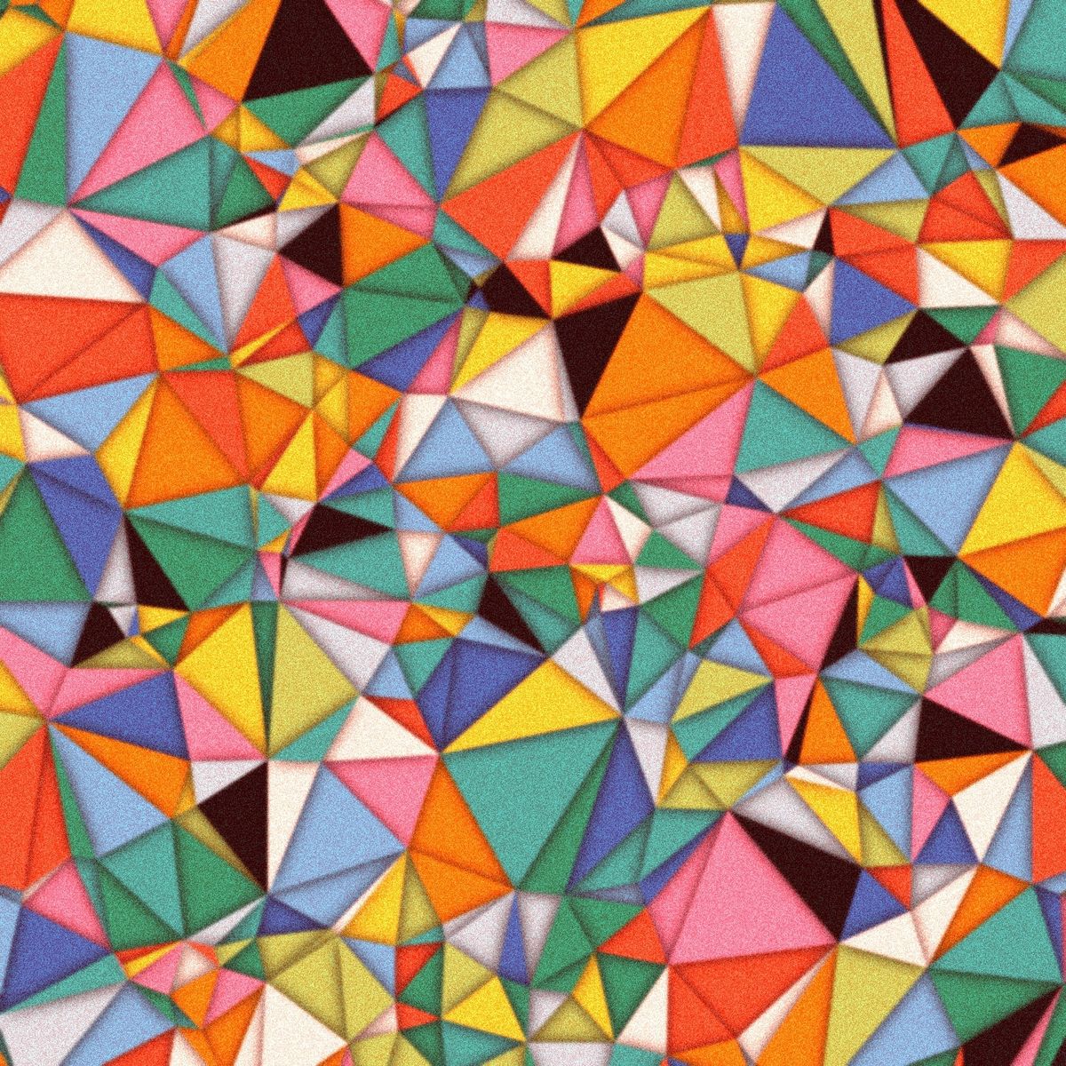
Voronoi Diagrams are also closely related to Delaunay Triangulations, in fact, they're duals! This means that we can derive a Delaunay Triangulation from every Voronoi Diagram and vice versa - we can do so by simply connecting the centroids of each two adjacent Voronoi regions with a line. Here's what this looks like, as well as some art I made with Delaunay triangulations:
A fun fact here is that Delone, the mathematician that came up with/discovered this kind of triangulation, actually knew Georgy Voronoy, and if you're curious about some of the history between these two types of fascinating patterns, I encourage you to check out something I've written about it:

If you want something a bit more technical, and want to challenge yourself with an algorithm that can construct a Delaunay triangulation from an initial set of points, here's an explanation of the Bowyer-Watson algorithm:
But back to the main topic, how do Voronoi Diagrams lead us to a Stippling effect? There's this cool algorithm called Lloyd's relaxation, that iteratively 'relaxes' a Voronoi diagram until all of the individual regions attain a somewhat equal size, essentially iteratively nudging the seed points that predicate the individual regions in the direction of their centroids - here's what this looks like:
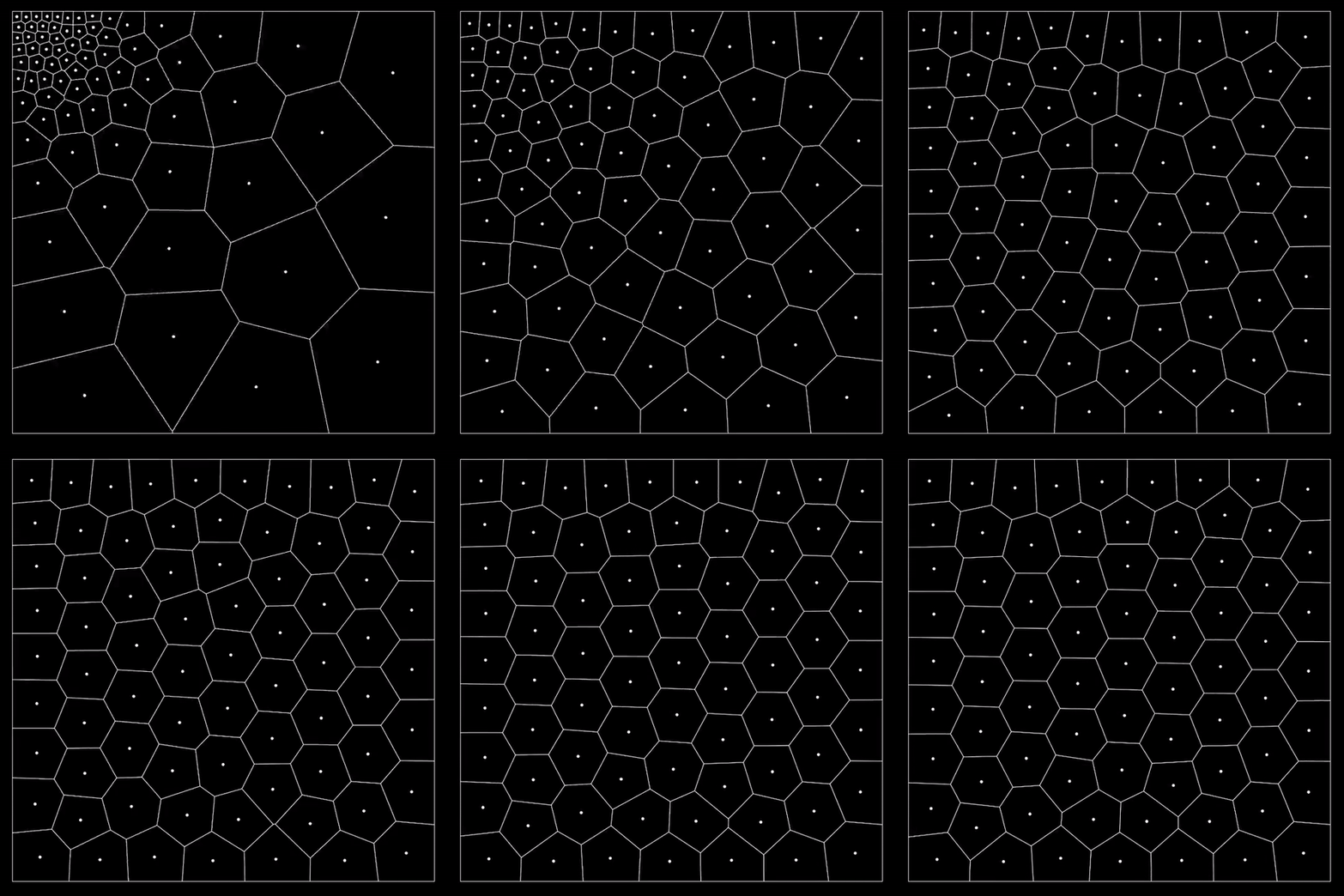
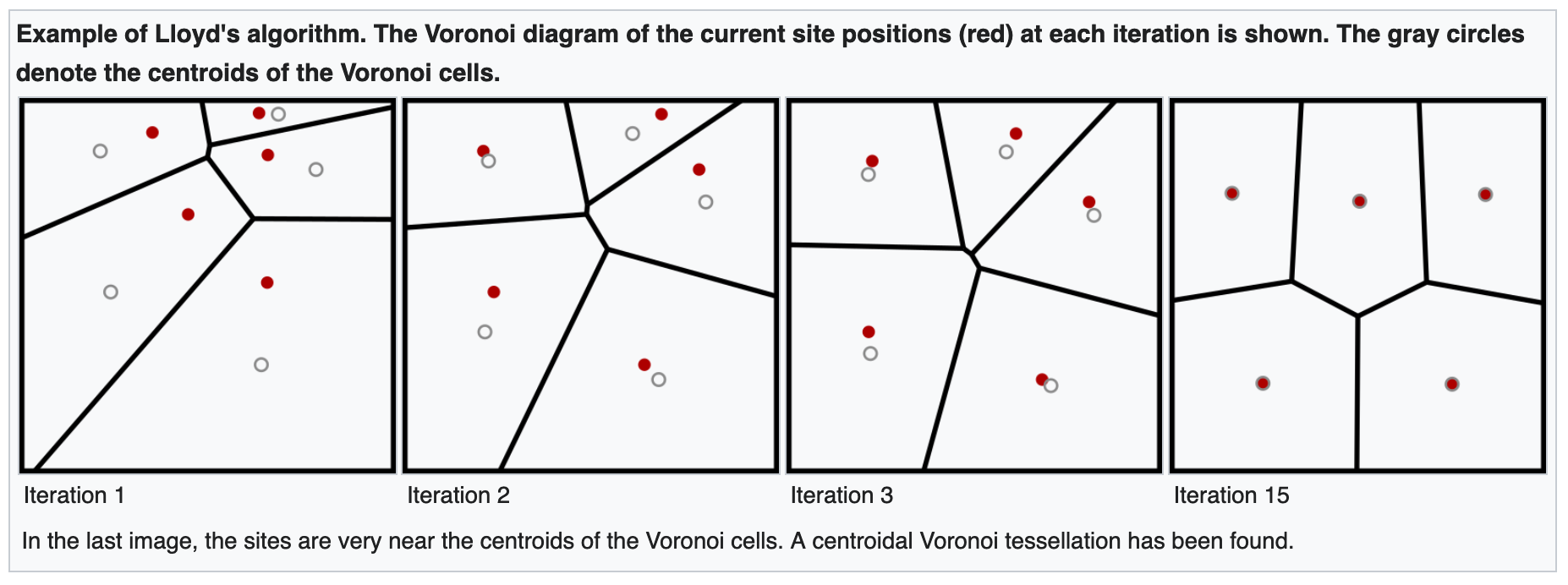
This already looks really cool, but it's not very interesting since the resulting diagrams will always end up looking similarly even after the relaxation has come to a conclusion.
However, what if we modified this procedure, and relaxed the Voronoi diagram based on some probability distribution? Meaning that we don't nudge the seed points towards the geometric centers of the cells, but rather in a weighted direction, towards a weighted centroid. This weighted centroid could for example be derived from the underlying pixel values that fall under the Voronoi cell, nudging the seed points in the direction of darker colors, ultimately achieving the stippling effect described when we place an image underneath our Voronoi diagram.
And this is the part that I couldn't figure back then, how to calculate the weighted centroid basically - that's where Shiffman comes in, tackling it in the latter part of the video! I haven't had time to experiment with it yet but I'm super excited to do so. And kudos, the recent coding challenges have just been banger after banger!
Okay, Color Spaces
My therapist: color spaces aren't real, they can't hurt you...
Color Spaces: RGB, CMYK, HSB/HSV, HSL, LAB, YUV, XYZ, YCbCr, LCH (CIELCh), sRGB...
If you've ever wondered about Color Spaces, what the differences are, what each one of them is useful for, why we need so many and why there are so many in the first place - this is likely going to be the last article that you'll need to read about the topic. Eric provides us with all of the answers in this massive article:
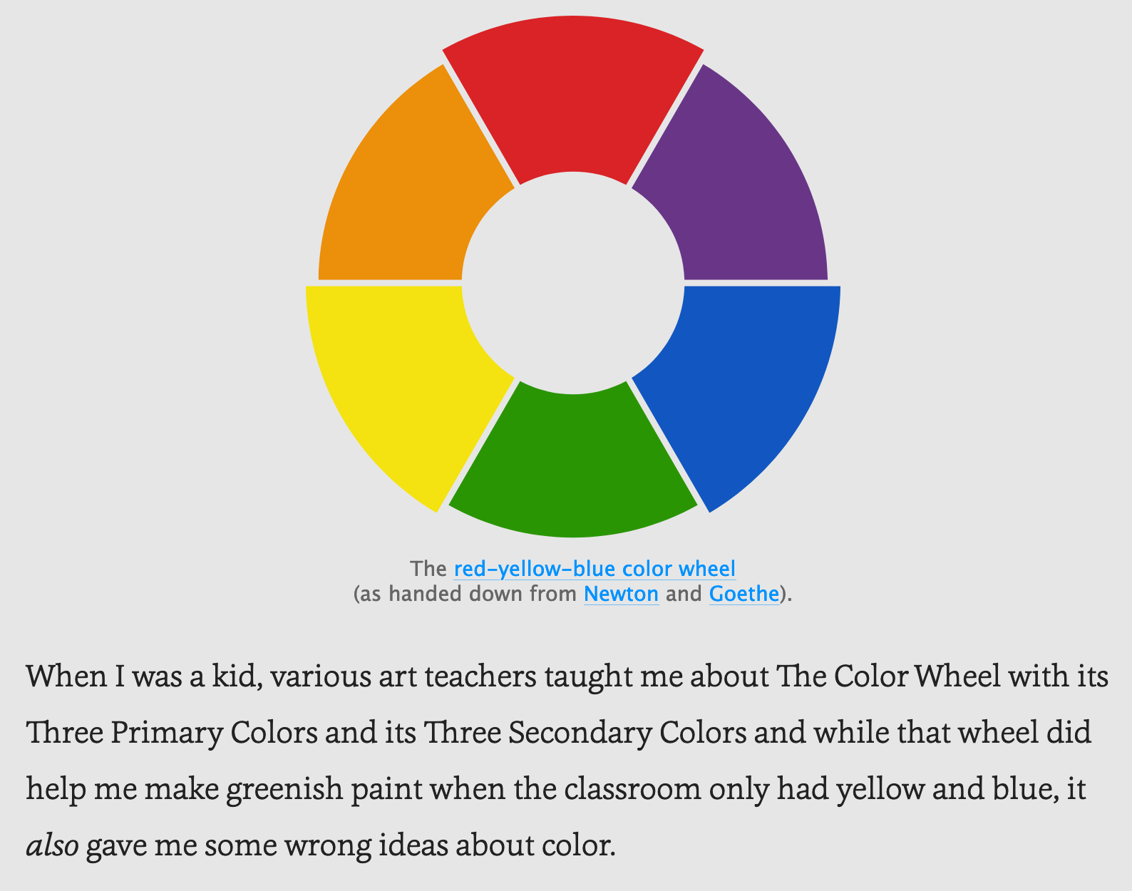
I was shocked to learn that Oklab, a perceptual lab-like color space, is actually only 4 years old, and proposed in 2020 by Björn Ottoson through a blog post of his - now tell me that you can't change the world with a blog - and it actually seems to have become quite a big deal seeing that it has a number of advantages in certain areas:

Unfortunately I'm all out of time for investigating strange internet rabbit-holes this week, so you'll have to be satisfied with this thread over on the Processing forums about the Oklab color space:

Anyway, lots of cool stuff here again. Read the article.
Speaking in Net Language
Credit for discovering this one goes to Tom aka pumaparded, sharing it over in the birbsnest discord's inspiration channel - leading me to one of the most fascinating reads I've had in a while. Michael Connor recounts the story behind Olia Lialina's net.art masterpiece "My boyfriend came back from the War":

If you're not familiar with Net art, short for networked art, it's and artform and art movement that emerged in the 1990s with the increasing accessibility of the internet, and used the emerging web technologies as the primary medium - it's a really interesting piece internet history to dive into:
_2.jpg/220px-Teo_Spiller_net.art.trade_(net.art)_2.jpg)
Olia Lialina's work is a prominent example of this. In "My boyfriend came back from the War" she retells the reunion with her boyfriend as an interactive web experience, and it can still be accessed here.
I have to say it again, the Rhizome article is an absolutely fascinating read, not just analysing Lialina's work, but also contextualizing it and providing insights and commentary on the net.art movement from a historical point of view. Olia Lialina's work is part of the Net Art Anthology, where efforts have been made to present and preserve many more of these kinds of works:
Web3 News
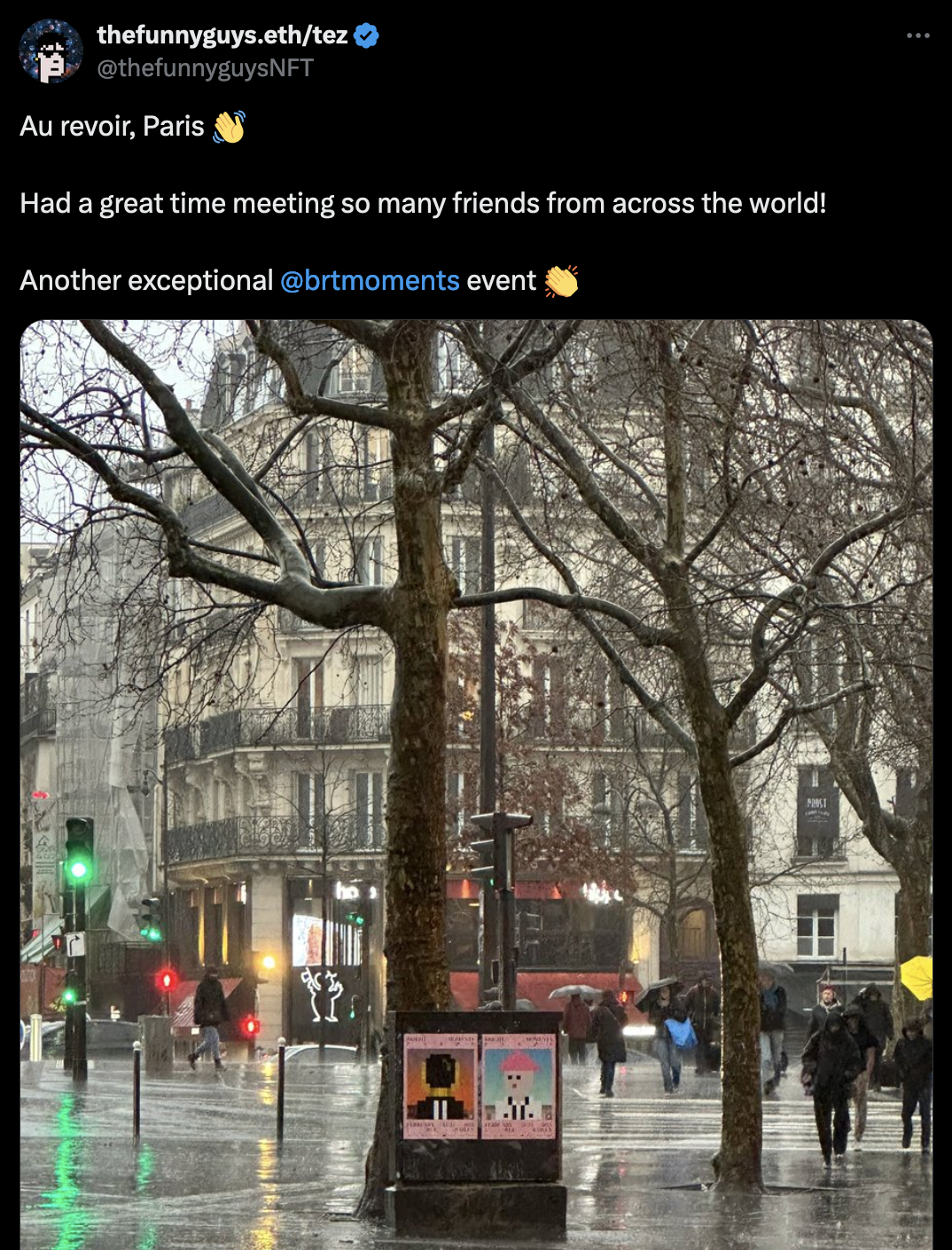
The FOMO this past week has been absolutely unreal with all of the NFT Paris shenanigans in full-swing and seeing everyone having a good time over in France - if you're curious about all of that you just gotta hop on over to Twitter and check out what everyone's posted over the past week:
Doesn't mean that there hasn't been some other cool Web3 things to report on throughout the week 👇
fxhash launches on base

Holup... what is Base?
Base-ically an Ethereum L2!
... and what is an L2? 😅
L2s are solutions built on top of a blockchain's mainnet (L1) to improve scalability, and usually drastically lower gas fees! Base is actually only one of Ethereum's L2s, you might have heard other terms thrown around, like Polygon and Arbitrum that refer to other L2s. I have no idea how they work from a technical point of view, but I found this nice article by Lipsa Das from Ledger, that provides us with a good and easy to understand overview:

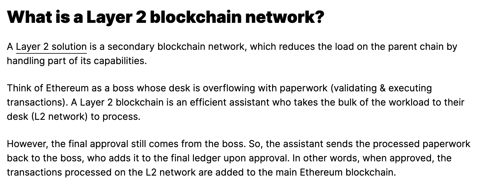
If I'm understanding this correctly, minting an NFT on base should then theoretically also make it available on mainnet Ethereum? Depending on how the L2 stores the token on the blockchain? Maybe one of you guys can chime in on this. But anyway, big W for fxhash - not an L at all.
Aux Arbres by Zancan
And while we're talking about base, in light of the Coinbase's France kick-off, Zancan was tasked with creating a generative artwork for the occasion - and it turned out to be a really impressive one:
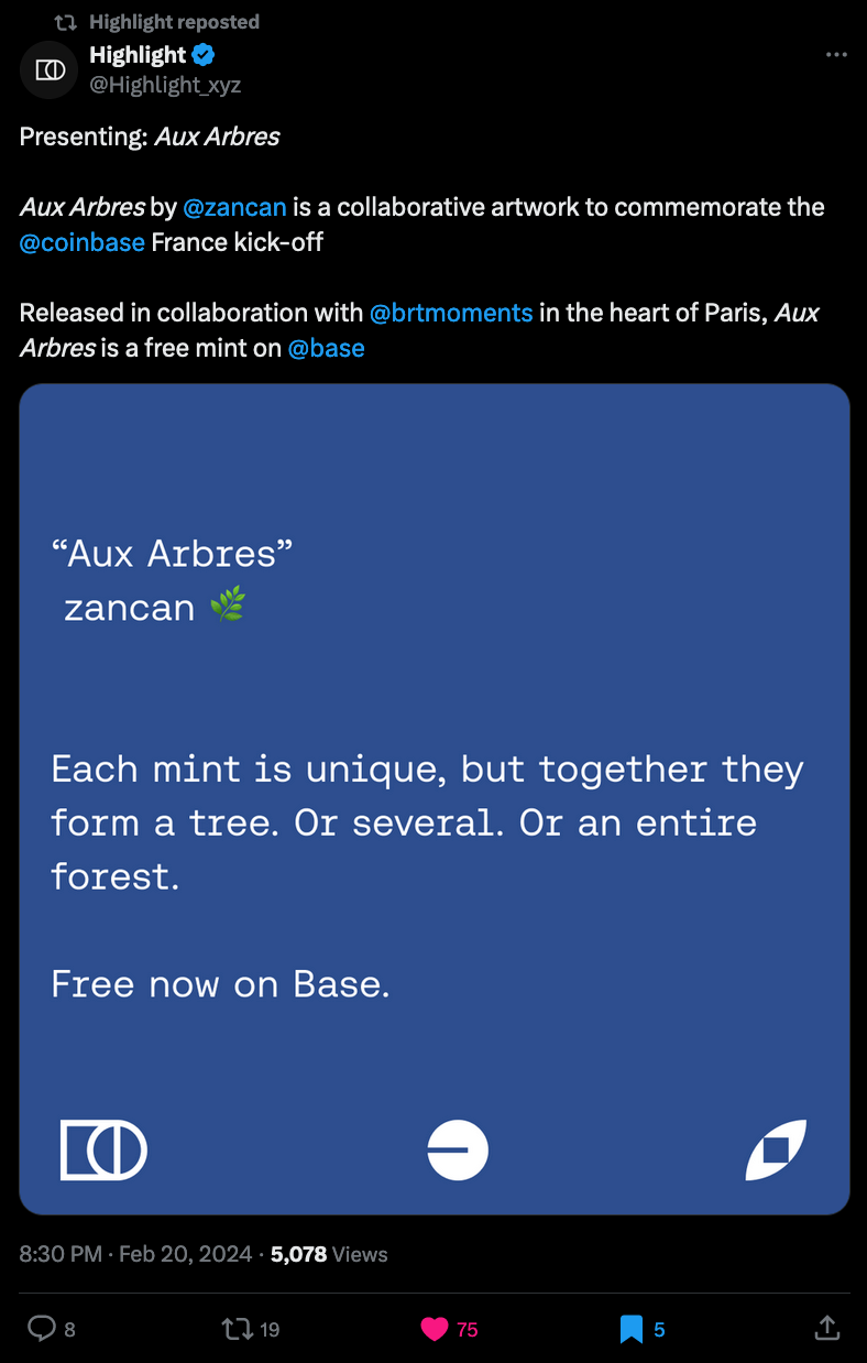
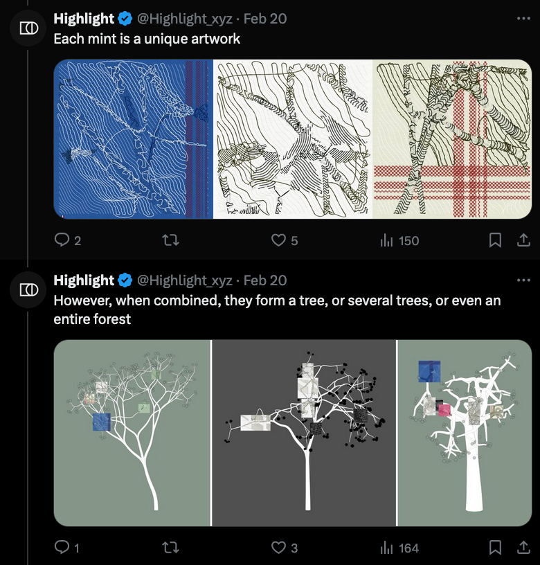
Continuing with his signature aesthetic, Zancan lets us take individual snapshots of larger growths with Aux Arbres, that translates to "To the Trees", each mint presents part of the branches or trunks of a number of trees. What's special about this generative artwork is that each unique mint from Aux Arbers is part of a bigger whole, in the literal sense of the word; highlight provides us with a special interface to visualize where each one of those minted snapshots falls and to which tree they belong:

What's more, it's a free mint, and the gas fees are super low due to it being minted on base - so if you've every wanted a Zancan piece, now's your chance! The project's still open for minting for a couple of days, and at this point over 50k individual snapshots have been taken.
Iroh: IPFS Reimagined
Recently learned about Iroh, an IPFS alternative that seems to do things in a little bit of a different manner, aiming to be a more efficient and scalable version of IPFS:
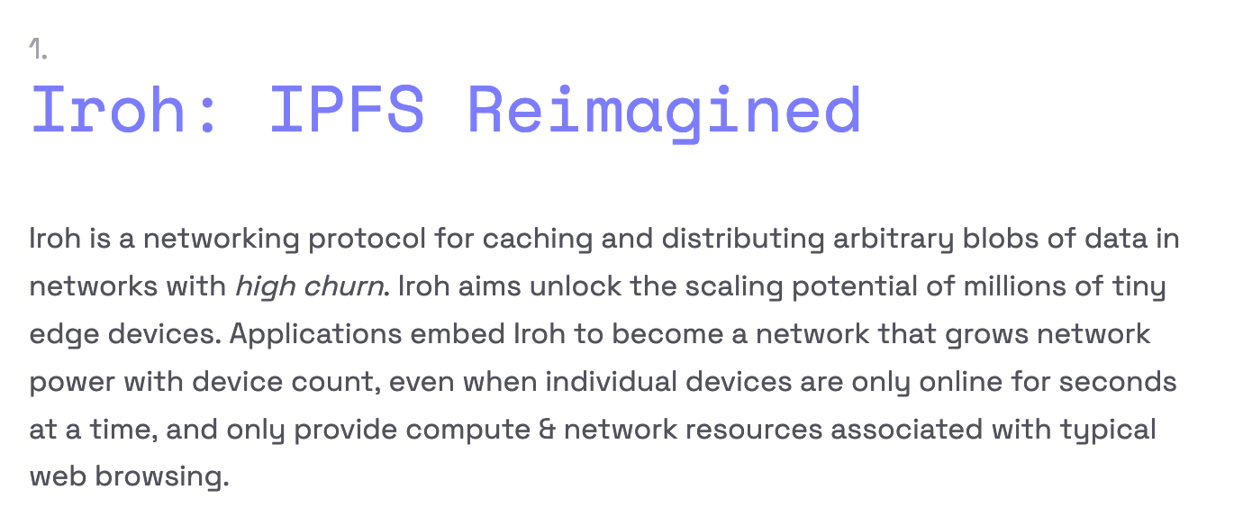
But there seem to be some mixed opinions on the project when juxtaposed with IPFS.
Thoughts on a Global Design System
An interesting article from early January that I only recently came across is a piece by Brad Frost, titled 'A Global Design System'. The article caught my eye because when the term 'global' is attached to something, it often incites political undertones. In recent years the globalization debate has become more nuanced, more politically charged, and opposing views have emerged around it in different context.
Moreover, the notion doesn't only concern itself with global trade and economics, but can also be conceptually extended to other practices, like web design in this instance:
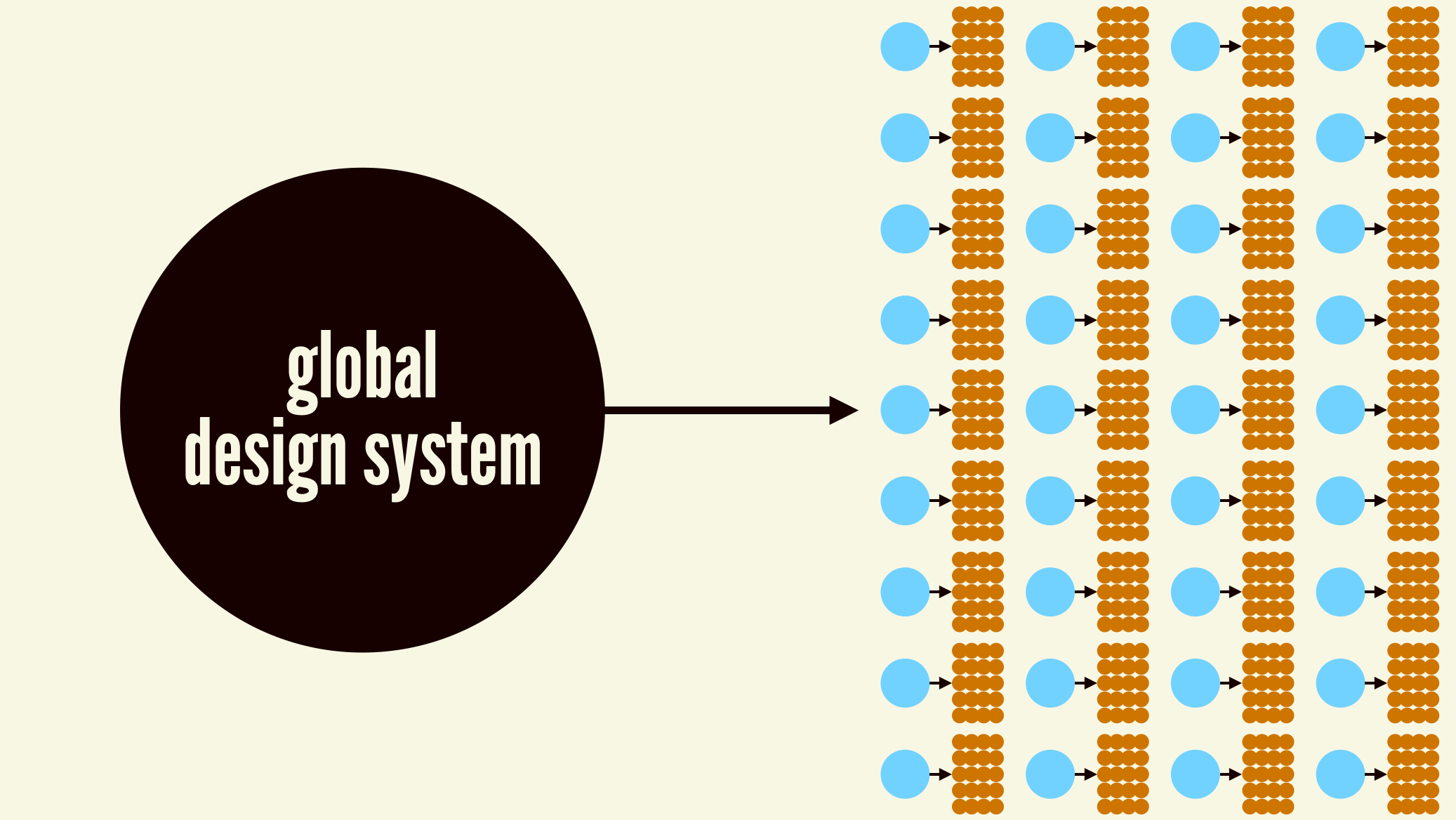
Frost argues that we live in a duplicative present, where organizations invest valuable labor time and resources into creating design systems that are to a large extent the same - naturally because everyone needs to adhere to the same web standards. The main argument of the article is that we'd alleviate much of this wasted time with a unified global design system - Frost doesn't just preach, but also follows up with an actual proposal for such a design system.
You could now argue that it is not necessarily a bad thing that different companies are creating their own individual proprietary design systems - isn't it a good thing that there's diversity in brand identities and how they design things? On a related note, I only learned about 'A Global Design System' through a more recent article by Piccalilli that argues for a similar globalization scheme in the context of documentation platforms:
And another interesting piece of content by Brad Frost is this talk he gave at TEDx, almost a decade ago now, that I think pertains to many of the creative folk on here:
Web Dev Things
TC39 Meeting Notes
Ecma International's TC39 is a group of JavaScript developers, implementers, and academics, that collaborates with the community to maintain and evolve the definition of JavaScript - and they recently held their 100th meeting. Hemanth captured all of the points of discussion of this 100th meeting in form of a dev.to writeup:
Interactive Guide to SVG Loading Spinners
Who doesn't love loading spinners? A repeat offender of the Newsletter, Sébastien Noël from fffuel, wrote this cool interactive guide to making them:
Book Reviews by Adam Majmudar
Adam Majmudar built a really cool page for his book reviews, with an interactive scrolling bookshelf that lets you click on the individual books to read their reviews:
You can check it out here:
And also have a look at the code here:
The Importance of Page Footers
I got sick again this week, and came down Tuesday morning with some sort of food poisoning, which left me bedridden for the most of Tuesday and Wednesday. The older I'm getting, the more sensitive my stomach is becoming it seems.
I did however come out on top of it pretty quickly, had a relatively clear head again on Thursday, and decided to pick up the re-design of the blog again as a way to ease myself back into things. I'd actually started working a little on designing a page footer back in January, hence it made sense to resume with that and try to finish it. A page footer is quite an important part of a webapge - some studies show that users will often scroll all the way down to the bottom of the page before actually reading any of the actual content of a page, usually in search of more information about the page, or alternatively as a navigation portal:

Here's what I have come up with so far - and I must say, I'm quite happy with how it turned out:
Wowowow, fancy schmancy animated cards. Figuring out the JS part that slides in the card description from below was actually trickier than I expected.
It's still a bit rough around the edges, and the layout of the footer card still needs to be fixed up a little - but I'm quite proud of the idea of including the footer as an element within an article grid, making it feel sort of like a business card, while also being somewhat modular in design such that I can include it on other pages and grids as well.
I also ended up spending quite some time designing the surrounding article cards, which I think will replace the current card design that you can find over on the article/archive page - that is currently a bit bare-bone. It's always a question of how information rich you want to make the elements, so that you catch the user's eye and make them want to click on it.
The trickiest part here was overlaying text on an image; if the images aren't hard coded, then you can't always predict on top of what color your text will be placed - sometimes there will not be enough contrast for the text to be readable. When using white text, a solution is to underlay the text section of the cards with a soft blur that transitions to a darker color towards the bottom. This way we bring back enough contrast and the text becomes readable again.
Also, you might've noticed the lack of a Gorilla Updates section - I thought I might try something a little different and give the section a proper title in context of what I've been working on in throughout the week. Expect a lot more web dev/design mini updates in the coming weeks!
Music for Coding
Neon Indian is one of those artists that has their very own sonic identity - it really isn't comparable to anything else. I thoroughly enjoy listening to his tracks every now and then. Drawing inspiration from 1980s pop and electronic music, with heavily analog and textured sounds, the overall mood he evokes is often described as nostalgic, capturing a sense of dreamy escapism:
And that's it from me this week, while I'm typing out these last words I bid my farewells — hopefully this caught you up a little with the events in the world of generative art, tech and AI throughout the past week.
Maybe you've noticed already, I've tried a little bit of a different tone/writing style this week, and now that I'm reading the previous closing statement, it's just a bit too meh for my taste, let's try something a bit more quirky - it was definitely a lot of fun putting together this week's issue.
And now that you've made it through this week's newsletter, you might as well share it with someone that you know who might enjoy this kind of content, or not, but send it anyway - what's the worst thing that could happen?
If you've read this far, thanks a million! And if you're still hungry for more Generative art things, you can check out the most recent issue of the Newsletter here:
Previous issues of the newsletter can be found here:
Cheers, happy sketching, and again, hope that you have a fantastic week! See you in the next one - Gorilla Sun 🌸
If you're interested in sponsoring or advertising through the Newsletter - reach out!
