Welcome back everyone 👋 and a heartfelt thank you to all new subscribers that joined in the past week!
This is the 47th issue of the Gorilla Newsletter - a weekly online publication that sums up everything noteworthy from the past week in generative art, creative coding, tech and AI - as well as a sprinkle of my own endeavors.
That said, hope you're all having a great start into the week! Let's get straight into it! 👇
All the Generative Things
Le Random's first Anniversary
Last week, on the 8th of March, Le Random celebrated its first anniversary marking one full year of their presence in the generative art scene. In this short span of time they've established themselves as a leading voice in the space, not just by building the largest documented genart timeline in existence, but also by amplifying the voices of the individuals that are at the forefront of this art movement:
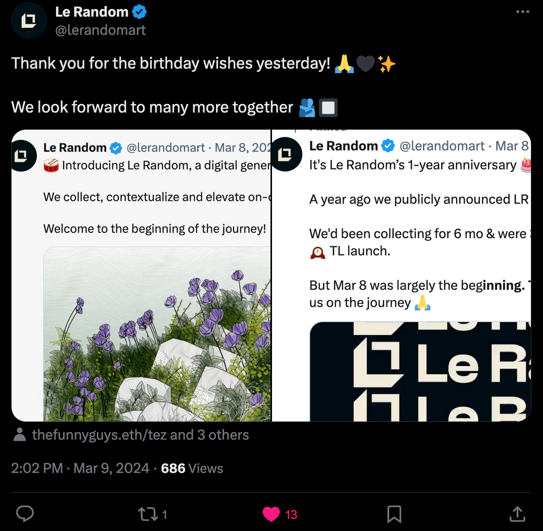
Happy Birthday Le Random, and thank you for all the wonderful articles and interviews throughout the past year! Naturally we also get a new piece from Monk, in which he writes about how we got to where we are today with generative art, recounting how the machine has played a crucial role in reinventing how we make art and how it greatly augments our art making capabilities:

Combine24 Generative Art Competition
In other news, the Finish National Gallery just recently announced that they're organizing an open generative art competition; you can find more info about it over on the official announcement page:
The submission period for the competition runs from March 1st to May 31st, so there's still plenty of time. The only requirements for your artwork are that A) it needs to make use of the provided CC0 dataset that represents the gallery's collection, and B) it to be an original work minted as a generative project on Highlight:
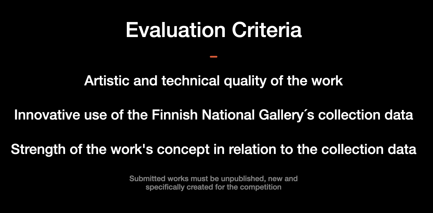
If I find the time, I might give it a shot and participate. But it might be challenging for me personally at least, since I'm not generally used to making data driven works. The first idea that comes to mind is training a neural network of some sort on the dataset and then have it imagine new outputs, but that's hardly very innovative - it would still need to have some sort of creative twist. Besides, it's also been a minute since I've done anything ML related.
Another idea would be some form of generative dadaist collage, but that would also be outside of my comfort zone, and I'm not certain how you'd go about implementing it - since the final work needs to be minted on highlight, the image assets would also have to be stored somewhere. On second thought, maybe I should actually get a feel for the dataset first and then only do something with a subset of the images.
Tsubuyaki Processing by Koma Tebe
Koma Tebe never ceases to amaze us with his tweet sized code sorceries; in a recent creation of his he impresses with a cool metaball-esque sketch, that makes use of a cool P5 trick that I had almost forgotten about:
The secret to this one is the filter() function that comes out of the box with p5js, which lets you apply an image filter to all pixels of the canvas at once, such as the BLUR and THRESHOLD filters in this instance. Quickly popping Koma's code into the P5 editor and toggling off the two filters, we can get a feel for what's happening under the hood:
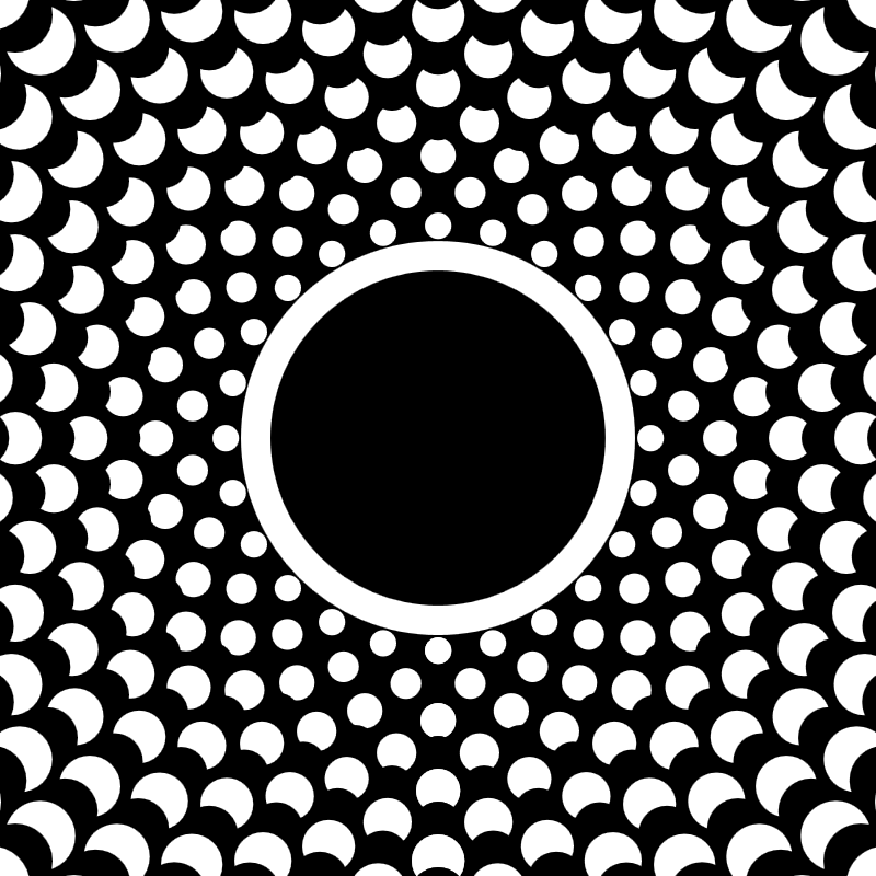
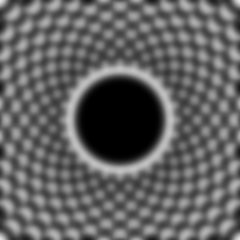
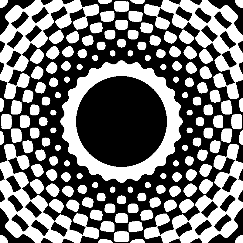
Base Pattern -> Blurred Canvas -> Thresholding the pixel values
The blur makes it such that the outward going circular shapes on the canvas blend into each other, while the threshold clamps these values back to a saturated black or white value. This makes it such that the shapes connect in a sort of goo-y, metaball-esque manner. Which has the nice side-effect that you can get different outcomes depending on the harshness of the blur and threshold parameters. Simply a classic P5 trick.
I also recommend checking out Koma Tebe's other sketches over on Twitter, since there's lots of cool tricks that can be learned from the Tsubuyaki format. And while we're talking about code golfing, another cool one I came across recently was by Steve over on Warpcast, in which he packages an entire web page inside of a tiny cast:
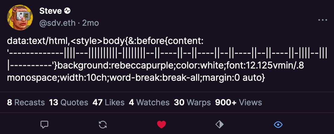
Initially I had some trouble figuring out what I was looking at, but that was due to being a Firefox user... which doesn't actually render the code properly. If you're viewing the cast in Chrome you can simply highlight the content of the cast, then right click it to reveal an option that says 'go:to' to open the code snippet as page in the browser (or alternatively drop the cast content into your address bar) - which will then reveal Steve's creation: the farcaster logo made entirely out of vertical slashes and horizontal dashes. It's a neat trick, and I'm wondering what more can be done with it since you technically could also include JavaScript within such a short code snippet.
Optical Illusions by Akiyoshi Kitaoka
I frequently browse Pinterest to find inspiration for my sketches, and my latest obsession has been optical illusions - they also seem to perform really well on social media since they're really powerful eye-catchers. I recently came across one that had me do a double-take, to check if I I was actually seeing correctly - have a look for yourself:
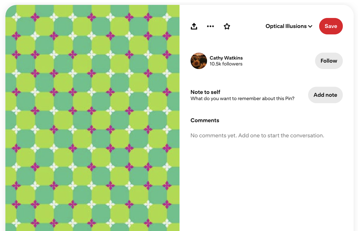
If you're not color-blind then it should appear as if the grid of alternating darker and lighter green tiles is warped in some manner - but that's actually just an optical illusion, the grid is actually perfectly square! And there's no bend to it whatsoever. So, what's actually going on? I quickly did a little investigation and recreated the pattern with code, also making an alternative version with different colors:
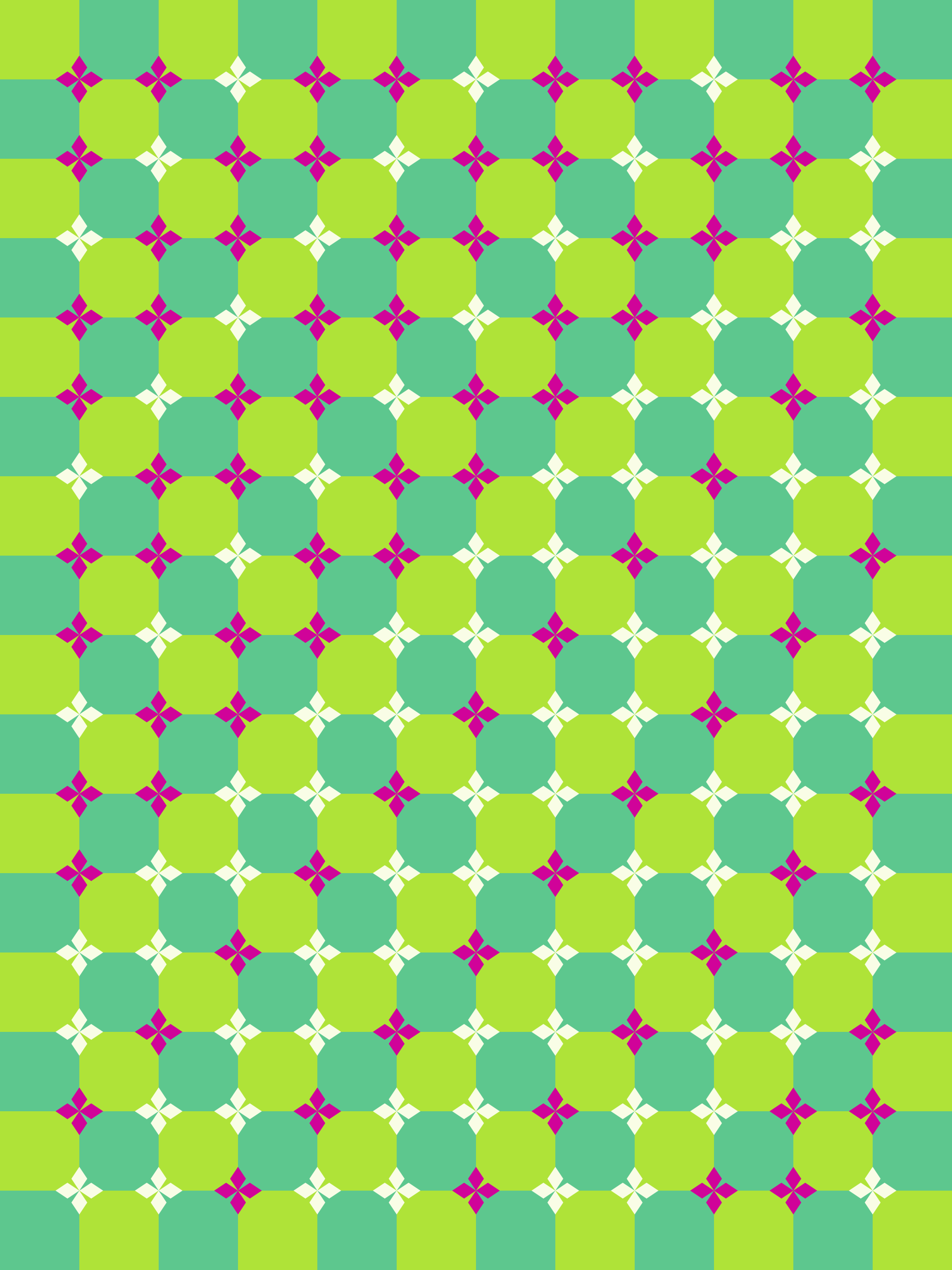
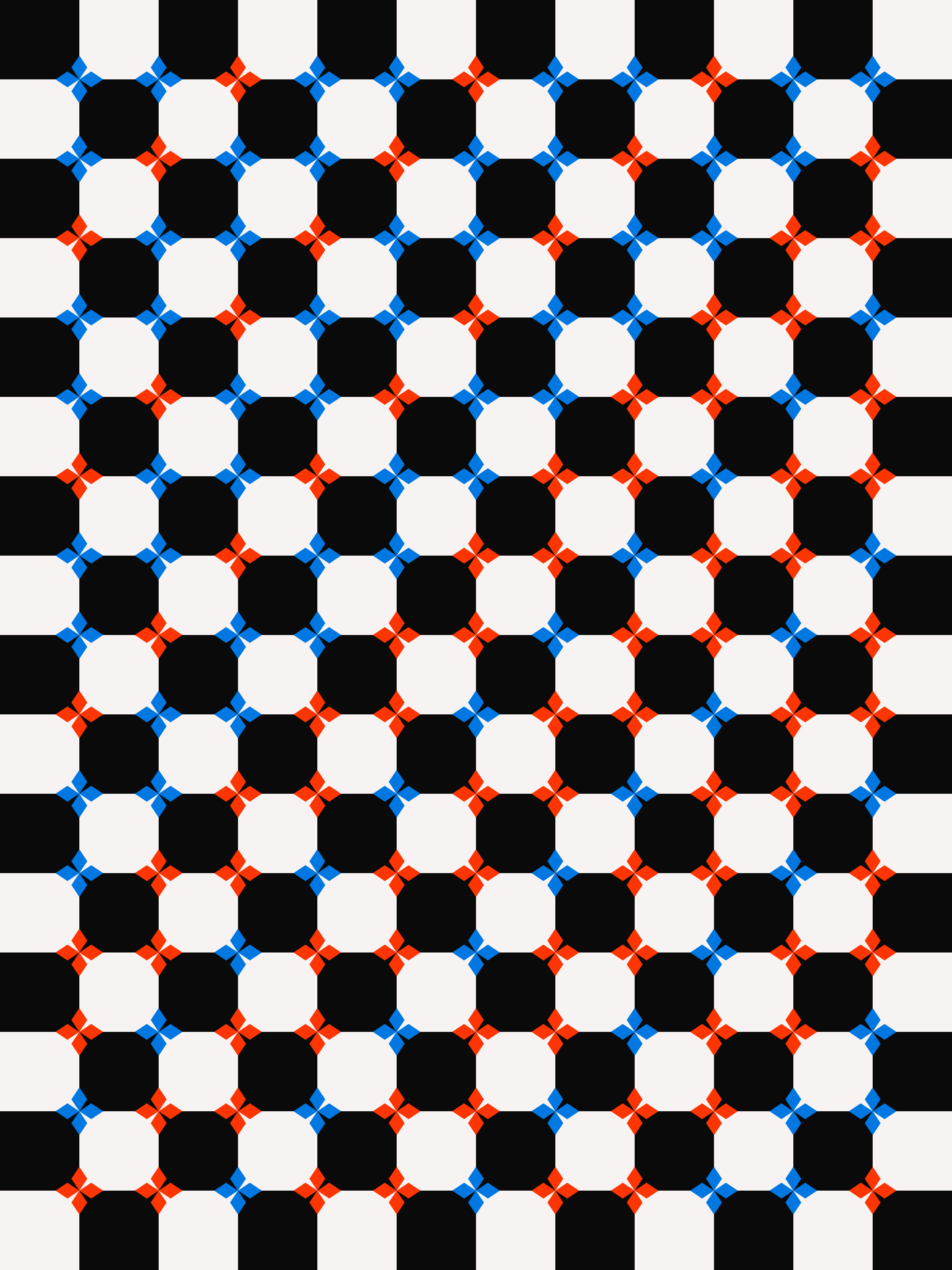
It's not a 1-to-1 copy of the pin when it comes to the placement of the pink and white geometric flowers, but the effect's still there, and even more pronounced when you scroll over the image. In the alternative version with different colors the effect didn't really come through - so it must have something to do with the actual colors! After posting it over in the birbsnest discord, Metamere jumped in explaining that it's an optical illusion invented (discovered?) by the Japanese professor Akiyoshi Kitaoka:
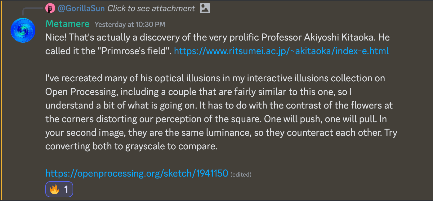
Turns out this specific pattern is called Primrose Field, and comes in different versions, it also works when the grid is grayscale and the geometric flowers are alternatingly black and white. But that's just one of many, many more optical illusions that Kitaoka has created - he's actually been documenting his works since 2002 over on a page titled Akiyoshi's illusion pages:
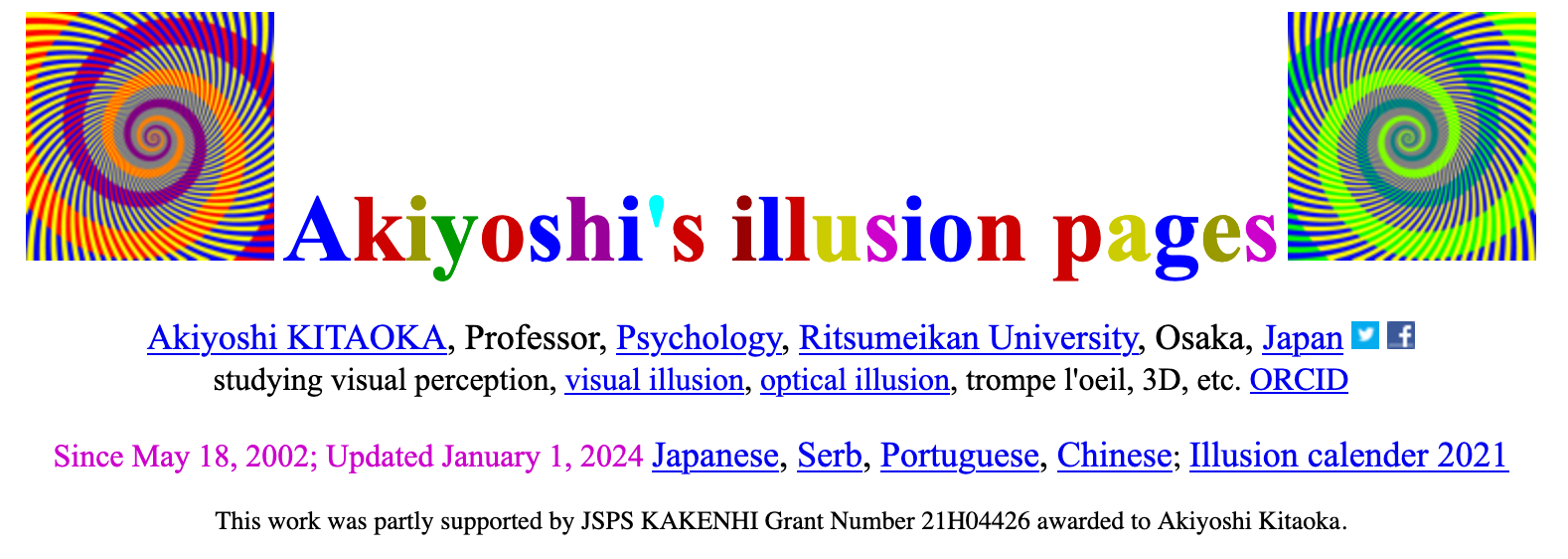
It's essentially a treasure trove for all sorts of different optical illusions - with a big focus on those that are still images but appear to be in motion whenever your gaze shifts, or when they fall into your peripheral vision. What's more is that Akiyoshi's illusions have made it onto quite a few influential album covers, such as Animal Collective's critically acclaimed album, Merriweather Post Pavilion, as well as Lady Gaga's 2013 album Artpop. You can learn more about Kitaoka's life over on Wikipedia:
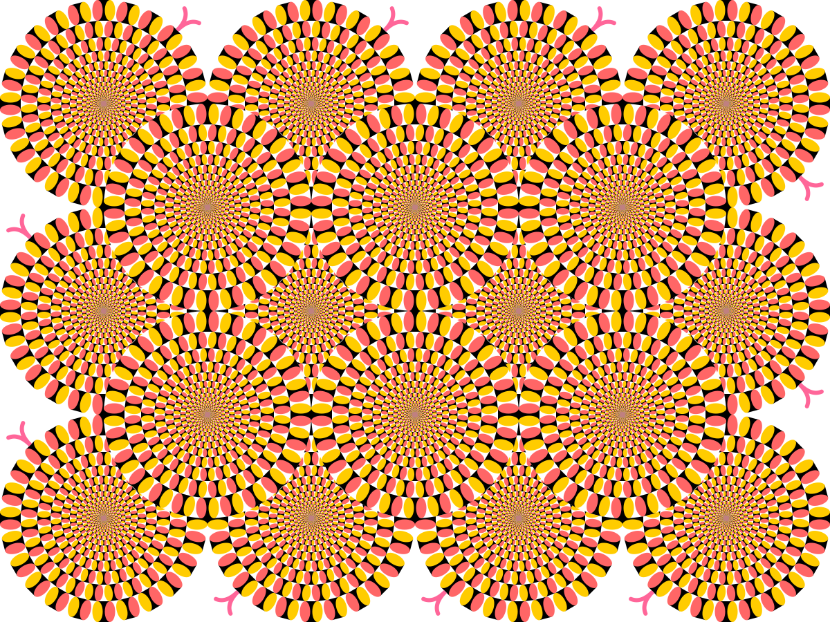
I'll probably try and recreate some more of his works and maybe even try to come up to remix them in a generative manner.
On SDFs by Inigo Quilez
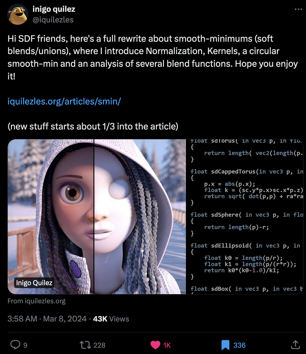
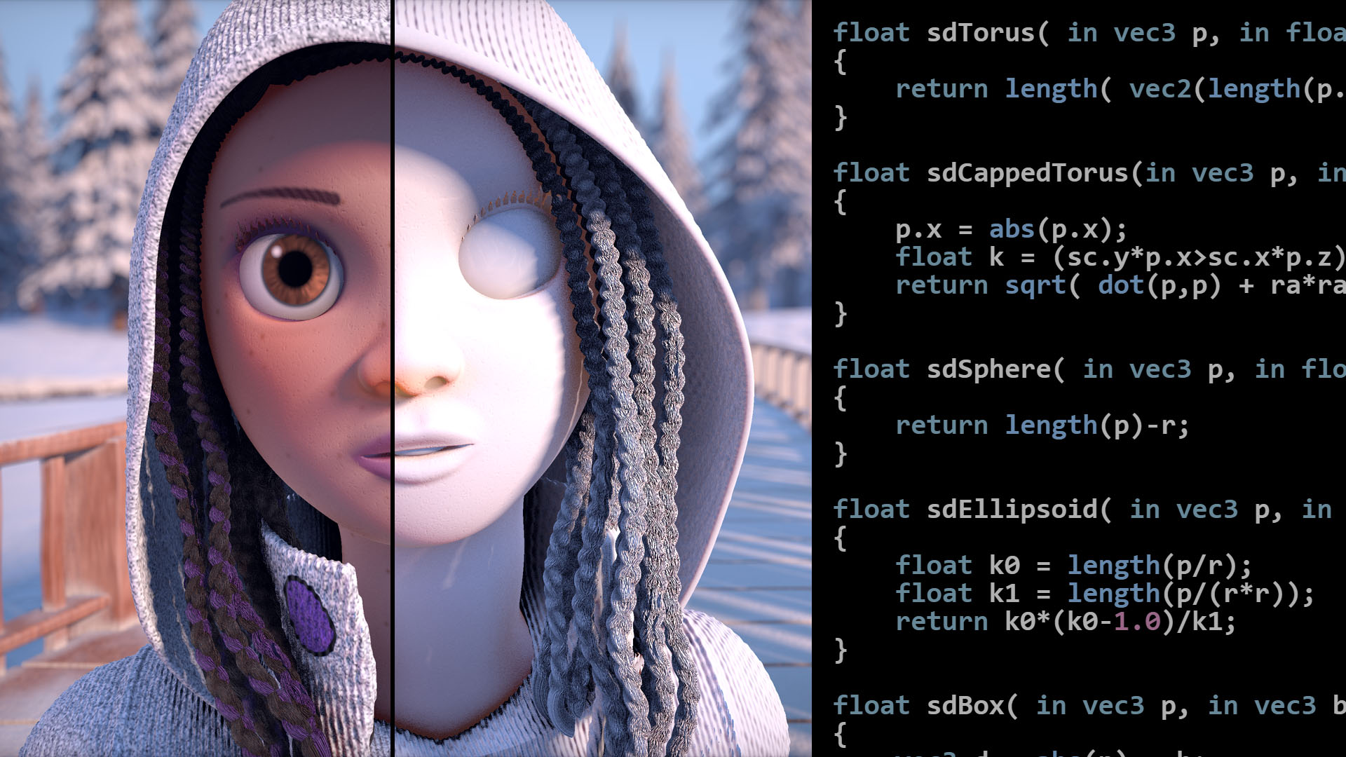
Inigo Quilez made a full rewrite for one of his stellar articles about SDFs, in which he introduces smooth-minimums and how they allow us to blend 3D shapes in a smooth manner:
Web3 News
The largest Genart Collection in History: Aux Arbres
A couple of days ago the minting period for Zanca's Aux Arbres concluded - and with over 70 thousand mints it indubitably went down as the largest blockchain art collection in history. A factor that played into this exorbitant number of mints likely has to do with the fact that Zancan's system kept revealing new types of variations, colors and patterns whenever a certain mint-number milestone was reached:
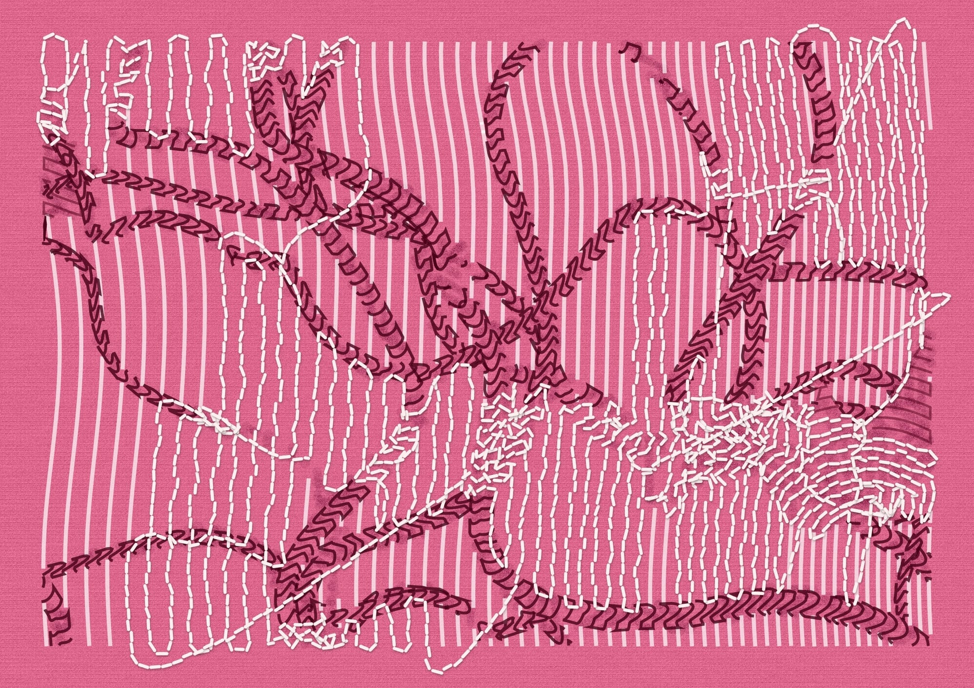
Some of the rarer variations that were revealed later throughout the minting will likely be highly valuable collector pieces in the future, for instance the honey-comb variation that was one of the last ones to be revealed, as well as a cool Smolskull crossover:

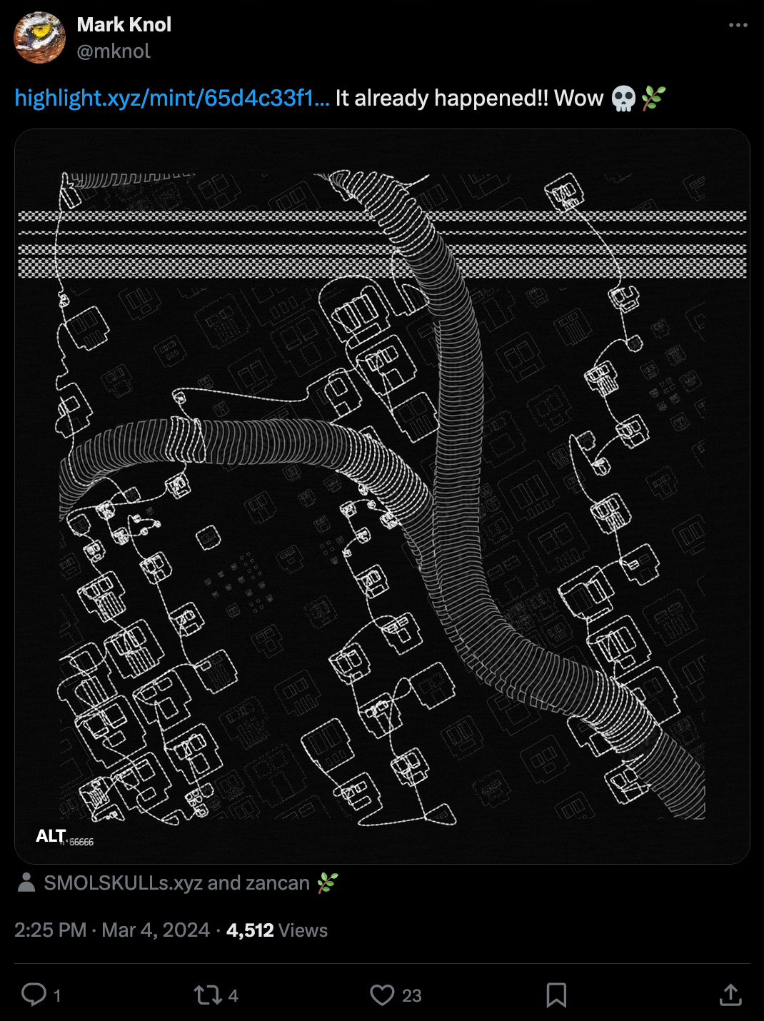
#74213 minted by @MorpheusSomnia | Link to Mark Knol's Tweet
After being asked about if there were still variations that were unrevealed, Zancan reveals to us that these variations weren't actually part of the original script but were added in during the minting of the project!
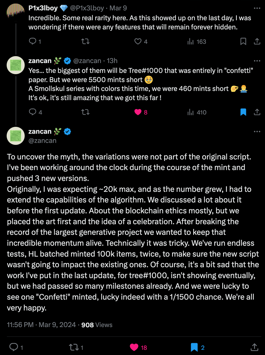
If Zancan hasn't already cemented himself as one of the greatest contemporary artists then this should do it, we'll likely still be talking about Aux Arbres for many years to come. I'm happy I didn't sleep on this one and have a few in my own (meager) collection.
ArtBlocks Self-Publishing Announcement
Last week Art Blocks made quite a big announcement, unveiling that with their recent acquisition of Sansa the platform is currently in the process of creating an environment that will make it possible for artists to self-publish their generative projects:
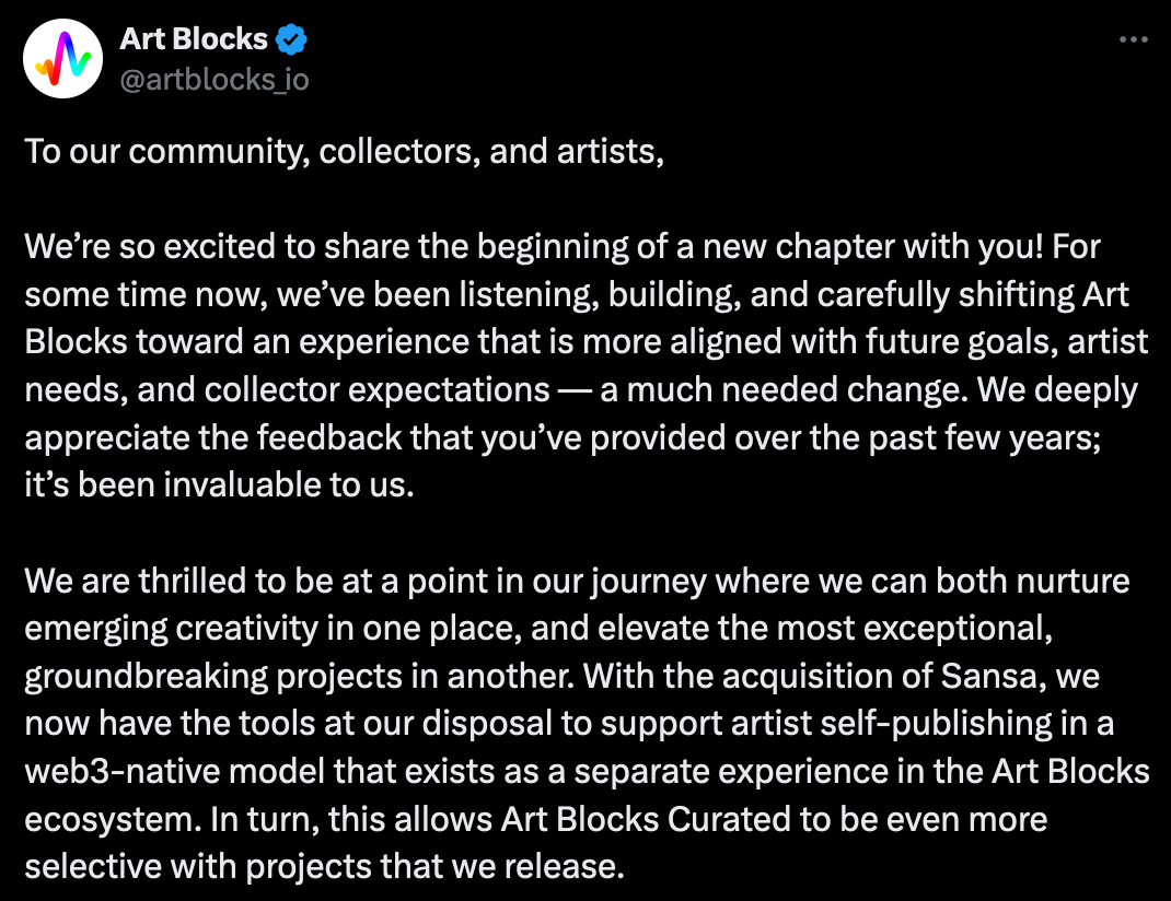
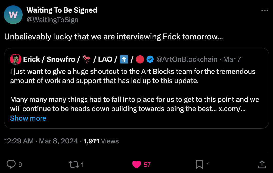
It is however not entirely clear how open this new branch of Art Blocks will be, considering that projects which weren't Art Blocks curated, still had to undergo some form of curatorial audit before obtaining a stamp of approval for being released. In other news, WTBS also made an announcement that they're recording an episode with Erick, and I believe that we should be getting more information about the upcoming changes to Art Blocks in that conversation:
Web & Tech
Naive Yearly by Are.na
I must confess that when I first came across Are.na, I didn't really get it - it simply seemed like a place for collecting things you find on the internet, and I can already do that in any kind of note taking app, so what's the point?
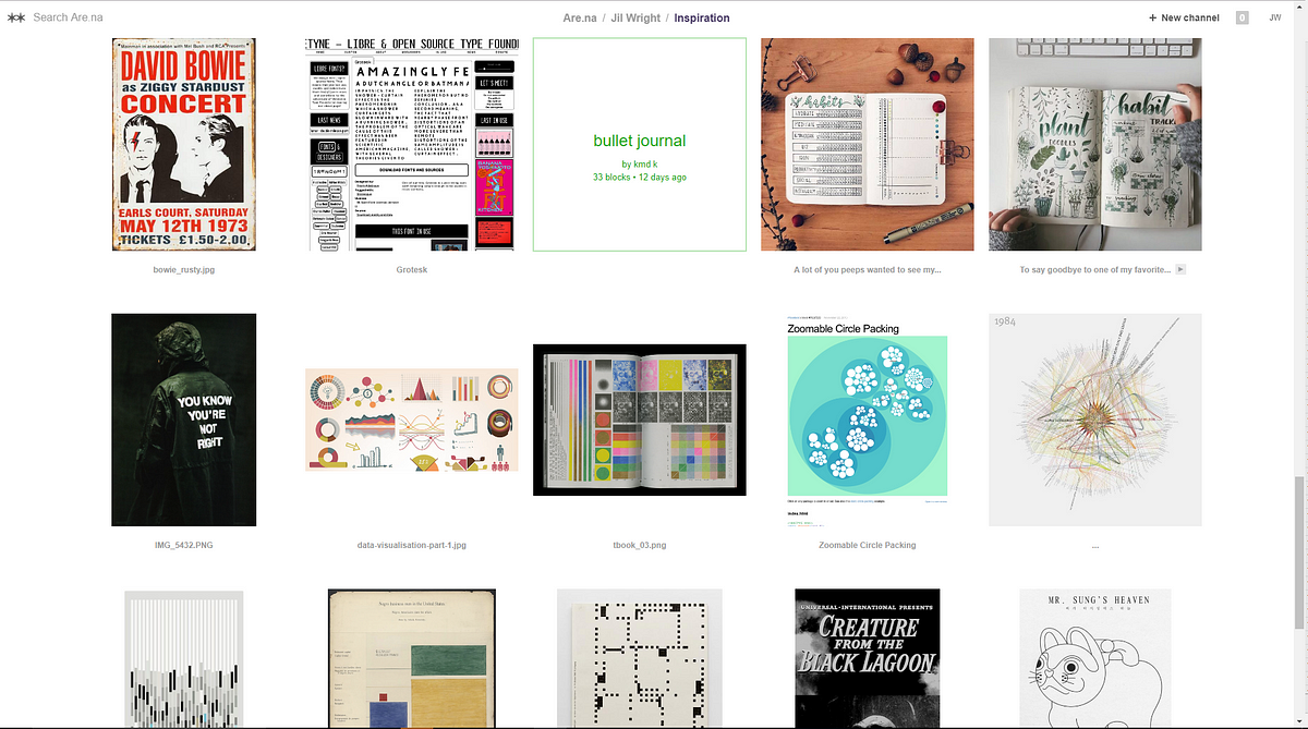
But I slowly came around, Are.na is a distraction free place on the internet where you can not just collect ideas and arbitrary types of content, but it also lets you organize your thoughts and give them structure, while providing social features tailored towards this end. If you're not familiar with Are.na, this article by Jil Wright describes it beautifully, explaining how she uses the platform as someone that has an information addiction (just like me):
Every year Are.na holds a conference gathering people who expand what the web is and can be. They document this conference in form of a web page with pieces that compliment the talks given by the invited speakers:
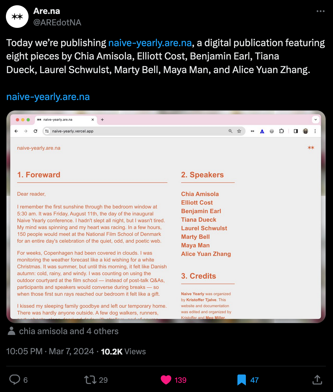
I highly encourage you to explore those pieces (by clicking on the speaker names in the list on the right) - my favorite is Maya Man's eulogy for Google's 'I'm Feeling Lucky' button that found the end of it's lifespan in 2010:
That said, if you're not on Are.na yet, go check it out!
Retrofitting Fluid Typography
Choosing fonts and an appropriate font-size for different text elements in a web page's UI is often more involved than it seems. In the age of responsive web design it often makes sense to scale font-sizes depending on the size of the browser's viewport that's displaying the page; and the most common solution nowadays is to apply a different font-size value whenever one of these breakpoints takes effect. This is a bit cumbersome as you'll have to create quite a few media queries in which you define the font-size values. Richard Rutter recently wrote an interesting article in which he takes a different approach that calls itself Fluid Typography:

Fluid Typography disposes of breakpoints and interpolates font-sizes depending on minimum and maximum values. It's a novel concept suggested by Utopia, which isn't a tool or framework, but rather a way of thinking about type and space in web design in a fluid manner. Although it sounds a little pretentious, I recommend giving Utopia's introductory video a watch, where they explain the concept and overall approach:
Over on their website they provide a couple of free tools, like font calculators, for you to use and get started with fluid typography yourself:

CSS Scroll-triggered Animations
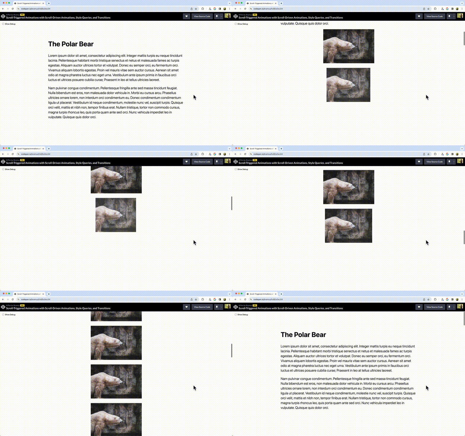
Modern CSS is truly a treat - Ryan Mulligan recently wrote an interesting article about scroll-triggered animations that are purely done with CSS:
His article is inspired by an experiment from last year by Bramus van Damme that's also worth a read:
AI Corner
Why future AI won't revolve around Chatbots
The hype around our AI powered chat partners has yet to die down - and deservedly so, they've proven themselves to be extremely powerful tools for all sorts of tasks. We are however still limited in that our only means of communicating with them is through a prompt based interface. Fast Company discusses this issue in a recent article of theirs and showcases three companies that have already leveraged LLMs in innovative manners:
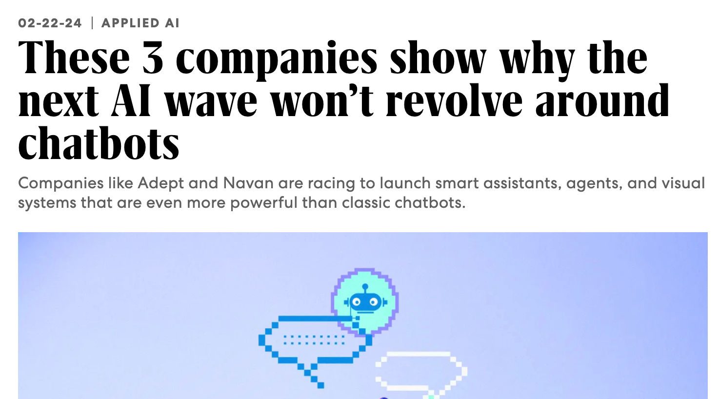
For instance, the second example they provide, a company pitted two LLMs against each other in a sort of conversation to come up with new ideas:
He started playing around with the idea of combining two large language models (LLMs), one to gather travel data and the other to analyze company spending. What if those two LLMs had a kind of conversation? And what if they instructed one of those LLMs to act as if it were a CFO who needed to prepare a board presentation on how to save money on corporate travel?
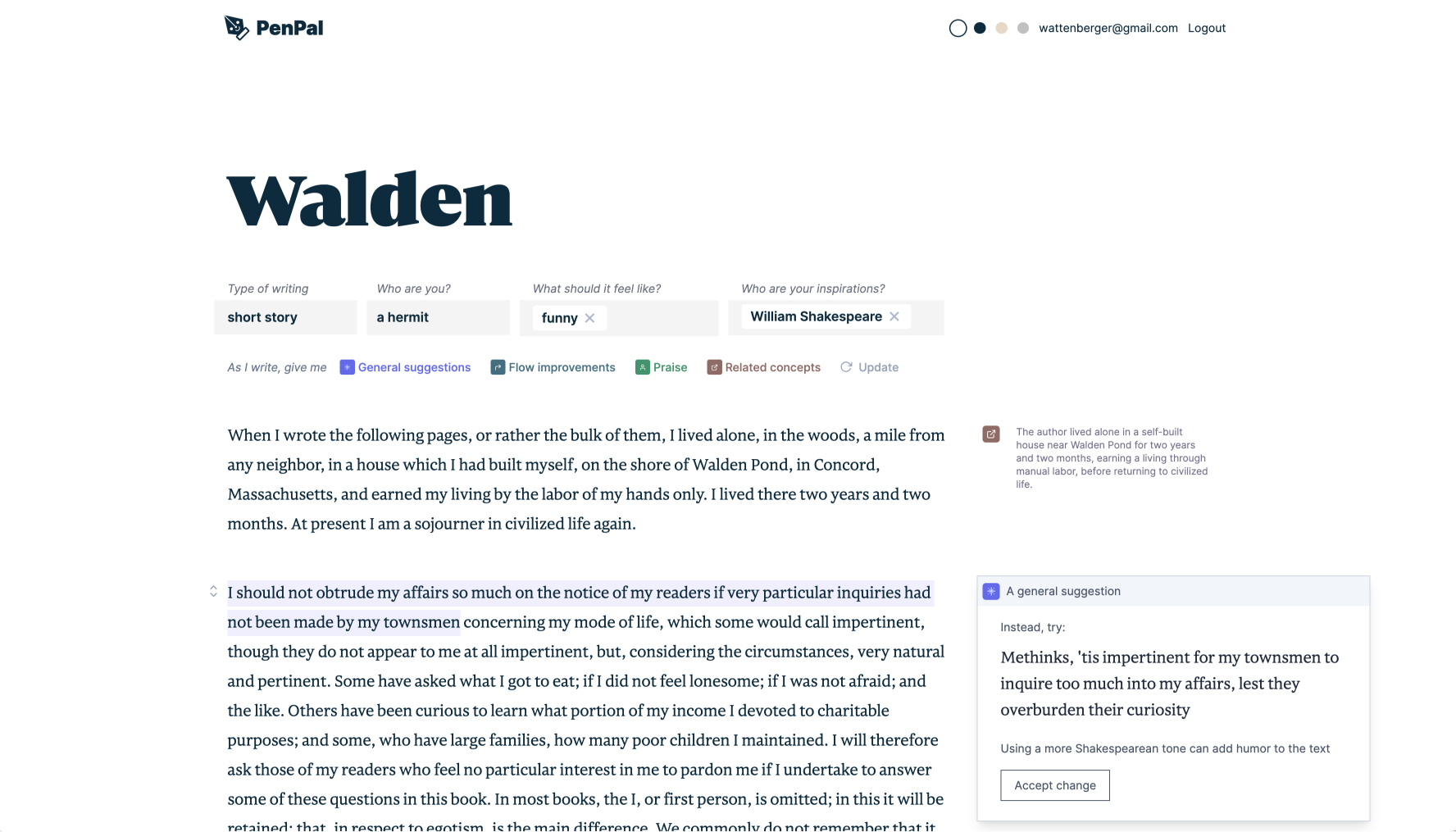
A relevant article in this regard is by Amelia Wattenberger back from 2023, in which she had already identified this same issue and also tackles it from a UI perspective:
An AI masterpiece better than Dune 2
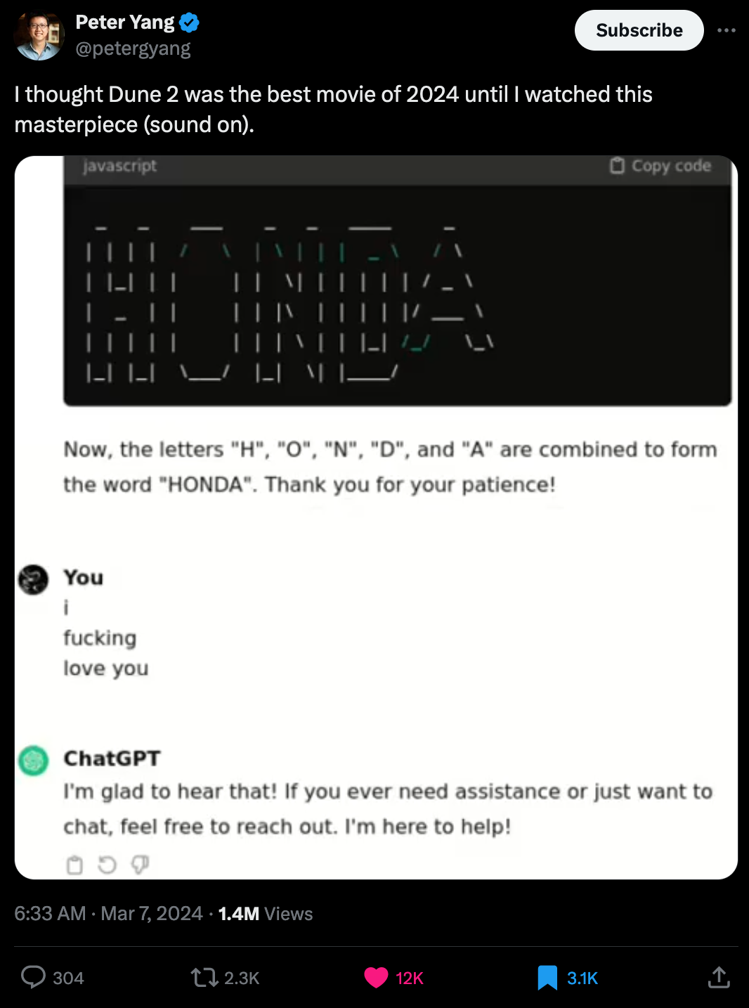
This one isn't educative in the least bit, but as someone who's attempted to make ASCII art with ChatGPT's help, I highly enjoyed watching this dramatic chat of someone with far more patience that I do:
Gorilla Updates
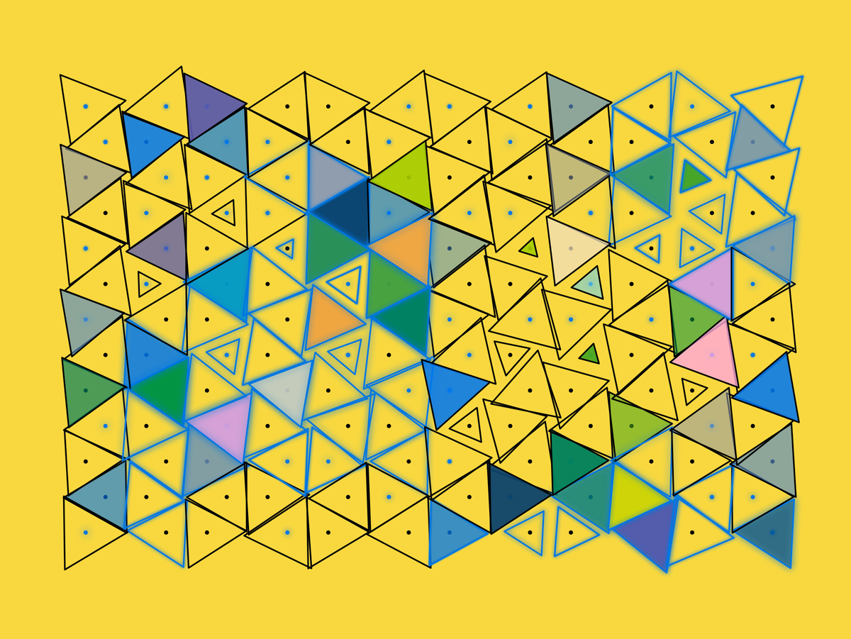
I've been deep, deep in CSS hell again this past week, in an attempt to figure out a relatively decent design for a new landing page for the Newsletter, and there's still not much to really show right now, except a big stinkin pile of broken CSS. I did however find a little bit of time for some generative shenanigans - I already mentioned the little Akiyoshi Kitaoka inspired optical illusion sketch earlier - but I also explored another idea that involves a triangular lattice inspired by yet another thing I saw on Pinterest:
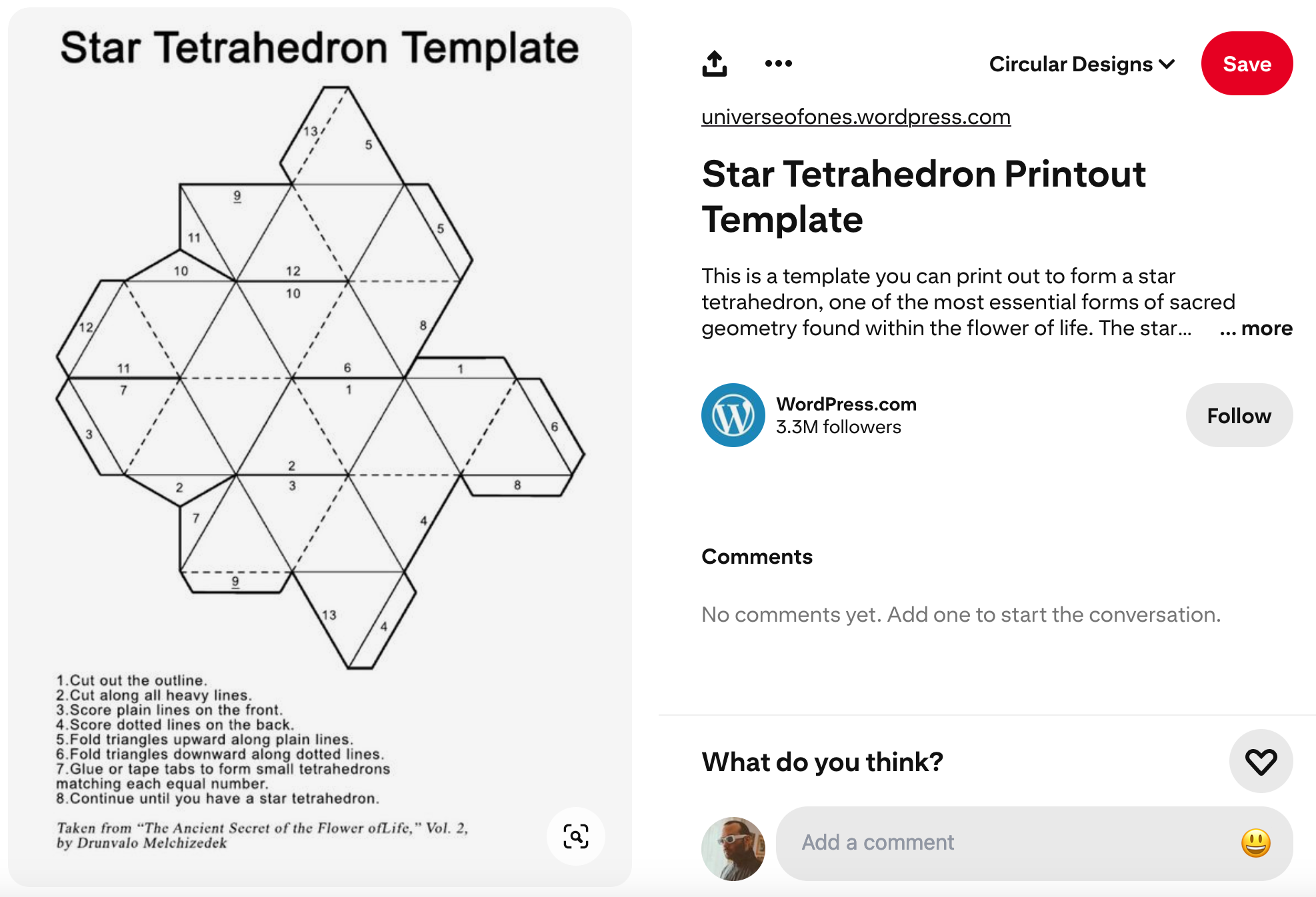

I thought that the unfolded cutout for the star tetrahedron looked really cool - from an artistic POV it's more interesting than the actual 3D shape that it forms, to me at least. Apparently these are called nets:

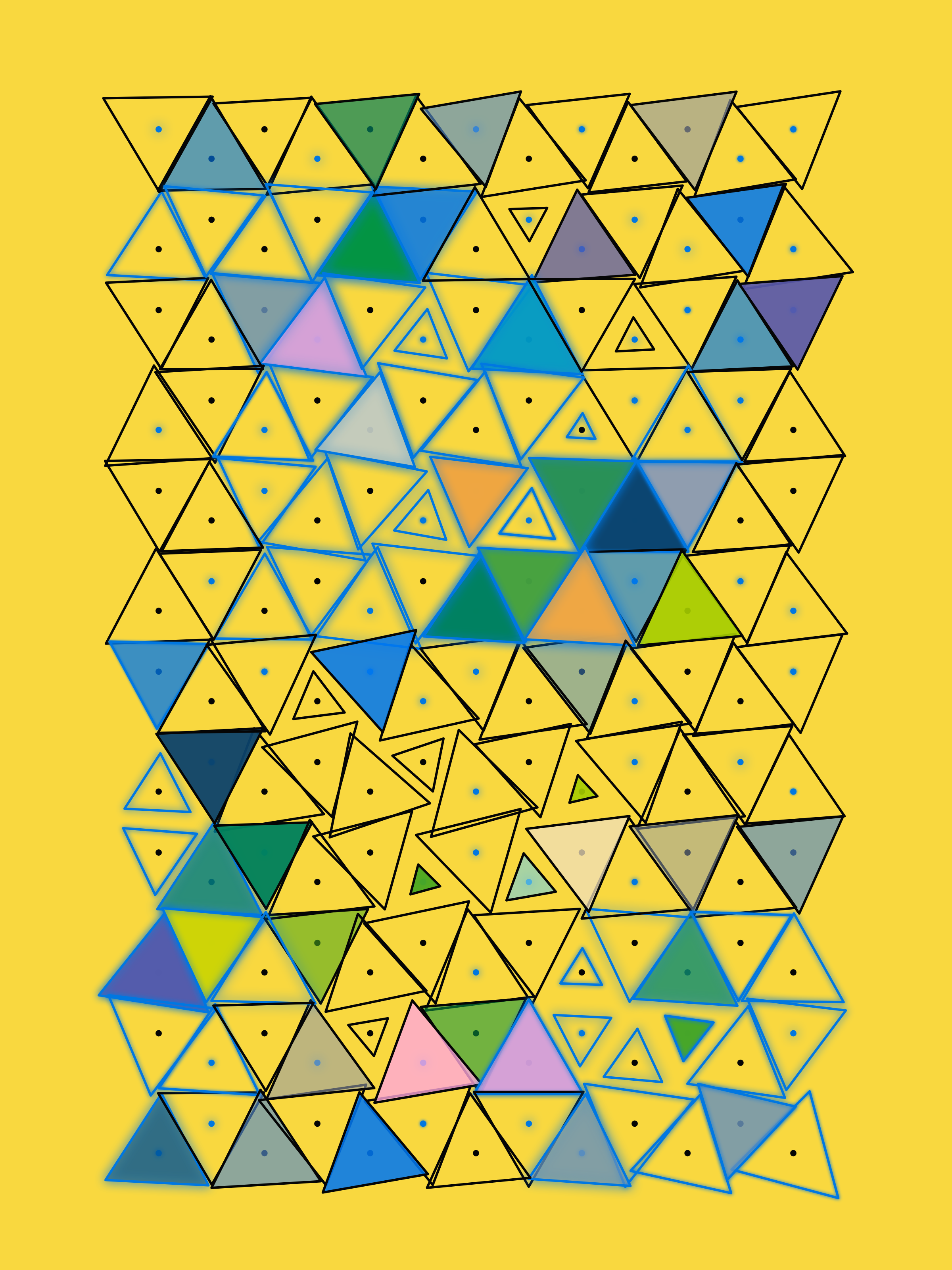
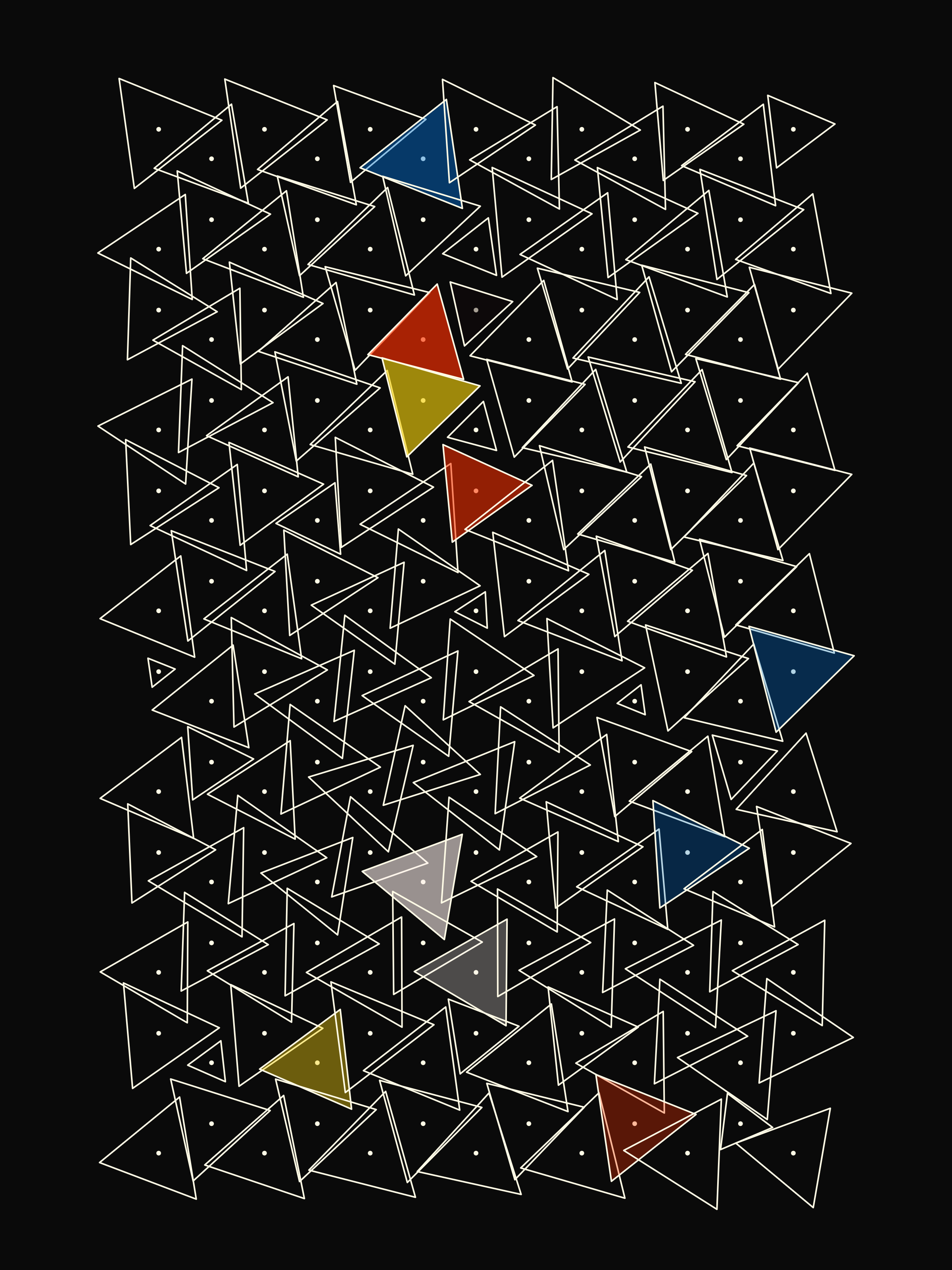
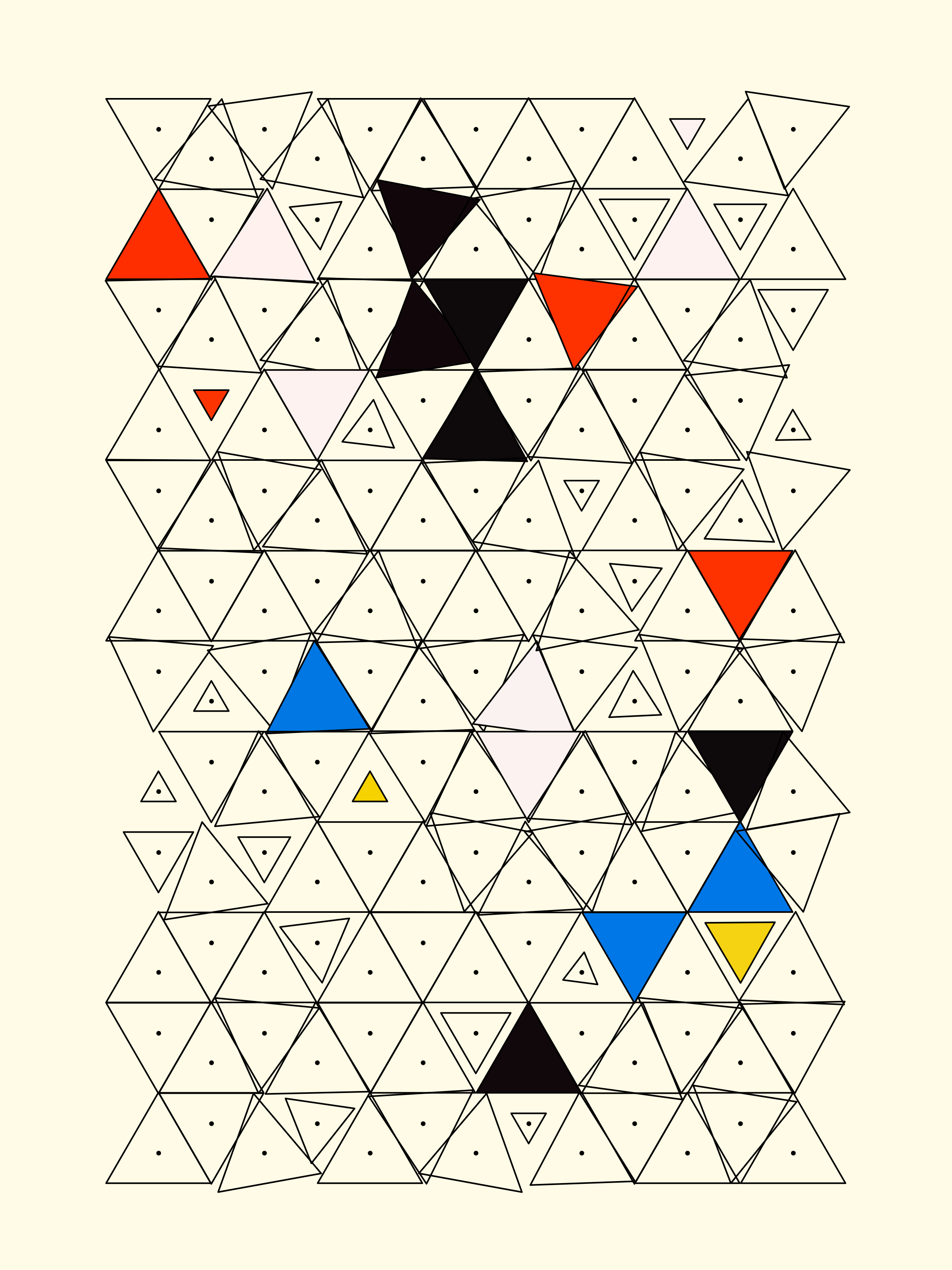
Looking just a little bit more into it, if you're looking for an algorithm to unfold a 3D shape onto a 2D plane you'd probably be looking at UV unwrapping. But yet again, I was all out of time for exploring internet rabbit holes this week... so maybe that's something better left for next week. And that's not really what I wanted to do in the first place, I just wanted to generate some interesting triangle patterns, so I started out simple and just did a little grid/lattice in which I apply some random rotations to the individual triangles, and I feel that there's already something there:
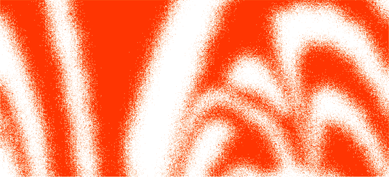
Besides that I also finally got another idea out of my system that I've been thinking about ever since I made my sketch for Genuary 2024's Wobbly prompt - and it turned out differently from what I had envisioned, but in a good way actually! In my mind I was envisioning a circular thing that had wavy bands shooting outwards from the center, but it ended up looking somewhat 3D, with the bend of the bands conveying some sort of additional depth:
Music for Coding
If you're a fan of Nujabes, then this one by Uyama Hiroto will hit the sweet spot - Freeform Jazz is Hiroto san's third full-length studio album released in 2016:
The overall sound is hard to describe, somehow distant and mysterious, but still raw and intimate, uneasy but relaxed. Each track is very different and unique, but the entirety of the album still flows really well and blends into a beautiful larger whole that never loses your attention. A relevant piece of writing here is a conversation between Uyama with his editor and music compiler Hashimoto Toru that shines light on how the album came to be:
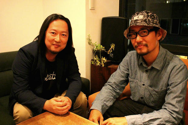
It is, as implied by the title, a work that is free in form. Alongside the beautiful ensembles characteristic of Uyama, the release is filled with freaky beats, experimental ideas, and dope song progressions, lulling the listener into a false sense of security.
In the famous words of Patrick Star "Now you must acquire a taste for... Freeform Jazz" - but I believe that it's not too difficult to do so when the Jazz is presented as beautifully as this. After giving the album a full listen, I have to say that it's very likely going to establish itself as a personal favorite. Being considered as Nujabes right-hand man, they have worked closely together on multiple tracks - here's one of them that I found to be stellar:
That's it from me this week, hope you enjoyed this week's curated list of generative art and tech shenanigans - now that you've made it through the newsletter, you might as well share it with someone that you know who might enjoy this kind of content - sharing the newsletter is one of the best ways to support it!
If you've read this far, thanks a million! And if you're still hungry for more Generative art things, you can check out the most recent issue of the Newsletter here:
And if that's not enough, you can find a backlog of all previous Gorilla Newsletter issues here:
Cheers, happy sketching, and again, hope that you have a fantastic week! See you in the next one - Gorilla Sun 🌸 If you're interested in sponsoring or advertising with the Newsletter - reach out!
