Welcome back everyone 👋 and a heartfelt thank you to all new subscribers that joined in the past week!
This is the 49th issue of the Gorilla Newsletter - a weekly online publication that sums up everything noteworthy from the past week in generative art, creative coding, tech and AI - as well as a sprinkle of my own endeavors.
Before we get started - for some reason last week's newsletter was intercepted by many a spam filter, I don't know exactly why, and it's the first time that this happens. My hunch is that I might have used some words that the spam filter doesn't like, which I'll be more careful with in the future.
If you got a second to check your spam folder and mark the Newsletter as 'not spam', that would actually help tremendously! It sends a positive signal and helps improve the overall deliverability of the Newsletter!
That said, I hope that you're all having a great start into the week! Let's get into it! 👇
All the Generative Things
Demystifying Generative Aesthetics
Among the very first videos that I've watched on generative art is Tyler Hobbs' iconic talk at Clojure Con 2018 'Code goes in, Art Comes out'. He begins his presentation with a number of loaded questions:
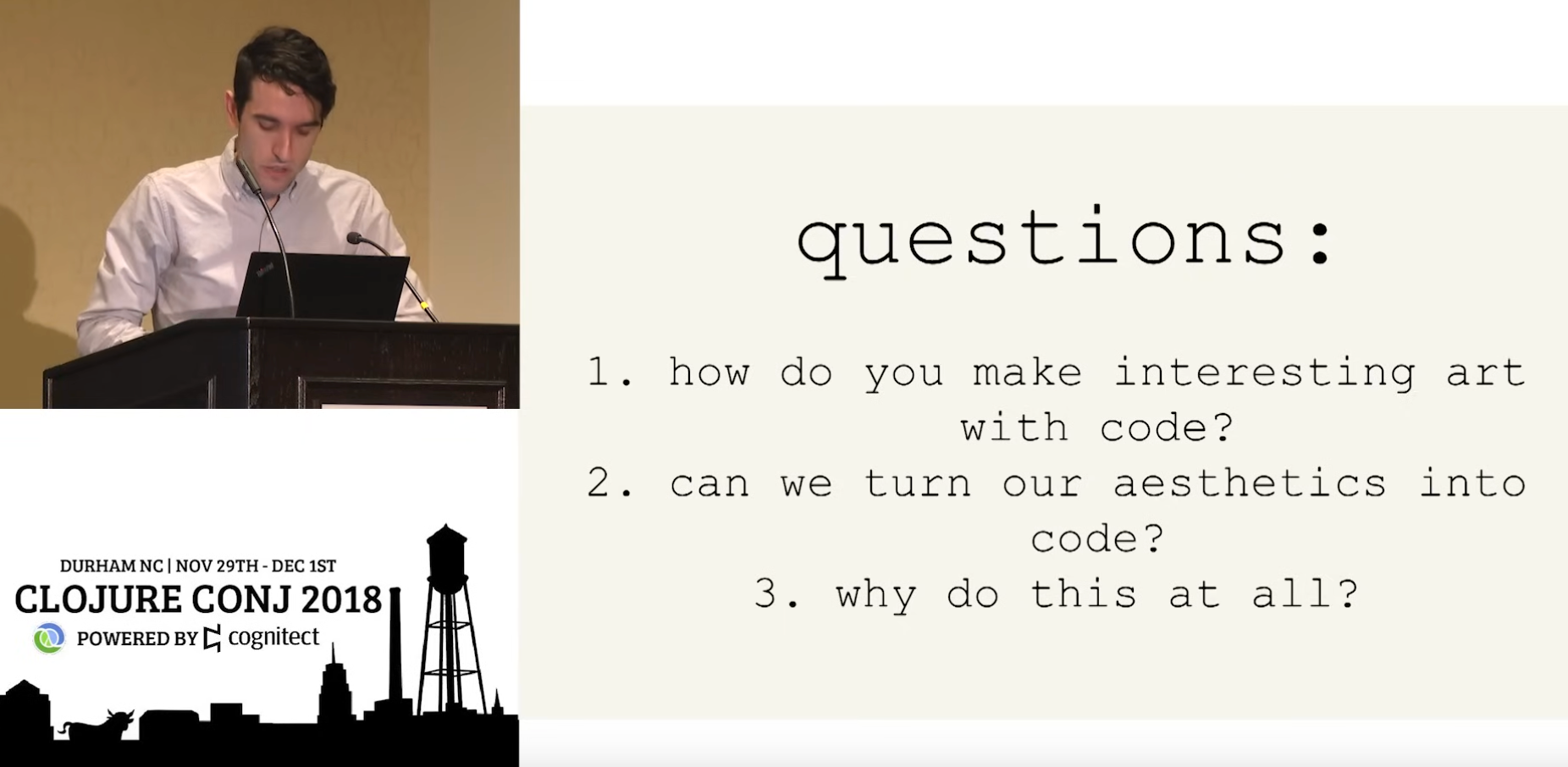
What actually makes for an interesting artwork? And more specifically, what makes for an interesting generative artwork? Are the requirements different just because it's made with code? This question bothered me for a long time because there isn't really a clear cut objective answer to it - in some cases I can't even explain to myself why I feel drawn to a particular artwork or why it evokes something inside of me — "Ugh, you know, the colors are nice, and stuff"
That's why I've really fallen in love with Monk's article on this topic from a couple of months ago, titled 'Demystifying Generative Art', he hypothesizes a framework for the analysis, evaluation and appreciation of generative art:
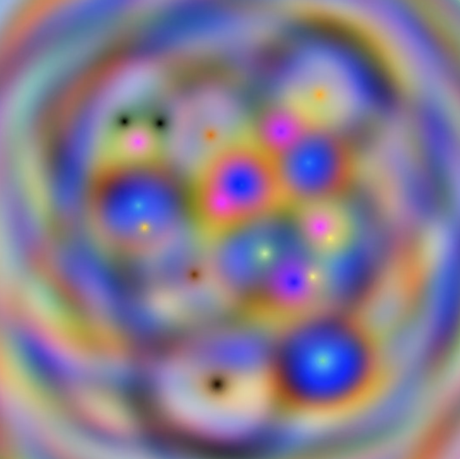
Generative art is quite a unique artform when compared to other art practices, and that's primarily due to the artist not directly creating the artwork, but rather a somewhat autonomous system that is in charge of generating the actual outputs. This gives rise to new evaluation criteria: should we now place emphasis on the qualities of this system? Or the process that goes into the creation of this system? Both? Neither? Maybe the system isn't so important after all, and what truly matters is still the final result that comes out on the other end - after all, that's in many cases the only thing that the audience will ultimately interact with.
Each one of these questions can be leveraged as a unique angle of analysis - a lens as Monk calls them - to further examine what makes for an interesting generative artwork. While Monk's pilot article focused on introducing a potential framework, the second installment places emphasis on the aesthetics, and examines the criteria to evaluate them:

Monk explains that we require a mixed approach, we not only need to consider traditional design principles, but also modern, digital, criteria - particularly the algorithmic considerations that are unique to generative art. Whether you're a generative artist, a collector, or simply someone that is interested in the art form, these are essential reads, and a great deal can be learned from Monk's insightful writing. As always I thoroughly enjoyed it, and am eagerly awaiting the next installment!
Inside the Machine
Santiago Ortiz recently shared a data visualization experiment which made quite the ripples over on Twitter - by asking ChatGPT to complete the same prompt "Intelligence is" hundreds of times and subsequently visualizing the results with an interesting interface, he enables us to peer into the mind of the smart text generator:
I believe that this could be an interesting exploratory tool to examine the output space of an LLM. I often find that I have to tune my input prompts to guide the answers that the chatbot returns, and nudge them into a satisfactory direction. It's pretty much trial and error. This also just makes me realize how slow LLMs still are, all things considered, having this kind of tool run in real-time could be a game changer.
Beyond that, I think that it reveals something more profound about LLMs, and it's humbling really. Seeing the outputs exposed in such a manner does ultimately exemplify that they're simply text generators, albeit very powerful ones they merely complete input sequences. If you were to repeatedly ask a person to complete the phrase "Intelligence is", they'll likely tell you off and to stop pestering them with stupid questions after the third time.
The HTML Review
The HTML review describes itself as an annual journal of literature made to exist on the web. Edited by Maxwell Neely-Cohen and Shelby Wilson, it strives to collect and showcase web-based experiments and experiences that act as story-telling devices. After being drawn in by the intriguing circular design shown in the tweet, I quickly realized that I had stumbled upon a treasure trove of internet art:
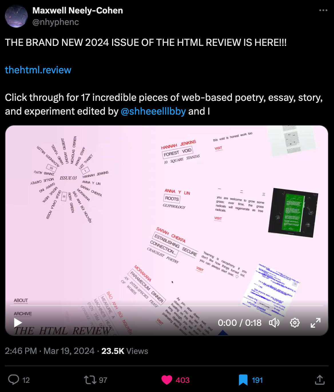
And it reminds me a lot of NET art; many of the showcased projects make me feel the same way, almost as if you're going through someone's diary, intimate experiences where the authors share their stories with you. While I didn't have too much time to dig into all of the showcased projects, my personal highlight was this web essay by Garry Ing, where the interactivity of the page ties into its narrative:
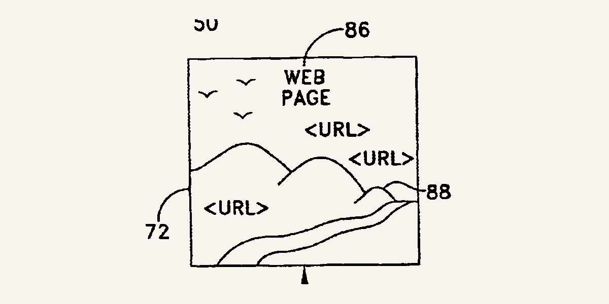
Recounting the history of the view source button that every web browser now makes readily available, he lets us simultaneously inspect the HTML tags of the elements that make up the essay's page. I highly recommend giving it a read! Beside this, if you have a cool project of your own that goes in this direction, you might want to pitch it to the HTML review. In their about section they elaborate a bit what kind of projects they're generally looking for:
We especially love when the subject matter of a piece has nothing to do with the web or technology, but the medium is merely a means to further the story and poetry.
P5JS' New Website
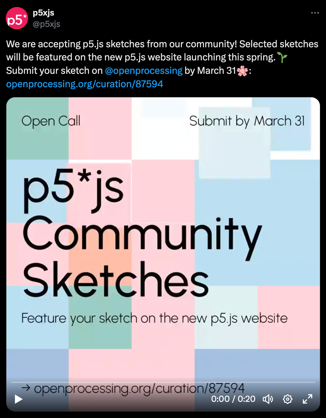
P5JS's new website is bound to launch this spring, and for the occasion they're currently accepting submissions from the community to later showcase on the website when it eventually comes out. Submissions are open until the 31st of March, and need to be submitted to the respective curation over on Openprocessing:
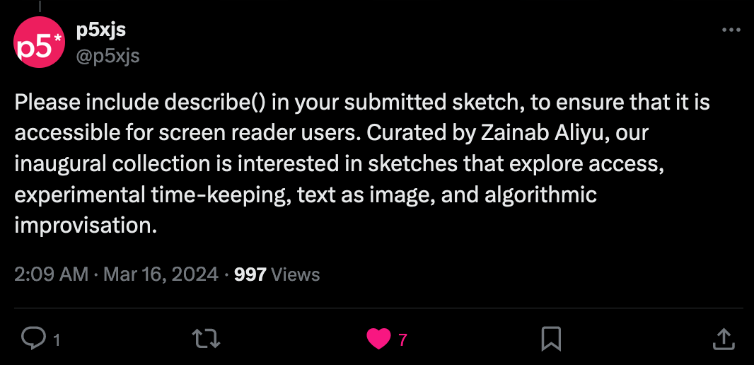
An important detail that you might miss if you don't check the tweet's replies is that you should also use the describe() function that lets you add a screen-reader accessible text to your canvas creation:
Web3 News
Maybe it's just me, but the past couple of months have been absolutely bonkers in terms of web3 and generative art. First we've had fxhash's launch on Ethereum at the end of 2023, and then more recently its Base integration earlier this month, then we also had Art Blocks' announcement of acquiring Sansa and their plans on greatly expanding their eco-system, and all of that while Highlight is dropping banger after banger, culminating in the largest generative art collection in history with Zancan's Aux Arbres.
That is to say that it's overall been an incredibly exciting time in the space, and it seems that things are moving forward really quickly!
WTBS in Conversation with Erick Calderon
We've all been eagerly waiting for the newest episode of the WTBS podcast after they teased it a couple weeks ago - this time, they're in conversation with Erick Calderon, aka Snowfro, who's probably best known for being one of the founders of Art Blocks. In their conversation they ask him all about the recent acquisition of Sansa, and what it means for the future of Art Blocks:
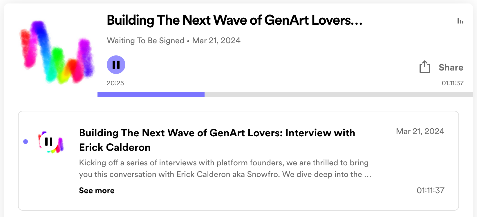
The acquiry of Sansa is mainly motivated by Art Blocks desire to cater to the collectors that lean towards a more data-driven approach to collecting, while wanting to remain a art-forward platform at the core. Sansa was originally built around Art Blocks and already has all of the tools to provide such an experience. Beyond that, Art Blocks will however remain a curated platform even with this expansion, artists will still need to apply and get a stamp of approval before being able to release their project on the platform - and for a good reason as there's just too many problems with a completely open approach. Erick states "I don't have the courage to be an open platform"
Another thing that really came through in the conversation, is that we're still incredibly early; we're at the very forefront of something that's going to be much bigger in the future. The generative art scene is still very much a niche when compared to other spaces, Erick gives a good example of this, consider how many iphones are sold every year by Apple - a whopping 232 million in 2023 - compared to the 2 million generative art NFTs that have been sold overall, as Erick estimates.
But despite this, I'd wager that NFTs are here to stay and no longer just an experimental new technology, especially when I see what the different players in the field are currently building, how they're innovating, and how the eco-system is becoming more interoperable.
[20:37] Getting your work timestamped on the blockchain is critical right now, don't be disappointed and don't be discouraged with the market, get it out there because you are staking your place in history prior to the day where I can go to ChatGPT and ask it "Please, build me the entire Art Blocks platform with 75 projects of great variety"[...]
An Update from fxhash
Ciphrd recently posted a big announcement over in the fxhash discord, explaining why it might appear from the outside that the platform has been somewhat inactive, and why it's been necessary to take some time to regroup and figure out how to rebuild a strong foundation and clear all of the tech debt that the platform has accumulated over time:
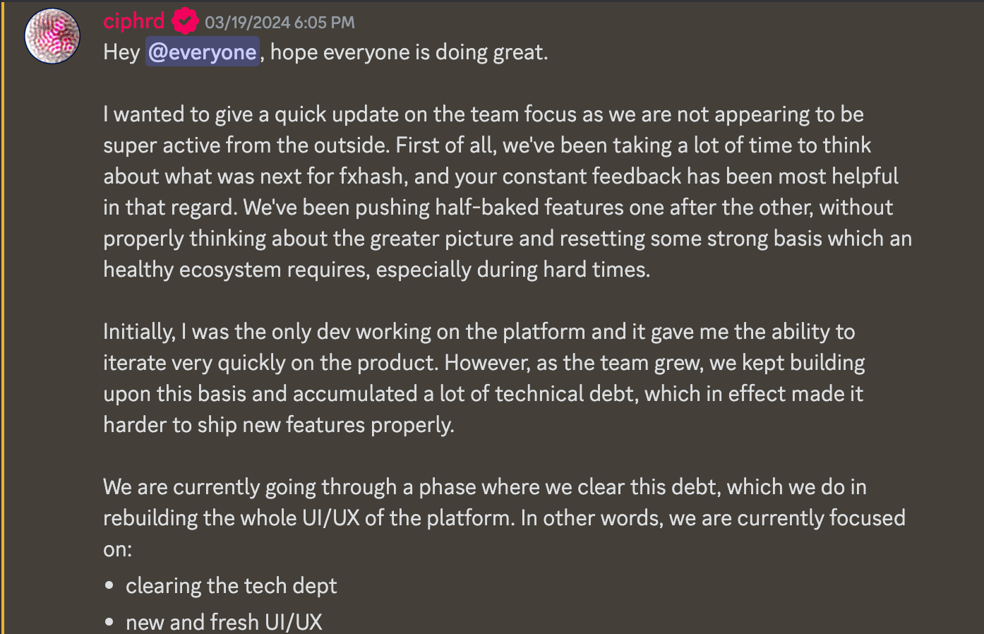
Ever since its inception fxhash has grown incredibly quickly, both in terms of platform features as well as in terms of community size. Emerging from the remnants of the hicetnunc community towards the end of 2021, many generative artists quickly flocked towards the open platform that enabled them to publish their work in a web-native manner.
And I remember, it was so wonderfully chaotic in the early days, for instance, you had to wait a couple of hours for the minter to come through and reveal what had been minted. In those early days it absolutely made sense to build out the platform very quickly, and iterate rapidly to cater towards what its audience wanted - how many platforms have we already seen completely lose momentum and find their end of service earlier than expected?
Even if it means that things will slow down momentarily, I honestly believe that it's for the best to take some time, clear all of the technical debt and deliver a more refined fxhash experience. Especially considering that the scene has become more competitive. I for one, am eagerly awaiting the new design and am excited to dive into the new version of fxhash when it comes out.
Highlight Studio
This piece of news completely flew under my radar last week - but Highlight released their proprietary tool for aiding artists in developing their generative projects for the platform: Highlight Studio.
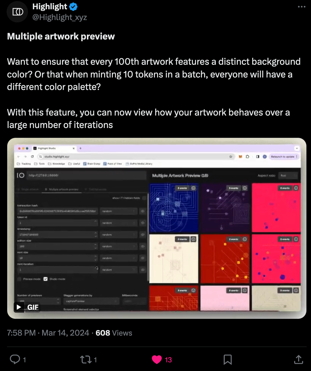
Although I haven't tried it yet, apparently there's two ways to use it; either directly from the highlight website where you simply drop in a link to your project running on localhost, or by downloading it as a script and including it in your project where you have more functionalities to play with. You can find more information about it over on Github:
Tech & Web Dev
CSS Flexbox vs. CSS Grid
Choosing between CSS Grid and Flexbox is a common web design dilemma. While the CSS Flexbox comes in handy for one-dimensional layouts and is super useful for arranging items linearly in a row or column, CSS grids on the other hand let you tackle two dimensional layouts more easily and allow for a more precise positioning of elements. There's many scenarios where both could be used interchangeably, which often gives rise to the age old debate on which one should be used.
Christine Vallaure recently published a deep-dive into exactly this topic, explaining both methods in detail, illustrating what each one is good for, and all of that in a way that is specifically geared towards UI designers who might not program the interface themselves:
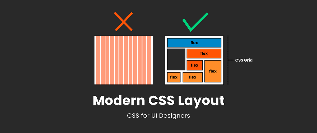
The most interesting part of the article is towards the end, where Vallaure addresses the usage of breakpoints in conjunction with these layout methods, enumerating a number of scenarios where the use of breakpoints is acceptable. for instance, whenever a more radical change of the layout is desired, or a component needs to completely change in appearance.
Recently, in modern, modern web design (not a typo) there's been a trend towards more fluid design that tries to avoid breakpoints as much as possible, ditching them in favor of fluid design approaches that can self-sufficiently adjust to different viewport sizes. A prime example for this is Utopia's fluid approach to scaling font sizes to different viewport widths respectively - covered in issue 47 of the newsletter. Might the future of responsive web design be breakpointless?
But anyway, kudos to Christine for putting together this great resource. Here's also another cool article on the two methods that I thought was put together really well:
A Formula for Responsive Font-Size
Last year when I migrated the blog over to Ghost I decided on using one of the free themes that they provide, namely the solo theme - now the blog looks a lot different than what you see in the theme, since I made quite a few modifications in the meantime.
When I first popped the theme into my code editor to try and make sense of what's going on in the CSS, and trying to make an adjustment to the size of the text I was met with the following line:
--content-font-size: clamp(1.7rem, 0.38vw + 1.4rem, 2rem);For the longest time I couldn't really make sense out of this line, but thinking about it for a second now, it actually makes sense, and turns out to be a cool trick to achieve somewhat responsive font sizes.
In CSS, a rem, short for “root-em”, is simply a relative unit of measure that's used for defining font sizes as well as other element dimensions, and is usually based on the font-size of the root element. Most browser will usually default it to 16px although users can change that influence this from the settings. Similarly, the vw term is a viewport width relative measure, a percentage essentially - 10vw would basically be equivalent to 10% of the viewport width.
Combining these two notions, we get the above line: basically a formula that makes the font-size grow and shrink depending on the overall width of the viewport, naturally also clamping it to a maximum and minimum value as well. I'm bringing all of this up because I recently came across this post by James Fisher where he talks exactly about this in a bit more detail:

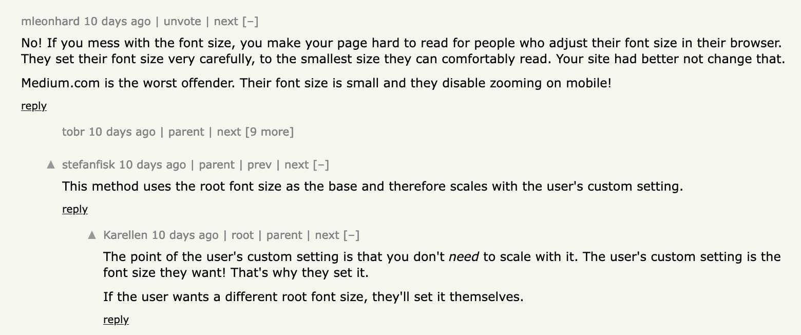
The comments over on Hackernews bring up some good points though, since users often set the root font-size themselves for an ideal reading experience, or have vision problems, it might be a bad idea to override this with a CSS rule like that when a specific font-size is desired. But I'm not certain which is right or wrong, maybe using breakpoints in this scenario might not be too bad after all:
The State of the Terminal
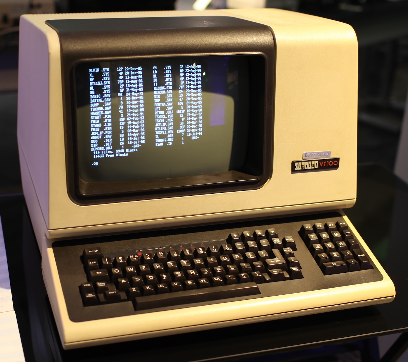
Gregory Anders published a companion article to a talk that he gave at Neovimconf 2023, titled 'The State of the Terminal' and with it he takes us back in time showing us some of the historical problems terminal based applications have had to deal with and how they were overcome before explaining how modern terminal emulators tackle these issues:
If you prefer a video format, a recording of the talk can be found here:
Gorilla Updates
RE:designing the Blog
This week I made some big progress on the redesign, and finally feel very confident about being able to complete the re-design in a reasonable amount of time. There's still a lot of details that I need to figure out to set myself up with a sustainable system, and there's still many pages that I still need to tackle. But, the heart-piece, the article template, is shaping up really nicely and close to completion now - here's what it currently looks like with a fancy dark mode as well:
And since we talked about the CSS Flexbox earlier, this new design solely relies on a Flexbox driven approach: the entirety of the page is contained within a big Flexbox, containing the vertical navigation bar on the left hand side (itself a vertical column flexbox), and the page content on the right that in turn nests other Flexboxes.
Why not use CSS grids though? Well because I never really learned how to use it, and never felt the need to so far, I have yet to run into a scenario where I'm not able to make the layout that I want with a Flexbox - although I will admit that sometimes there probably are many parts where it would make more sense to use a grid instead.
I'm also really happy about how the sidebar turned out; instead of solely applying a blur to the background when it expands, giving it an additional slightly transparent background color makes its contents much more readable imo - and it works both in light and dark mode:
Hoping to make more progress in the coming days. Let me know what you think so far! What are some of the things you'd like to see on the new website? Any features in particular? I still also need to consider a lot of accessibility issues, so let me know if any of you guys have specific requirements in that regard.
SDF Shenanigans
I've also found the time to experiment a little more with SDFs, here's one that came out really nicely - although it's just a bunch of circles rotating around a central point, it almost feels like it's a 3 dimensional thing, and it's not actually very clear if the floating orbs are represented by the colored area or the negative empty space:
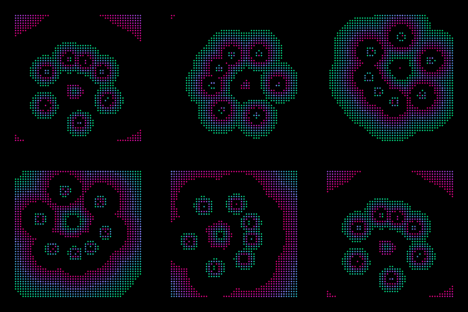
Initially I dismissed the sketch as being boring, but after posting it to Twitter and seeing that it got a bunch of likes I had another look and thought that it actually was pretty cool with an unintentionally interesting effect.
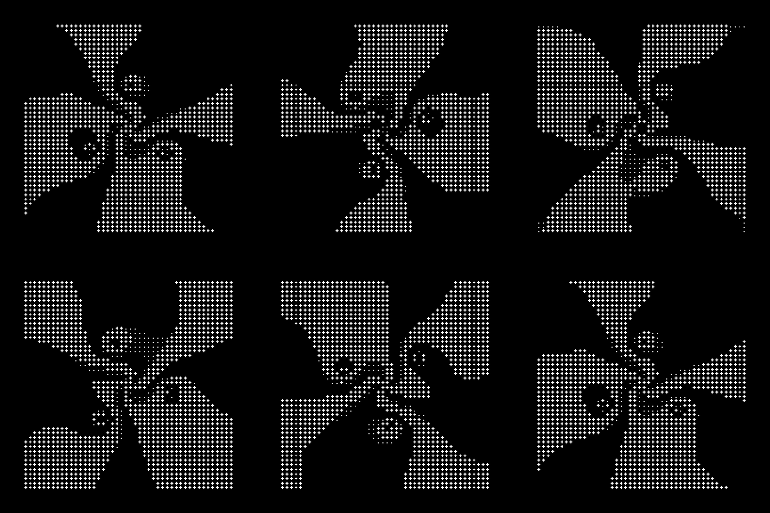
This one was actually not the initial sketch that I had made that day. Earlier in my session I was playing with the Math.exp() and Math.log() functions in JS, since I rarely ever use them, leading to the emergence of the following a meta-ball-esque sketch:
Letter packing made Easy
And yet other thing that I tackled head on this week was letter packing; or font packing... or text packing - I'm not entirely sure what to call it, might be important to figure that out for SEO purposes. But the idea basically revolves around loading in a font file, then writing a bunch of letters to the canvas using that font, and later on jumbling them up and packing them on the canvas so that they don't collide. Here's something I made with it:
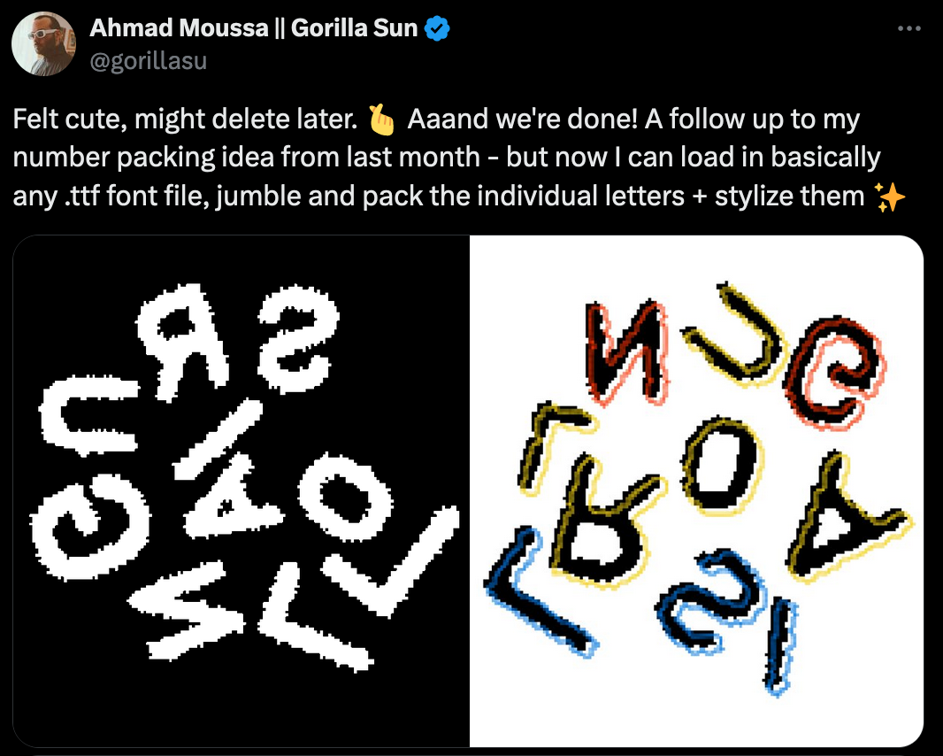
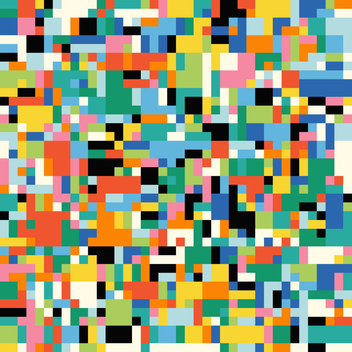
I've had the idea for a long time, but I never actually tackled it because I knew it would be tedious to write the code for it - and it was, but it's not actually that complicated, just quite lengthy. A big part of it is OpenType.js, that lets you easily load in fonts, and also lets you get the paths of individual letters (glyphs) as vertex arrays. Coupling it with a collision strategy makes it possible to pack them on the canvas. I'm already in the process of writing about this idea and will likely release as my first premium content piece! If you're interested in packing shapes I recommend checking out this post of mine:
Music for Coding
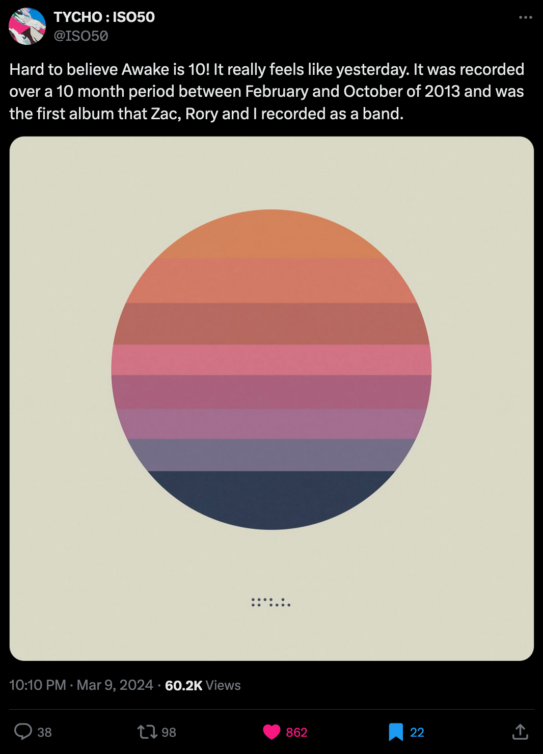
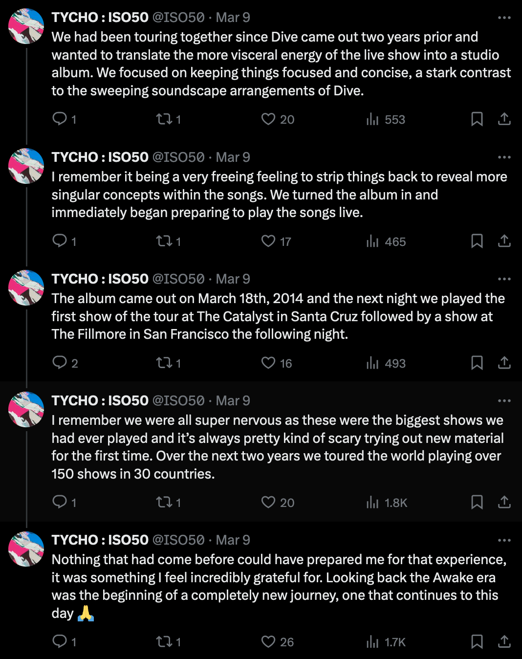
Well there's really only one piece of music that I can share this week, and it's Tycho's Awake for the occasion of it's 10th anniversary:
I remember the first time listening to it in my bedroom around 2017-2018, I was completely blown away. At the time I wasn't a big fan of electronic music, but listening to Tycho really made me do a complete 180 on that. I've listened to the album countless times now and I really recommend you give it a listen, works especially well while coding.
And that's it from me this week, hope you enjoyed this week's curated list of generative art, web3 and tech shenanigans — now that you've made it through the newsletter, you might as well share it with someone that you know who might enjoy this kind of content - sharing the newsletter is one of the best ways to support it!
If you've read this far, thanks a million! And if you're still hungry for more Generative art things, you can check out the most recent issue of the Newsletter here:
And if that's not enough, you can find a backlog of all previous Gorilla Newsletter issues here:
Cheers, happy sketching, and again, hope that you have a fantastic week! See you in the next one - Gorilla Sun 🌸 If you're interested in sponsoring or advertising with the Newsletter - reach out!
