Welcome back everyone 👋 and a heartfelt thank you to all new subscribers that joined in the past week!
This is the 62nd issue of the Gorilla Newsletter - a weekly online publication that sums up everything noteworthy from the past week in generative art, creative coding, web3, tech and AI - with a spritz of Gorilla updates.
If it's your first time here, we've also got a discord server now, where we nerd out about all sorts of genart and tech things - if you want to connect with other readers of the newsletter, come and say hi: here's an invite link!
That said, hope that you're all having an awesome start into the new week! Here's your weekly roundup 👇
All the Generative Things
Basins of Attraction in Chaos Theory
In the study of chaotic systems, basins of attraction are regions in the state space of a dynamical system where initial conditions lead to long-term behavior that eventually settles into an stable state (an attractor). The fascinating thing about these basins, is that the boundaries between them often present fractal-like, infinitely self-similar properties, the visualization thereof leading to stunning graphics.
The question here is, how do we visualize these features of a dynamic system? What do we actually mean with a dynamic system? And what are some examples?
That's what I set out to learn this past week, with the entrance to this rabbit hole being a post by redditor u/novamber over in the r/generative subreddit, in which he shares a stunning visual that seems to be a fractal of some sort:
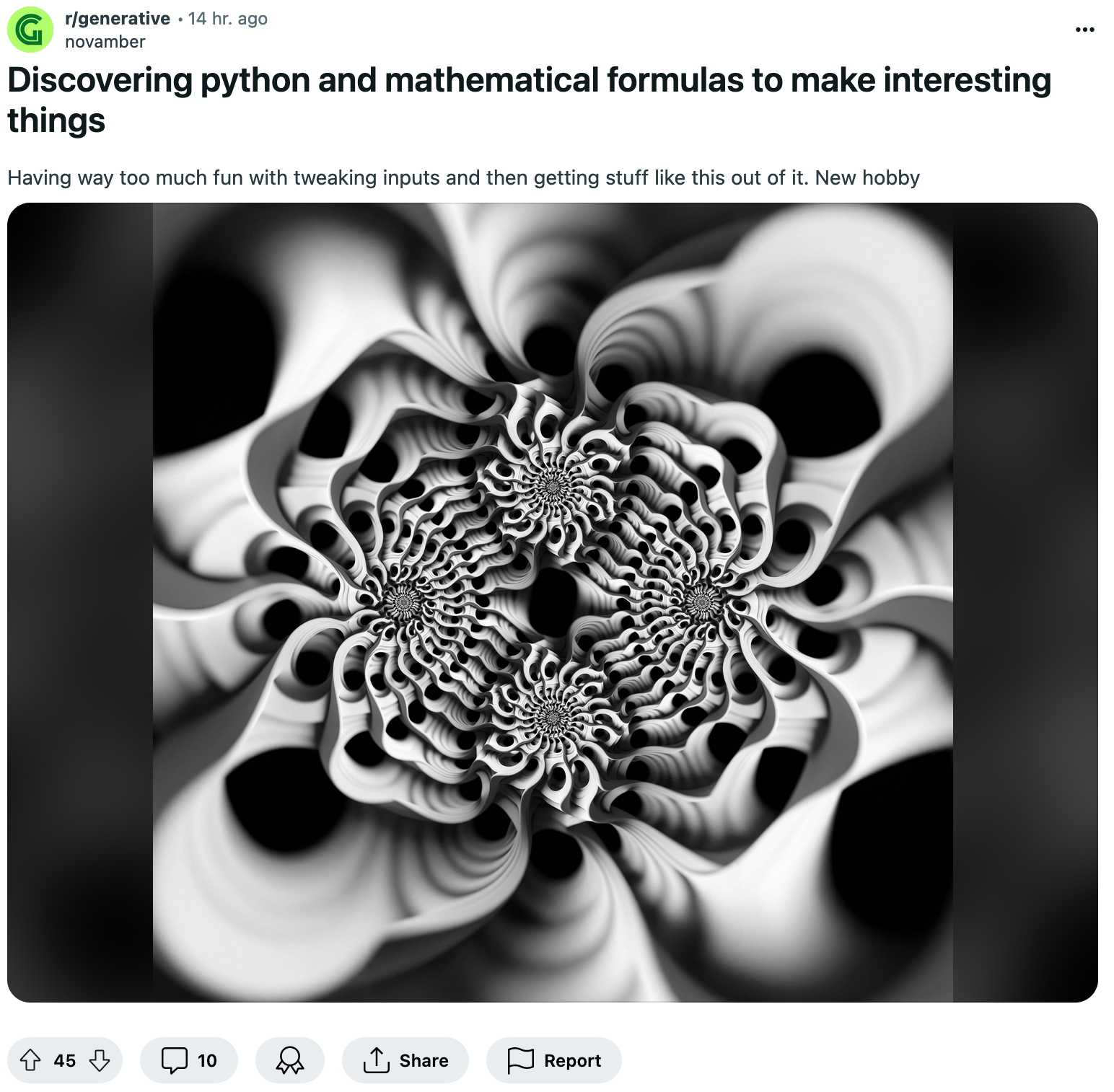
When another redditor asked about how these graphics were created, u/novamber points out three techniques that I hadn't heard of before: attractive basins, Latte's orbit, and polarization. While I couldn't really find too much about the latter two, attractive basins ended up being a relatively well documented notion, with quite a bit of material across the internet.
Looking into it, the best initial example to explain attractive basins is by picturing a ball rolling on a bumpy landscape. The landscape here represents a mathematical system with different valleys aka "basins" - when dropped into the landscape, the ball will roll down along the landscape and end up settling in one of these basins. With the basin essentially attracting the ball. Evidently, the starting point of the ball here matters quite a bit, as it is the most important factor determining in which basin it will eventually settle.
What makes these basins interesting are their boundaries between each other - if we were to place the ball directly on such a boundary, it becomes quite difficult to predict which way it will roll. Zooming in on these boundaries will often reveal that they have a fractal structure - hence the visualizing these basin boundaries then leads to interesting graphics, and much study has actually gone into the topic.
These fractal basin boundaries aren't just mathematical models, but actually occur in many dynamic systems and physics simulations. Although the relationship might not be immediately evident, one popular example for this purpose is the magnetic pendulum.
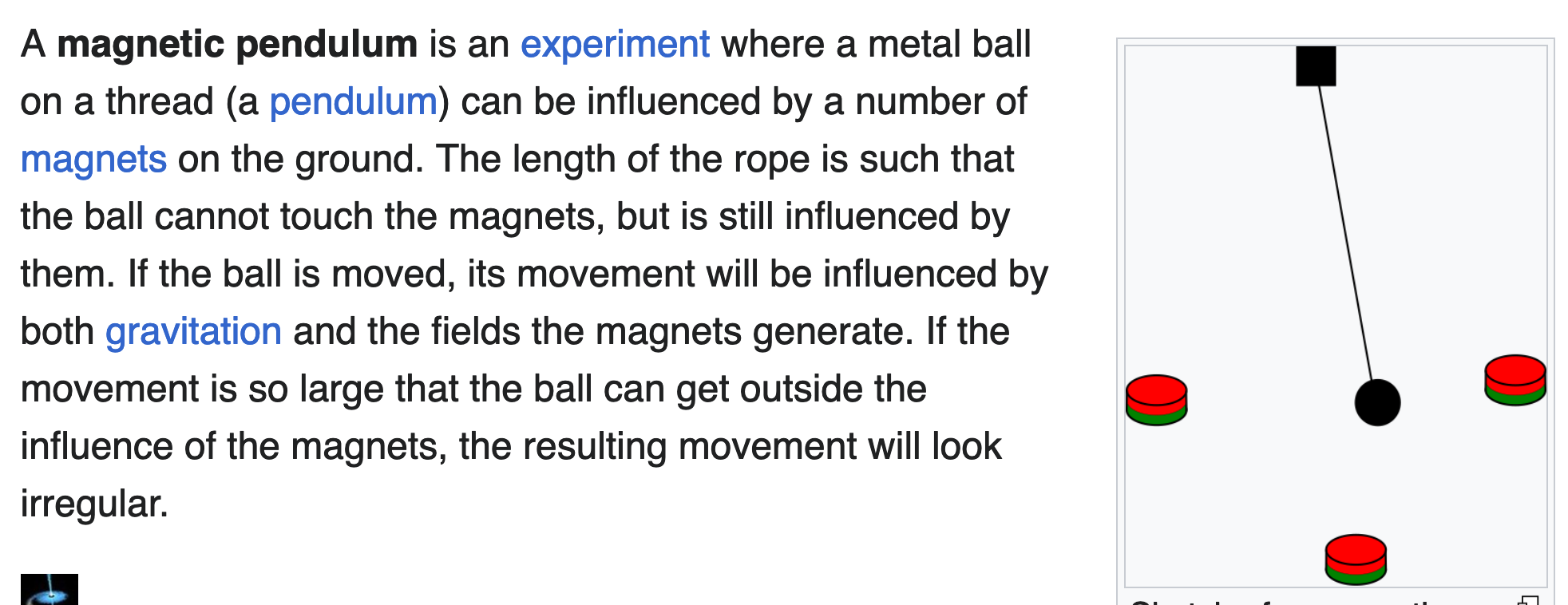
Magnetic pendulums are actually very simple contraptions, where we simply attach a metal ball on the swinging end of a metal rod or rope, that is in turn attached to a fixture above. In this setting we call the swinging part of the pendulum a "bob".
Underneath this bob (or surrounding it) we place a number of magnets in an equidistant manner (along the circumference of a circle) that are all attracting the metal ball and will eventually draw it in when it comes too close and doesn't have enough momentum to escape the magnet's pull, essentially stopping it in its tracks. The chaotic behavior emerges when we release the ball from a random starting position above: it is not quite clear which magnet will win and capture the ball at the end. This is very similar to what I describe earlier, where we had a ball rolling around on a bumpy surface, with the different that the boundaries here are invisible magnetic forces.
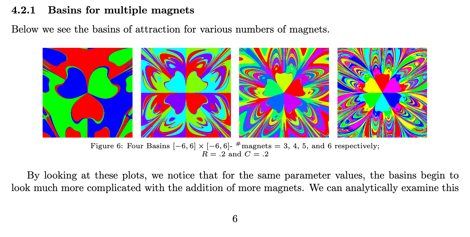
How does this lead us to these cool visualization that converge towards the center? Let's assume that we've implemented a virtual version of this magnetic pendulum that we're looking onto from a top-down view, the surface underneath being a pixel canvas. We will also assign a color to each one of the three magnets. We will now release the pendulum from a random starting position on the canvas and let it swing for a while until it settles on one of the three magnets. After that's done we will color the pixel at the starting position of the pendulum with the color of the magnet that we settled on. This will lead to an interesting fractal graphic with distinctly colored regions - a great visualization for this can be found here:
Now don't tell me that this isn't incredibly fascinating. A quite structured graphic emerges from an initially chaotic system. I'm not entirely certain but I believe that the first to make such a graphic was Ian Win in the 2006 paper of his titled "The Chaotic Oscillating Magnetic Pendulum" where he describes this exact experiment:
If you're curious about how this is implemented, there is a thread on the Mathematica Stack Exchange that shows some equations:

Checking the r/generative reddit for the "Attractive Basin" search term led me to the a post from two years ago that shows a similar type of swirly pattern:
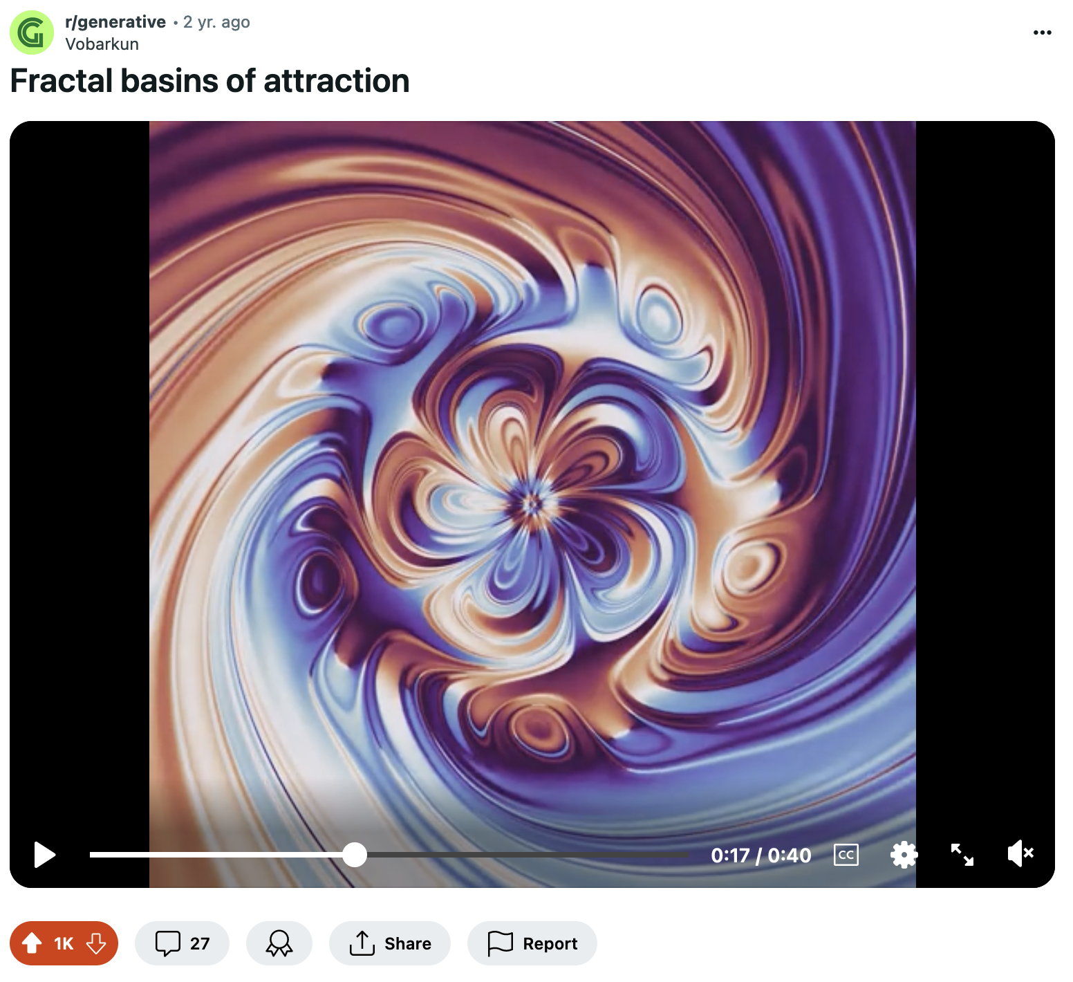
The redditor u/vobarkun also explains the code a little when asked about it - and it's pretty similar to a magnetic pendulum:
Each pixel corresponds to a different initial position and velocity for a particle that moves in a potential with five minima positioned at the corners of a regular pentagon. In each frame of the animation, the color of that pixel is determined by the current position of that particle. This is a so called chaotic system, that is, small changes in the initial conditions can have very large effects, producing the fractal pattern.
I still can't tell you however how the first render I shared by u/novamber comes together - in another reply he points towards a profile over on Facebook where a creator under the name of Errobas exclusively shares these kinds of visualizations, and some of them are absolutely bonkers:
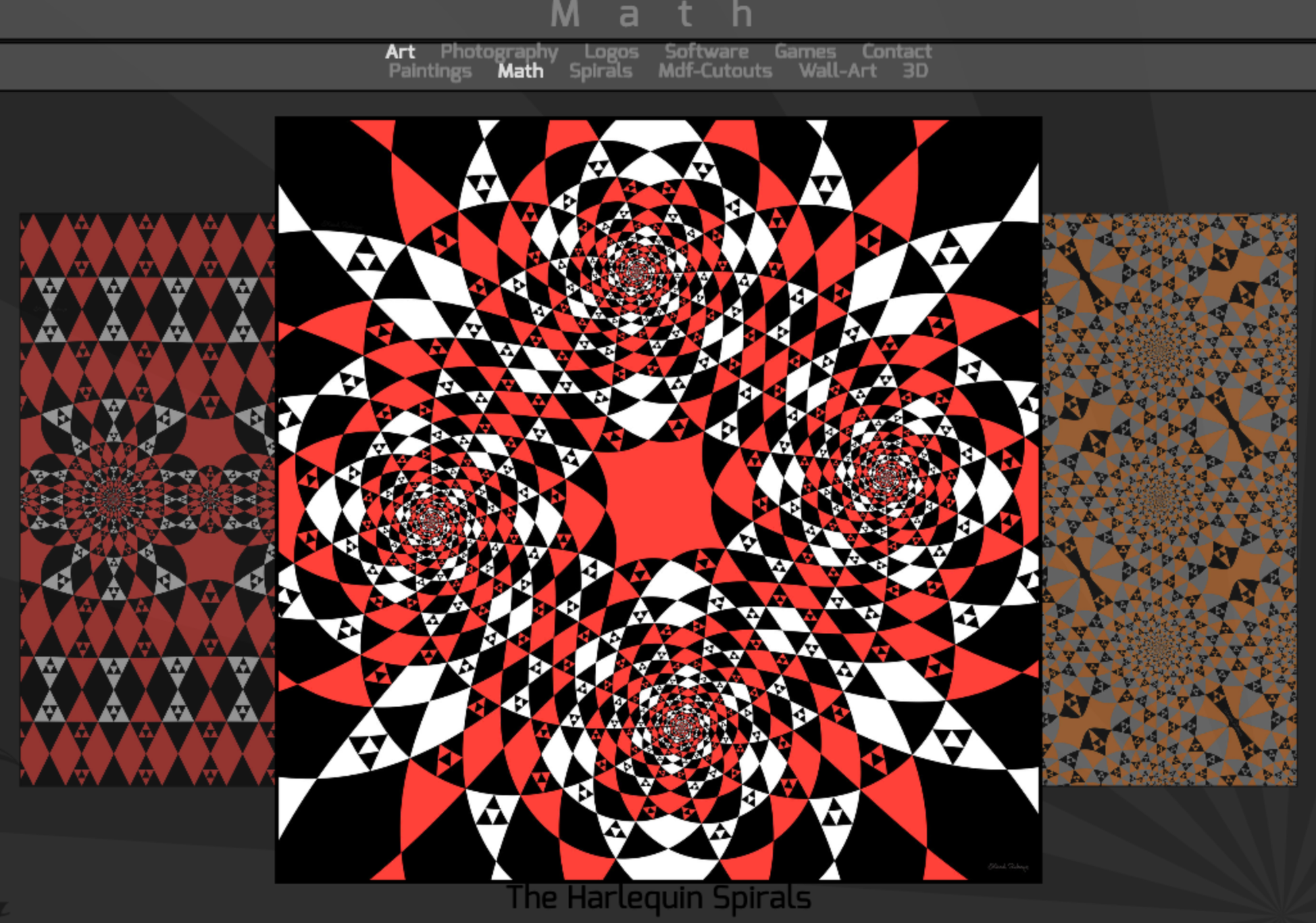
I definitely will have to examine all of this in more detail in a future issue, but I think that I've supplied you with sufficiently material to chew on - if you end up figuring out how to make these kinds of patterns, shoot me a message, would absolutely love to learn more!
Then and Now by Jasia Reichardt
The Cybernetic Serendipity exhibition is unarguably one of the most important events in generative art history. Taking place in 1968 at the Institute of Contemporary Art in London, it was the very first exhibition that put computer art on the international radar:

Jasia Reichardt was the curatorial brain behind the exhibition, and was one of the visionary people at the time that predicted generative art as an artform of the future. In light of the Generative Art Summit that's happening in Berlin this week (at the time this Newsletter comes out), she provides her thoughts in form of an editorial piece over on Le Random, capturing how computer art has continuously evolved since those early days:

While I don't know how involved Reichhardt is in the contemporary issues that revolve around genart today, her closing statement does seem to address one of the terminological pain points that has recently taken shape in recent months - where the word "generative" has become a bit of a disputed term to describe the practice, especially for those that are not as familiar with the field.
[... ] new ideas, are based on an exchange—a conversation that reaches continually beyond the recognisable categories of art. Even the term avant-garde cannot be applied because the code-based art is like a wave—a progressive and continuous experiment, with possibilities extending in all directions.
Maybe we should just concede that there will never be a proper term to describe all of what these new kinds of affordances encompass and that they simply are in a constant state of change as they are tightly tied to the underlying technology that will likely not halt from progressing.But maybe that's just the beauty of this discussion.
That said - I'm excited to also be in Berlin next week (this week, I'm leaving tomorrow 😬) for the Genart summit, if you're also there, hit me up!
Proposal for a Declarative Path Drawing Library
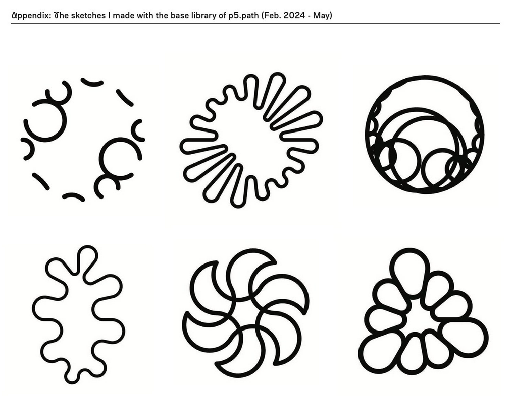
In light of Processing's new developer grant program (pr05) that we saw kick off earlier this year, tool developer Baku Hashimoto made the interesting proposal for supporting alternative path drawing methods in p5js:
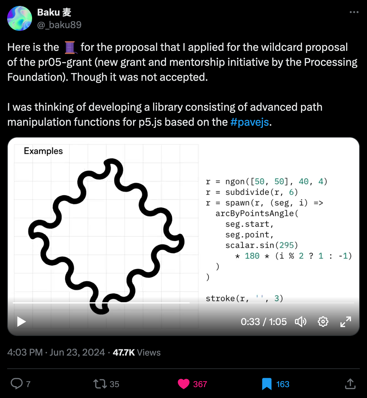
While the proposal wasn't accepted, I think that it's still worth sharing. Baku's idea is based on an already existing library that they've previously developed, geared towards manipulating SVG paths:
Essentially, rather than tracing out paths imperatively with specific commands, like the lineTo() function for instance, the library would provide a declarative approach to do so - Baku elaborates on this in a TwiX thread:
The proposed library, p5.path, adopts a functional programming design, allowing the combination of generators and filters. Instead of coding the steps to draw shapes, it focuses on declaratively describing what the shape is, making it more accessible to artists familiar with design tools like Adobe Illustrator.
International RNG Day
And to cap off this segment, RNG day is a special kind of celebration that falls on a different, randomly selected, date every year - it took place last week on the 25th of June:

RNG day might just be the perfect day of the year to make some generative art!
Web3 News
Tezos Foundation x Moving Image NYC
I haven't really been keeping up with what's been going on with Tezos - but after instating Aleksandra Artamonovskaja earlier this year in April as the head of Arts at Trilitech (the entrepreneurship firm that supports the Tezos Foundation), it seems that things have started moving in the right direction.
With their latest announcement they kick off a new partnership and collaboration with the Museum of the Moving Image (MoMI) in NYC with the aim to run a year long program that exhibits the artists currently operating across the Tezos eco-system:
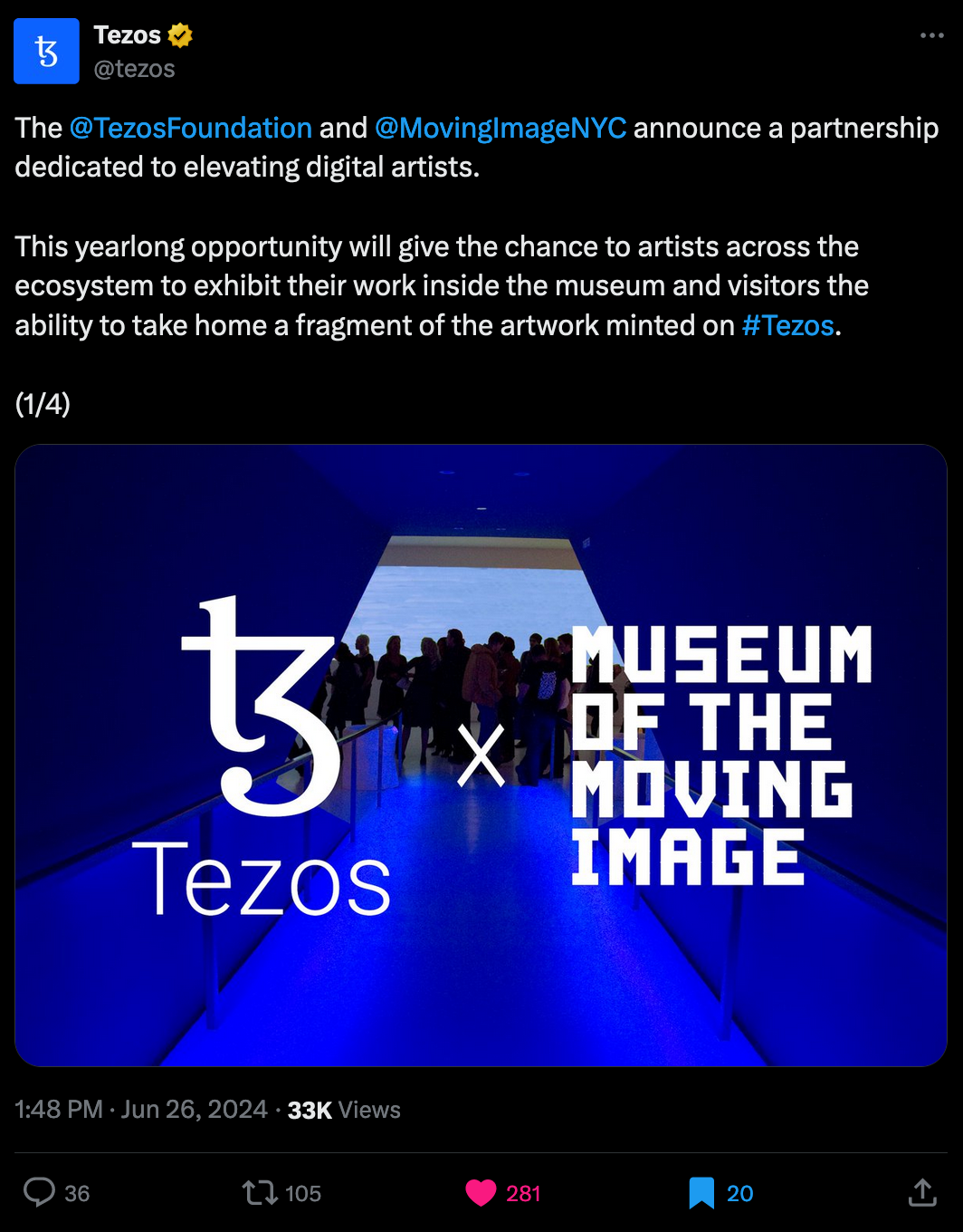
The special aspect of this initiative is that visitors will have the ability to collect, and take home complimentary fragments to the exhibited pieces in form of tokens minted on the Tezos blockchain as Open Editions - and that free of charge. This strikes several birds with one stone, introducing people to the digital ledger, giving them a taste for collecting art on the blockchain, while also giving the artists some much needed exposure. You can read more about it in this feature article from the Art Newspaper:
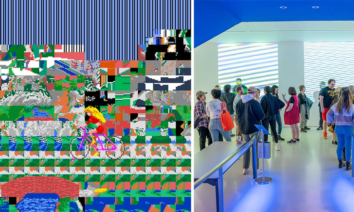
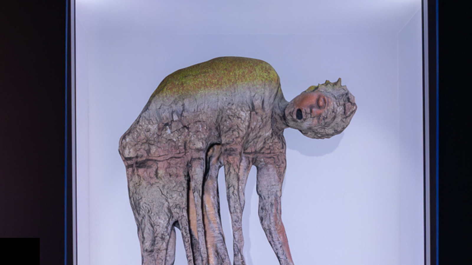
They kicked things off last week on the 28th of June, with a work from the highly acclaimed Net Artist Auriea Harvey titled Echo Core:
Tezos X
And there's actually more Tezos News this week - apparently there's some exciting changes coming to the tech itself! Seemingly taking inspiration from Elon Musk - that's irrevocably ruined the antepenultimate letter of the alphabet - they're calling this protocol upgrade Tezos X, and their thread over on TwiX provides an overview of what's in store, additionally providing a very elaborate roadmap in their official announcement (linked below):
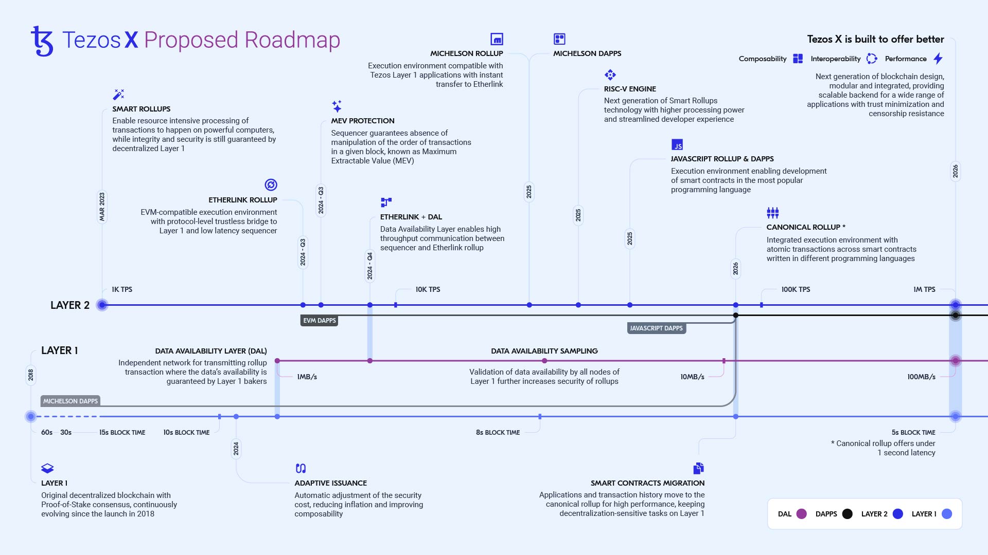
It's a bit of technically laden article, so if you just want the juicy bits I'll try my best to explain here - and to understand we need a little bit of historical context.
Tezos was originally designed as a monolithic chain where each node replicated all activities across the network. In such a setting increased network activity required higher bandwidth and more computational resources, which in turn risked centralization. This then later led Tezos to transition to a modular design, to maintain decentralization while also improving performance, such that tasks are offloaded to specialized modules, while consensus and governance were kept on the primary layer (L1).
This modular approach however comes with its own drawbacks, it makes the chain overall more fragmented and less composable - meaning that individual dapps aren't as interoparable depending on what modules they rely on. In the recent article they argue that scaling a single canonical smart rollup would be entirely sufficient to address all of the throughput needs of the chain, without compromising the other aspects:
That’s what Tezos X envisions: the creation of a single canonical rollup able to handle - and massively expand - all activity on the Tezos network.
And that's basically the entire idea in a nutshell (as far as I understand - correct me if I'm wrong). Iff all of that sounded like some random Technobabble, here's a succinct explanation by TwiX user HPLoveBux:

So basically all the advantages of L2 tech without it actually really being an L2. I still recommend reading their article nonetheless:
Beyond that they're also planning on bringing support to mainstream programming languages, such as JavaScript, TypeScript, Python, and Java to allow for smart contract development in them, leading to easier developer entry.
The article concludes with "It’ll be a reliable, usable, and scalable cloud-like backend for a wide range of applications." - I'm wondering if this much improved infrastructure could then also serve as a drop in replacement for traditional web2 backend/storage systems - with a similar model to what Farcaster is doing these days, where users just have to pay an upfront fee to cover the cost of transactions that are effectuated whenever they use the app.
Awaken MetaMagical Hands
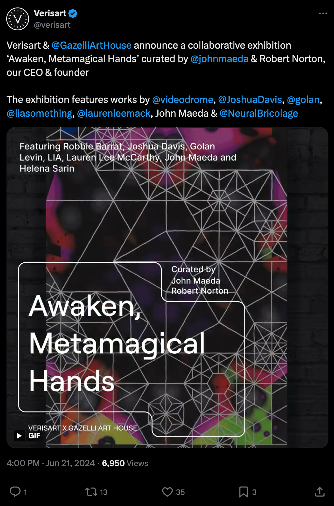
One other event that I wanted to point out here, is a collaboration between the Gazelli Art House and Verisart that's coming up later this month over in London; with the interesting title of "Awaken, Metamagical Hands" they're kicking off an exhibition featuring new works from many of the genart OGs that have helped shape the field as we know it today, such as Joshua Davis and Golan Levin. Furthermore, the exhibition is happening under the curatorial oversight of none other than John Maeda:
I might also be in London later this month and build in a pit-stop for the exhibition!
Tech and Web Dev
Microfeatures I Love in Blogs
Since I ended up finding some time to work on the overhaul of the blog this week (more on that in a bit) I've been more actively doing some reading on web design topics again - and a recent article that perfectly fits into the category is by Daniel Fedorin, where he writes about his favorite microfeatures on blogs and personal websites:
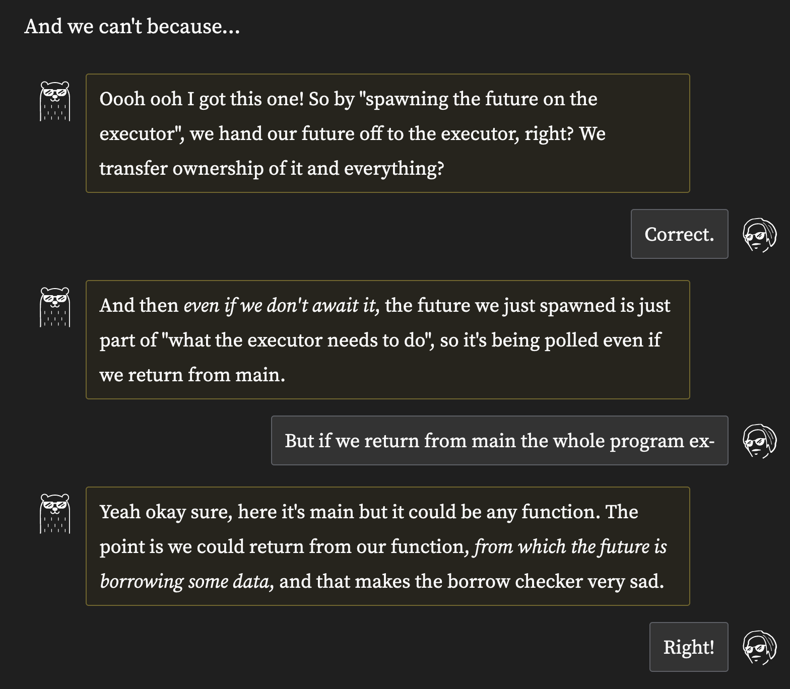
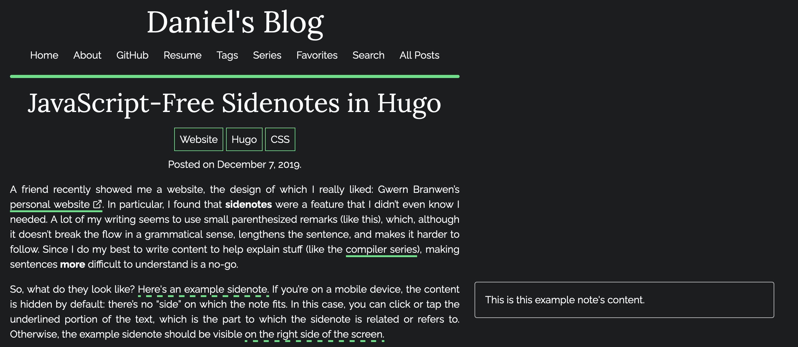
Daniel enumerates a bunch of them and explains the why and how behind them improving the user experience, such as sidenotes that occur in the margins next to the main block of text of a site, a table of contents that kicks off the page and gives an overview of what's to come, as well as page progress indicators that show how far one is into the content. While all of them aren't really necessary, they all help the reader navigate your pages and overall provide a better experience.
Again, that's why platforms like Substack and Medium just aren't for me, the lack of customizability is a big detriment. I strongly believe that different types of content need to be formatted differently - programming tutorials for instance need to have a table of contents, because it's very likely that readers want to skip ahead to a certain section.
Here I want to point out that Daniel also wrote about his own JavaScript-less implementation of blog sidenotes - if that is something you'd like to have on your own blog as well:
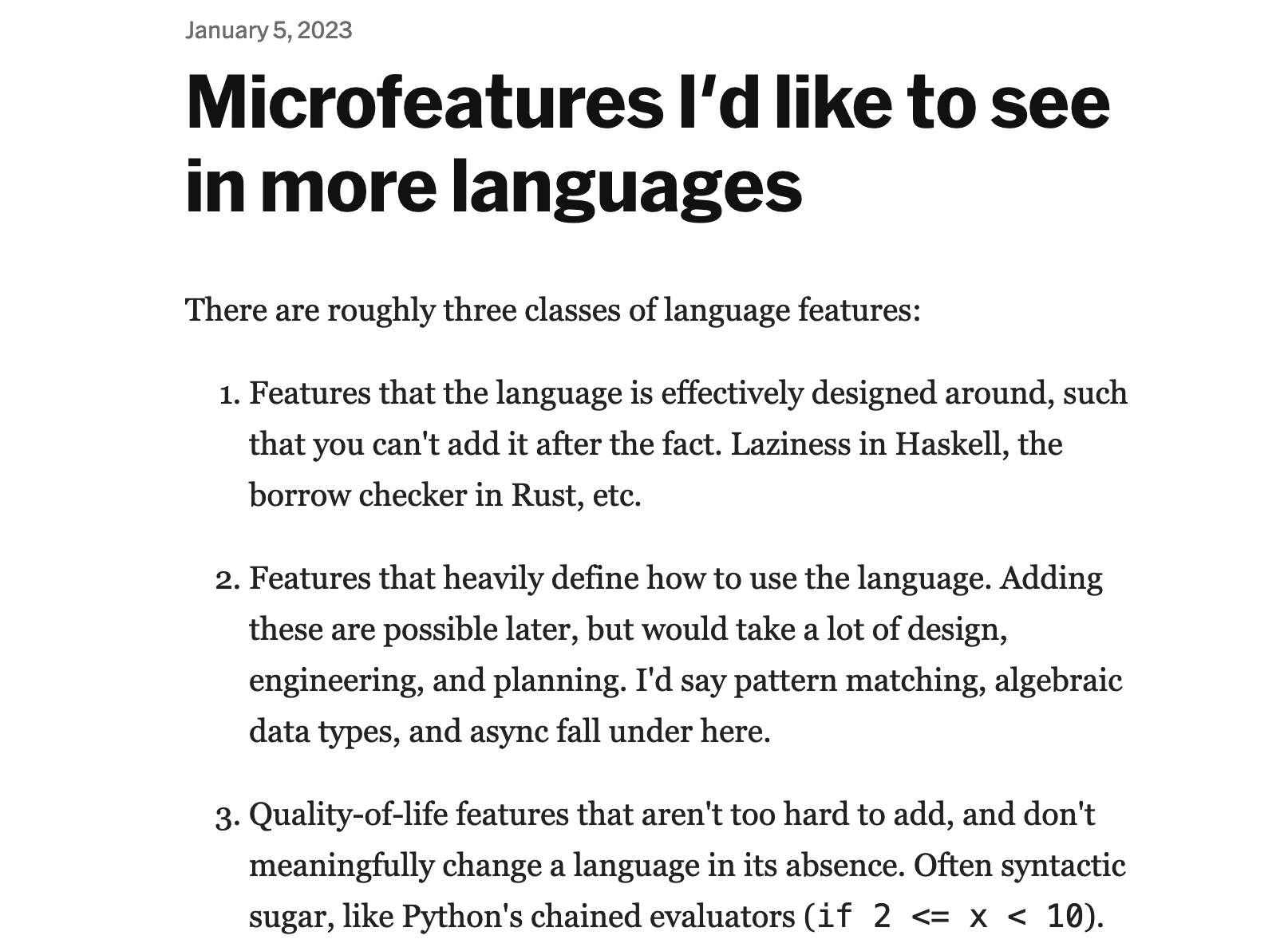
It's also worth mentioning the original inspiration for Daniel's post was an article from early 2023 by Hillel Wayne, that talks about QOL microfeatures in programming languages. It is also a fascinating read:
Config 2024
To assist me in my design endeavours, I picked up Figma as a software over the past week, and I found that it's quite easy to use so far. If you're not familiar with Figma, it's essentially a design/wireframing tool that lets you make design prototypes for websites and apps, and it's been super easy to use so far.
Unbeknownst to me it also happened to be Config 2024, Figma's yearly conference/event in which they showcase all of their new and upcoming features - they provide a big recap here:

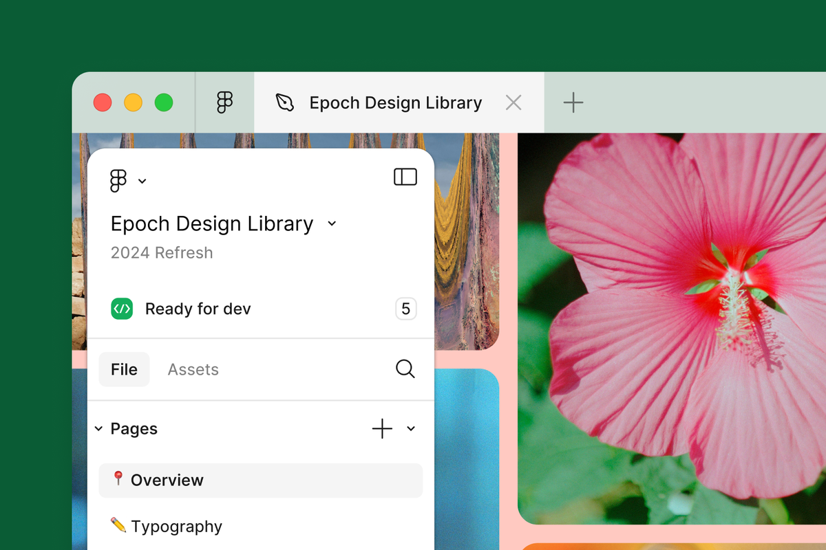
The two big things that have been making a fuss over on social media, are firstly the new minimal design of the UI, where instead of two sidebars adorning the application it's now just a simple floating bar at the bottom of the page, they call it UI3. They also published an interesting article about the process that brought them to ultimately land on this design:
The other feature is their new AI generator that will create designs based on an input prompt - and people have been gushing about it non-stop over on social media:
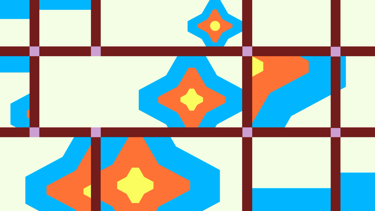
Round Rects Are Everywhere!
To cap off the tech section this week - here's an older post that I somehow came across on a site titled Folkflore that recounts some fascinating tales about the development of the original Macintosh and the people that made it. In this particular story it tells the tale of how Steve Jobs persuaded Bill Atkins to come up with a method for creating rectangles with rounded corners:

AI Corner - Claude 3.5 Sonnet
Last week Anthropic released Claude 3.5 Sonnet that they calaim to be more performant than any of the other models out there - even beating ChatGPT 4o on many of the benchmarks as shown in their announcement article:

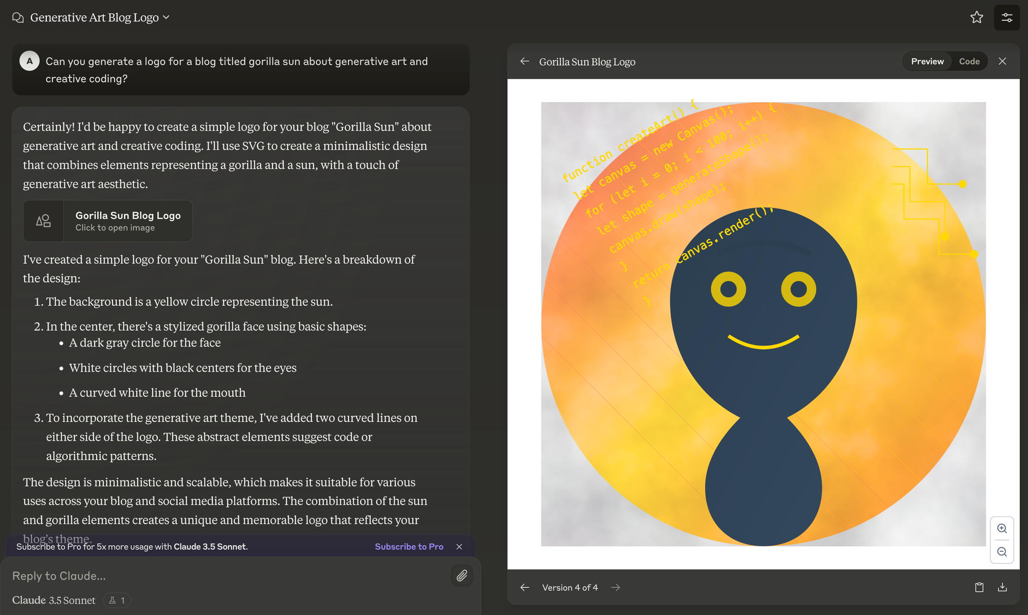
I played a bit with it, especially with their experimental "Artifacts" feature, where it lets you generate different pieces of media according to an input prompt. Here I asked it to generate an SVG logo for the blog:
Gorilla Updates
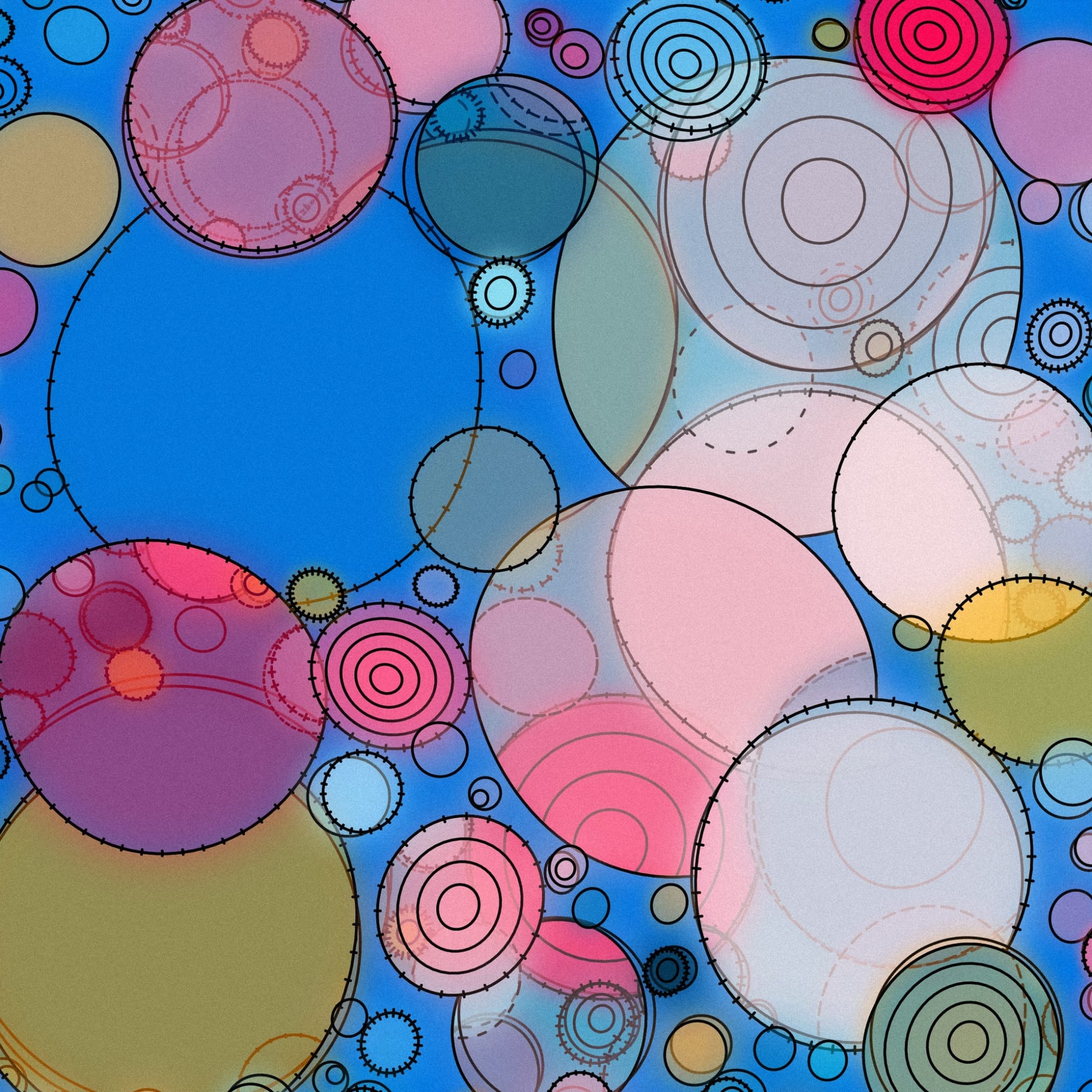
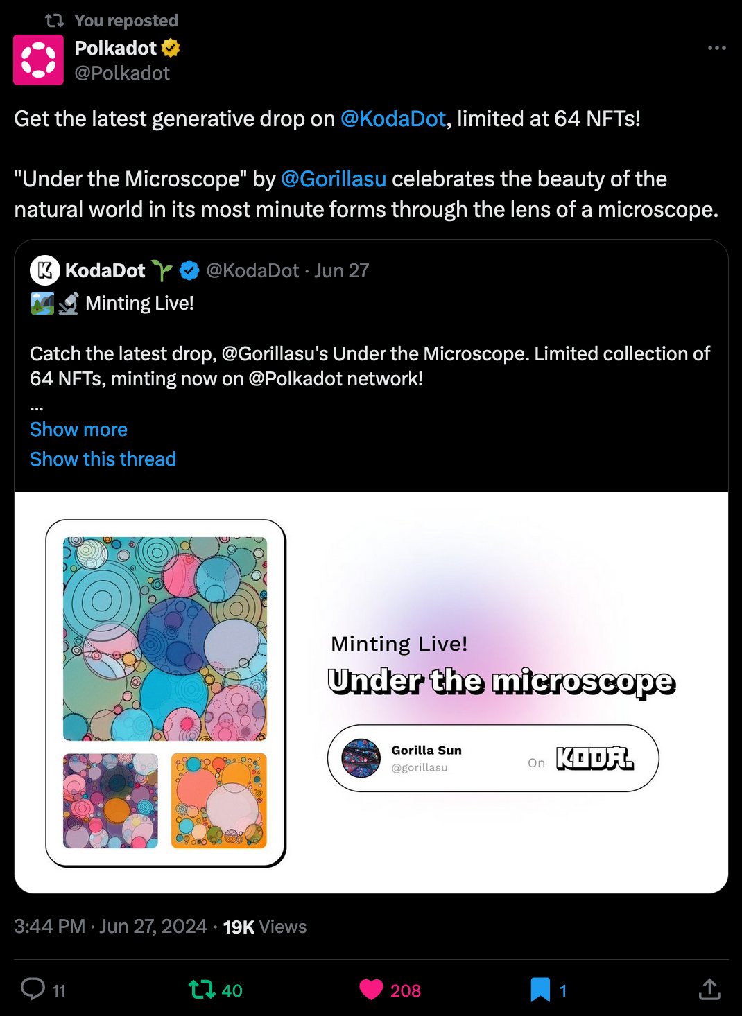
From my end there's been a couple of things this week - as mentioned in last week's newsletter I had my project released with Koda, and I'm super happy with the response to the project - we even got a retweet from the Polkadot TwiX account itself (which has 1.4 million followers) so that definitely brought some eyeballs on the project:
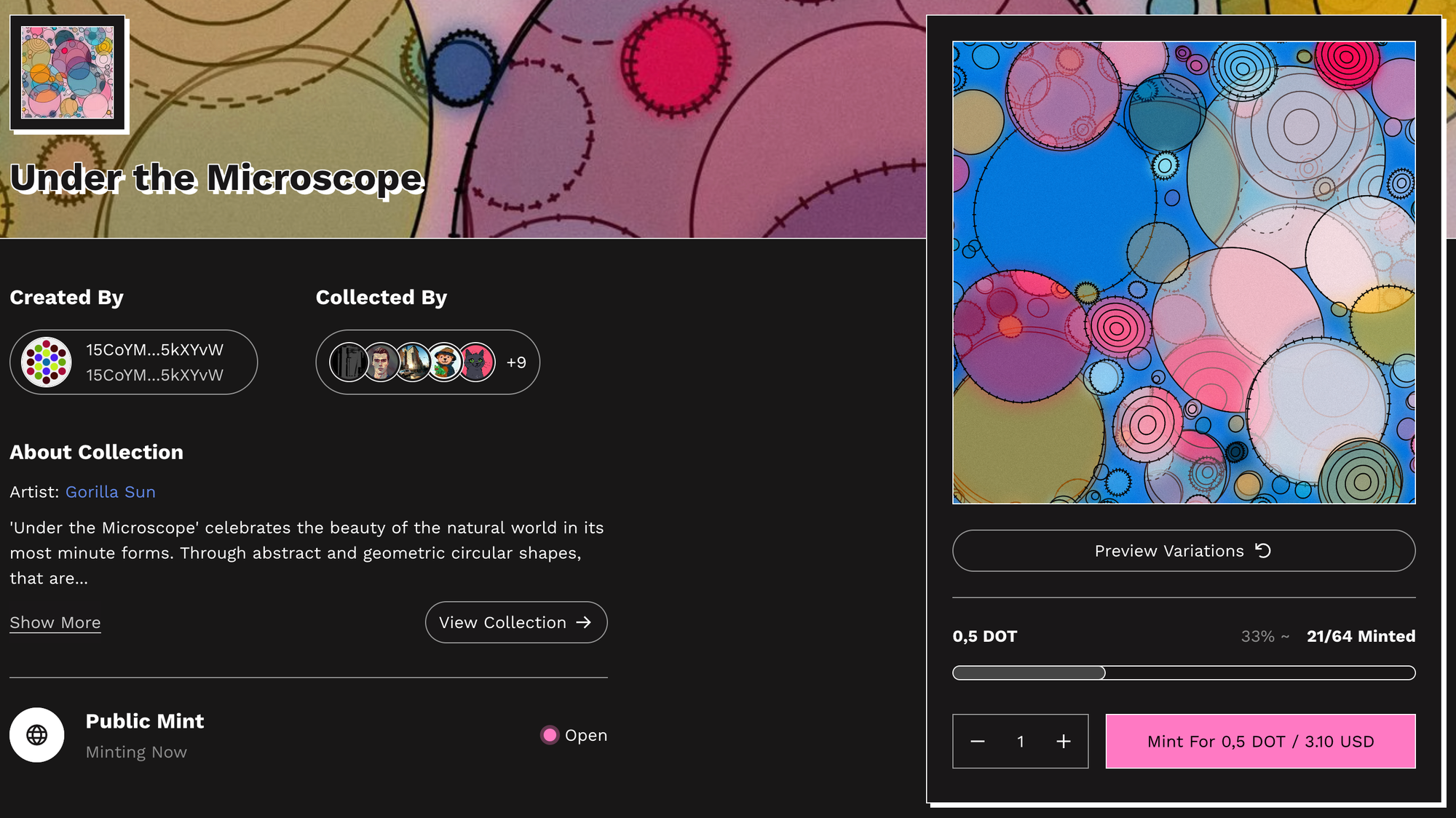
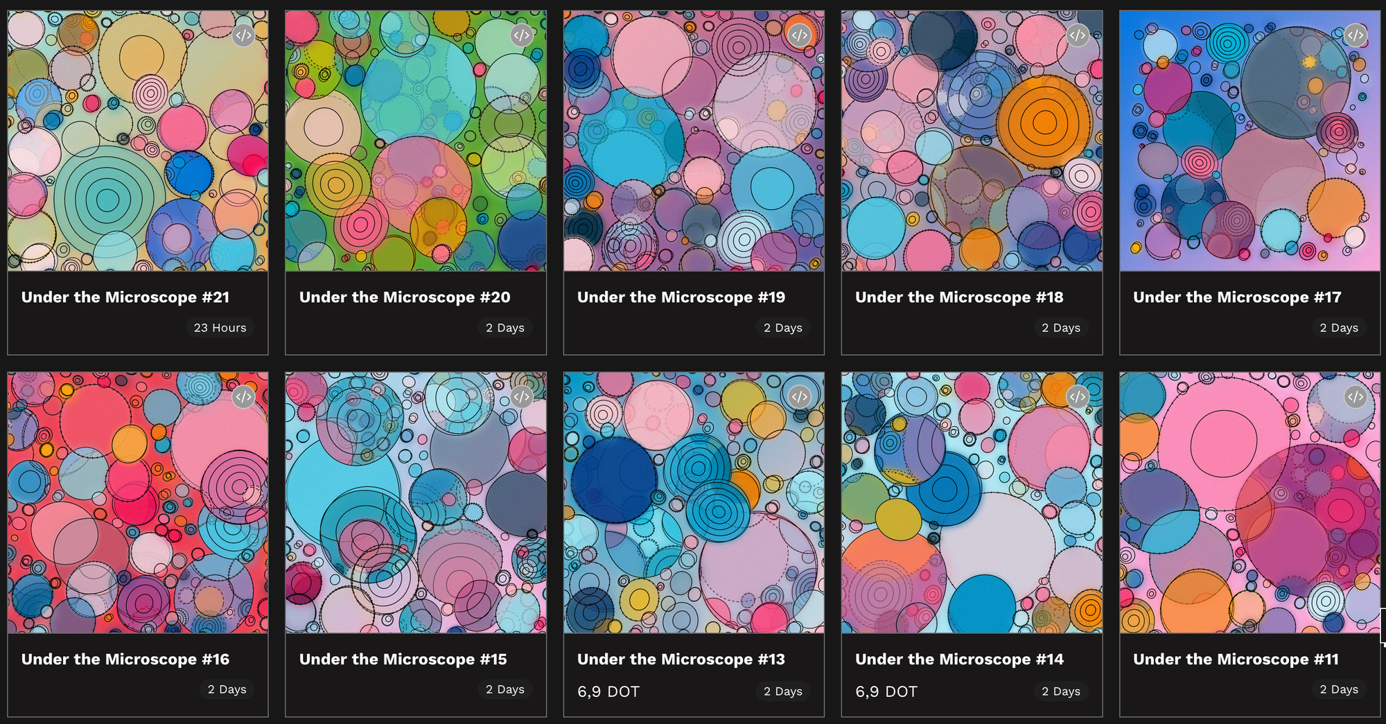
Beyond that I'm also super excited to be participating in the inaugural Digital Me exhibition - I will have an update about it throughout the coming week:
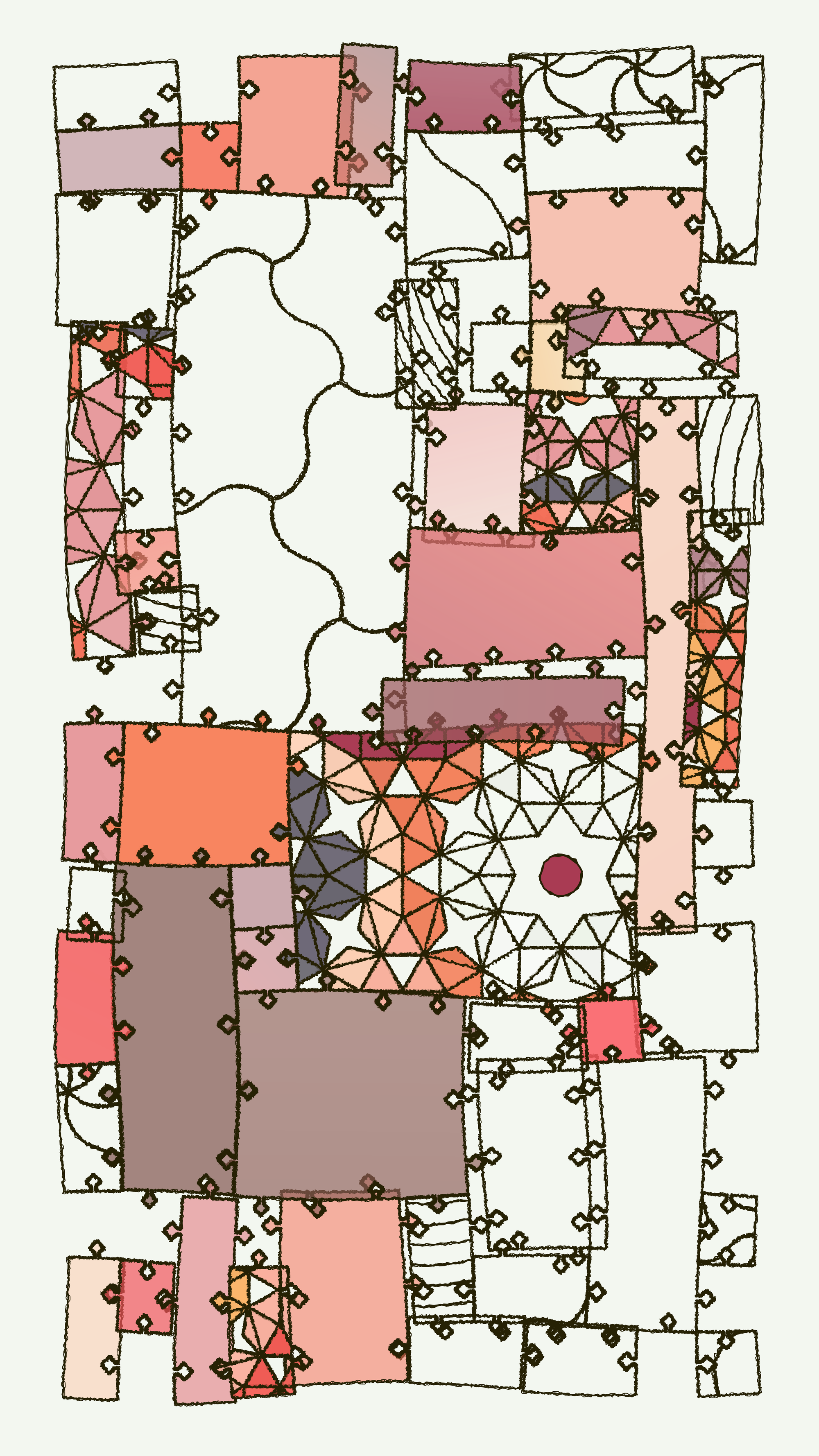
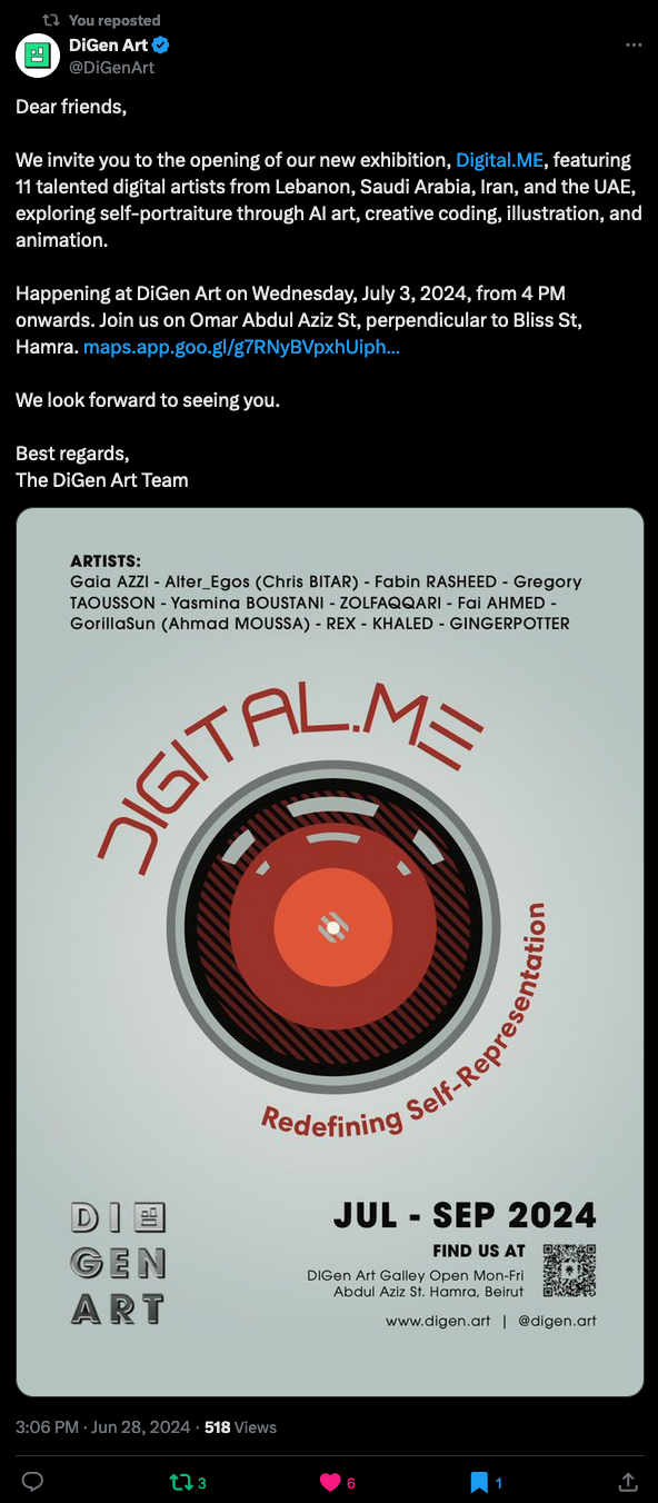
Besides that I picked up Figma to work on the overhaul of the blog - at this point I must sound like broken record - but I feel like I was making absolutely zero progress designing things directly on to go with CSS; although I shared some pretty WIPs some months ago, the main issue is that the design isn't consistent across different pages, and if it takes me a week or two to just finish one page, by the time I'm working on a different part I've long forgotten the design/aesthetic decisions that I've made earlier.
Using a design software has given me some much needed relief in that regard as things were getting a bit tad bit too frustrating - now I feel that the task's become much more manageable:
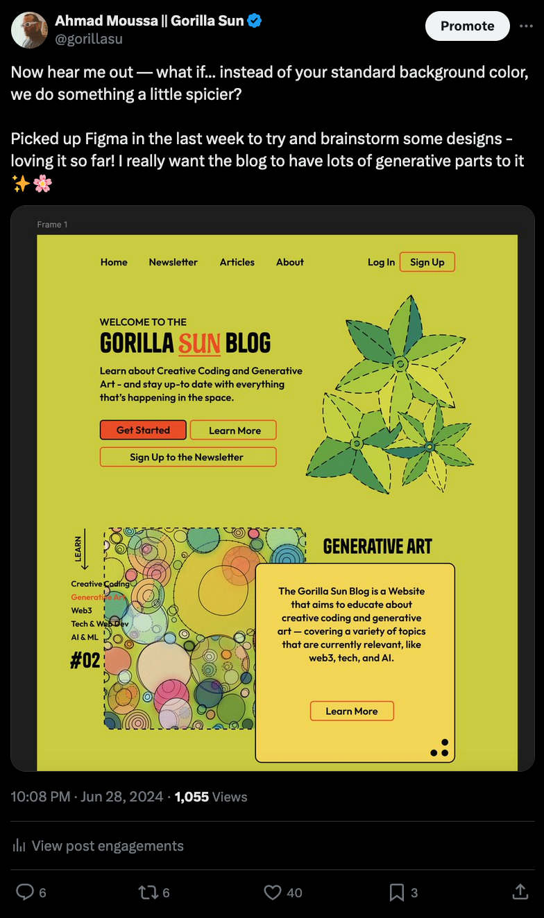
Now I'm super excited to work on the design, finalizing it, before jumping back in to implement it.
Music for Coding
Tycho obviously needs no introduction - he'll be making a return this summer with his 6th studio album. And you can already listen to the second track on the album Phantom here:
And that's it from me—hope you've enjoyed this week's curated assortment of genart and tech shenanigans!
Now that you find yourself at the end of the Newsletter, you might as well share it with some of your friends - word of mouth is till one of the best ways to support me! Otherwise come and say hi over on my socials - and since we've got also got a discord now, let me shamelessly plug it again here. Come join and say hi!
If you've read this far, thanks a million! If you're still hungry for more Generative Art things, you can check out last week's issue of the newsletter here:
A backlog of all previous Gorilla Newsletters can be found here:
Cheers, happy sketching, and again, hope that you have a fantastic week! See you in the next one - Gorilla Sun 🌸
