Hey everyone 👋 there's been quite a few new subscribers to the newsletter! Thanks for signing up and joining along for the ride! This newsletter goes out every Monday, and sums up everything Gorilla that's happened in the past week.
It seems that just like a work of art, a website is never really finished.
Another little visual update! ⬆️📅 Custom little blockquote!
— Ahmad Moussa || Gorilla Sun (@gorillasu) May 3, 2023
I had the feeling that the text was getting a bit too cluttered with all the quotes, adding a little bit of separation like this makes it look a lot tidier. pic.twitter.com/GybO3znepG
One of the posts from last week had quite a few quotes from other sources, which I included as screenshots. Visually that didn't really work well, hence I made this custom block-quote to make things a little bit more readable.
Readability has been my main concern with all of the changes in the past weeks; I want to make it as easy as possible for folks to digest the stuff that is post on the blog. Although there's some style guidelines that blogs should generally follow, they're not necessary applicable in every context.
For instance, you should use a font-size of 20px, larger fonts are easier to read. You should use serif fonts, because they're marginally easier to read as well. Line width shouldn't exceed 600px, or the text becomes hard to read. But now the text is so large and clunky that the user has to scroll every couple of lines, which is kind of bad when you're trying to explain something technical that requires a least a few sentences to be explained.
I feel like I've arrived at a balanced layout at this point. What do you think? Let me know if there's anything that could make the posts easier on the eyes.
Gorilla Articles
We got 3 posts in total this week!
As promised in last weeks newsletter, I published a post on Vera Molnar, with a specific focus on her earlier life and the events leading up to her working with computers for the first time. I learned a lot while researching, and had a lot of fun doing so feeling immensely inspired afterwards.
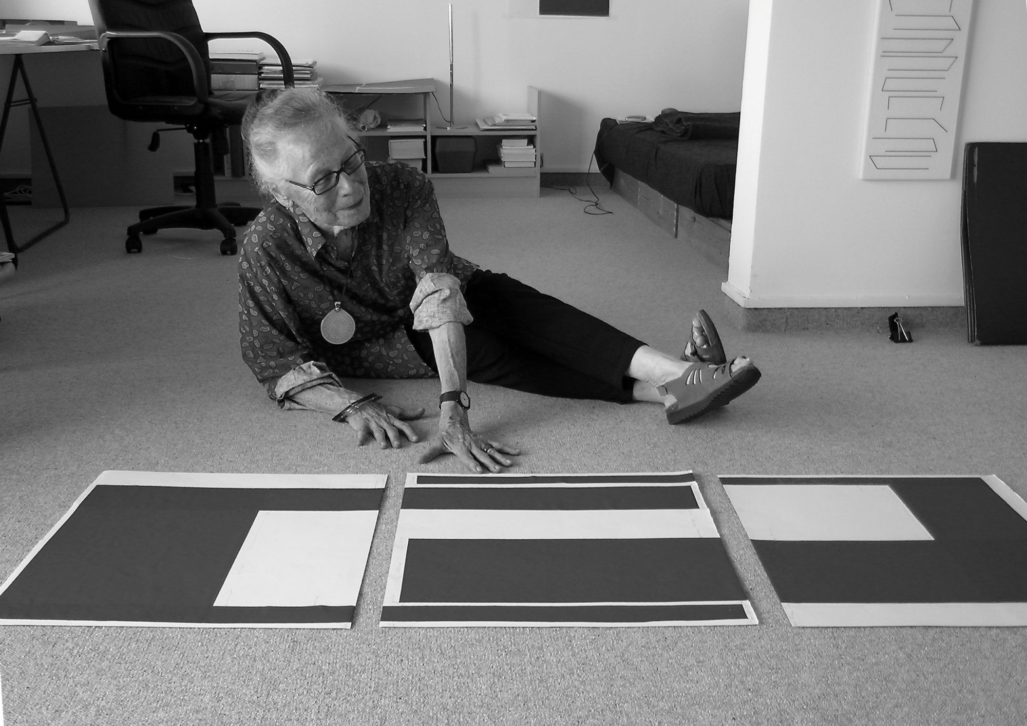
For the Tech-Thursday post (let's call it Tech-Thursday shall we?), we have a look at how to build a little Linktree-like page where you can showcase all of your social media links:
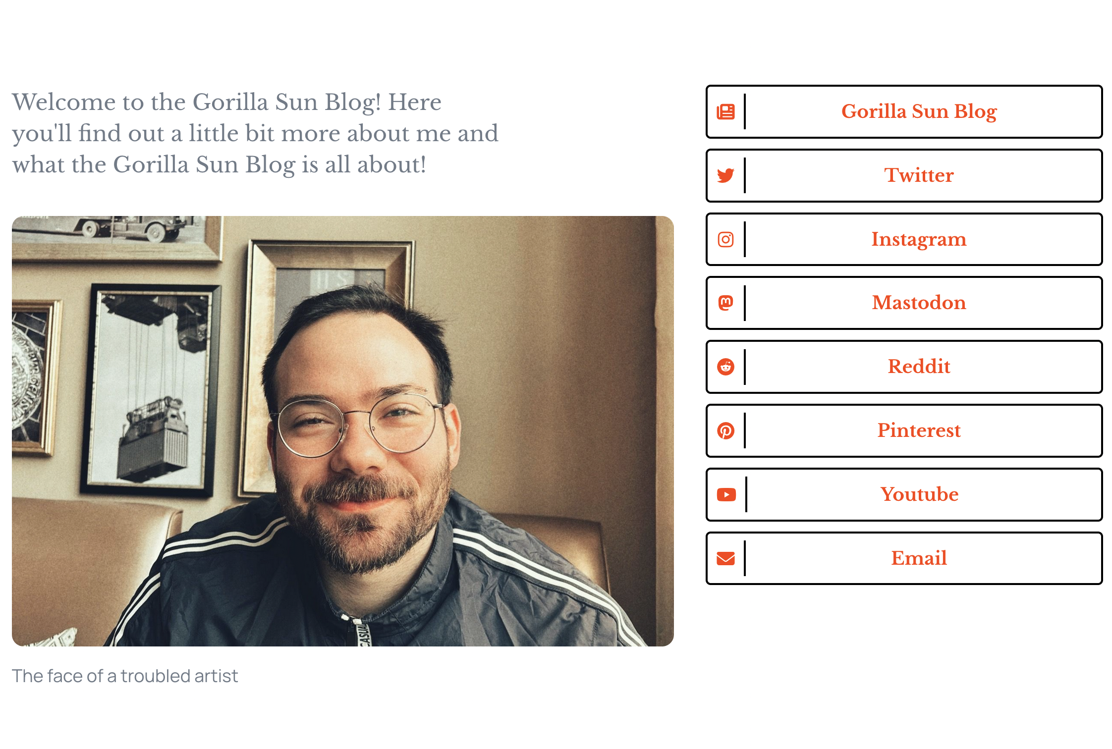
As for Sunday, we have a little bit more of a philosophical piece on why Sketching with Code is a fundmanetally important practice!
I've recently gotten into a better headspace, fixed my sleeping schedule (sorta) and been able to put more thought into my sketches. I haven't spent much more time on sketching per se, but I've been trying to go to make the sessions really count when I do.
Which made me think of all the facets there are to sketching, and why it's an wrothwhile endeavour to pursue:
Gorilla Sketches
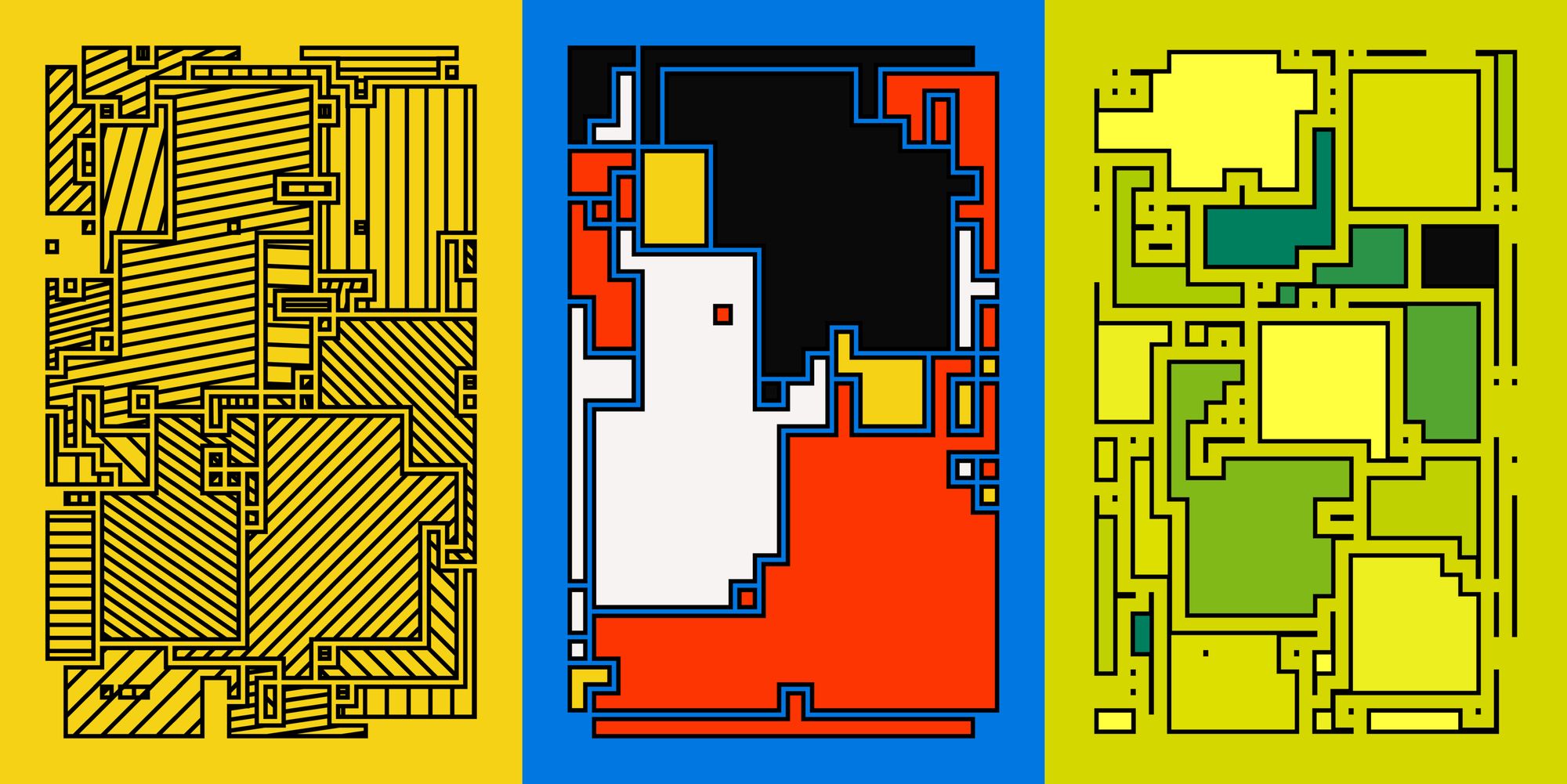
Initially, Blöck was actually supposed to be an animated piece. But I was under a bit of a time crunch, and wasn't able to figure it out. Blöck turned out fantastic however and I'm happy about that.
For the animation, I wanted the grid to expand and contract in a sort of organic manner. I tried a couple of things and found a method that I like, which actually doesn't need that many lines of code.
Blöckbuster #creativecoding
— Ahmad Moussa || Gorilla Sun (@gorillasu) May 5, 2023
Always fascinates me how ideas evolve over time! ✨⬆️ pic.twitter.com/7WjLJakBJr
I also spent a considerable amount of time last week on pinterest, searching for inspiration and patterns. I came across this beautiul quilt by Bauhaus textile artist Gunta Stötzl:
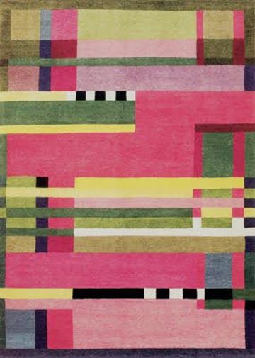
I love it! The colors, the patterns, the composition. Everything about it just works for me. Now I need to know how this could be recreated a generative manner. Evidently, it's a grid, but how do we choose the color for each patch? When you create a physical quilt you probably start from one of the top corners and work your way downwards, and you make color selections based on previous colors. Some colors become more likely to be chosen others become less likely.
Can I emulate this with weighted random probabilities that determine which colors get select? Here's my experiment from yesterday:
Had an idea that plays with weighted random probabilities, and the emerging patterns are actually really cool! #creativecoding #genart 🎨 pic.twitter.com/Fi1ZD1bSK1
— Ahmad Moussa || Gorilla Sun (@gorillasu) May 7, 2023
It's nowehere near Gunta Stötzl's quilt, but I feel like I'm getting somewhere.
Interesting Reads
Twitter per post Micropayments
More news about Elon and his plans for Twitter. One of his ideas is a per article micropayments, basically paywalled content where people have the option to purchase single posts for a fee, instead of having to subscribe. The article debunks why this isn't a good idea and why it doesn't work.

Rolling out next month, this platform will allow media publishers to charge users on a per article basis with one click.
— Elon Musk (@elonmusk) April 29, 2023
This enables users who would not sign up for a monthly subscription to pay a higher per article price for when they want to read an occasional article.…
Running a successful Newsletter
Since starting this newsletter last month, I've been actively looking into other newsletters, just to see what they're doing.
I came across Substack's Grow series, where they showcase some of the succesful writers on the platform and what they did to get to that point. Rob Henderson states that consistency and sticking to a schedule is one of the most important things:

Three posts a week has been tricky but I'm slowly finding the groove of things, planning ahead is key!
Trying to stick to a release schedule with new posts every Thursday and Sunday + Newsletter on Mondays 😬 proving to be a bit tough but let's see how it goes!
— Ahmad Moussa || Gorilla Sun (@gorillasu) April 27, 2023
The plan is to write a technical post every Thursday, and something a bit more journalistic on Sundays 🤔
The self-hating Web Developer
In a post from 2015 Joe recounts his career as a web dev and his falling out with the craft, because it was deemed to be a lesser form of programming. Towards the end of the post he summarizes his advice in one sentence: Find something that you think is interesting and pursue it both passionately and unapologetically.
The self-hating Web Developer by JoeQuery
Tip of the Week
This week I learned about the Flesch reading ease test. It's a way to measure how readable English text is and is calculated with the following formula:
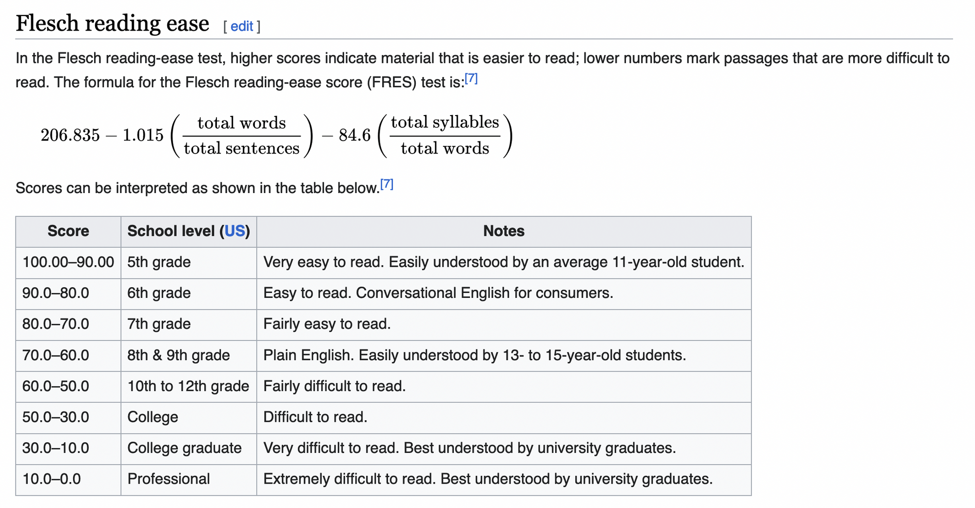
The formula then produces a number that indicates how readable a certain text is: higher numbers mean it's more readable, lower numbers are less readable.
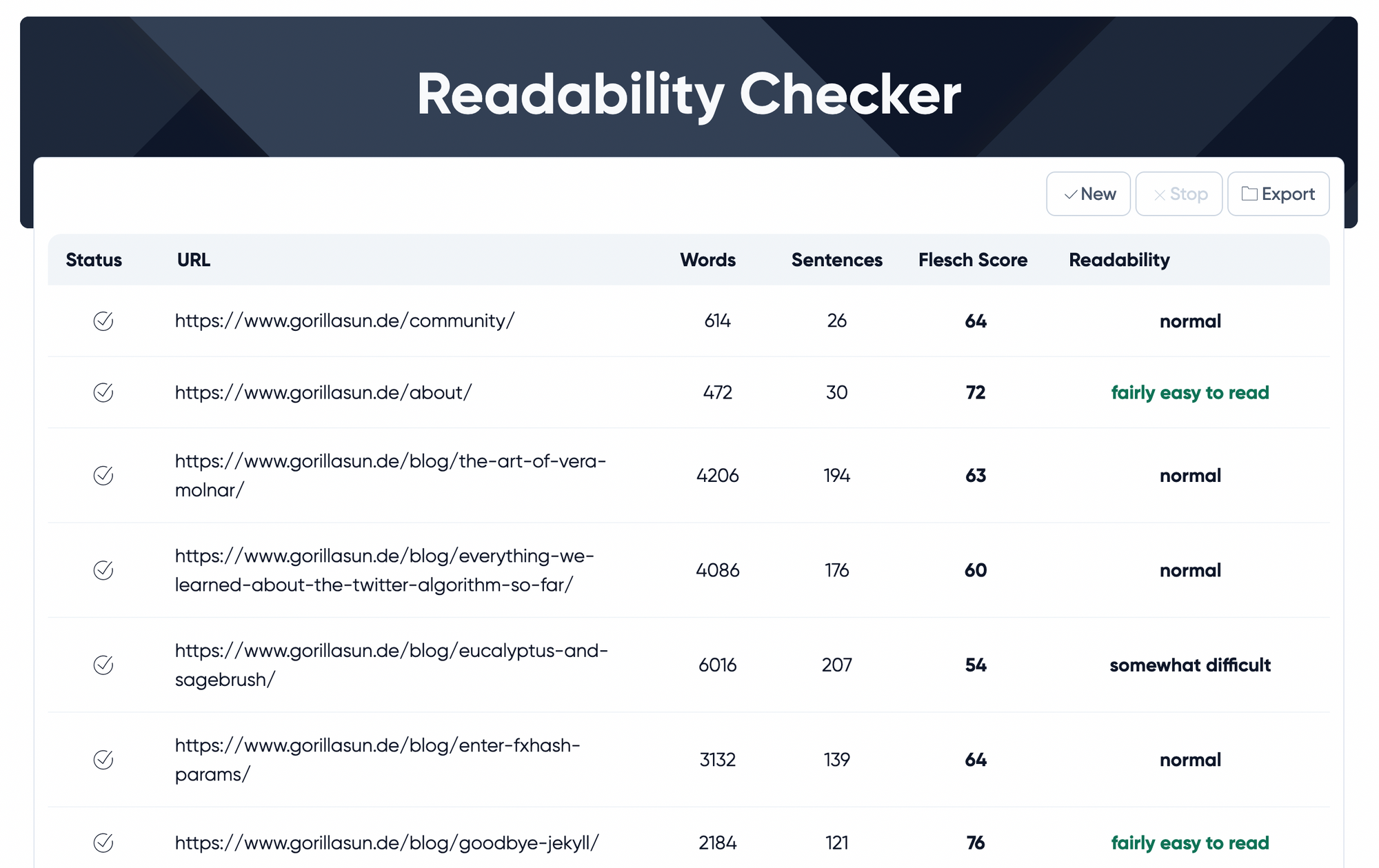
There's this online tool with which you can crawl your blog and check how readable each one of your pages is:
Music for Coding
Discovered this one in the recommended section while listening to Hyakkei's Okurimono album from last week. TOTORRO is an Mexican instrumental math rock band:
And that's it for me this week! See you on Thursday! Cheers and happy sketching!
