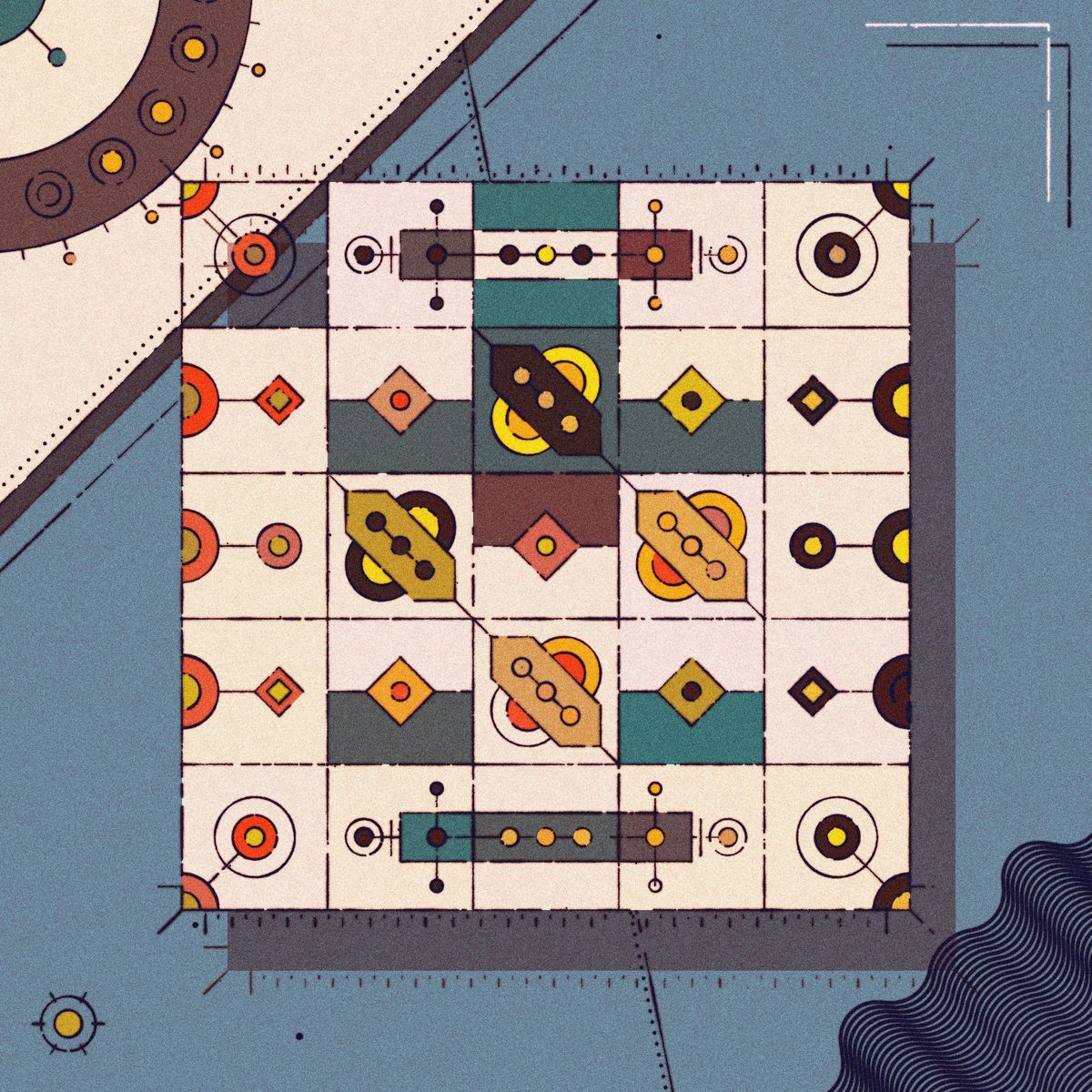
Exotic Quarpets began as an entry for @sableRaph’s weekly creative coding challenge. For those who aren’t familiar with the challenge, it’s basically a recurring weekly twitch stream where Raphaël reviews a bunch of sketches that are sent in by the viewers. Every week a theme is chosen around which the sketches should revolve, and for this particular week the chosen topic was ‘Quilts’.
The initial version of the sketch came together pretty quickly, it was a Saturday afternoon and I was stuck on a long and boring train ride. 2 hours down the line I had put together a prototype of the sketch. What became evident at that point was that it had the potential for a large variety of different patterns. As it is often the case with long-form generative art, the hard part was not to add a lot of variety to the sketch, but to strike a balance between variety and aesthetic coherence in the outputs. This entailed spending agonizing amounts of time on tweaking the parameter space.
How it started vs how it's going 💪#p5js #creativecoding pic.twitter.com/JPdAUexfiK
— Ahmad Moussa || Gorilla Sun (@gorillasu) August 4, 2022
Starting a New Project: Initial Versions
If you’ve followed my #WIPs over on Twitter you’ll know that initial versions had an entirely different aesthetic. Strokes were thick, colors bold and the sketch had overall a more 'cartoony' feel to it. It’s important to keep an objective perspective during the ‘ugly’ phase of the sketch and push further. Seeing similar outputs after refreshing hundreds of times can quickly lead to a sentiment of resentment towards your own sketch, because rather than seeing all of the good things that you initially liked about your piece you start to hyper focus on all of the small details that you dislike. There’s a couple ways that have worked for me to beat this particular case of impostor syndrome, partially by emotionally detaching myself from the art for a bit, and also by showing it to other people who’s opinion I value but who I know to not be afraid of being blunt with me and telling me what they don’t like about the sketch.

That aside, I needed to make some progress and move this project forward. I usually like adding a lot of variety very early on and then chiseling away at the code until I can hone in on a more coherent aesthetic. Excluding the tiles that occur at the edges and corners for a moment, I kept adding tiles over the course of the project, and ended up with a grand total of 11 different ones ultimately, some of which can also occur in a rotated or mirrored form.
For the borders and corners there is also a couple of options, technically there’s 3 distinct styles for each of the top/bottom and right/left ornamentation, but it’s a bit more complicated than that because some of them can’t occur when the grid is slim and long or alternatively wide and short. In this manner the tiles are allocated in a big ol’ nested for loop, and depending on their location in the grid assigned a pattern. A much more sensible solution to this would probably be a wave function collapse algorithm, which is something that I would love to explore in future sketches.
Clean code: tackling redundancies
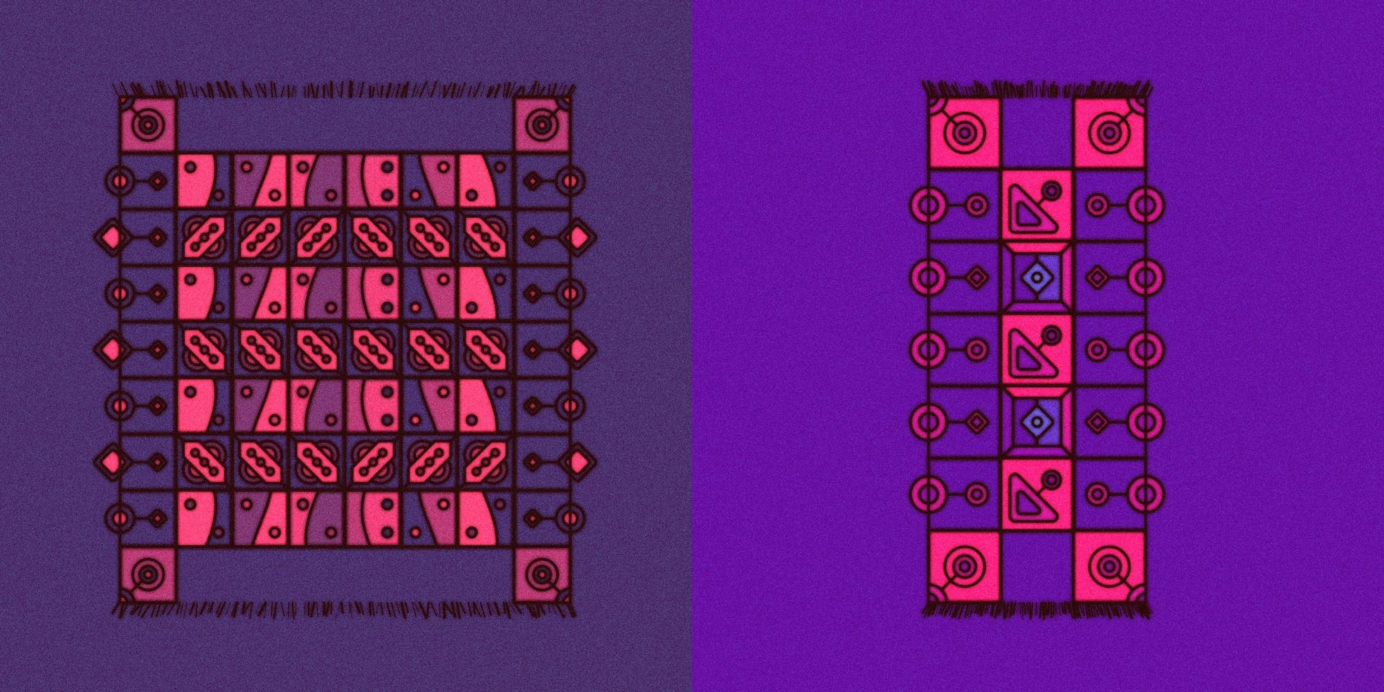
Writing functions for all these tiles I ended up with a lot of redundant code. Most of the tiles have shapes that extend beyond the enclosing box, for this I conveniently used the rendering context’s clip function that has come in very handy on many occasions. Without clipping some of the border tiles:
I ended up having this clipping code in every tile function, to reduce this unecessary code bloat I create a base tile function which essentially does all of the operations that are shared between all the tiles. We can then pass another tile function as an input parameter for it to execute, for example:
function tileBase(tileContentFunction){
  pg.push()
  pg.strokeWeight(0)

  // clip out a strokless rectangle
  fillRect(0, 0, spacing, spacing, 0, 0, 'tile', 'nostroke')
  ctx.clip();

  // draw the context of that clip area
  pg.strokeWeight(sW)
  tileContentFunction()

  pg.pop()
}
And then in the main Quarpet arrangement logic I can do something like this:
function tileSwitcher(idx1, idx2, param, mod, in1, in2) {
  if (param % mod == 0) {
    tileBase(function () {
      return makeQuiltTiles[idx1](in1, in2);
    });
  } else {
    tileBase(function () {
      return makeQuiltTiles[idx2](in1, in2);
    });
  }
}
I liked this sort of functional approach, the ability to pass around functions is something that I don’t use too often. What’s also worth noting here is that I can now just dump all of the tile making functions in a large array and select from them, this means that if I want to add another new tile I just need to write it’s drawing function and add it to the array, which is kinda neat.
Towards Skeuomorphism: Custom Lines and Strokes
Up until that point I had been using solid lines for strokes, but it felt like I could still push further texture-wise. I had already written wrapper functions around the p5 ellipse() and rect() function calls such that I could add some extra functionality as well as reduce some more redundancy. For example almost every rect/ellipse call was generally preceded by a fill() call, hence putting both of them in a function seemed like the way to go. Now since I invoke that function whenever I want to draw a rectangle, I could now simply swap out the rect() call for my own custom rectangle drawing function.
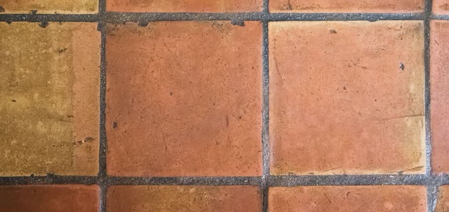
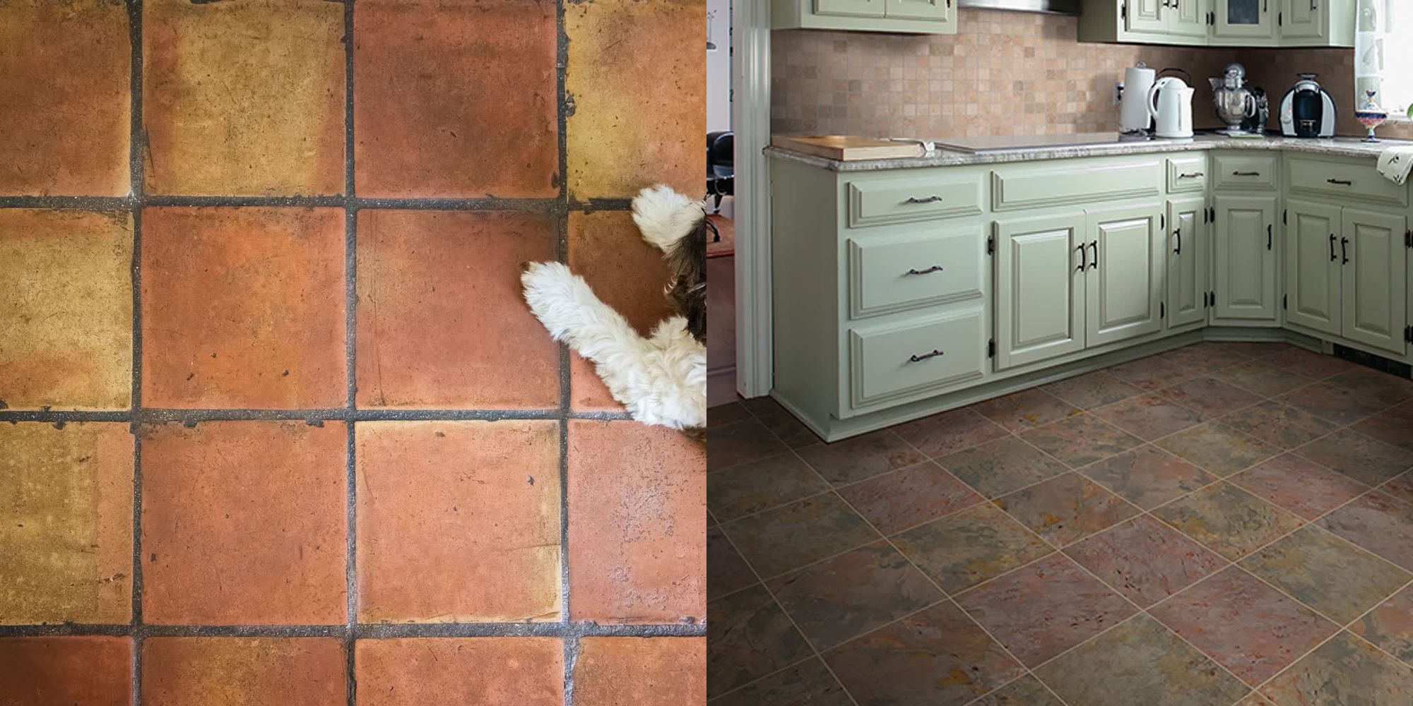
I wanted to try and create a sort of withered effect on the edges of the tiles that make up the Quarpet. You can see this occur in real life where the edges of weathered tiles are sort of chipped off:
I attempted a couple of things that didn't look that great, but finally I settled on using something similar to what I had already attempted in a previous fxhash mint of mine, 'Vestige'
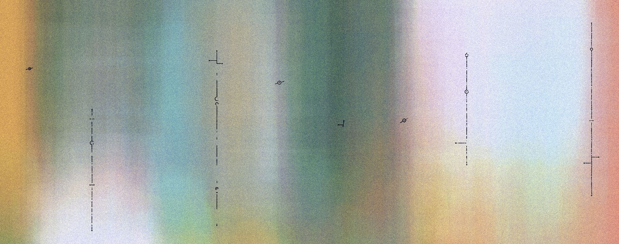
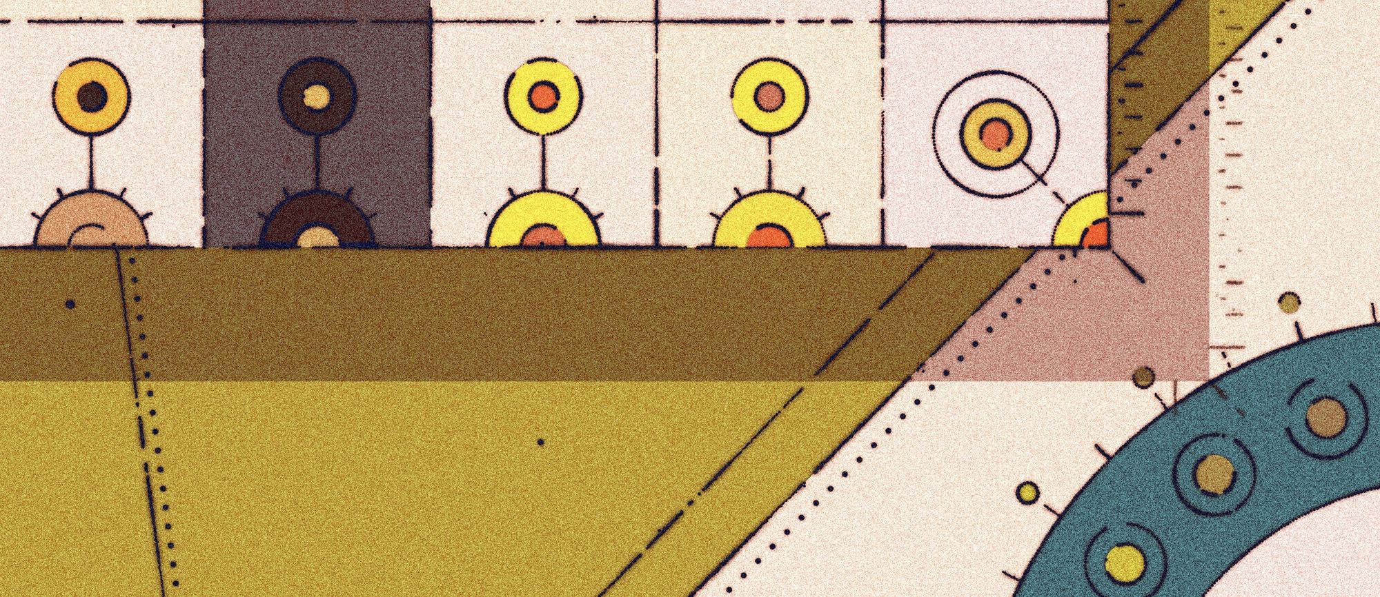
The strokes in this sketch are made from many small circles/points each of which has a semi-randomized size. I say semi-randomized because the stroke weight of each point is composited from a random number as well as a second one that depends on an underlying Perlin noise field. So we would end up with something that looks like this:
if (noise( x * 0.05 + offset, y * 0.05 + offset) < 0.305) {
  pg.strokeWeight(0);
} else {
  pg.strokeWeight(
    noise( x * 0.02 + offset, y * 0.02 + offset) * sW / 4.5 * 3 + random(sW / 4, (sW / 4) * 2) / 2
  );
}
Additionally, we are also using the noise field to threshold the drawn strokes. That basically means if the sampled value from the noise field drops below a certain cutoff , the line will simply not get drawn (because we set the stroke weight to 0). Essentially there's just two functions to trace all of the shapes, a parametric one for the circles and another one that draws points between two coordinates (a rectangle consists of 4 lines), and we'll obtain intricate textures like this:
Color Selection and Color Curation
Color selection and palette creation are definitely two of my biggest weak points. Predefined palettes can be very flavorful but can also quickly get boring, hence why they need to be handled with care. I must’ve spent a good number of hours putting together the color palettes until I had a few that I felt confident about.
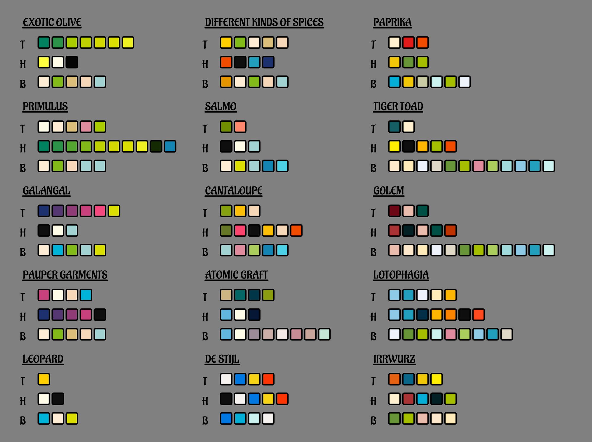
Color palettes in Exotic Quarpets are split up into three arrays: tile colors, highlight colors and background colors. A little bit similar to the Kjetil Golid’s color system in chromotome, and I think that it’s really good to have this top-level separation when they're ultimately going to be assigned at random. One thing I learned recently is the 60 - 30 - 10 color rule, which is mostly used in decorating spaces, but also translates well to gen-art compositions. Essentially, 60% of the composition should consist of a dominant color, 30% percent of a secondary color and the remaining 10% make up an accent color. This becomes easier to handle when you’ve already split your palettes up into those three categories.
{
  name: "PAPRIKA",
  tileColors: ['#fff1d0', '#dd1c1a',"#F24C00"],
  highlightColors: ['#f0c808', '#679436','#a5be00'],
  backgroundColors: ['#06aed5', '#f0c808','#c9cba3', '#cbf3f0','#a5be00', '#ebf2fa'],
},
In this manner I wrote the drawing functions of each tile to either select a tile color or a highlight color before drawing a specific shape, and since I have a wrapper around these drawing functions I can again just pass another argument and it will then make this selection. This system in place, it was still very difficult to put together palettes that worked well, but the outputs were much much more consistent, essentially ensuring that you wouldn’t run into ‘ugly’ color combinations. For example tile colors can never be too dark, and background colors can never be too bright since these colors simply don’t exist in the arrays. You could alternatively do this algorithmically by inspecting the lightness component of the colors in HSL space, but that’s just extra steps.
Another thing that happens to the colors in Exotic Quarpets is that not all colors that are assigned are the same. In fact colors can get randomly de-saturated or alternatively get slightly boosted. This adds a lot of visual complexity, and also makes it a little bit more lifelike. I already mentiond this, but when you go have a look at a tiled floor and/or wall you’ll notice that the passing of time has not been as kind to some of them as to others, hence naturally some will be more weathered and therefore have a more faded color. This color de-saturation can be done by shifting the S component of the colors in HSL space, which first requires us to convert the hex codes of the colors into the HSL color space and then reverting it afterwards. These conversion functions can be easily found via a quick google.
Lastly, there is a random chance that the color arrays get shifted, which means that the first item in those arrays gets removed and appended at the end of the array. This actually stems from a bug that I initially had in the code, but ended up being an effect that I really liked.
Weird bug that's shifting the colors, but I kinda dig it 🤔 #creativecoding https://t.co/AtjRbt0cMh pic.twitter.com/jLNujuLTfN
— Ahmad Moussa || Gorilla Sun (@gorillasu) July 23, 2022
As for putting together the actual palettes I found it best to start with a large array of colors and then iteratively remove colors, while constantly refreshing, until I converged towards a composition that felt consistently balanced. All in all, I didn’t want color selection to feel like an afterthought where I just copy in a few predefined palettes, and I think that it’s probably a good idea to spend some time doing color ‘curation’ for every individual project.
The modern artist’s struggle: Browser Compatibility
Come Saturday morning 6th of August I wake up extremely early to make some final checks and mint my project on fxhash. I had to catch a long train ride shortly after and was probably locked up for the remainder of Saturday. Sometime during a layover I get a message from @meezwhite that my sketch wasn't displaying properly on Safari as well as Brave on mobile.
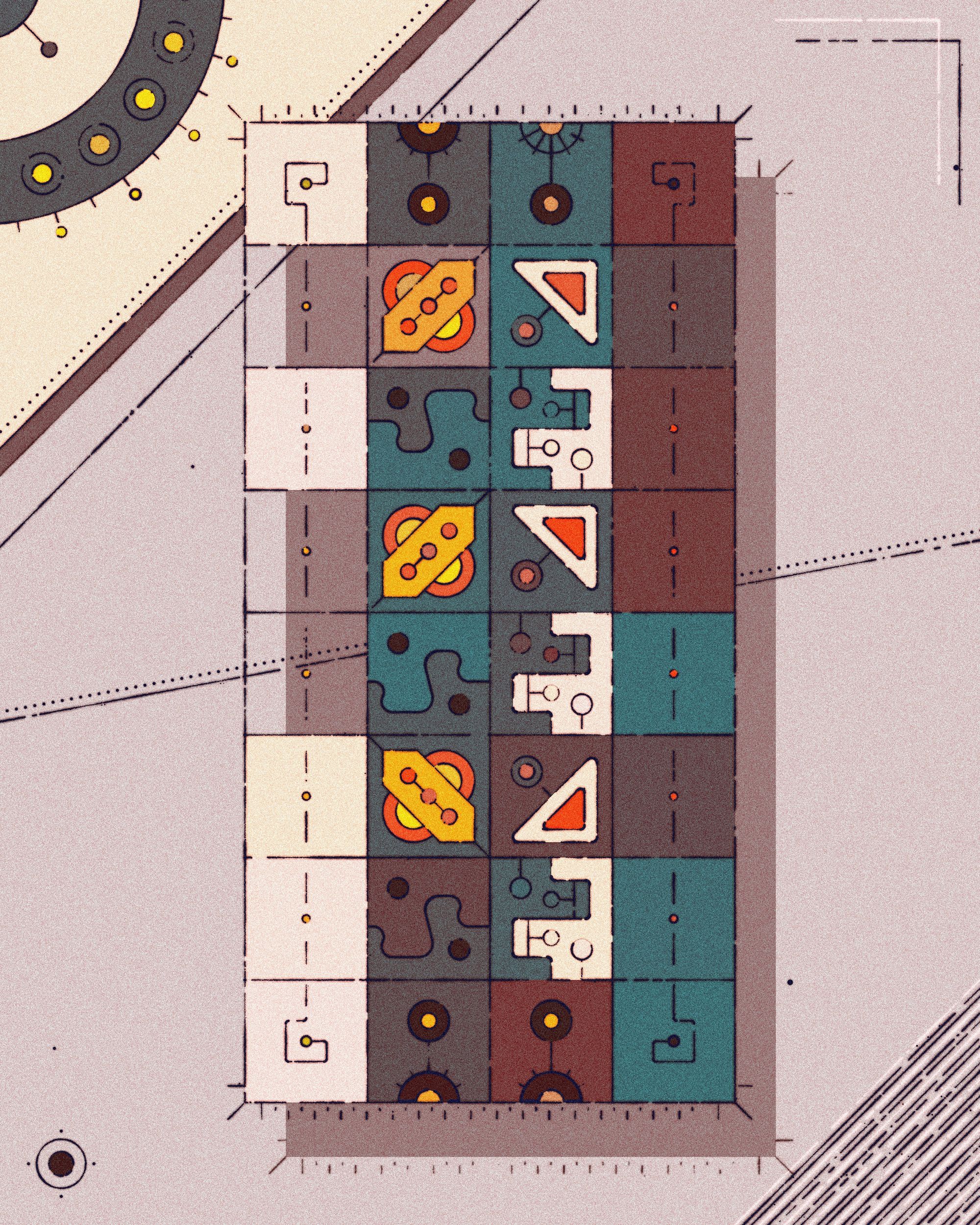
Minted Exotic Quarpets on #fxhash 🥳 Token #17606
— Ahmad Moussa || Gorilla Sun (@gorillasu) August 6, 2022
Tomorrow at 6PM CEST it'll be open for collecting! pic.twitter.com/vc6vFq2sXK
After 7 long hours of train rides and running on 3 hours of sleep I had to crash a bit before I could tackle the problem. The hardest part of this was deciding on how to best approach and communicate this issue. Ignoring the problem was hardly a solution, so I had to do some debugging. Both @meezwhite and @davepvm (go give them a follow on Twitter) were of tremendous help with this!
The error that was showing up in Safari's console:

It took me a while to pinpoint what the problem actually was, but essentially I had a function that was making P5's loadPixels() call, which under the hood utilizes the rendering context's getImageData() function. And apparently this throws an error when the canvas has more than 4097 × 4096 pixels. This also causes issues on browsers that run on an mobile ios device as it forces them to use their WebKit:
For those unfamiliar, iOS relies on the WebKit engine, which not only powers Safari but all web content on Apple's operating system. That's because, unlike macOS, iOS apps are required to use WebKit as their browser engine.
This was problematic because I wrote my entire code with the thought that I'd be working with a fixed size graphics buffer, which has generally been my go to method and makes a lot of things easier, like centering and re-scaling to different window sizes. That would be all well and good if Safari didn't throw an error for the specific canvas size I've chosen. I considered a few different options but ultimately decided to just have the graphics buffer's size slightly under Safari's pixel limit, rather than having a solution where I have to manually detect if the sketch is run on Safari or ios mobile (which can be unreliable sometimes) as well as patch in a lot of exceptions for this case.
Closing Thoughts
Overall, this was a very fun project to put together, albeit there being some stressful bumps along the road. I also learned a lot this time around again, for me personally publishing projects on fxhash has had a little bit of a steep learning curve but I feel like I'm slowly improving every time I put something out into the world. Thanks a billion to all those who collected an iteration of Exotic Quarpets, it means the world to me. And if you've reached here, thanks for reading! Happy coding and collecting, cheers!
