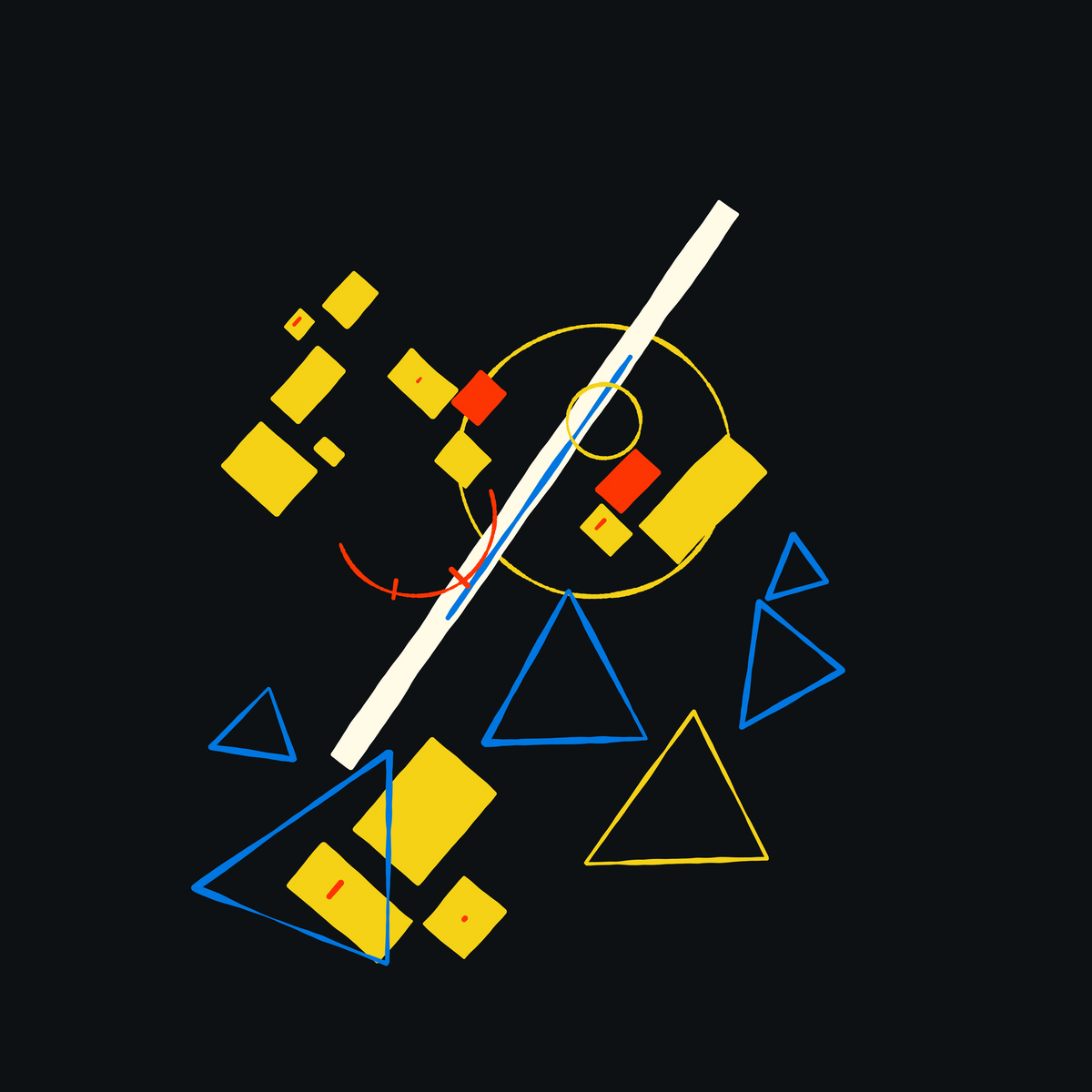
Neo Supremus is a generative ode to Kasimir Sewerinowitsch Malewitsch's suprematist compositions. Malevitch was not only one of the most influential Russian avantgarde artists and theorists of the 20th century, but also arguably very controversial for his time. Treading in the same ranks as Kandinsky, and giving rise to the Suprematist art movement, Malevich's ideology aimed at reducing art to it's most basic and simplistic form.
Suprematists searched for the ‘zero degree’ of painting, the point beyond which the medium could not go without ceasing to be art. In order to achieve this point, simple motifs were used which best articulated the shape and the flat surface of the canvas - Art Movement: Suprematism by Shira Wolfe
To me, there is something very fascinating about the radical nature of the suprematist art movement. For the era that suprematism was conceived in, it was considered to be very daring. Malevich lived in a period of time where art needed to have an educational value, art couldn't just exist for the sake of art. Malevich couldn't accept that, he believed that art existed whether or not we were on board. Accused of 'formalism' and being suspected of being a spy Malevich was even imprisoned.
On September 20, 1930 Malevich was arrested and taken to prison. When he was released six months later he was given three choices: 1. He could leave the country; 2. He could close himself in a room and work just by himself; or 3. He could become a realist painter - Kazimir Malevich: Atragic Visionary by Cathy Locke
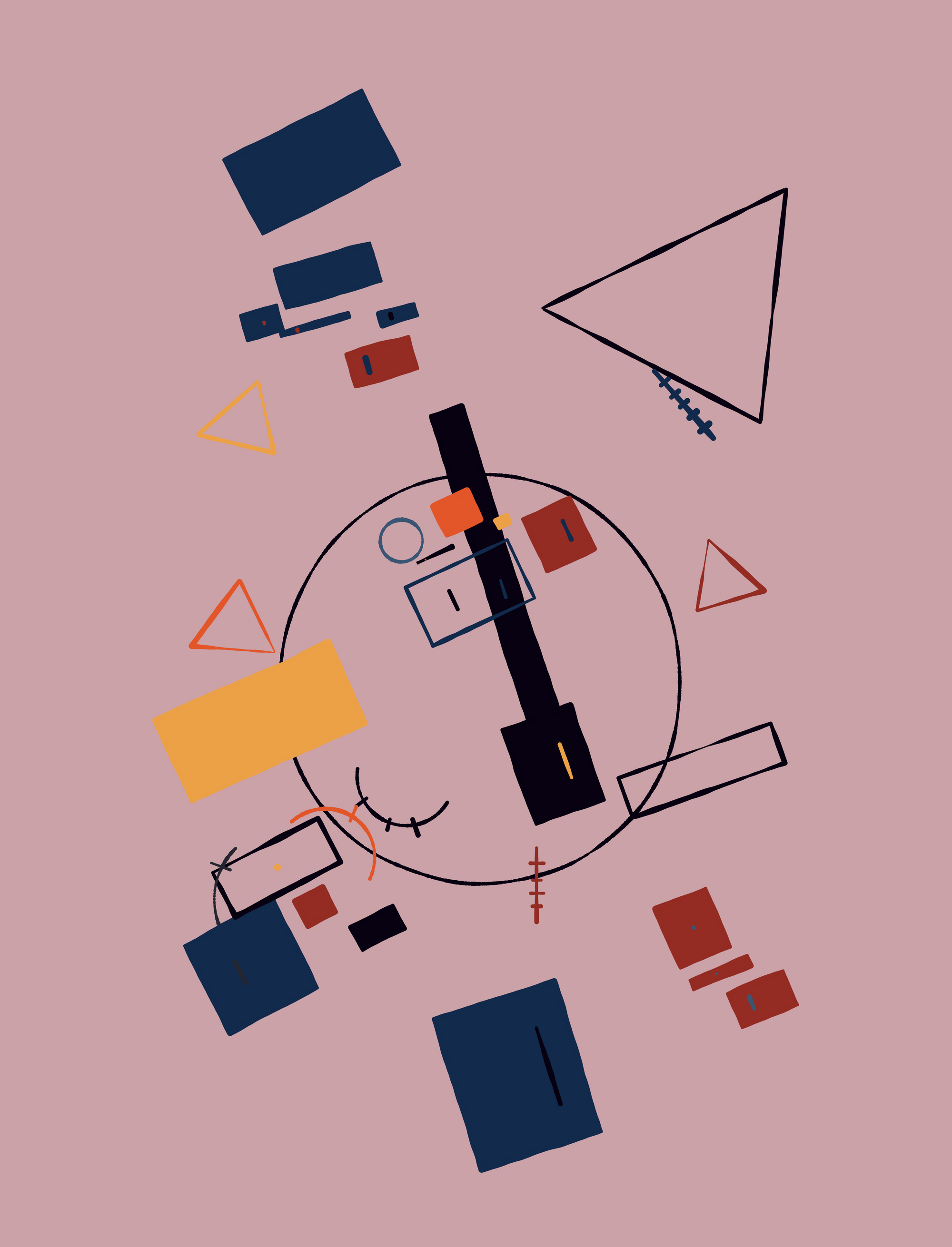
Maybe this piqued your interest in the Suprematist art movement and learning more about it! It surely did for me, being the reason why I even started this entire project. Besides the historical and political background of it all, I also simply adore the compositions from an aesthetical point of view. In the rest of the article, we'll talk about how Neo Supremus came to be as well as some of the techniques that I utilised.
A Beautiful Mess: Structure in Chaos
Neo-Supremus is a study on two of the overarching and re-occurring concepts in Malevich's compositions, namely Directionality and Positioning. It proved to be quite difficult to arrange things in a seemingly natural manner with a generative system; in a similar vein to my previous project Kandinskomorphism, this time around I also didn't rely on the comfort of an invisible underlying structure. For Neo Supremus I ended up using a collision detection system that is nowadays probably much more prevalent in video games.
While trying to figure out the math behind Neo Supremus, I coded and collected a number of useful functions, most of which had something to do with computing the intersection between different kinds of shapes. I ended up with more than enough material, sufficient for a complete article in of itself, by the end of which we build up to a complete method for determining polygon intersections. The article can be found here: An algorithm for Polygon Intersections. However, Towards the end of the post, we briefly venture into the world of clipping algorithms, and I believe that I've just scratched the surface of that topic and that there is still a lot more to say. Hence there might be another future post in that regard.
The article also briefly made it onto the front page of hacker news on the 2nd of October, which was a really surreal experience. I've never had so many simultaneous visits on the blog!
We're on the front-page of hacker news! 😁😭 pic.twitter.com/K2NZZgQ0Tw
— Ahmad Moussa || Gorilla Sun (@gorillasu) October 2, 2022
Movement in Directionality
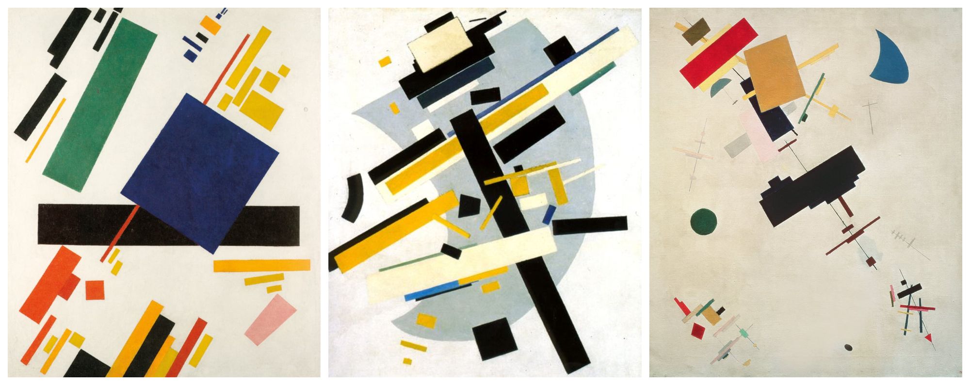
A common trait in Malevich's suprematist compositions is that the shapes on the canvas often follow the direction of a main axis, often indicated and accentuated by a larger central shape. This common direction shared among shapes makes it seem like the rectangles are collectively heading somewhere, such that the canvas is only capturing a fleeting moment before they depart and leave. Frequently we'll also find a complementary secondary axis, that has a lesser number of shapes alongside of it. Here are some of Malevich's famous compositions that illustrate this notion:
Another piece that I think is important to mention here is Malevich's 'Airplane flying', which also was the original inspiration Neo Supremus and is in manners also a very influential and important artwork. We'll have another look at it in the next section but for now I think it gives an important hint on perspective:
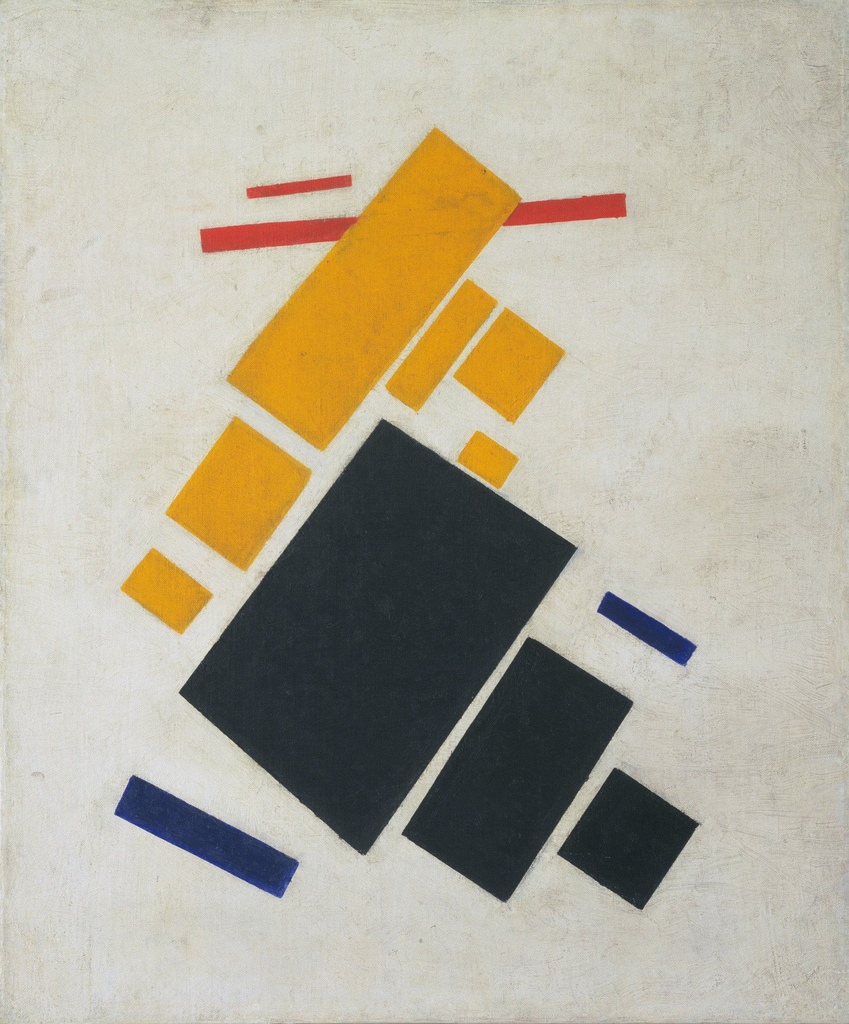
I am not certain if 'Airplane Flying' is trying to represent some sort of abstract flying machine, or if it is trying to convey an aerial view of some buildings beneath. I am tending towards the latter, since it plays into the previous notion of ephemerality I mentioned, that we're only seeing a momentary slice of an abstract imagery that is simply passing by before it's gone forever. Both of my previous statements would probably have sounded preposterous to Malevich however, his art was intended to be non-representational. Meaning that it wasn't intended to represent anything in the physical realm.
(Oil on canvas - The Museum of Modern Art, New York )
And this is where I will stop myself, the Suprematist philosophical doctrine underlying Malevich's compositions is much deeper. Maybe after I've read and understood Malevich's The Non-Objective World I'll be more qualified to talk about this. These are just my thoughts after a couple hours of studying the compositions and trying to translate these ideas into code.
Clusters and Positioning
Emulating a seemingly natural positioning of elements was by far the hardest part of this project. And it took me an embarrassingly long time to get something in place that was somewhat consistent in that regard. I could probably spend many more hours writing code that simply positions rectangles on the canvas in arbitrary manners, and it will probably never be completely satisfactory. Here's some of the ideas that I had while trying to crack this tough nut:
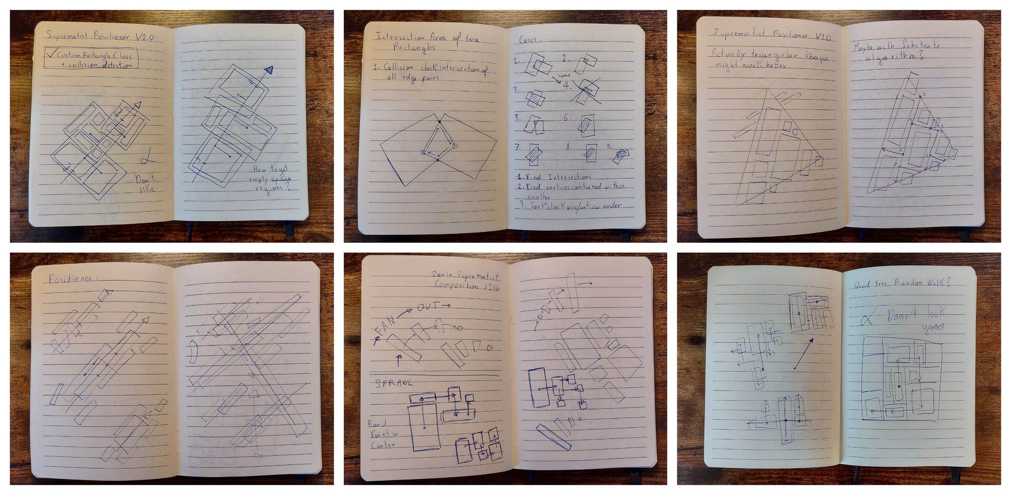
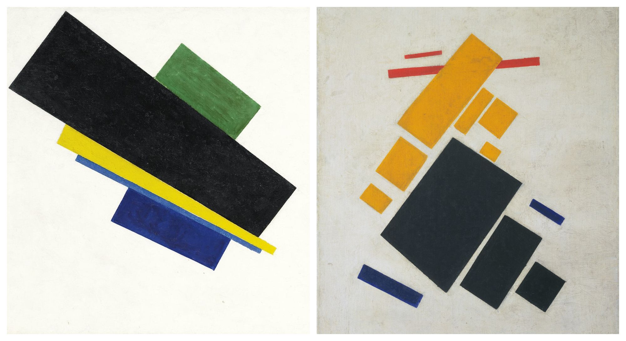
At it's essence the shapes are positioned with a rectangle packing algorithm, most of the math for this I've explained in detail in the polygon intersection article I mentioned earlier, if you're curious about that. But TLDR, to check if two rectangles intersect it's sufficient to check if any two of their edges intersect, which also works in the case when two rectangles are rotated in some arbitrary manner. With a handy rectangle class in place (in hindsight it's ironic that I used the object oriented paradigm when Malevich's art was ought to be non-objective), the next task was to figure out how to create small clusters and patches of rectangles on the canvas, in a similar pleasing manner to what can be seen in Malevich's compositions, as well as other suprematist artworks of that era:
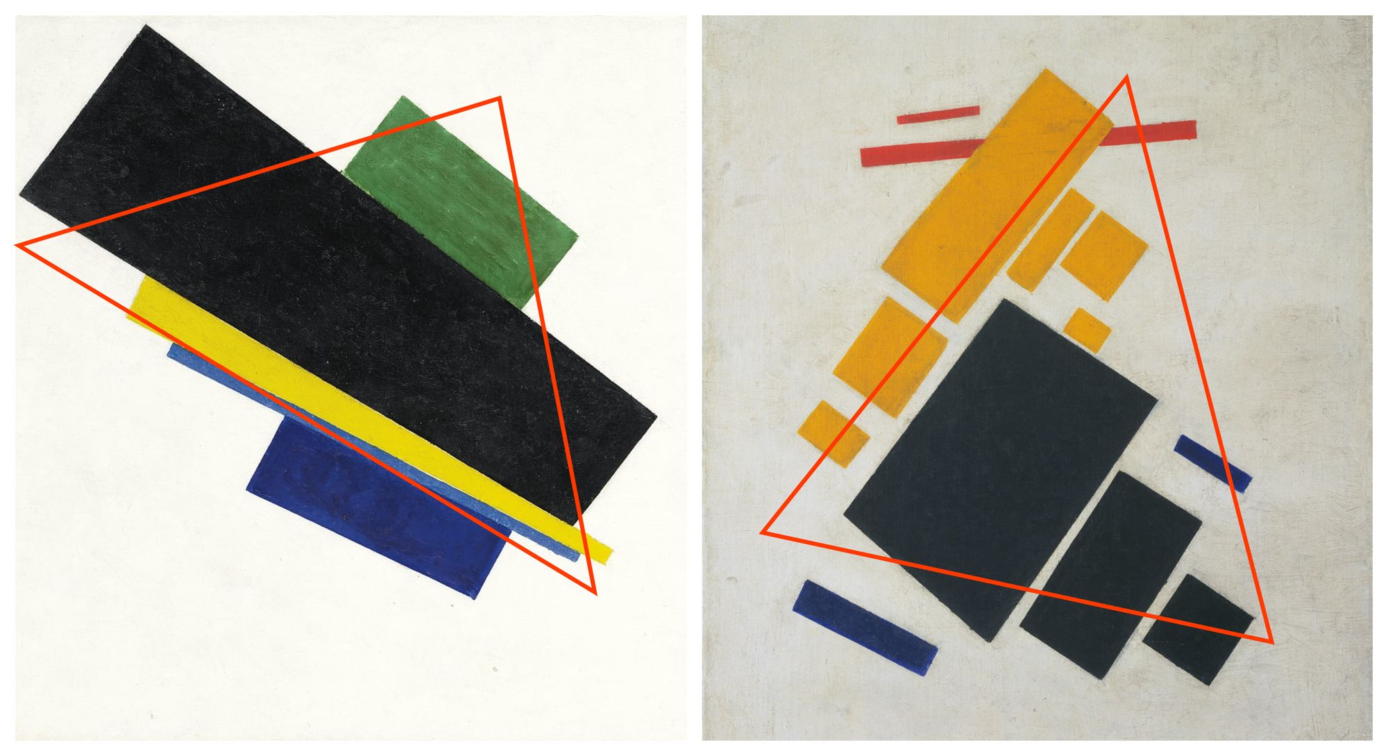
I found that spawning the rectangles within triangular patches worked very well. Why a triangular patch though? Looking at some of Malevich's works I noticed that the rectangle clusters can sometimes be outlined with the trace of a triangle. Well, it doesn't always apply but it worked well for the purpose of the composition. At first I tried the same with a rectangular patch but those patterns were too obviously rectangular. Here's what I mean:
In that manner, we also require a method for sampling a random point within a triangle to determine the location of the rectangles that are to be placed, this can be done with the following formula:
// Source: https://stackoverflow.com/a/19654424/6688750
function randomTrianglePoint(triangleVertices) {
    var r1 = random();
    var r2 = random();

    var px = (1 - sqrt(r1)) * triangleVertices[0].x + sqrt(r1) * (1 - r2) * triangleVertices[1].x + sqrt(r1) * r2 * triangleVertices[2].x;
    var py = (1 - sqrt(r1)) * triangleVertices[0].y + sqrt(r1) * (1 - r2) * triangleVertices[1].y + sqrt(r1) * r2 * triangleVertices[2].y;

    return {x: x, y: y};
  };
This function is quite handy to have when you need a random point within a triangle, but I found that it generated spawn points that were just a little bit too... well, random. Sometimes the points were either too close to an already existing rectangle or too far away. To tighten it up a little I ended up using points generated by a Poisson Disk sampling procedure as explained in this coding train video:
So instead of picking a point at random, we now pre-emptively generate a couple evenly spaced points which we can later pick from to place our rectangles on. Constraining the points to a triangle was also not very difficult, I simply reused the 'Point in Polygon Test' code that I also covered in the polygon intersection article (which utilises raycasting to check if a point is contained within a polygonal shape). Poisson disk sampled points constrained to a triangular shape would look as follows:
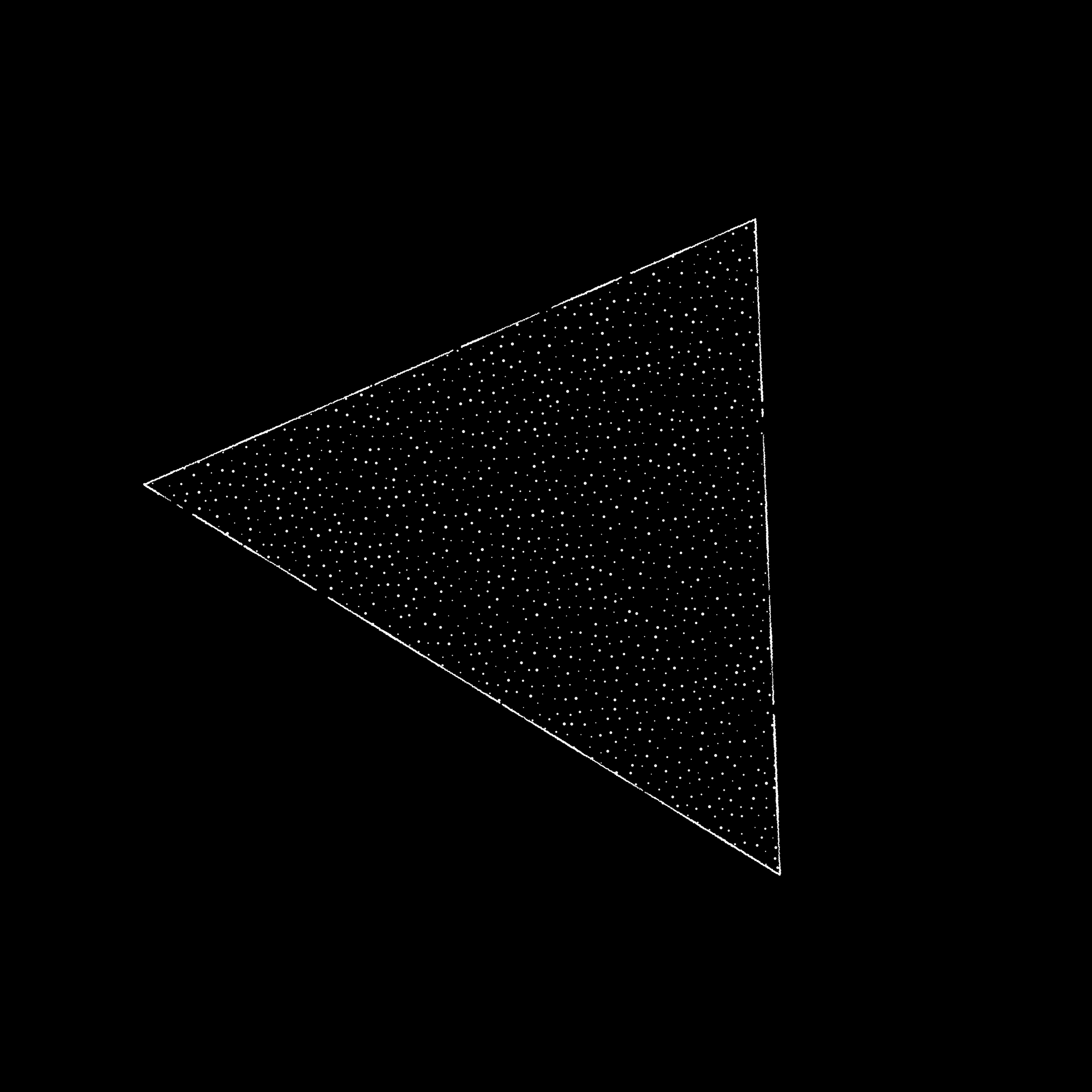
Here I added the constraint that the point shouldn't be too close nor too far from the other rectangles, so that the cluster is a little bit more tightly packed. In this manner, we can simply create multiple clusters and position them on the canvas in such a manner that they don't overlap. I generally don't like using while loops because they can sometimes be dangerous when there isn't a certain exit condition, but essentially, after positioning the very first cluster, we create another cluster and attempt to place it on the canvas while checking if any of it's constituent rectangles collide with any of the already placed clusters' rectangles, until a randomly chosen number of clusters has been placed. This isn't very fast, I'm not implementing a grid look-up but since we're only dealing with a relatively small number of rectangles the overall initial delay is not noticeable. The patterns generated in this matter would look as follows:
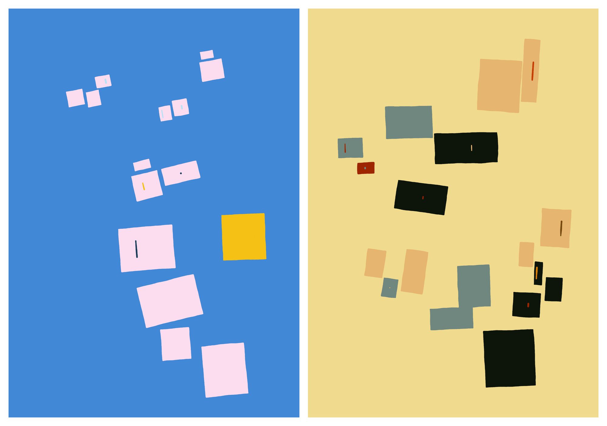
The rectangles in the background can be overlapped, somehow as if they had a heavier weight to them and were allowed to sink to the background. Like a flock of smaller birds following the larger specimens. The other elements of the composition follow a similar positioning strategy. Ultimately I'm not very certain that this is the best way to go about it, maybe a physics simulation would have been more suitable, such that the rectangle clusters arrange themselves by means of an attractive force or some flocking mechanism. Would the resulting patterns have turned better? Only one way to find out.
Texture and Color
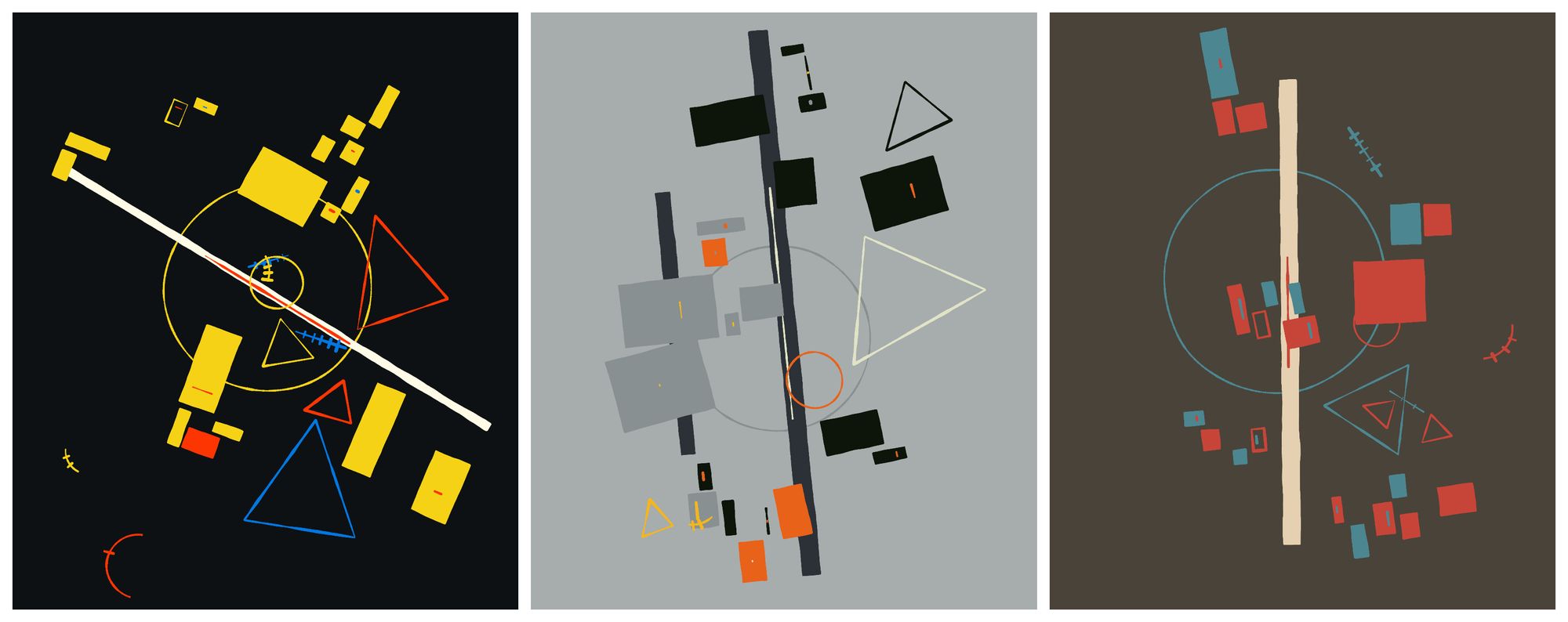
Yet again I recurred to my Perlin noise wobbly strokes that I've used on several occasions already, with the only difference that this time there is no random dropout in the strokes. This gave things a sort of painted style. The edges of shapes in Malevich's paintings are relatively straight and only at some points presenting a slight waviness, hence I didn't crank this effect up very much. It was a bit tricky finding high resolution scans of the artworks, but examining some examples we can have a closer look and see that there is great detail in the canvas texture and how the color is applied.
Nothing special was done to the colors this time, except that I sampled them from some famous Suprematist paintings, not solely restricted to Malevich, but also some of his contemporaries.
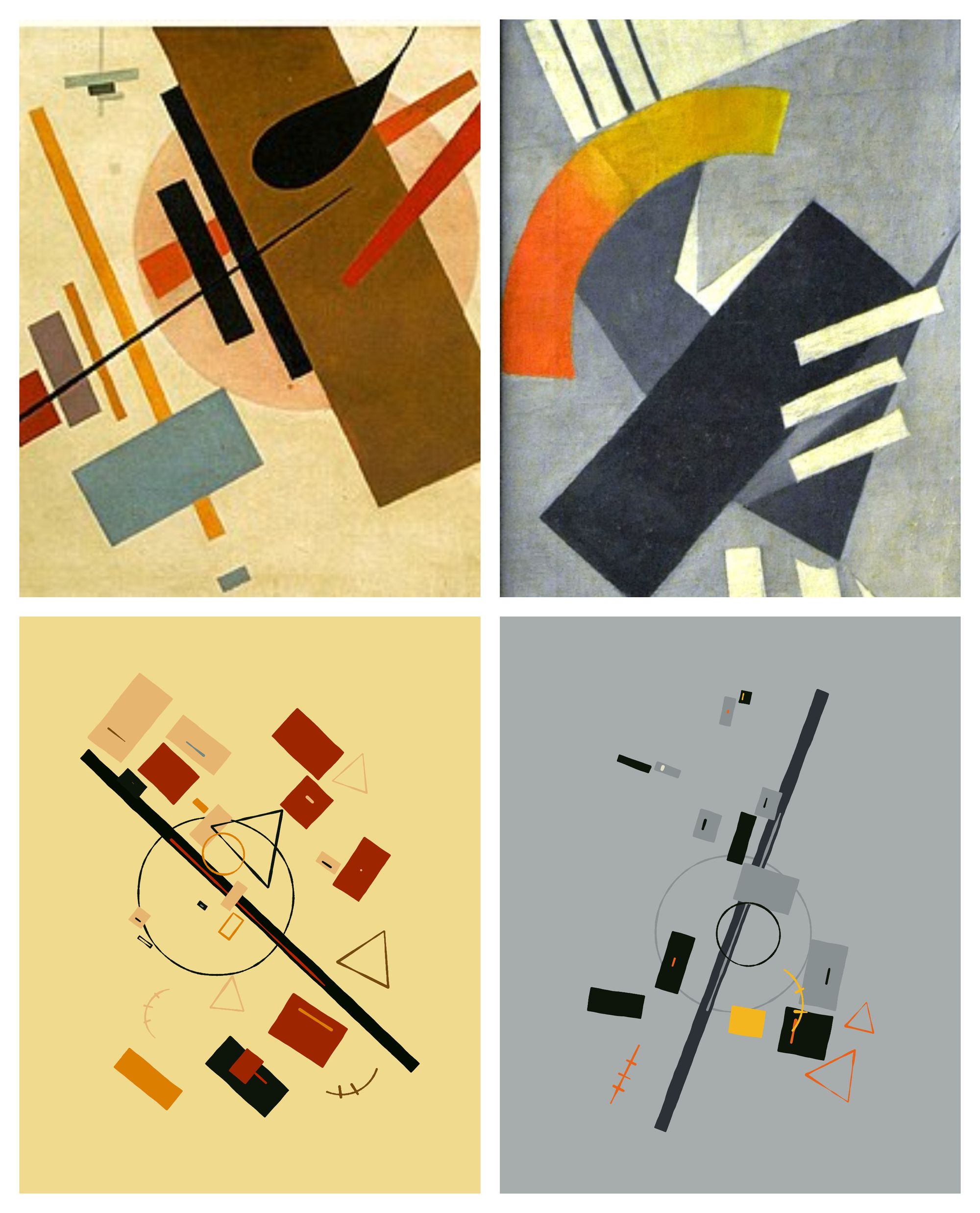
I also sampled palettes from other artworks as well as some that I already liked:
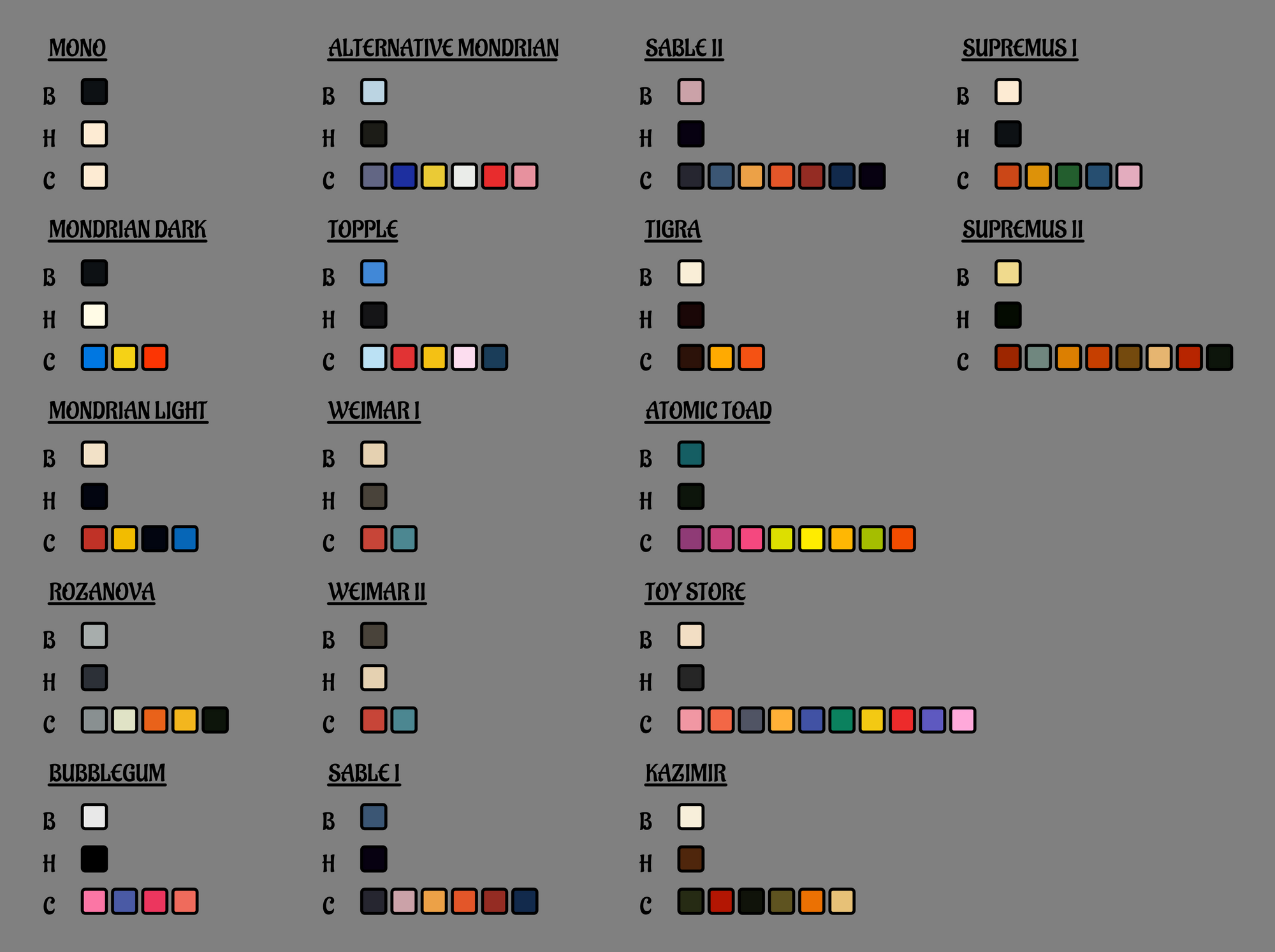
As for the canvas texture, it is still something that I am actively investigating. There's something very special about the old faded oil colors on a canvas that I have no idea how to go about yet. Krankarta is doing something super realistic in that regard currently:
Boxes of colour pic.twitter.com/qhJRs1UJ6Y
— KRANKARTA (@krankarta) October 11, 2022
I looked into paint simulations a little bit, and it's a heavily researched field, especially with respect to drawing softwares intended for tablets and touch surfaces to emulate a realistic behaviour of color. For my purposes it doesn't have to be interactive though. Another one that recently really caught my eye in that regard was Disjoint and Disoriented back from June, a collab between Lunarean and dmarchi:
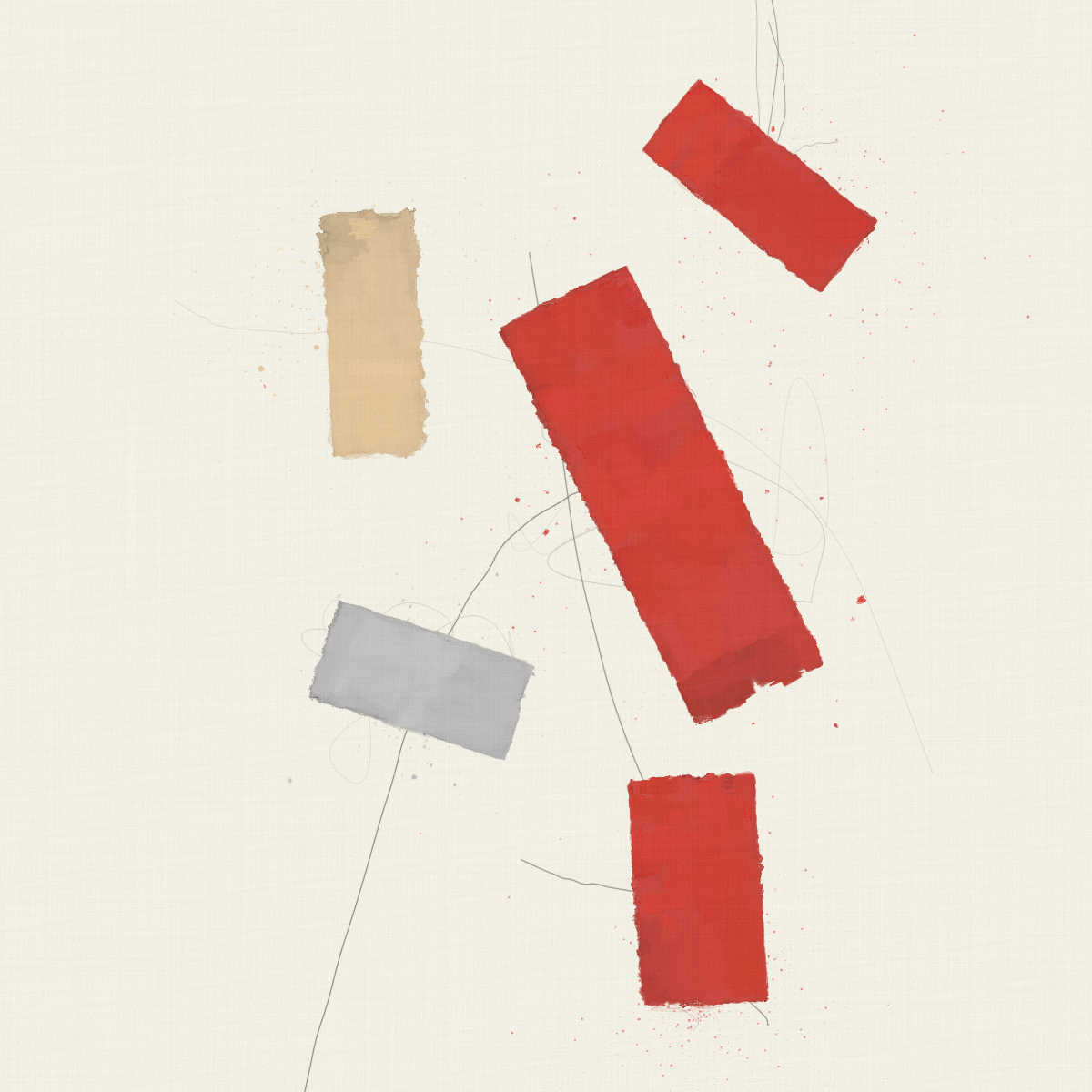
What a stunning texture! And the animation is incredibly satisfying! The resulting rectangles really have that 'oil on canvas' aesthetic, with what I naively assume stems from layering lots and lots of transparent strokes and rectangles on top of each other. Not only the layering, but also the manner in which they're layered is very important! I'm not a painter, but when you're drawing with oil on canvas, it takes a certain level of mastery and a trained hand to be able to distribute the paint evenly on the canvas surface. Additionally, the artist sometimes creates new colors by mixing together two different ones on the palette, or wants to darken or lighten a color by mixing in a little bit of another color. This can't be done in an atomically perfect manner, leading to the color having slightly different shades at some points, visibly so when ultimately applied to the canvas. Going back to 'Disjoint and Disoriented', this is done masterfully, where the rectangular paint strokes have soft fluctuations in hue and lightness, really selling the effect!
One very iconic article in that regard is Tyler Hobbs' A Guide to Simulating Watercolor Paint with Generative Art, which I've mentioned countless times at this point. I've experimented with that in the past, but the 'oil on canvas' texture will probably require a little bit of a different approach.
Animation and Image Export
The idea for adding an animated component to the artwork came after coming across one of Malevich's famous quotes, originally stemming from From Cubism and Futurism to Suprematism: The New Realism in Painting (1915):
A painted surface is a real, living form.
What would Malevich have done if he had the chance to animate his compositions? Personally I think he would have been delighted about it. In general I think the Suprematist and Konstruktivist art movements would have been very fond of gen-art. Futurists would probably have been really into AI art.
In that manner, I wanted to create something that would look good as a still but also have some interesting aspect when presented on a screen. Approaching the project in an object oriented manner from the get go had a few benefits. Each shape on screen being represented by a class, meant that it already had it's own coordinates and dimensions stored, which allowed for an easy way to make things slightly sway around and have them fade in from nothingness.
The intuitive form should emerge from nothing.

It was relatively straight forward to add a function that made each shape sway back and forth. Each rectangle on screen has a three different vertex arrays: one that represents the rectangle at it's final and full size, a second one that represents the rectangle at it's full size minus a certain margin, and a third one that is used for fading the rectangle in as well as animating it later on. The first two arrays are used to make sure that the rectangles have some space between each other, essentially when their outer bounding boxes intersect they will stop growing. Without a margin we would get clusters that look like this:
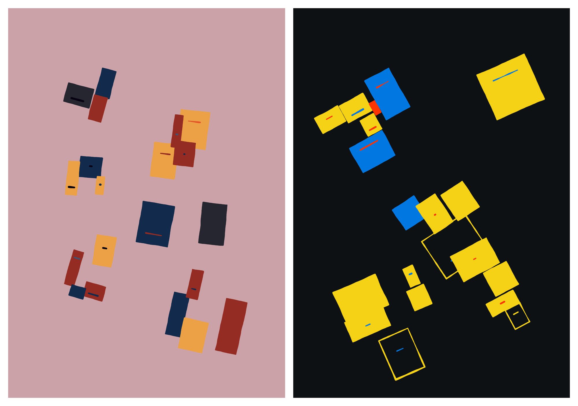
The vertices that represent the rectangle at full size are also necessary to position the clusters initially. The third vertex array on the other hand is used fade the shape in, in conjunction with a growing parameter:
this.grow = function() {
  if (this.growing) {

    // recompute the coordinates of the rectangle
    this.recomputeCoordinates();

    // this.size's range is between 0 and 1
    this.size += this.growSpeed;

    // if we reach the max range we stop growing
    if (this.size > 1-this.growSpeed) {
      this.growing = false;
    }

    // another check is done somewhere else if we intersect with another rectangle
    // in that case we also stop growing
  }
};
Since the shapes in the sketch consist of many little dots that outline the shapes, the animation starts becoming a little slow on canvases with higher pixel densities. To avoid that the displayed animated graphics buffer has a pixel density of 1. Taking a snapshot of the graphics however is done on a graphics buffer with a higher pixel density. For taking a snapshot, I temporarily swap out the animation graphics buffer for the high resolution buffer for one frame, drawing everything on there, saving and then reverting to the original buffer. This happens when the corresponding key press is registered.
Concluding Thoughts
Thanks a million to everyone who collected and supported me along the way, liking and retweeting my #WIPs on Twitter! It's been endless amounts of fun, from observing and contemplating suprematist compositions, learning a little bit about art history, and trying to solve the puzzle of recreating the compositions in a generative manner. It's been a bit frustrating at times, but ultimately absolutely worth it, overall coming out on the other side as a better artist after each project. That's it for this article, cheers! And happy sketching in the meantime!
